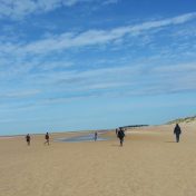
I had decided to develop the work I had done in the ‘outdoors’ (Part three – Expanse) section of the course. I chose this, as considering subjects under the sky and in the open air sparks my creative thoughts and interest.
I found looking for ideas within the home and indoors quite challenging and a little oppressive. Though, I did feel I might want to develop my portrait skills at some point, as I did find representing a human soul intriguing.
Ultimately, I’m very interested in space, nature, the mysteries of the planet and universe and how these connect to us as human beings.
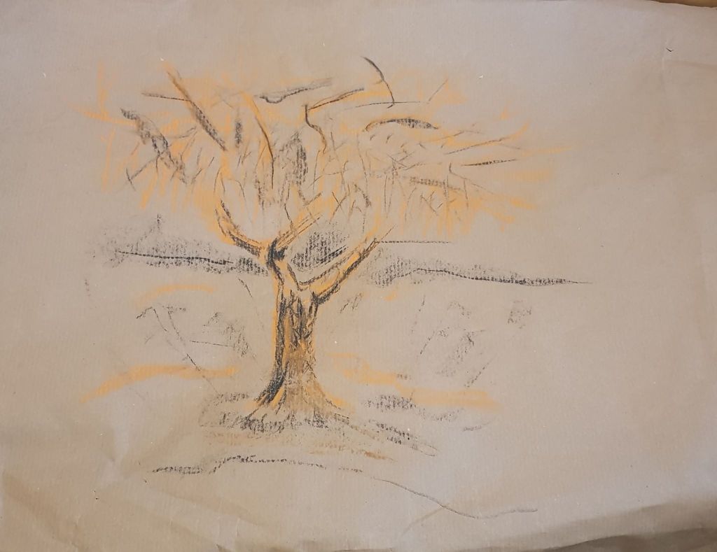
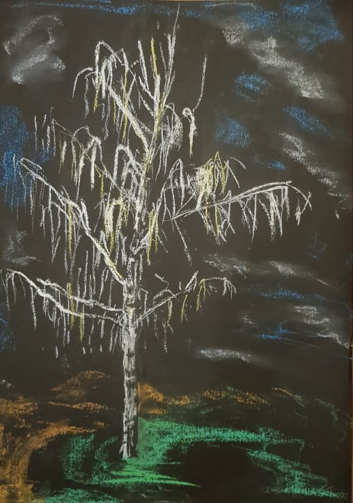
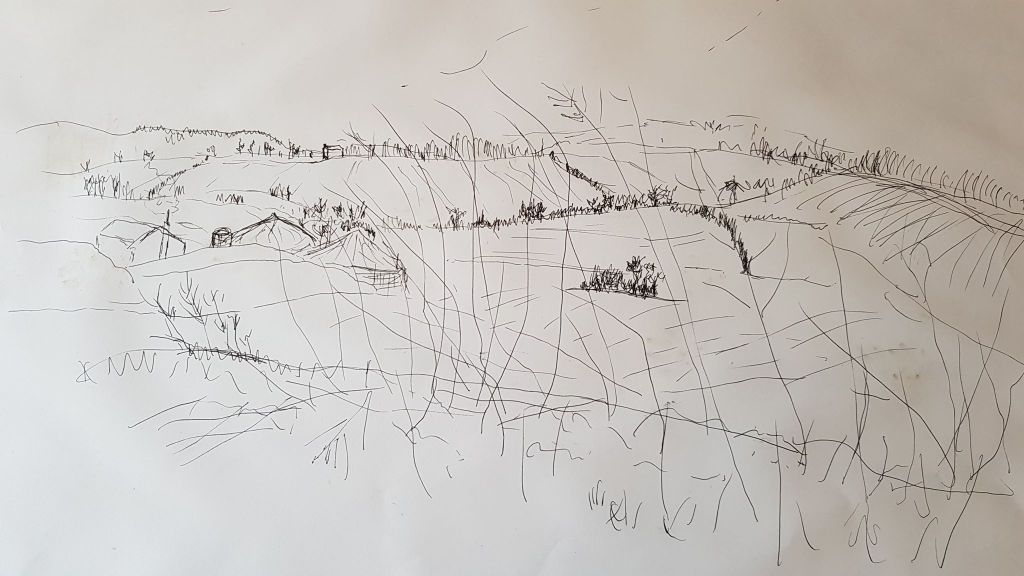
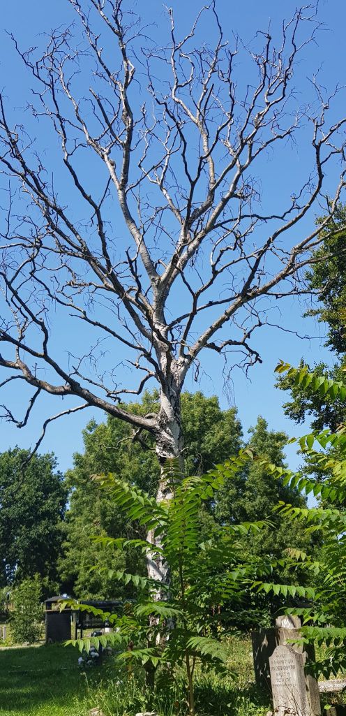
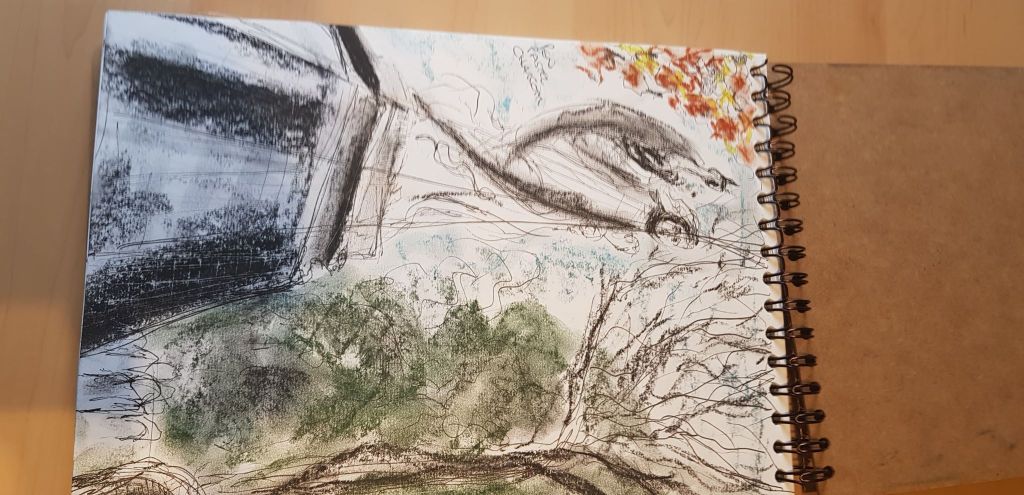
In part three I had drawn trees with expressive marks. See below for examples. It was amazing how making quick gesture marks gave satisfying results. Also experimenting with different papers gave pleasing effects.
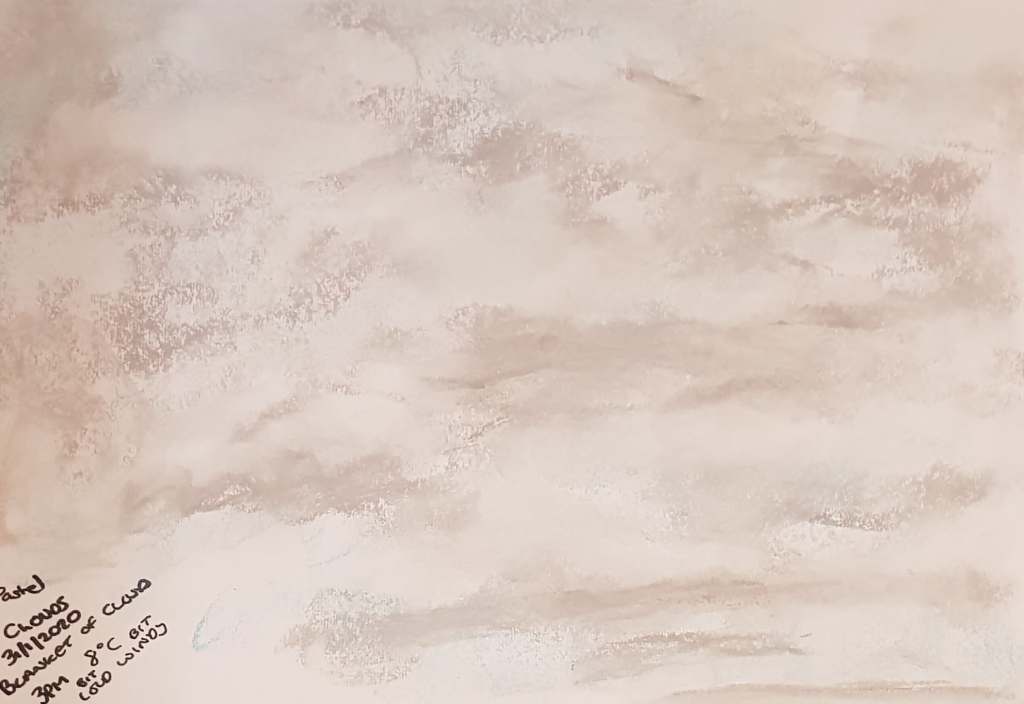
I found cloud drawings satisfying and liked the effects of the pastels and charcoal when experimenting with creating the impression of clouds
Working on layers of foreground, middle ground and background was pleasing (see below)
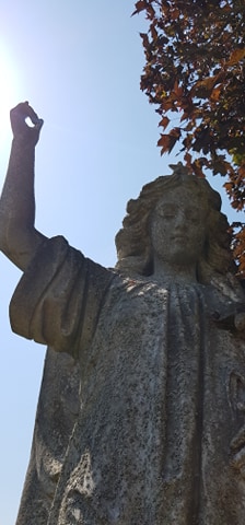
I enjoyed composition with the statues around where I live.
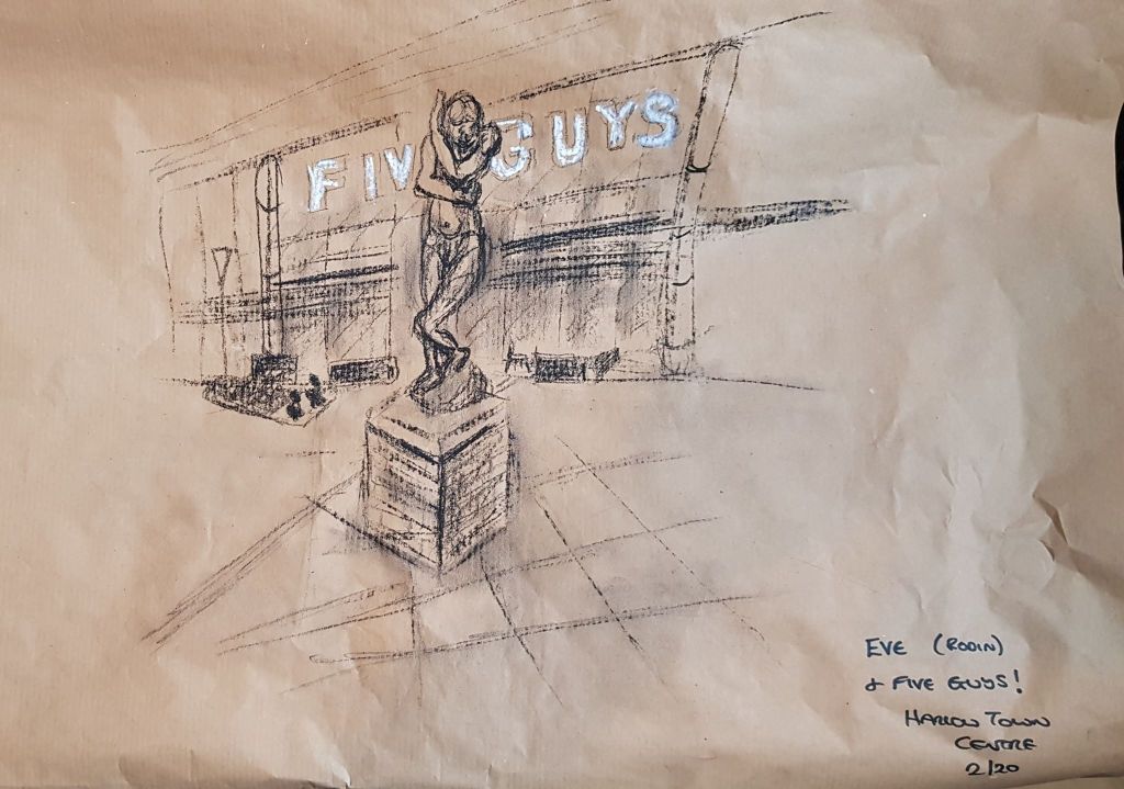
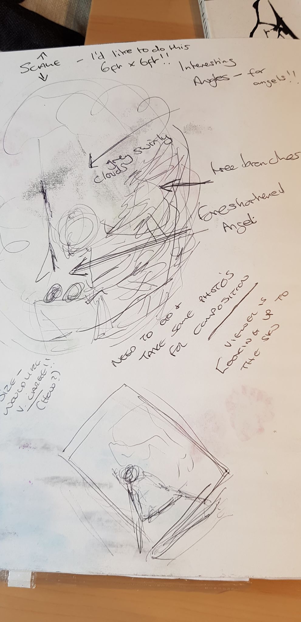
In part four I got inspiration from experimenting with different perspectives to make composition more interesting.
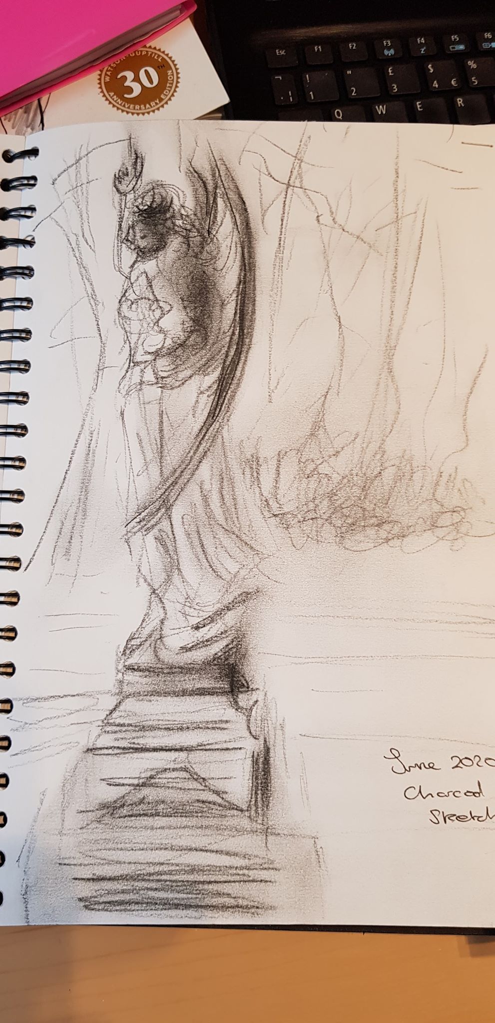
The final piece I had drawn in part three ,below, had many things that needed reflection and growth. I needed to work on my expression of lights darks and tone.
I revisited this earlier in part five and re-worked the drawing. I then decided I wanted to develop aspects of this drawing even further for the part five personal project. I wanted to expand on this type of drawing subject matter and make it more exciting, experimental and ultimately a better way of expressing what I had to say via the medium of drawing.
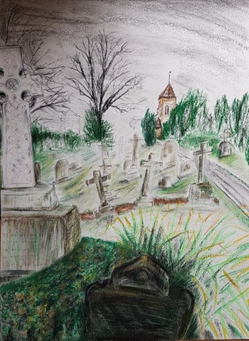
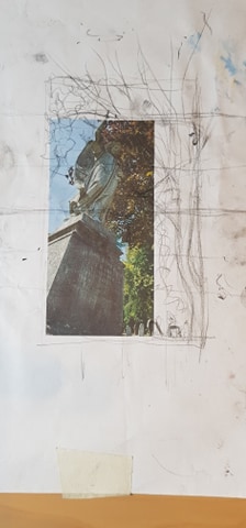
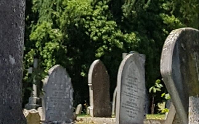
I was interested in the subject matter the Bedford churchyard presented. I revisited it and took many photos. I was drawn to the angel and took photos all around her and at different angles and perspectives.
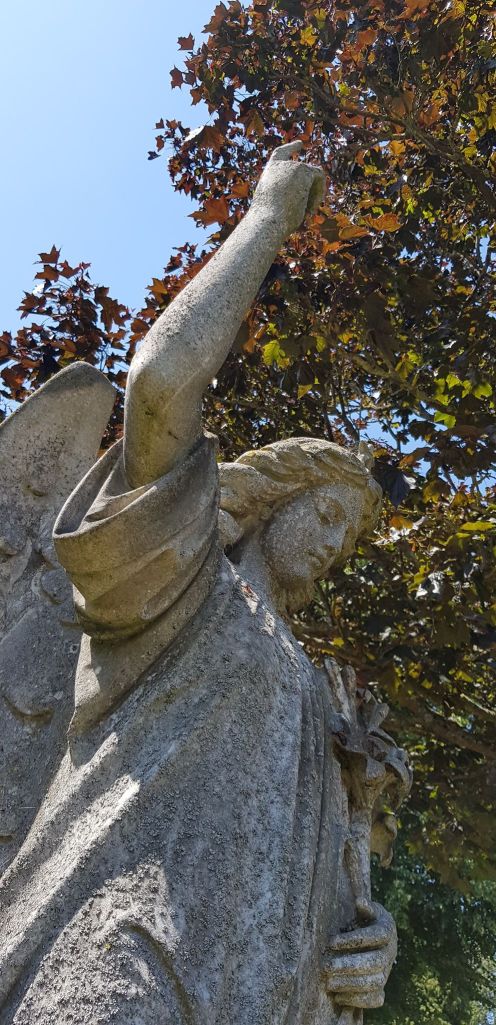
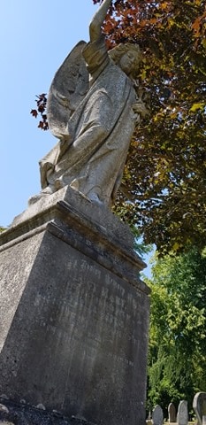
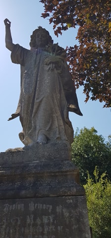
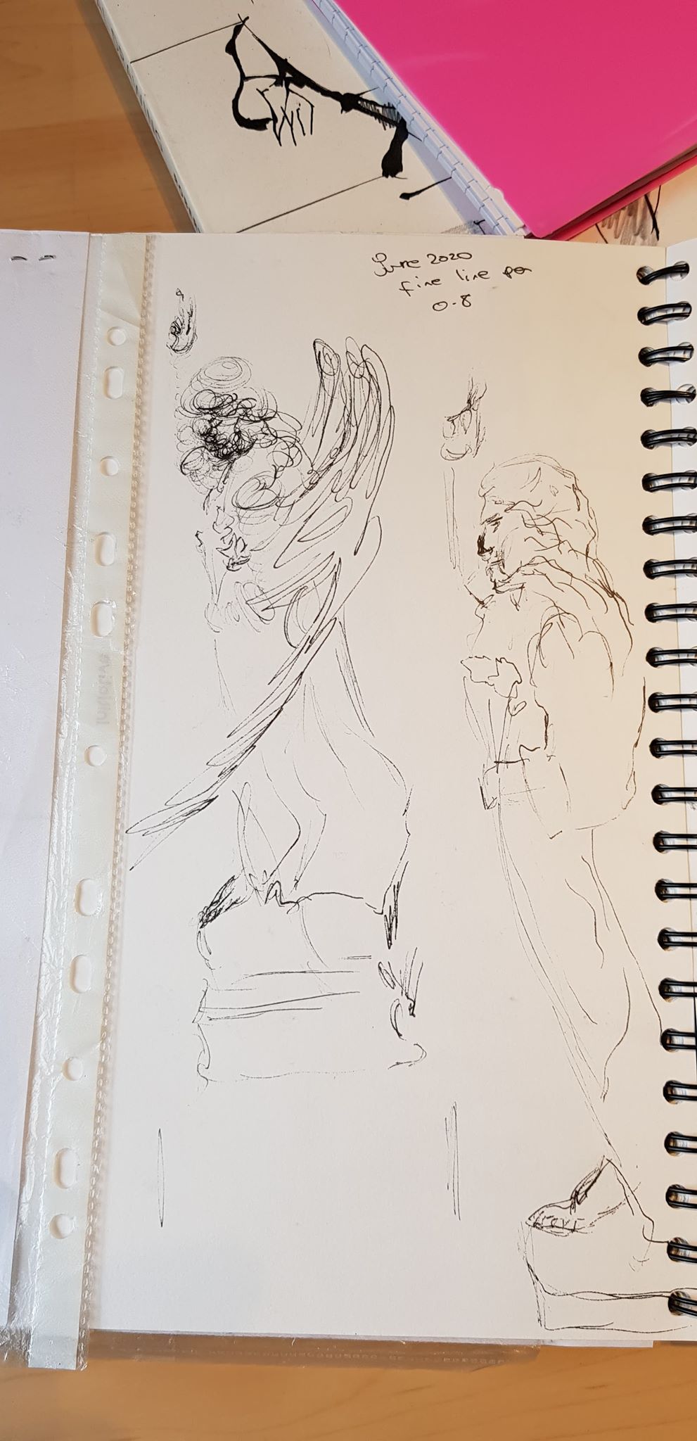
I considered the composition I wanted for my drawing and took elements from a couple of the photos I had taken, moving them around in my imagination and testing on printouts and in my sketchbook to create the picture I wanted.
Below are some of the artists and images I drew inspiration and direction from for the final piece. From top left, clockwise:
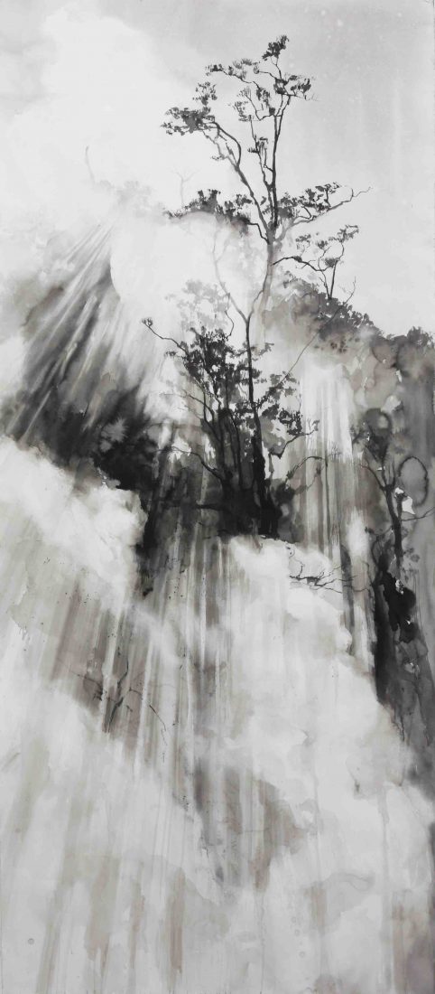

EMMA STIBBON, Steam Vent, 2017, Black ink, volcanic ash and carbon,
210.9 x 92 cm
I am inspired by the scale and power of this drawing. She uses simple materials and monochrome to such great effect. I am inspired to try and use large scale and simple materials.
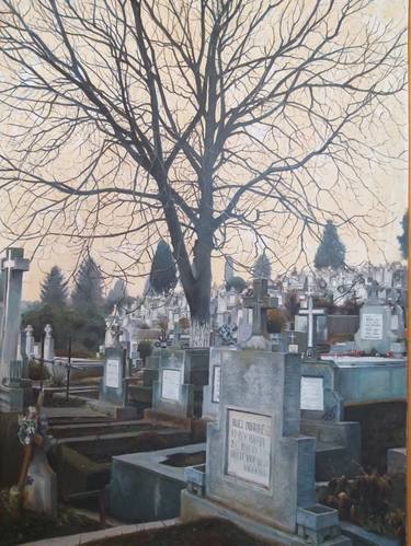
STANCIU ANDREI, Cemetery Painting, oil on canvas, http://www.saatchiart.com
Although not a drawing, the way this cemetery is depicted demonstrated to me that the subject didn’t have to be morbid – just intriguing. Again a simple use of limited pallet to massive effect.
Jenny Purrett – her student’s – wallpaper drawings
Use of an easily purchased product to make a drawing ‘support’ as long as you like!
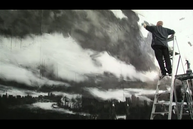
John Virtue, London Paintings, white acrylic paint, black ink and shellac
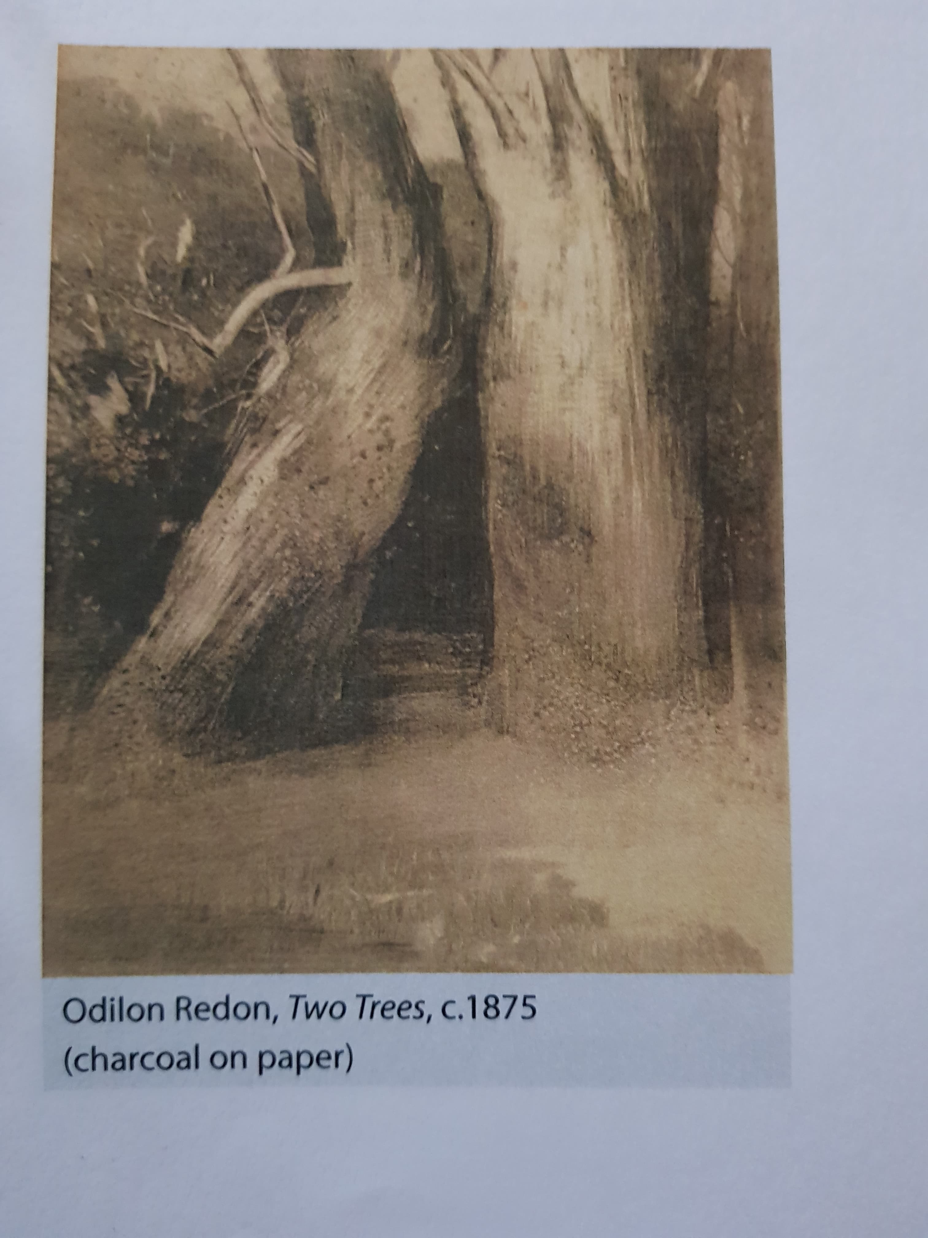
Odilon Redon, Two Trees, c 1875, charcoal on paper
Tacita Dean, ‘The Montafon Letter’, Los Angeles, 2017 TACITA DEAN
The vast image she has created is full of power and awe.
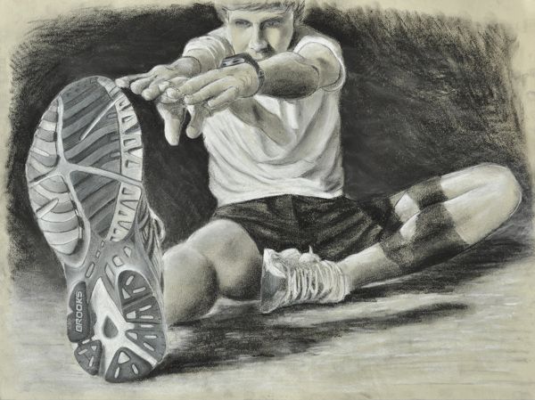
Tennis Shoe Stretch, artist unknown, www.art4tab.com
Use of perspective to make a quite day-to-day idea very interesting to the viewer.
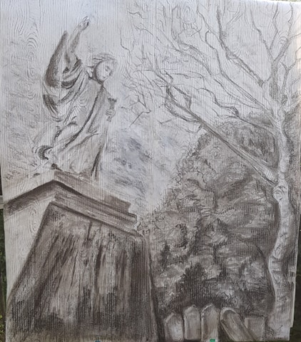
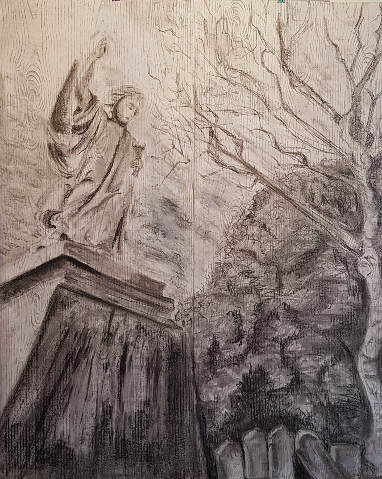
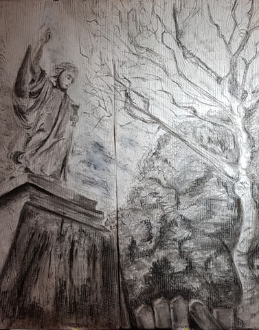
ASSIGNMENT FIVE – THE DRAWING ITSELF
GRAVITY, EARTH AND HEAVEN
I knew I wanted to use a different kind of ‘support’ than I had tried before, along with a different scale (large) of work. I wanted to demonstrate interest and power. Hence, I had to do some tests with drawing larger scale. I also tested some surfaces and papers.
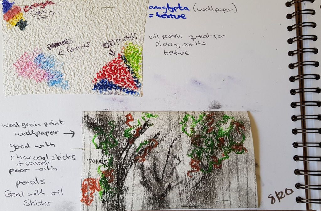
Below was a pastel drawing on anaglypta wallpaper. Experimenting with texture.

Below, test marks on tree patterned wallpaper
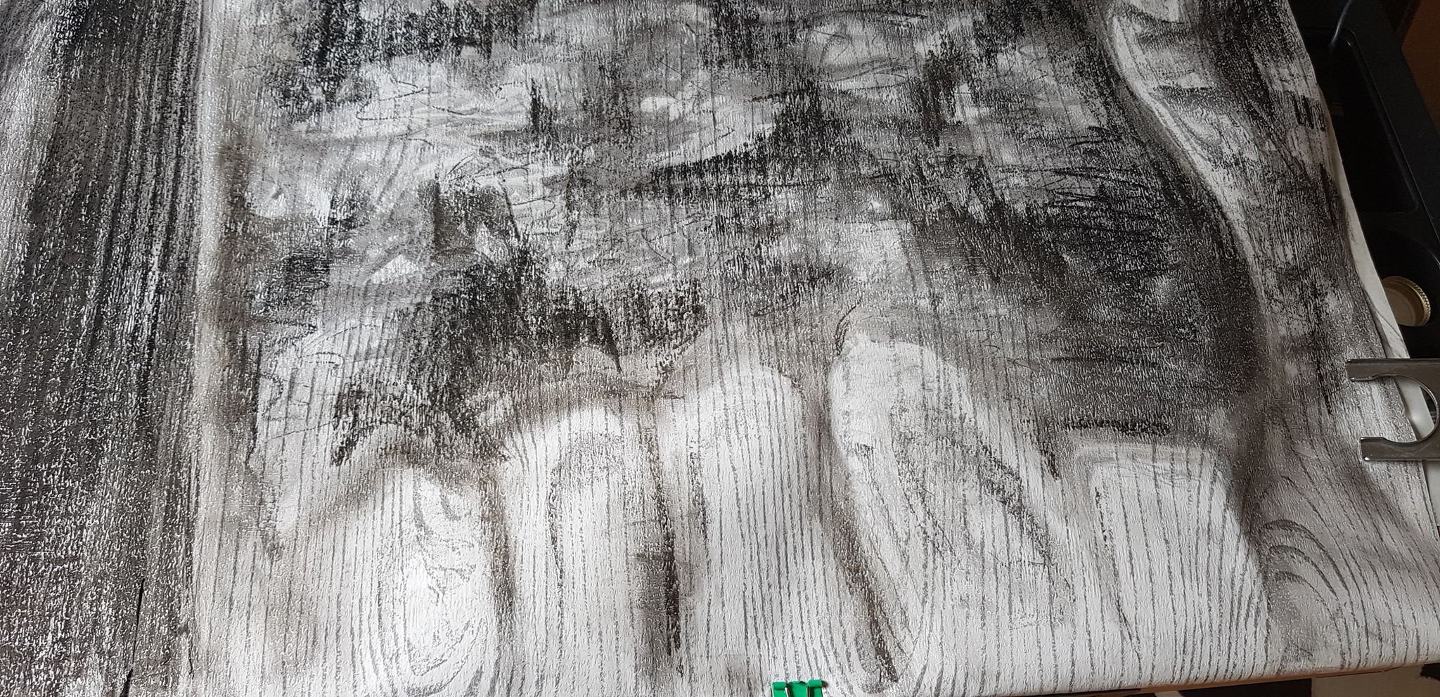
Below – tree drawing on wood grain pattern wallpaper. Testing how the wallpaper would perform. 86cm (h) x 56cm ![]()
Below – experiment with scale. Large charcoal drawing on brown paper
100cm (h) x 70cm ![]()
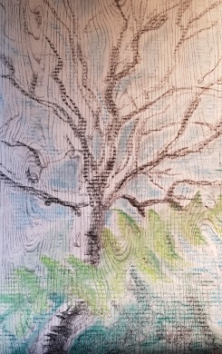
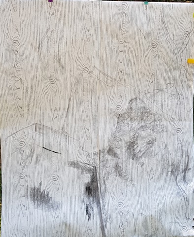
Below – testing material shapes, lines, blending and smudging on wood grain pattern wallpaper. Charcoal.
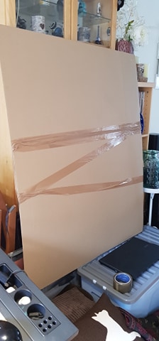
I had to create a base to actually draw such a large piece on to. I used some large cardboard sheets, ordered from the internet and joined them together with heavy-duty parcel tape. This, I found, was reasonably sturdy. The size of the image was to be 126cm (h) x 106cm (w).
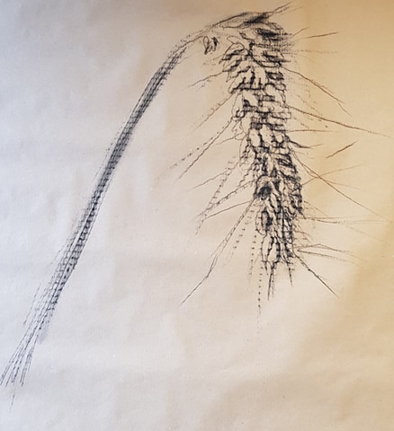
I had noticed, during my previous tests, that the corrugated card pattern had come through into the image I had drawn. It was quite a pleasing effect on the ear of wheat image (mentioned above), but I didn’t want this to come through onto my project piece, as I had already planned to use wood grain patterned paper and further marks would confuse the eye further. Hence, I put lining paper as a first layer on top of the cardboard
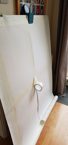
I then cut two strips of the wall paper, to fit on to the card. I measured the whole piece so it would actually fit on to four panels just larger than 420 mm x 594 mm per panel.. I did this, as I knew that if the piece ever needed posting it would need to be cut into four and mounted on to 4 x A1 boards.
I spaced two pieces of 420 mm x 594 mm paper on the back of the sheet of wall paper and repeated this on the second sheet of wall paper. I did this as another lining layer and to space out the panel sizes equally (so they would be in equal quadrants if I ever needed to cut the piece up).
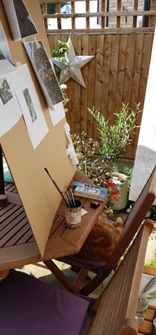
I had to work at eye level, to stop my image becoming distorted at the top or bottom. So I placed my work surface on a big box to raise it. I worked outside in the garden, as the size of the piece meant I created a lot of dust and mess as I went through much more drawing material. The outdoor light of a bright day was also better to draw by.
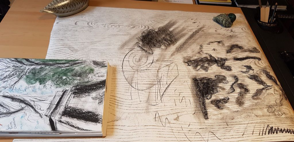
Below is a ‘mood board’ I put together with all the images I wanted to pull together into the final piece. I had them stuck on with masking tape, so I could pull them off as I needed them and then stick them back for safe-keeping.
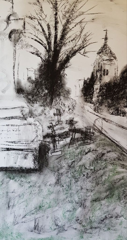
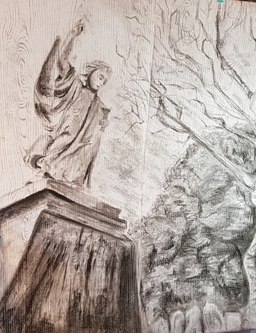
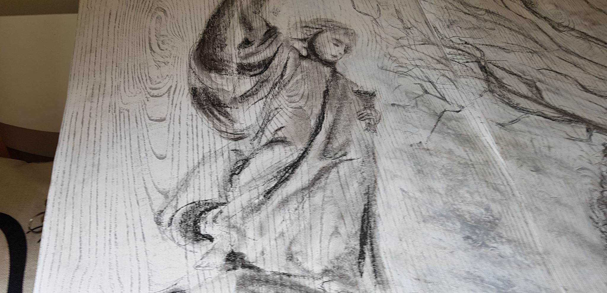
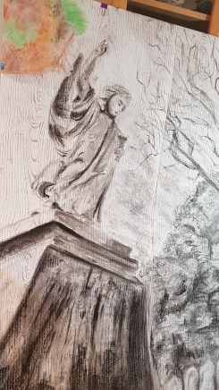
Once the paper was mounted on the card, I mapped out a basic outline of the objects and spacing on the piece with very light charcoal – using the point. It was important to get the perspectives of the whole piece correct before toning it. Perspective was a very important element to the story the image was supposed to convey – adding drama. I started work in the bottom left quadrant, on the stone plinth of the statue. This base was to be the main focus of the drawing. It was weighty, imposing and one of the darkest areas of the drawing. I applied charcoal with the side of the stick, using heavy sweeps for the darkest areas. I drew lines down the plinth with smaller pieces of charcoal and then lines with the end of the charcoal. I pulled a wet brush downwards – to try and reproduce years of rain running down the stone.
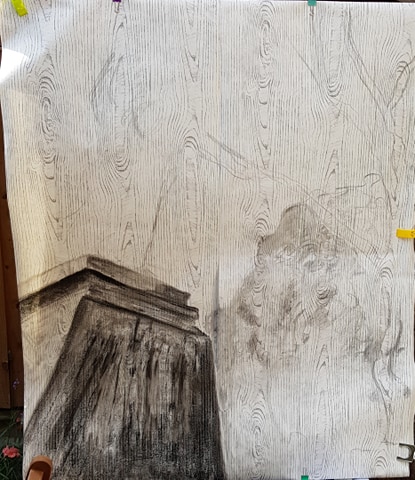
I did run in to problems. I had tested the original charcoal on the wall paper and had found it gave a range of tone quite well – from light to very dark. However, I then bought some new charcoal for the project and didn’t think I needed to test this. However, the new charcoal performed very differently from the old charcoal – which surprised me. The new charcoal had less range of tone and didn’t go to the darkest black – only a mid/dark grey. I learnt from this – that even the same material-type can perform differently. I suppose it depends on the raw material and processes it goes through (brand). I had to revert to the little bits of old charcoal I had left and also use black pastel stick in the darkest areas.
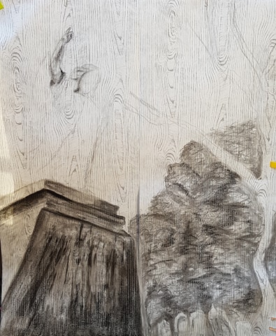
I then worked on the shape and perspective of the angel. I wanted imagined lines to converge onto her hand and index finger pointing sky-ward – to again add drama to the story and give focus to the direction of the piece.
I worked on the face detail as carefully as I could, using graphite pencils to create delicate features of her hair, nose and mouth. I used charcoal as carefully as I could to give shape and depth to her face and hair. As she isn’t a real person, but a statue, I did try and keep her features more blocked and angular.
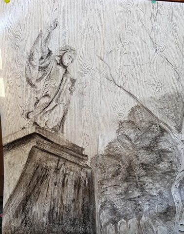
I had blocked in tones of the bushy trees shapes. I tried to get a range of tone as the trees had very dark areas and also areas were the sun was hitting, plus tones in between. I tried to create texture using the point of the charcoal to draw jagged lines representing branches and clumps of leaves.
I left grave stone spaces at the bottom of the bushy trees.
I drew the outline of the white birch tree trunk on the right, using sparse, directional shading to hint at shape and shadow.
I added a sweep of sky in the middle of the drawing. For this I used charcoal but I also used white oil pastel and white crayon to add some texture and hint at the shape of the clouds. After applying the white oil pastel, I gently cut in to it with a stick to create swirls and break up the cloud forms – I thought this might make them look more realistic.
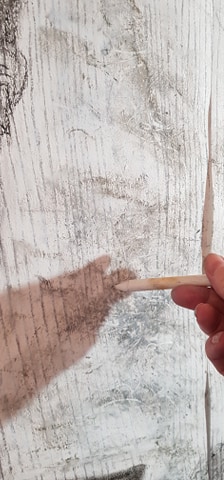
I did run in to a problem with the oil pastel, as the area where I combined using it and charcoal, cutting lines in to it, became overworked – I was worried the paper may tear. But as it was wallpaper underneath it was, luckily, quite robust.
I then left the drawing for a couple of days. This gave me time to contemplate what was needed to move onwards. I kept coming back to it over and over to imagine, criticise and consider.
My pondering resulted in my need to add some extra clouds behind the angel, to the left of the piece. The clouds had just stopped in the centre and the balance and flow of the image looked wrong. I didn’t use oil pastels in this area, as I wanted the clouds to fall more in to the background, as the angel needed to be the centre of attention in this quadrant.
I also saw that I couldn’t just hint at the gravestones in the bottom right. They needed to have a more defined shape and shading to give them purpose and form. So I used a close up of the photo I had to work on this.
I added hints of the branches of the birch tree reaching skywards. I copied the general flow of the tree, but didn’t go in to detail – to keep the angel as the central focus.
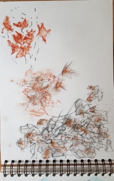
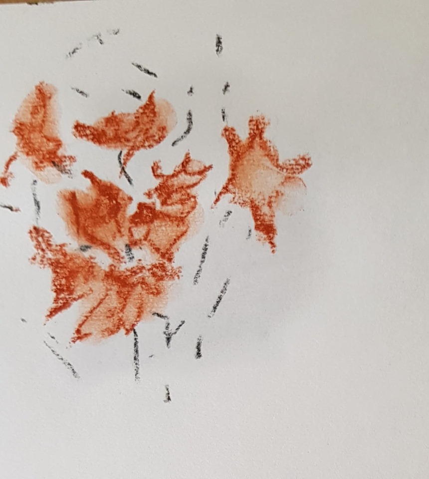
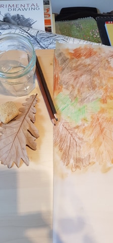
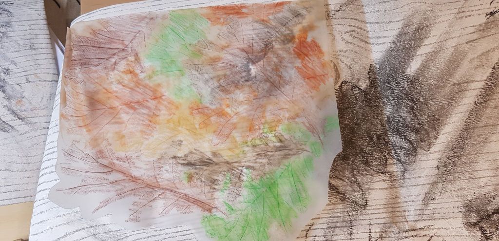
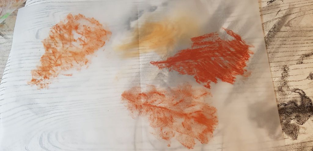
I did consider adding a splash of colour to the top corner of the the picture. The original photos had a canopy of leaves behind the angel’s head. I do like to add a colour accent to images. I tested some leaf images with smudged brown/orange pastel. I then did some experiments with leaf rubbings on tracing paper – to see if I liked how these looked. I was going to stick the tracing paper over the top of the left top corner as a translucent hint of leaves in the wind – but I decided against it. I thought it added a distraction and complication that I didn’t really want.
I tried to photograph the final image and ran in to problems with this. As the image was so big, it was hard to find even light. Also, whatever light I took the photo in, e.g. outdoors, indoors, sunny day, dull day, artificial light, natural light, changed the look of the image quite drastically. In some lights the image had a sepia look, in some lights the central paper join was in shadow, some lights picked out the blue pigments in the white oil sticks. I settled on the photo I liked the best for the final image.
In total, to draw the piece took 7 hours.
BELOW – THE FINISHED PIECE – GRAVITY, EARTH AND HEAVEN

Charcoal, soft pastel, 4b pencil, oil pastel on woodgrain-patterned wallpaper, 126cm (h) x 106cm ![]()
14 August 2020
