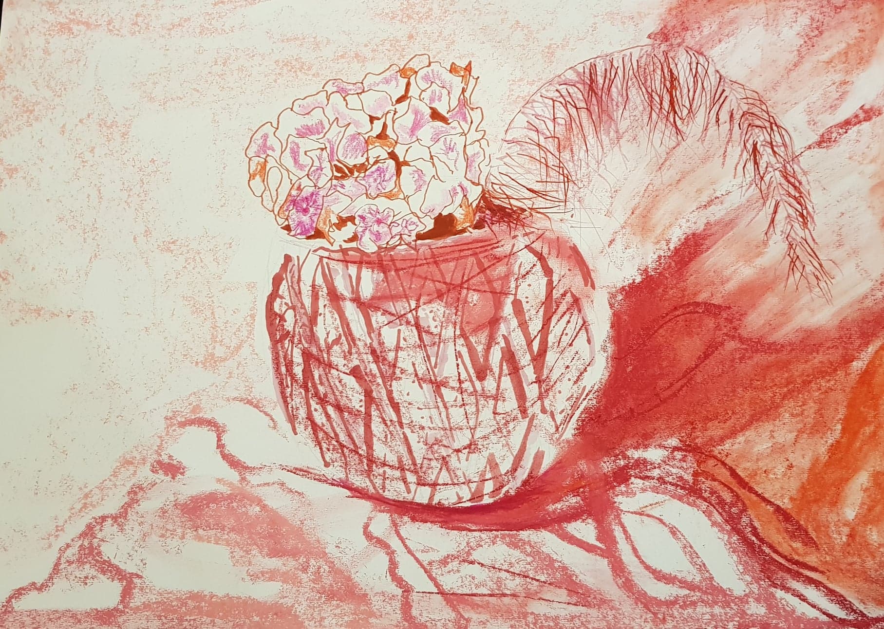
I enjoyed this exercise partly because I decided to work quickly and not labour the image. I left empty space (negative space) within the image and I think this helped improve the overall effect. I may have stopped too early – but I think this may be a way forward for me. Less is more. I liked the monochrome effect of the sickly pink! I used thick felt pen marks for the man-made surface and to show its shape and shine. I used pastels to create softer background. The empty spaces in the petals of the flower hint at the light source.