Perhaps God is the sky!?
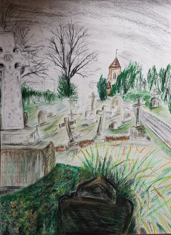
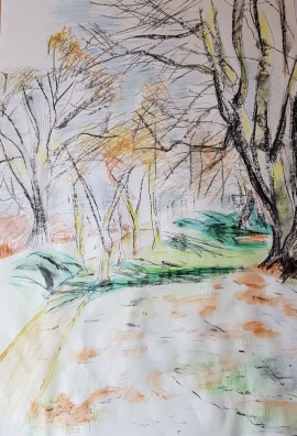
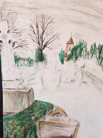
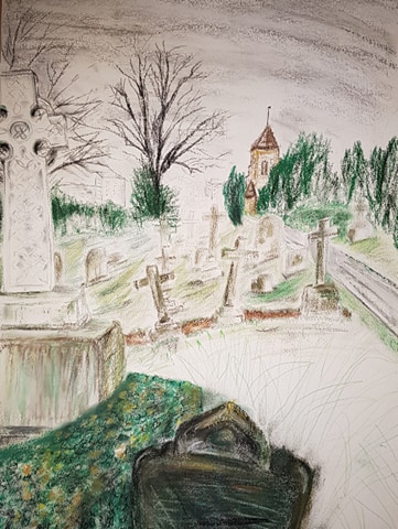
Above – Final Drawing – Assignment 3 – Expanse
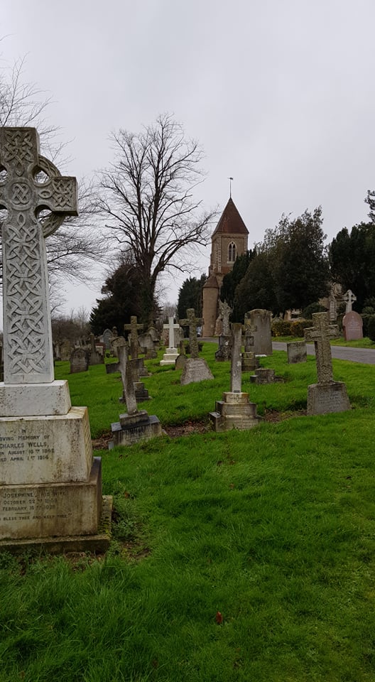
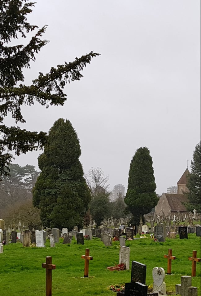
I decided on Bedford Park Cemetery for my final drawing, after some consideration. The view I chose seemed to contain elements that needed to be demonstrated: perspective, distance, manmade structures, natural objects, emotion.
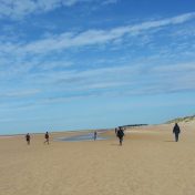
I had a few views in mind for this project, but this one seemed to offer itself. Below are two other images I considered.
I visit Bedford quite a bit to visit my poorly dad in a care home, so the journey (I live near Stansted Airport) and destination is charged with contemplation and sometimes difficult emotions.
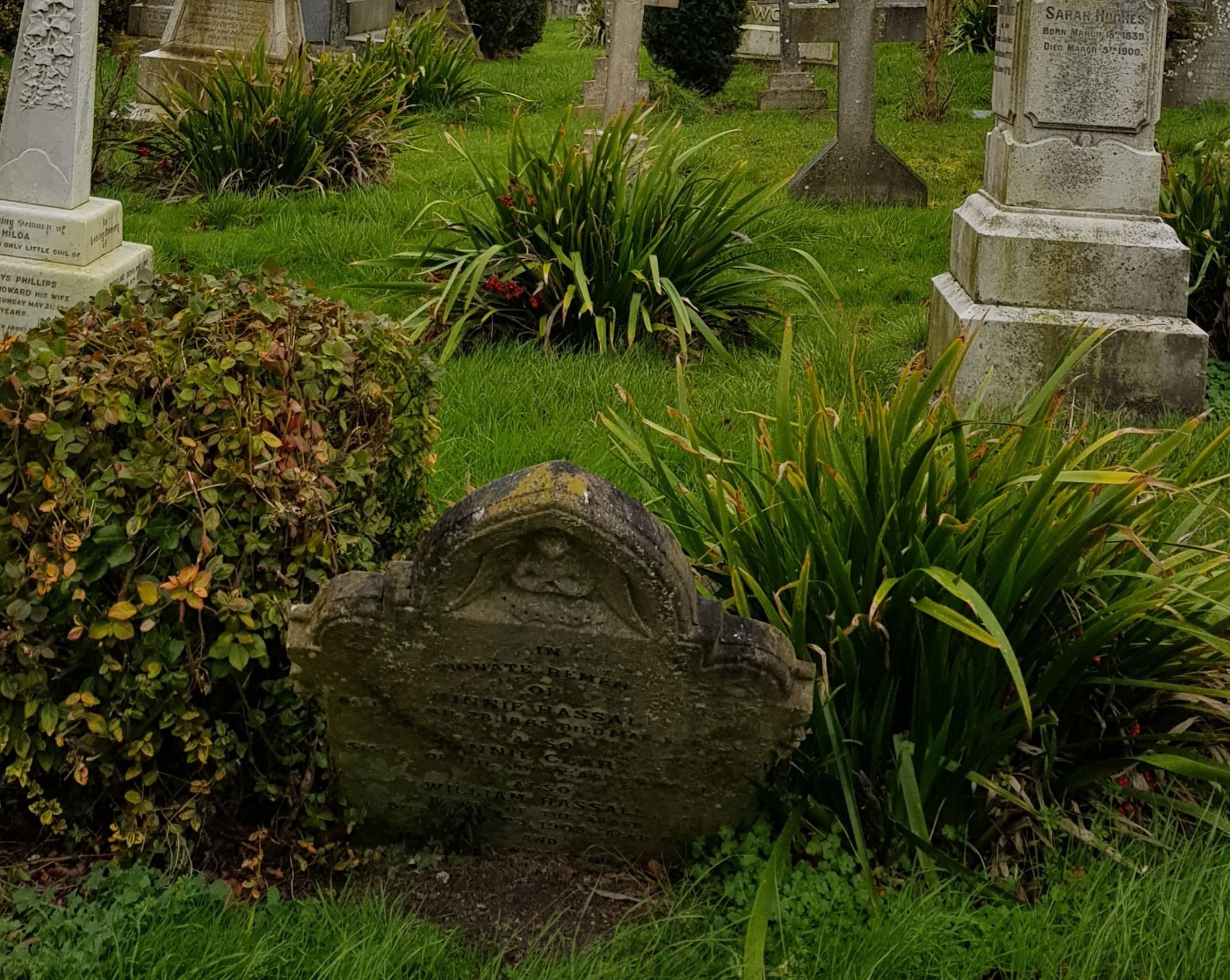
I didn’t choose the cemetery to be a morbid subject. It is a beautiful, quiet, interesting place with winding paths, trees, animals, birds, interesting stones, statues and buildings. It is on a hill and has an expansive view over Bedford and beyond. You can see life going on in the distant, surrounding buildings and flats. A vast sky umbrellas the whole scene.
Preliminary Research
Researching cemetery drawings on the web, I did find many, many pictures relating to horror, ghosts, fear, demons etc. This is not what I wanted to represent. I found other drawings that showed this subject as contemplative, interesting and beautiful.
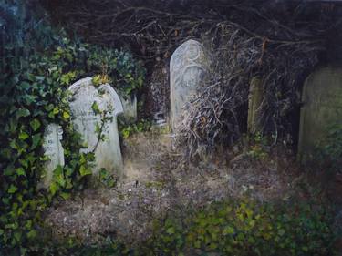
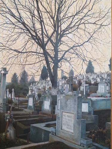

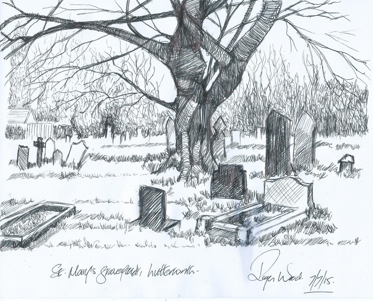
Images above, from left to right: CEMETERY OF LONDON, JORGE ISLA; CEMETERY PAINTING, STANCIU ANDREI; CHURCHYARD IN YORKSHIRE, DAMIAN OSBORNE; ST MARYS GRAVEYARD, ROGER WOOD (?)
For more inspiration I looked at the fabulous works of Hockney – his colourful patchworks of land, expansive views and winding roads. I also found an amazing artist, Oscar Oiwa, who has produced amazing 360-degree drawings in a blow-up dome, using Sharpie pens – so the viewer gets whole surround-view experience!

I looked at some work I’d done previously and hoped to pull some of the things I thought were successful. The lose drawings of hedges. The bending, repeated lines to show the form of the ground.
The soft, wet brush marks in pastel and watercolour pencil marks. These demonstrating the flow and shape of the land. The soft edges the water marks add seem more natural, subtle and fluid.
Preliminary Exercises
On more than one occasion, I took some digital photos around the park and the cemetery to get a feel for the place and to consider what would make a good subject to draw. The camera itself is a good viewfinder because it limits you field of vision and gives focus (though it would be lovely to create a 360 scene like Oscar Owia).
However, on the day I came to make preliminary sketches the weather turned very nasty indeed – I got completely soaked to the skin and so did my sketchbook. Hence the sketchbook I will hand in for this piece looks very bedraggled!!
For this reason I had to work on sketches and the main piece at home – using my digital photos and my memory. The sky the day my piece was based on was very grey – a thick blanket of cloud overhead. The landscape was soaked and damp. A cold, wet February at the end of a storm.
I wanted my drawing to show the slope of the earth beneath and the curve of the sky and the weather above. As it was late winter, everything was green and soggy, moldy and damp.
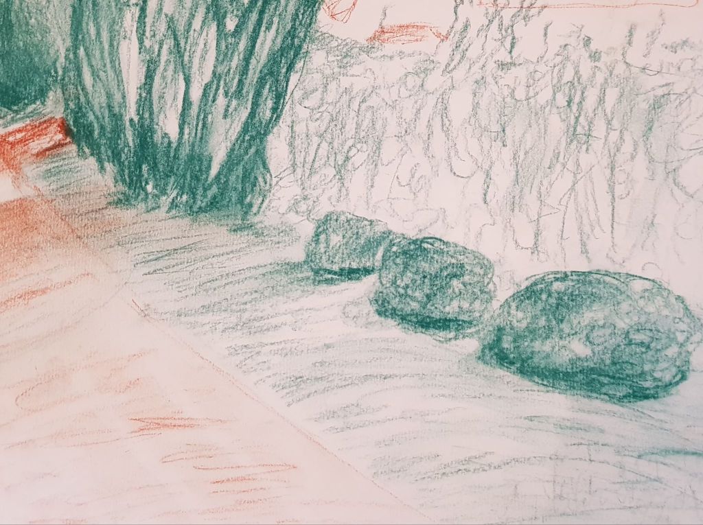
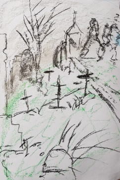
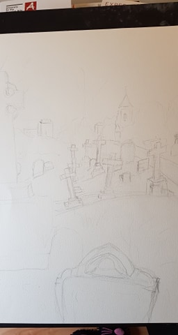
My first sketch was to think through composition of the piece. I decided to move some objects I had seen elsewhere in the cemetery, into the foreground of the scene I was looking at, to create focus and a front layer to the drawing.
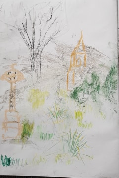
My second sketch was to have a look at the forms I was going to add – the church, trees, grass, monuments. Did I like them?
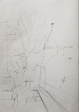
The third sketch was to again look at composition, with perspective, depth and placement of objects in mind.
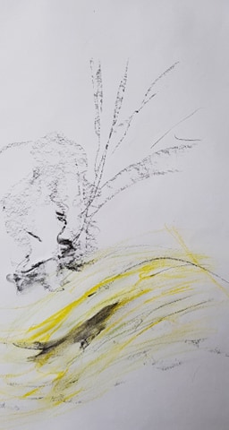
My fourth sketch was a brief warm-up of creating trees and slopes with marks and lines.
Drawing the Piece
I started by lightly plotting the outline of the shape of the land and the objects in 4B pencil. I had done this in black pen for other, previous drawings but I didn’t want to commit at this stage.
I started at the top of the drawing and used various grey to white pastel sticks on their sides to give the curve of the clouds and weather. Pressing light and soft to give the sky its variation in depth and intensity of colour (greyness). The blocks of shades of grey show the heavy cloud cover. The shape of the blocks also tries to hint at the direction of the wind. I worked quickly to impart energy.
I then drew in the background trees. The dense green pastel jagged points for the evergreens. I added jagged lines of black charcoal within these structures to hint at depth and shadowy recesses in the leaves and branches. With black charcoal I added the bare, tall, leafless trees. I wanted to make them appear stark against the sky so only used black for them. As they were in the middle distance, detail was not important. Plus, the lack of detail helps develop perspective.
I added the colour in to the church with pastel pencils and drawing pen for the shapes in the window and the spire. I used pastel pencils so I could give a delicate outline to the shape of the church. It was important to hint at the lines of the church to make it believable and give perspective to the whole piece.
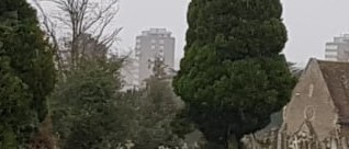
In the very far distance, I hinted at the shape of the blocks of flats. I did this using a fine drawing pen. I made the lines undefined – just to hint at shape. I added no colour to their form. to help created atmospheric perspective. I had moved these flats into the view for my picture. They were in the background of the actual scene – but not at the angle I drew the piece at. I wanted them in my drawing to show distance and add to perspective. I also wanted them there to show that the cemetery is surrounded by life going about its business as usual – to put life and death in perspective to each other as concepts.
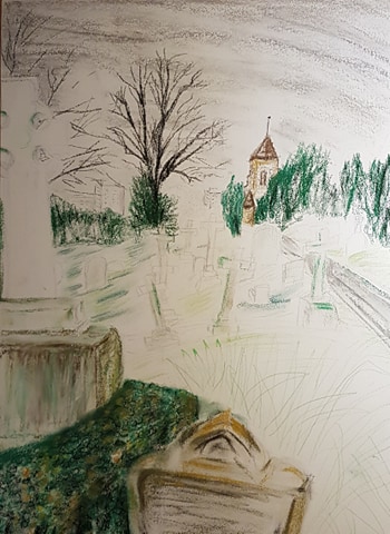
I then moved forward to the front of the mid section. I drew marks in watercolour pencils and pastel to hint at the shaped of the slope and colours in the grass
The path was also important the piece’s perspective. I tried to hint that it was disappearing into a vanishing point, somewhere unseen.
I worked on the mid ground and crosses to show slope and the form of the land with pencil and pastel marks. I pulled a wet brush through some of the green contour marks to soften them and give them movement and energy.
The time-consuming section of the piece was the white cross in the foreground. I wanted to hint at the Celtic artwork without spending many hours laboriously drawing every part of it. I coloured the cross white using pastel then used a 4B pencil to hint at shapes of the carving, weathered marks and shading.. This took a good hour. I wanted the cross’ plinth to look weathered, rain battered and moldy. I made it white with pastel then finally dragged through brown and green pastel. I used a dry brush to pull the green and brown downwards, then wetted the brush and dropped some drips of water down the shape.
The foreground was a box hedge, a very weathered small headstone and a large ornamental grass mound. I imported these elements from another photo of a different area, as the original landscape had nothing at the front of the picture. I did this to create better balance and composition. I made the colours of these elements stronger and more detailed to again give better perspective – differentialting the front middle and back of this drawing.
The drawing is composed of at least 6 layers.
REFLECTION

WHAT WORKS (and why)
I like the idea of the piece. To show life, death, the human worLd, the natural world and the sky beyond, all in proximity to each other.
The sky – with it banks of grey moving in a direction. Its very simple and Its not overworked. It hints at the weather progressing across.
The persective – The eye is drawn to the vanishing point behind the church. The path (decreasing in width) and placement of the objects, e.g. the cross and black tree, all hint at this vanishing point.
The plinth of the white cross – The marks made by using a dry brush through the pastel and by using a wet brush to create real drips, make the plinth look weathered and moldy.
The contour of the earth and slope – the drawn lines give the land shape and movement. The way the crosses point (rather haphazardly) hint at their age and that the land is moving over time. The marks made with a wet brush through pastel soften the contours and show the land isn’t static.
The detail at the front – The Celtic pattern of the cross, the detail of the grass and box hedge develop the perspective of the piece.
The energy – The lines of the drawing show the slope moving up and the sky moving across – hopefully making the scene more dynamic and alive.
The layers – I like the idea of layering images. It makes them more interesting and tells a story.
WHAT DOESN’T WORK (and why)
The box hedge at the front is too lumpy and dense. Looks like a green bath sponge! I think it needs more detail or different strokes of pencil to give a better effect. I should have maybe used the technique demonstrated on my previous drawing of a hedge? The shape isn’t quite right either. This is partly caused by me adding this element into the scene – as it doesn’t truly belong there it is hard to judge what will make it look right.
The contour strokes of the land are not soft and subtle enough. I should have used the wet brush more effectively – maybe with more pastel lines rather than pencil lines. I think the image was affected by the grade of paper I used. The paper is quite rough and absorbent so the watery lines don’t move across the paper as I’d have liked. I didn’t practice on this actual paper grade beforehand.
The grade of paper I used was incorrect for the effects I was trying to achieve. A smoother paper (less tooth) would have let me drag colour across with a brush. The effect of dragging a pastel stick across the paper was rather too dotty. I need to have a look at different papers and what paper works best for what I want to achieve.
The white cross in the foreground is a bit wonky. As this was in the foreground, I should have checked its lines more carefully. All the crosses were wonky – but this was meant to be, as age and land shift had actually caused this. The white cross outline was just misjudged!
The other crosses needed a bit more work to give them depth.
I should have maybe tried this in a less traditional format (rather than white A1 paper). My tutor did suggest this to me, but I wasn’t quite brave enough. Maybe Ill give it another go on larger, less traditional paper. I do have an issue, as I have to work at home in quite limited space, but this may be the way forward.
I tried to make the piece fresher, looser and spontaneous, but I did get quite bogged down at the front of the drawing (hedge, stone) and I think this shows. The piece took a good 8 hours (without the prep). I need to keep working on loosening up my technique.
