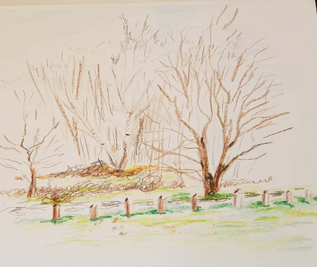
I am very lucky to live near Epping Forest. So, I travelled there to find some trees to sketch – though there are plenty of nice subjects everywhere! I downloaded a guide to UK tree shapes and popped it in to my sketch book as a reference tool (I may actually learn to recognize some tree species as a result!)
I use my car as a tool too – as I feet rather awkward and exposed walking around on my own. There are some strange goings on in the forest sometimes! Plus, the car is warm and dry on a cold winter’s day. I can also spread my drawing materials out on the car seat.
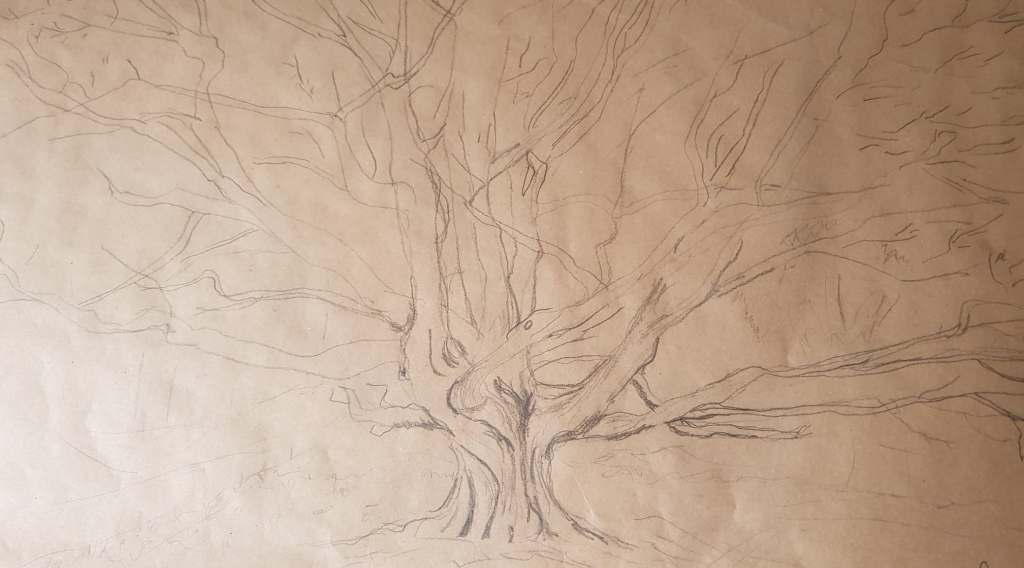
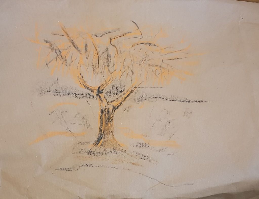
I used pencil to make some very basic sketches then settled down to draw a very large, impressive oak tree. I used brown paper and pencil for the drawing. The brown paper’s colour and texture suggest roughness and a more natural state than bleached white paper. The paper felt right – but the pencil line wasn’t heavy enough for it. The pencil line disappeared into the paper somewhat. In hindsight, I should have used a black drawing pen or charcoal, for a bolder line. I liked using line rather than tone, as the outline of the tree was amazingly impressive. The tree was leafless as it is winter. I think drawing pen would have been the best, as I like its crisp, hard line – good for reproducing the shape of the tree against the cold blue and grey day winter sky. It would have been lovely to do a massive version of this drawing – as brought to mind the tree photo/drawing of Tacita Dean. I would need a bigger workspace to develop this, as I only have my car/living room at the moment!

Above – Majesty 2006 Tacita Dean Photograph outside area overpainted with white gouache
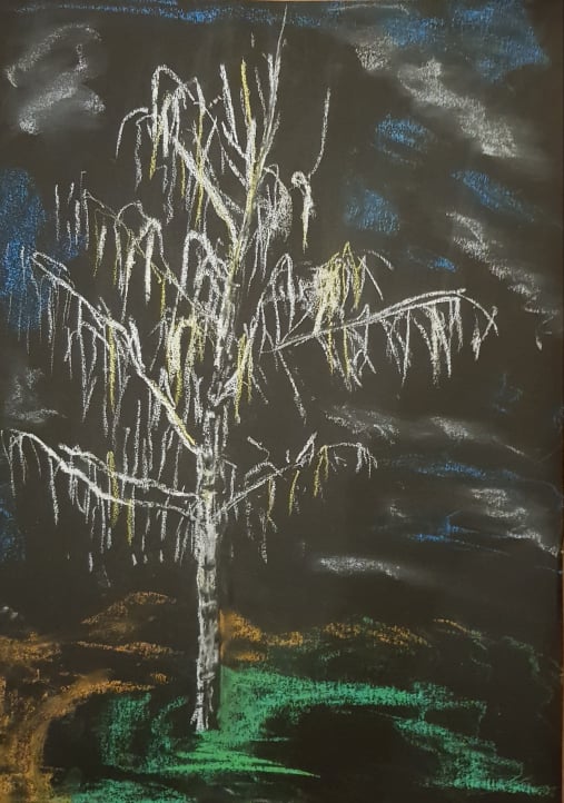
I thought I should experiment with further with outline, as I had found some lovely silver birch. I used black paper and white pastel to draw the outline of the tree, as they are a stark contrast to each other. I left spaces in the white pastel – to indicate the shadow, shape and texture of the trunk. I think this worked as the effect created was rather 3D. I did downward soft white and yellow wisps of pastel for the branches – as the birch’s leafless form weeps rather that points to the sky. The yellow hints at the different texture and colour of the branches to the trunk. I hinted at the blue of the sky and white clouds with side strokes on the pastel. I hinted at the shape of the grass and path underneath the tree with directional side strokes of pastel. I was quite pleased with the image as I think it looks rather dream-like – as the background is obviously not real. The silver of the birch and the droop of the branches is the more realistic part of the image.
I tried to keep the work quick and spontaneous.
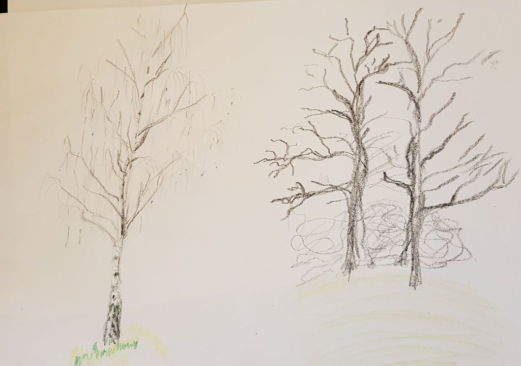
I sketched a few more individual trees on this trip in pencil, pastel and charcoal – trying to keep my technique loose, to try to create a fluid style. On one drawing on brown paper I experimented with highlights of orange to try to draw the viewer’s eye into the tree’s shape and excite the senses.
LARGER OBSERVATIONAL STUDY OF AN INDIVIDUAL TREE
This tree is in my back garden. It’s a weeping fig. The garden is in a dip with high surrounding bank on three sides and hints at circular shapes. I wanted to demonstrate this by drawing the tree in a circle with the sky and garden intersecting as circles.
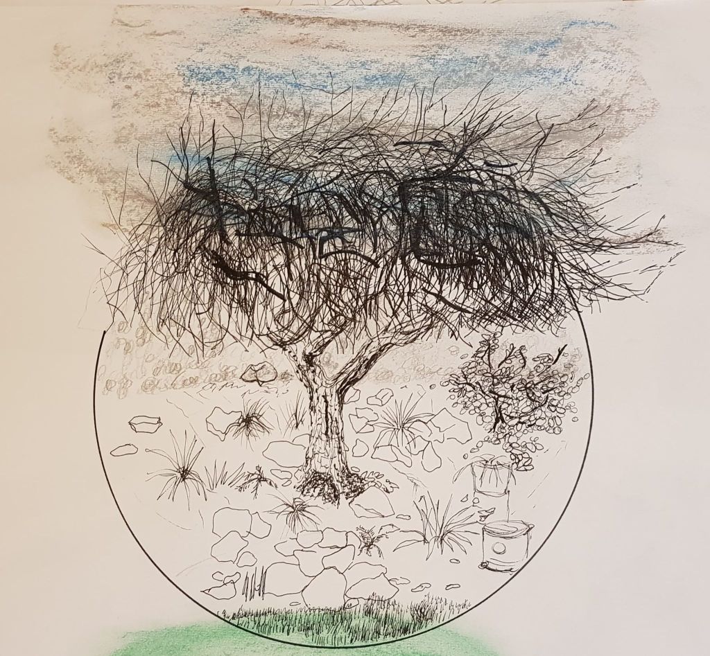
I drew all of this with a 0.8 black drawing pen except for the sky and garden intersections, where I used coloured pastel.
I quite like the idea of the overall image – though it is more abstract than realistic. However, it is quite childlike and lacks depth of character.
With marks, I tried to hint at the texture of the bark, the sharpness of the grass, leaves of the bush and the grass in the foreground.
The thicker branches in the crown of the tree did not work. I did one with a black thicker felt pen (as the tree had bigger branches in the crown) but this didn’t work as the lines were much too thick – I then tried to balance it out with other thick marks – but this hasn’t worked. I probably should have used shading with my original 0.8 pen to just hint at thicker shapes.
STUDY OF SEVERAL TREES
One study was completed on my trip to Epping Forest mentioned previously. I quite liked the individual tree on the black paper, so I tried to create a grouping of birch in the same style.
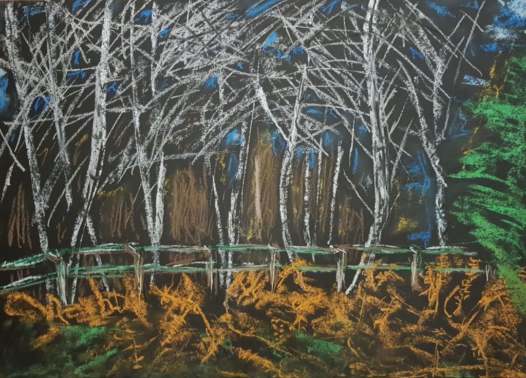
I think the foreground of ferns worked quite well. I did this very quickly with orange pastel, just hinting at leaves and shapes of stalks. Orange brings the foreground right out to the viewer. The green of foliage is right at the very front – creating another level for depth to play against. Again, I hinted at the shape of the bark by leaving bits of the trunk black. I used a point of a fine brush handle to scrape the lines of the shape of the tree out of the white. The undefined brown lines at the back hint at distance into the forest too far away to see detail. The horizontal fence divides foreground from mid ground and gives structure. I tried to work quickly and loosely to bring energy to the drawing.
What doesn’t work – The blue of the sky doesn’t really work. It was full daylight when the drawing was done and I wanted to show this though the branches of the trees (as the day time sky was visible). Maybe I should have put the sky in as flat plane of pastel in the top fifth before I drew the trees in?? Maybe the image is too basic and lazy?
Below is a very quick sketch – I quite like the immediacy of its marks