Back in January 2010 some friends (on Facebook) and I were finding our winter surroundings rather testing. For our great amusement, we started to take photos of what we saw around us, in our towns, every day. It started with sightings of plastic bags in trees and grew from there. We posted our snaps in a group. One of the (inspired) friends put a selection of these into a book. Below are the pictures I took (and a few others) that ended up in it. It really made us smile (and grimace) at the reality of our world. It was meant as a joke – but it is also an honest reflection.

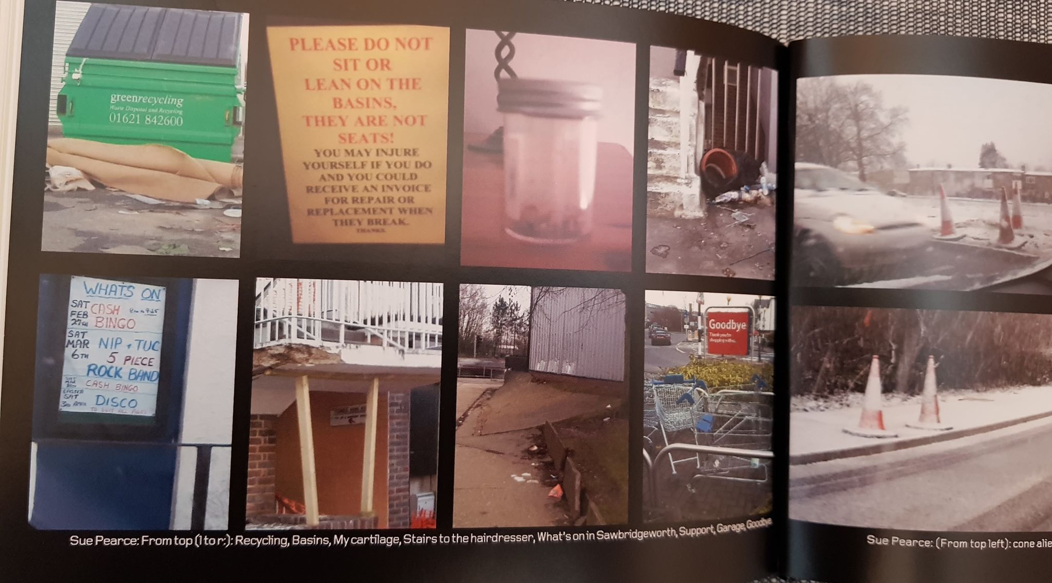
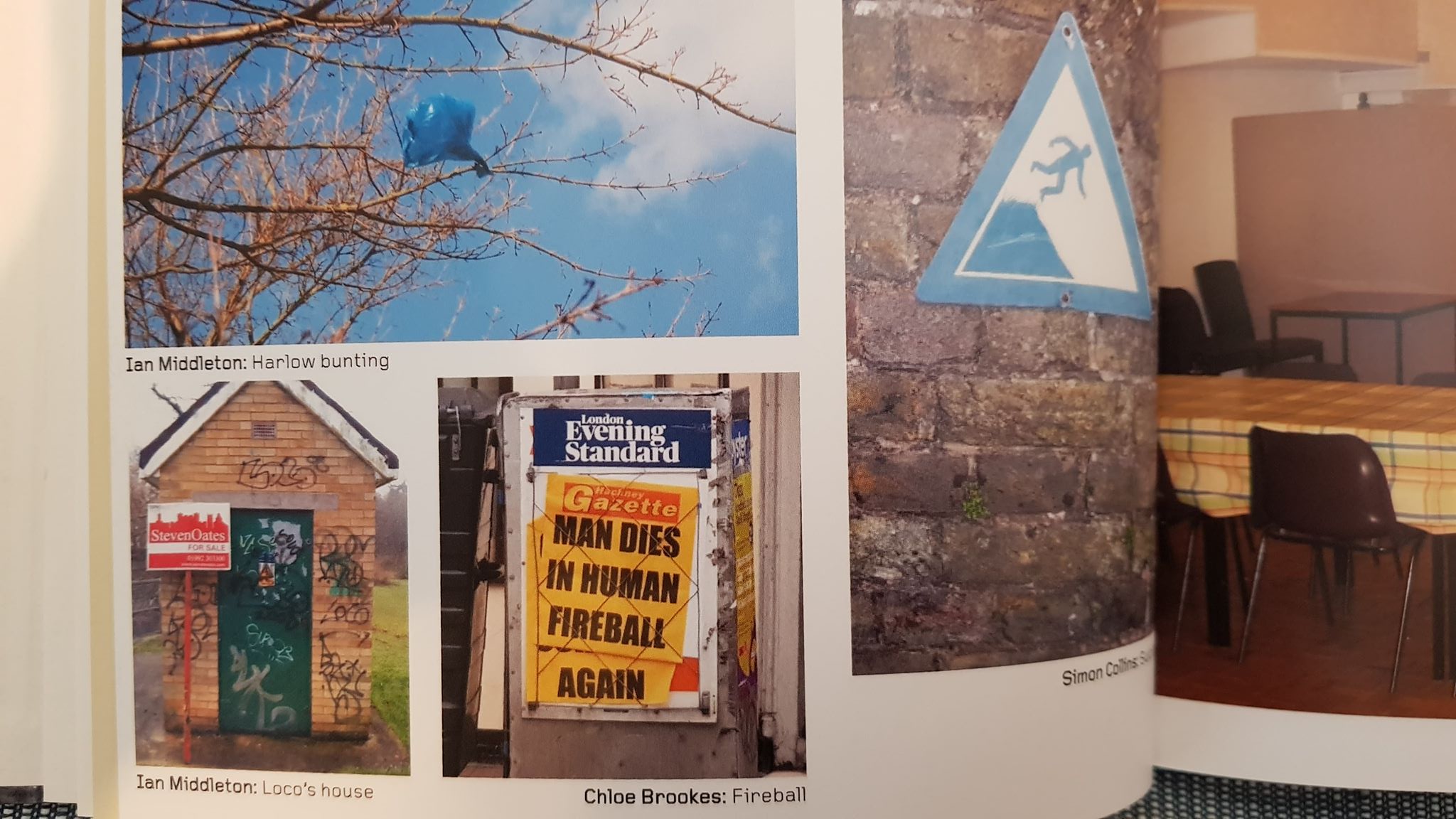
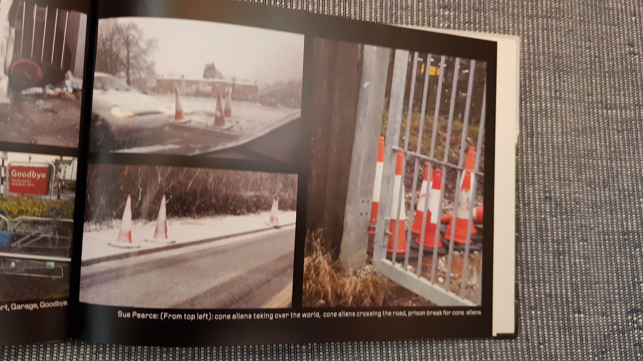
I think our little project highlighted what so many people living modern urban lives in the UK see everyday.
This fascination with the day-to-day, the ugly, the mundane and stark reality is also demonstrated by modern artists who also inhabit these environments. I can see it in George Shaw’s work.

George Shaw Scenes from the Passion The Black Prince 1999
Making these images into ‘art’ brings us face-to-face with ourselves as a modern society. The images are amusing, as many people’s traditional idea of good conventional art for a wall is often the subject that is beautiful and inspiring. The beautiful, however, is so not part of many people’s daily experience today – so why not have art that reflects this? It makes us think about the world and culture we have created for ourselves.
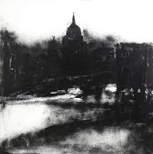
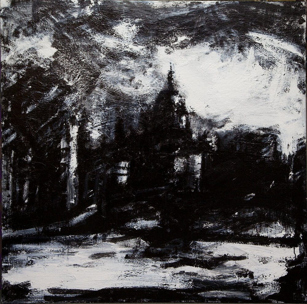
John Virtue’s London images are also gritty reflections of a real city. They look dirty, smokey, rainy, atmospehric and brooding. They are not a picture postcard view – but an image that a city resident would understand.

John Virtue only uses a monochrome pallet for his landscapes. He uses Shellac black ink and white paint. I particularly like the image above as the cloudline is like a heavy, swirling, oppresive blanket over and surrounding the buildings and makes you feel that dark rainy day he is watching.
I like the idea of using the characters of the materials used to create an atmosphere in a piece. I could recreate this with charcoal – maybe wet charcoal? The buildings aren’t drawn in obvious detail, but with the composition and use of light and dark the viewer knows what they are looking at (especially if the viewer is familiar with London and the Thames).
In contrast, below is an urban landscape by artist Antonio Lopez Garcia.

Antonio Lopez Garcia madrid desde torres blanca
This is an amazing image, but very different in atmosphere to that created by John Virtue’s brooding pallet. It is a lighter, hotter, airy city – with its warm horizon stretching far in to the distance and sun suggested by the brightness of sky. What you get from both images is the feeling the artist has towards the subject (and maybe more generally) – created from the choice of materials and the colour pallet.
