I wanted to use this opportunity for self-assessment, to write in a little more depth about artists I have looked at while I have been on the course. I want to explain what I like about them and why. Also, what I can bring into my drawing from my looking at their work. This is important, as other artists can inspire and shine a light on the creative process. They can also give answers to problems in my own work. I don’t think I have highlighted this enough elsewhere in my blog.
JENNY PURRET
I love her loose images, flowing marks and often simple natural subjects. I was interested in her use of rolls of paper to draw continuous line over time. I was inspired by her use of wallpaper in her drawing classes. She uses a huge variety of materials to create her work, including washes, ink, charcoal and pastels. She has also used found materials, e.g. elderberry pigments from berries. She actually works in the field.


I would like to try using wallpaper as a drawing paper – as it allows for a bigger image, experiments with scale and has texture of its own. Its also easily and cheaply available. There are many different textures and patterns – these may create interesting effects.

TACITA DEAN
I am interested in the vast scale of her work. Her use of tone, shade and value are awe-inspiring and overwhelming. Her subjects are very powerful, e.g. clouds and mountains. Her work is based on outdoor observation. She has used blackboard as her paper – a brilliant thing to apply tone to.

I would like to bring some of the power and vastness she demonstrates into my own work.
I would like to experiment with scale. However, I am limited, as I have to work at home (my home is very small)!
I can see how improving my tonal work could be used to produce amazing effects.

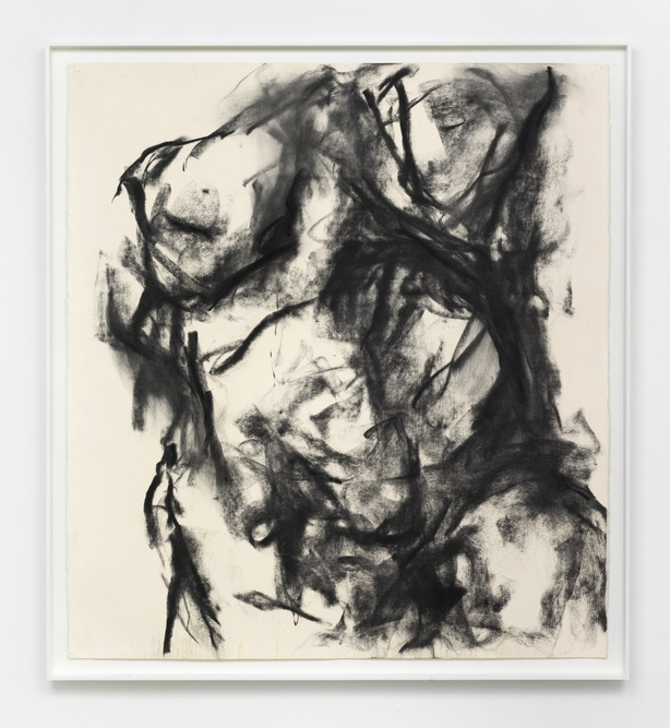
WILLIAM TUCKER
I thought I put William Tucker’s charcoal images in to this section, as a version of charcoal use that didn’t work so well for me.
I like the contrast between the back marks and the white paper – the images do grab your attention.
I found them heavy, rock-like and oppressive though. Lumps of amorphous darkness. They were rather masculine for my taste (is that sexist?). Maybe that is the story the artist was aiming for.
I prefer a more delicate, expressive, joyful creation – achieved by a different use of the material.
EMMA STIBBON
This artist, rather like Tacita Dean, achieves energetic, powerful vast images with only a few materials. Her volcano drawings are full of movement and excitement. Her compositions are so inspiring. Her subject matter is so interesting.

ANITA TAYLOR
Again, the scale and power of her pieces are inspiring. They are like monoliths, but contain much emotion and spirit.

Again the choice of materials is small but the effect is hugely interesting.
JENNY SAVILLE
I am fascinated by her use of unfinished line and repeating, overlapping images to create movement. Her images are alive.

KURT JACKSON
This artist, in his ‘Thorn’ series, approaches the same tree in so many different ways. He uses all sorts of mediums and materials. Each approach giving a different result. So many different ways of telling the same story. He uses print, paint, ink, oil, collage, etching, mixed media, sculpture. This holds his (and our) interest of the same subject over many versions.
I would like to try a variety of materials, to create interest and intrigue in the same subject. It is like an on-going experiment.
TIM KNOWLES
This artists work is very experimental and interesting. He is just the catalyst, the middleman, to natural objects creating their own art. The wind blows pens tied to a trees branches and the pens draw on paper.
Looking at interaction between man, man made objects, natural objects and natural phenomenon. What a creative and thought provoking process! This shows that there are few true boundaries to making images – just the limits of our imagination. I need to find ways to spark my imagination and thinking to break some of my own boundaries.
DARO MONTAG
As with Tim Knowles, this artist as a catalyst and middleman to natural objects creating their own art. Tim presents ant colonies with choices and hurdles and records their choices with their footprints in charcoal.
The image creation raises thoughts and questions. Again, his ideas break down barriers with creating images.
PHILIP PEARLSON
I learnt from looking at this artist’s images of groups of people. He crops his images and fills the paper beyond the margin were our view stops.

This focuses the viewer more intensely. I learnt a great deal about the use of cropping from this artist. His use of foreshortening makes viewing even more interesting and dynamic.
DURER
This artist was working 500 years ago but his images are fresh and interesting today. He used many techniques and many materials.

I have found looking at his gradients of light, shade and tone very helpful and instructive.

GEORGE SHAW
I like George Shaw’s work very much. I like the ordinary and everyday subjects that he produces.

There is beauty in the dismal and reflection of many people’s real lives. He shows me that the subjects you choose don’t have to be pretty, expected or traditional.
JOHN VIRTUE
I like this artist’s use of scale and tone to create mood. His London paintings are vast, weighty and brooding.

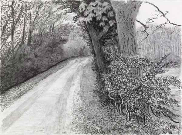
DAVID HOCKNEY
I get a lot from Hockney’s landscapes. I especially like that his views centre on roads through the countryside. The resonates with me as I get inspiration, when I am driving, from my surroundings. The feeling that you are in transition and passing through something, as opposed to static. His use of colour is amazing .