Its hard to get moving in a different direction … It’s like trying to stop an oil tanker on its path in an ocean … Doesn’t it take 20 minutes for a supertanker do an emergency stop? I’m sure I read that somewhere………
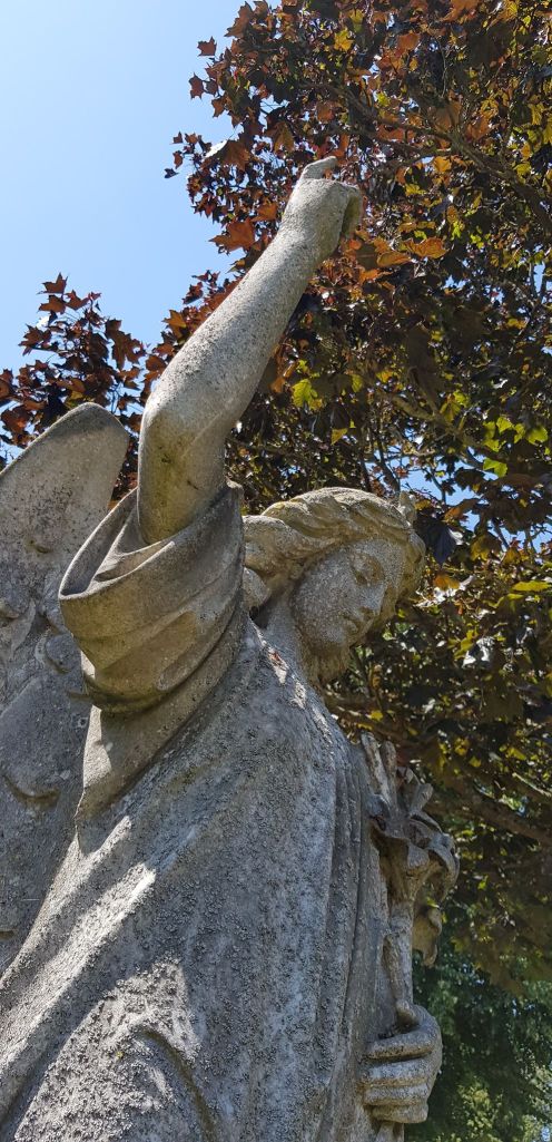
Symbolism of the angel pointing – words lifted from various internet sites:
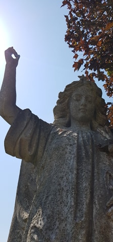
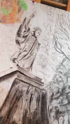
A cemetery angel that points towards Heaven with outstretched wings usually represents escorting the soul to Heaven. Angels are often seen as the messenger of God and commonly pointing Heavenward as seen in the image above.
A hand with the index finger pointing up symbolizes the hope of heaven,
The hand with a finger pointing upwards is a commonly found motif. The finger pointing upwards, indicates the soul traveling to Heaven, sometimes a presumptuous claim, though a hopeful one.
I had to plan how I would get the dynamic perspective I wanted for the piece (lying down, looking up). I had to arrange separate images I had photographed into an effective composition. I had to make the choice of materials to draw with and which material was needed for which part of the drawing (charcoal, pastel, oil pastels, 4b pencil). I had to work out how to actually draw such a large drawing – using the outdoors, boxes to stand the work on and a mood board to stick all my working images on to. I tested the materials in my sketchbook before committing to the picture.
Quality of Outcome
I presented the final piece and all supporting work in my learning log. I wrote about the processes, thoughts and development in the log.
Demonstration of Creativity
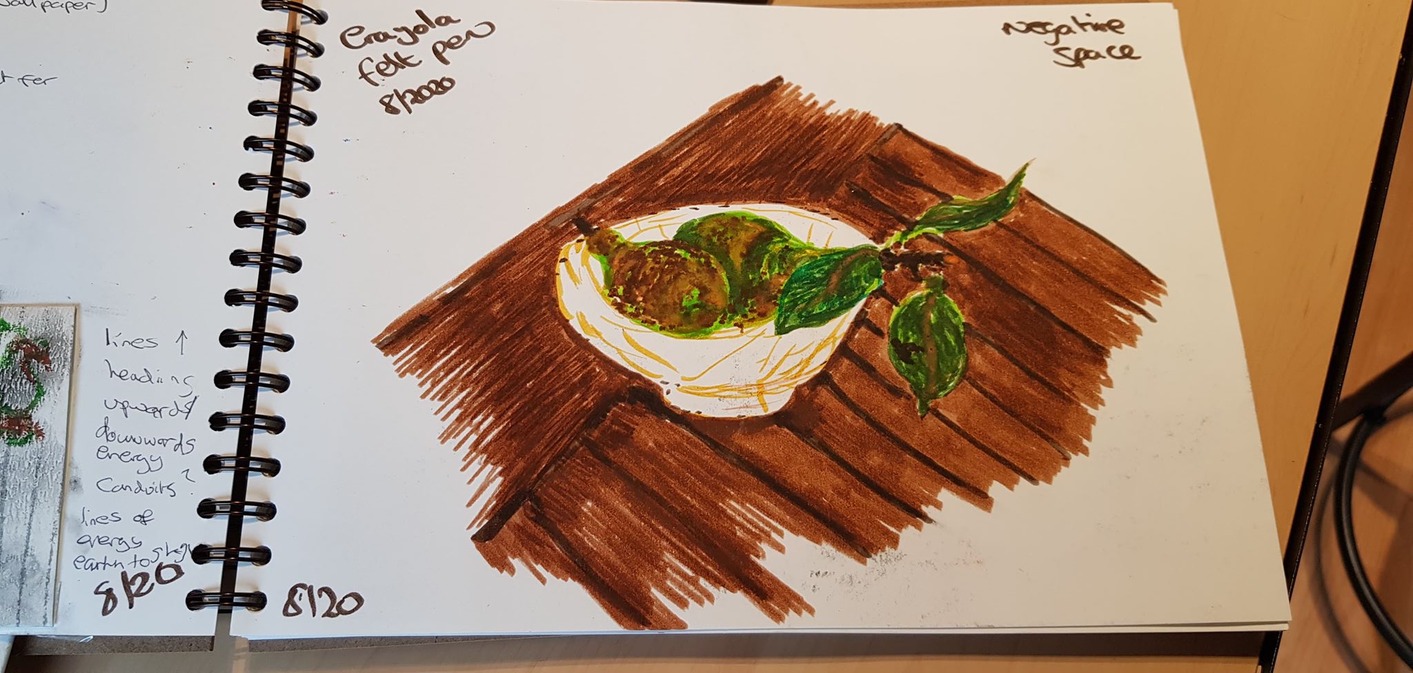
I have experimented with support and scale in this part of the course. I attempted, for the first time, a very large drawing. I tested this idea before drawing the final piece. I used a support I have never used before – the woodgrain printed wall paper.
I had to imagine the final composition – as the elements needed bringing together from four or more images studied and photographed.
I had to develop techniques myself to use these methods, e.g. mounting the paper on cardboard. I had to consider how I would break the piece down in to four if that was ever needed (for posting) and how I would mount these four pieces.
I have consolidated the positive things I have learnt over the whole course in the final drawing and know what skills and interests I would like to develop. I have also learnt those areas I may leave behind.
Context Reflection
I produced an artist’s statement
I have reflected on Part Five of the course below
I have re-visited previous work I have done – as documented in the learning log. I have tried to develop from what I have learnt (perspective, use of tone, use of line, image failures etc)
I have re-visited and inspirational artists’ work – as documented in the learning log. I have tried to incorporate things from their work in to developing my own (scale, support, fearlessness, materials, ways of working etc).
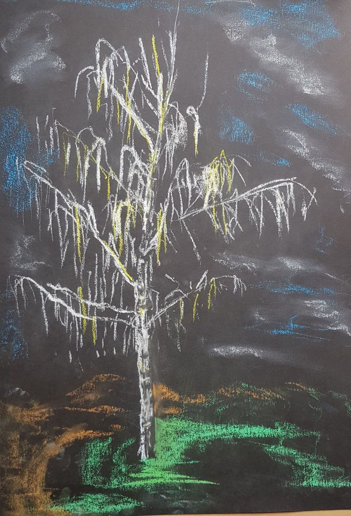
What worked – I liked the scale of the piece and the perspective it was drawn from. I think this created some power and sense of gravity. The way the subject matter was put together and what the image is hopefully creates an emotional response. I liked the composition. There were obvious grades of tone used. Tightening up the headstones was a good move. I quite like the trunk of the birch tree – white contrasts with the dark bushy trees behind. I liked the energy flow effect of the wallpaper pattern.
What didn’t work – The angel’s tone was lumpy and needed better observation. The birch tree branches could have been better observed. The range of tone could be improved – the dark areas of the plinth and the bushy trees could be even darker. It needs more affective marks for the bushy trees. It could do with a fuller range of marks and tone across the piece. The photographs taken of the final piece were a technical problem. Each image taken looked a different colour and gave a different effect. The new charcoal I purchased to do the piece did not perform like my old charcoal – I need to test all materials (even if they seem the same as those used previously) before relying on them.
Not sure – I nearly put a splash of colour (leaves) in the top left corner for more interest. But, felt this may have overloaded the image. I did experiment with this and decided against it. But – I’m still undecided – it could make or break it!
Not sure about the white oil pastel layer for the clouds. The pigment mixture with the charcoal is a bit strange. It looks blue in some lights. Maybe this is a good thing?
MOVING FORWARD
To move forward from this point, I do need to keep practicing my technical skills. I need to use my sketchbook as a visual diary, ideas scrap book and a place to further develop skills. I need to be brave and experimental and try different materials, papers, scales and ways of working. I need to be more free with my approach. I need to have fun!
I still need to keep finding my own voice. This will always be on going. I do know I like quite instant, exciting marks. I like emotional work. I like large scale. I like a splash of colour here and there as punctuation.
I don’t like over fussy or over thought-out ways of working.
I find instant inspiration from looking at the work of others – this does give me motivation.
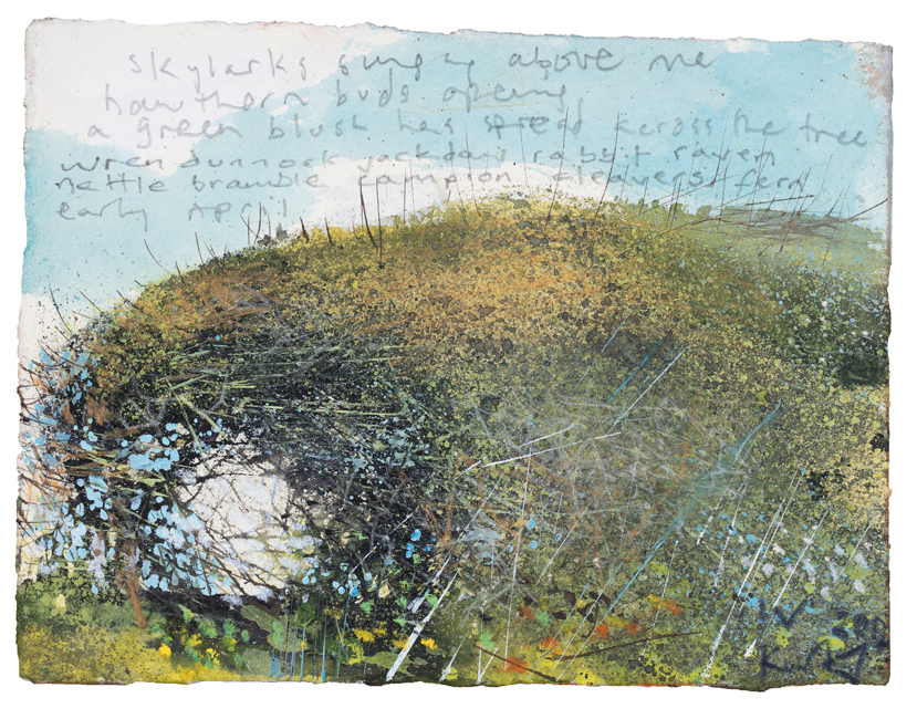
USING SCALE, TONE AND PAPER TO CREATE MOOD IN AN EXPANSIVE SCENE
I want to produce a dynamic and exciting work, through the medium of drawing, that pulls the viewer into a scene and makes an emotional connection.
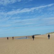
I have chosen to re-visit the ‘outdoors’ section of the course, as I feel that this subject has given the most opportunities to achieve this. The expanse of the outdoor environment has limitless subjects and raises so many questions about the human and natural condition. The outdoor environment also sparks my own creative thoughts and interest.
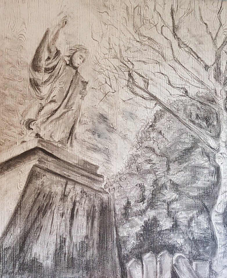
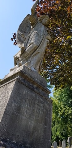
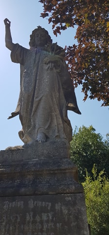
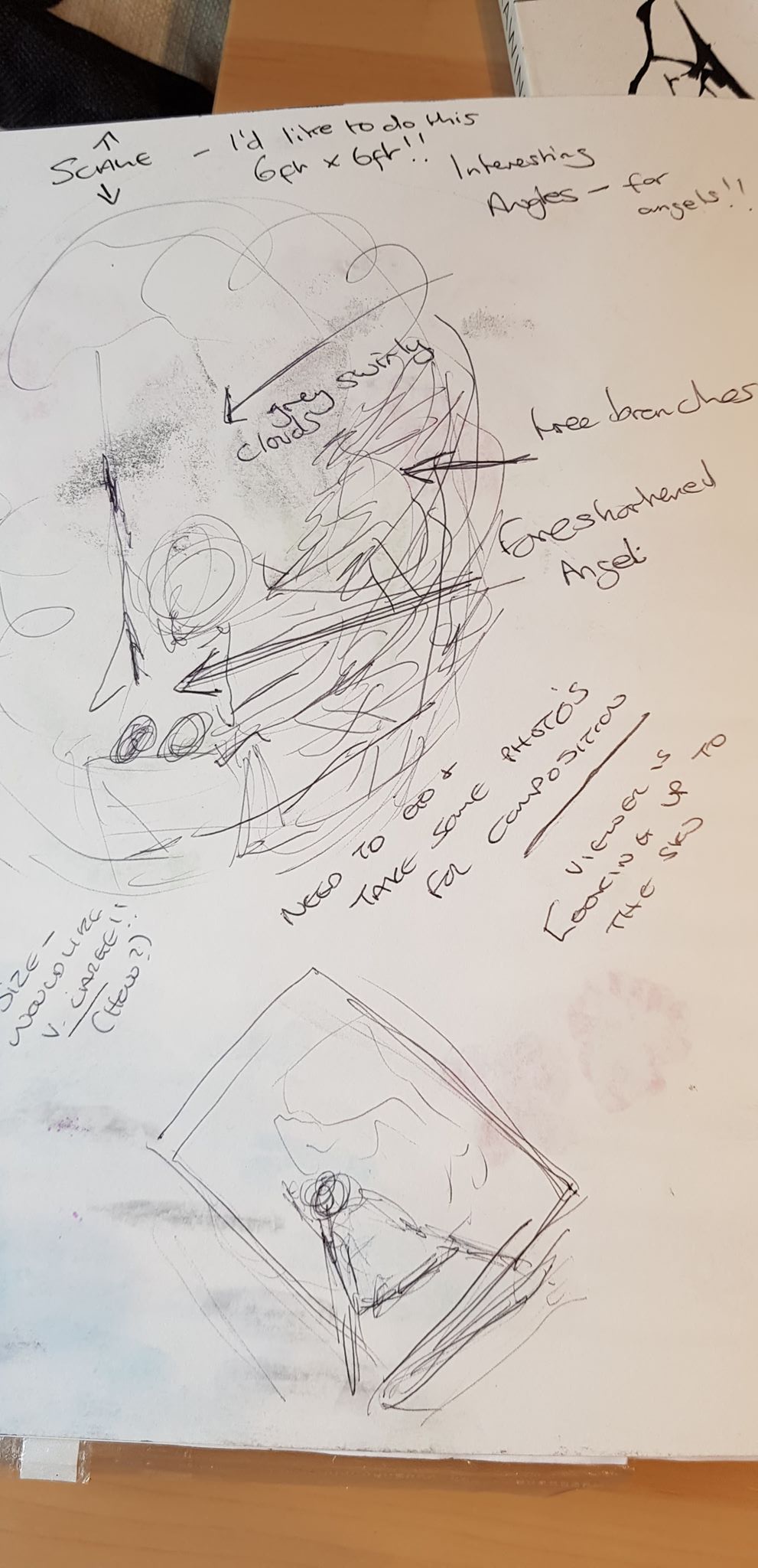
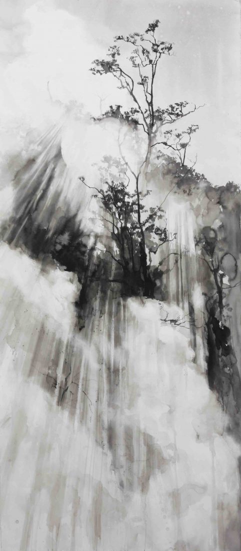
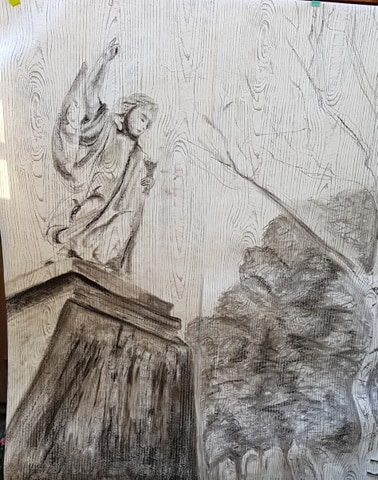
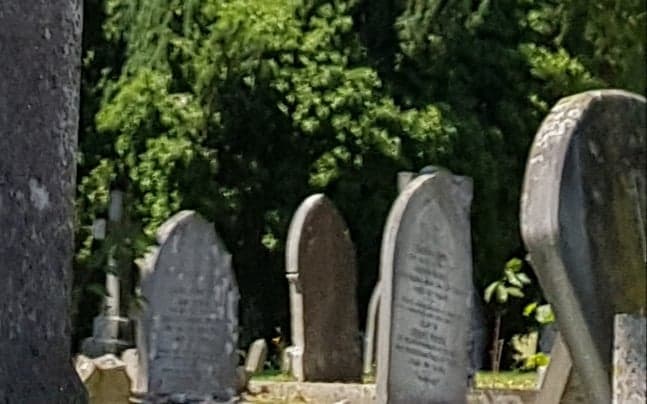
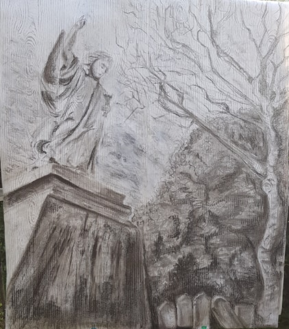
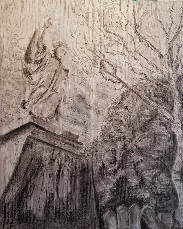
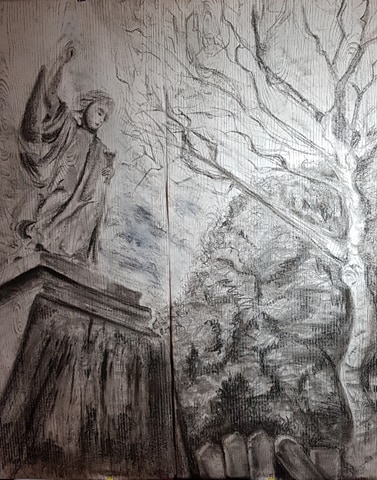
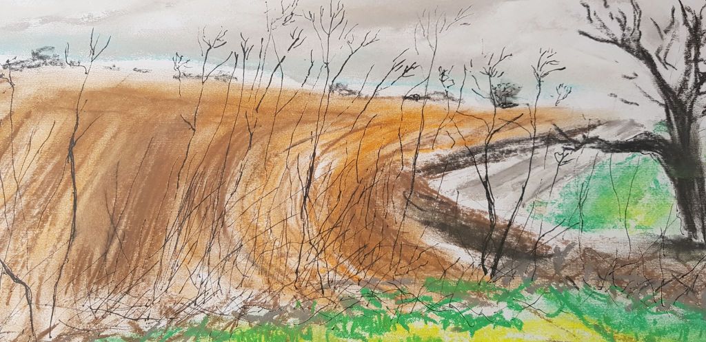
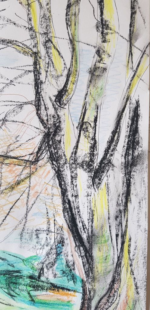
I am drawn to the churchyard theme as it tells a story full of drama. A vast sky hangs over and circles our planet. Beyond it – infinity. The huge, heavy, monumental plinth is dragged down by the gravity of revolving earth. The angel points heavenward. The statue was created by a living person, making us consider everyday human life, death, work, love, religion, material display and financial exchange. Trees and plants remind us of the living, natural earth-bound world. Trees reaching upwards draw their own life from light. So many questions.
My biggest development on the course has been my use of charcoal, pastel, tonal work and line. Charcoal/pastel can be smudged, blended, wetted, drawn on point. It can be moved a long way quickly to cover a large space. It can also be used delicately to create small detail. It can be almost white or the darkest black. It is a very versatile and expressive tool.
I had looked at the epic works of artists such as Tacita Dean and John Virtue and been inspired by their techniques and results. I will try and emulate their use of scale and tone to create drama, weight and emotion in my own piece. The use of a bigger scale is new to me and will be a test to see if this technique will help me reach my aim.
I will draw a 126cm (h) x 106cm piece with a limited pallet. These methods, I hope, will create impact. I hope impact will also be created from the perspective and angle the image is drawn from. I made initial studies of the image lying on the floor looking upwards. I have found this method effective in previous coursework.
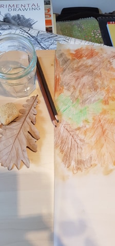
I want to experiment with the ‘support’ and have chosen a woodgrain wall paper. This gives scope with the size of the piece. The woodgrain also creates a flow in the image upwards and downwards, hinting at energy lay lines between earth and sky and the relationship between. This also creates interest.
Does this test of support, scale and tone achieve its aim? I think the size of the piece does give drama and interest, as does the perspective and patterned paper. Yes, I would use these techniques again. My technical skills still need to grow with tonal work. A more sensitive use of the drawing mediums could only improve the desired effect. I hope this will develop going forwards. I would also look at cropping and composition to improve the work.
I may have been over ambitious with this piece, but risks have been taken and experiments made.
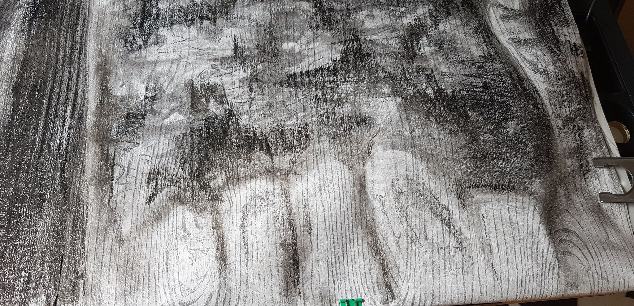
Charcoal, soft pastel, 4B pencil, oil pastel on wallpaper 126cm (h) x 106cm
I had decided to develop the work I had done in the ‘outdoors’ (Part three – Expanse) section of the course. I chose this, as considering subjects under the sky and in the open air sparks my creative thoughts and interest.
I found looking for ideas within the home and indoors quite challenging and a little oppressive. Though, I did feel I might want to develop my portrait skills at some point, as I did find representing a human soul intriguing.
Ultimately, I’m very interested in space, nature, the mysteries of the planet and universe and how these connect to us as human beings.
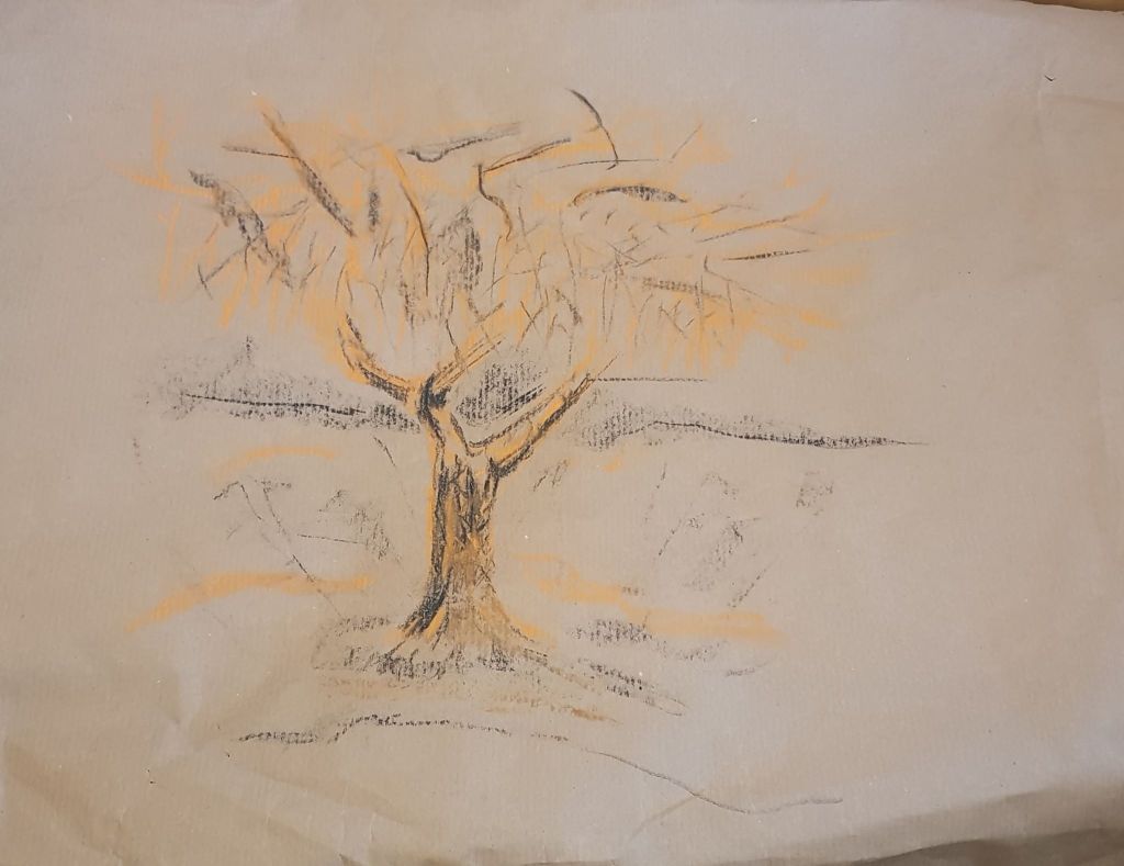
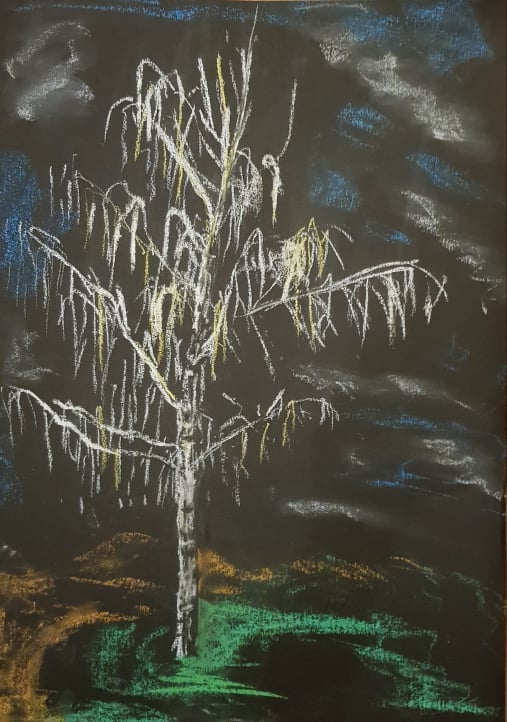
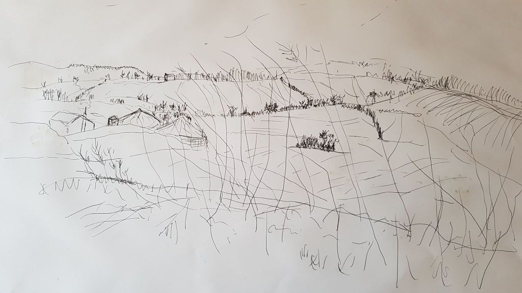
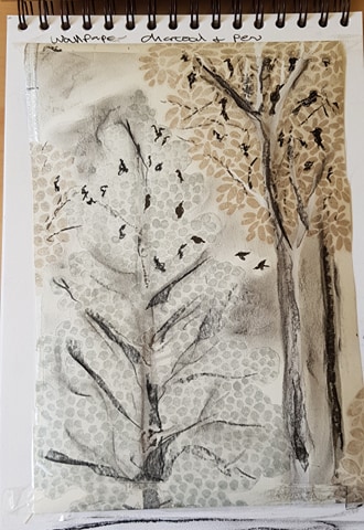
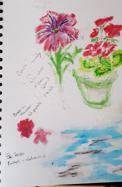
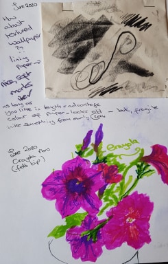
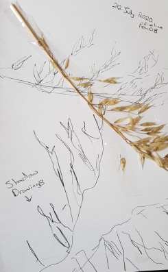
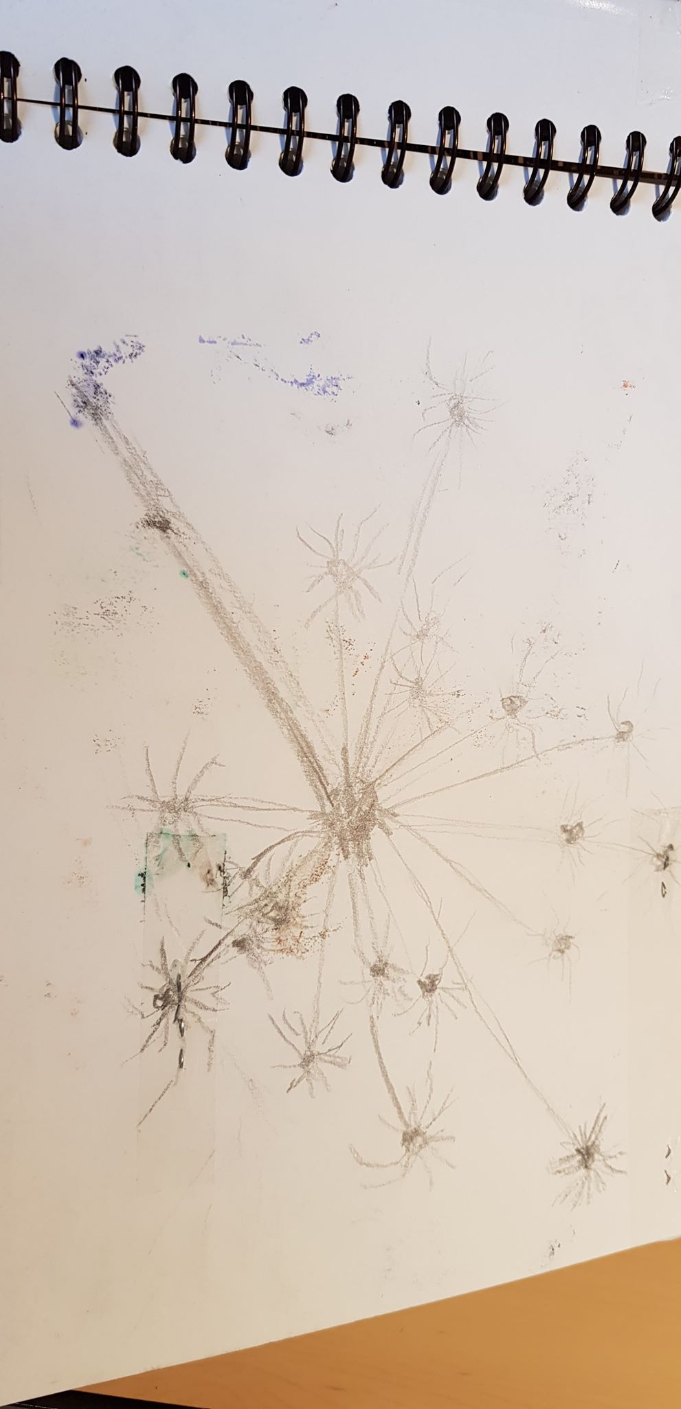
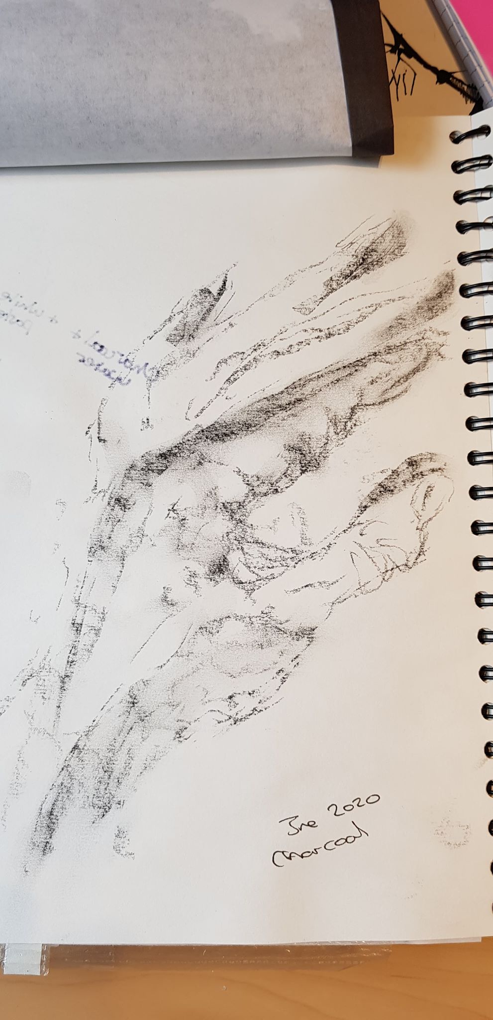
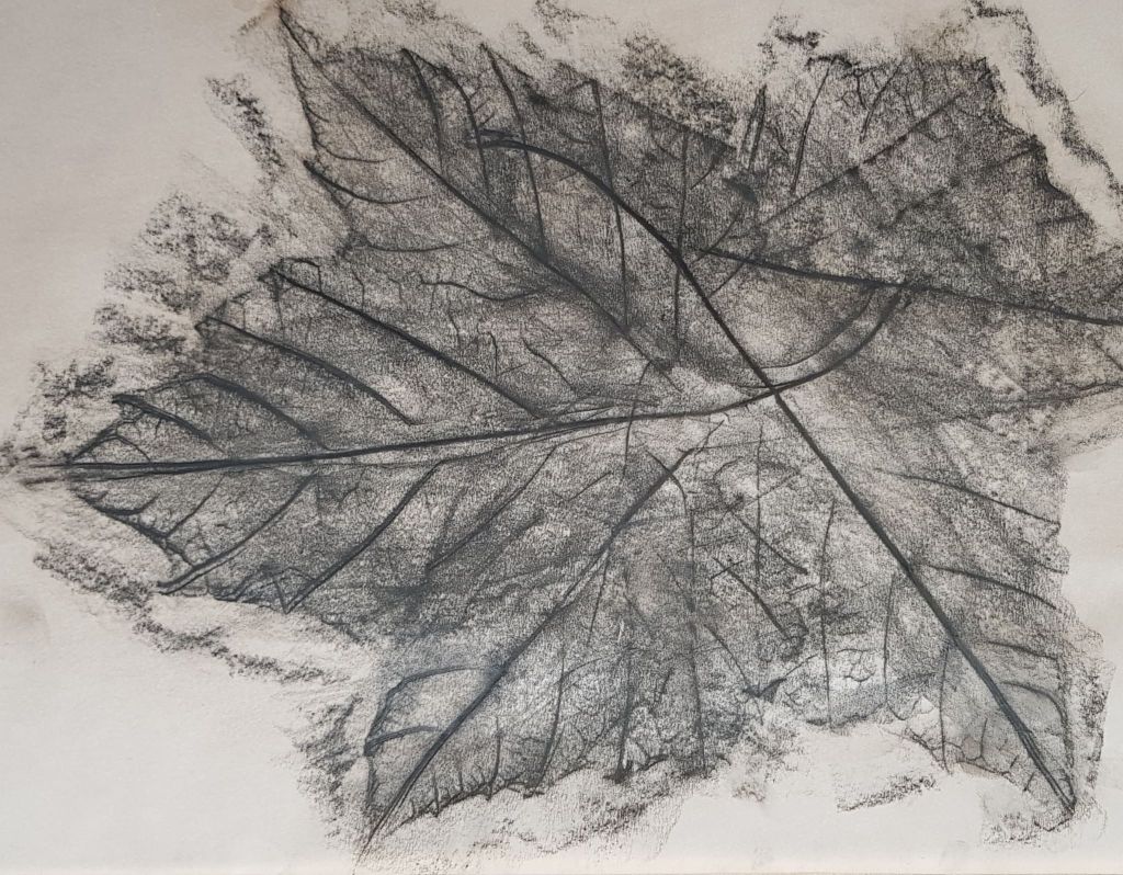
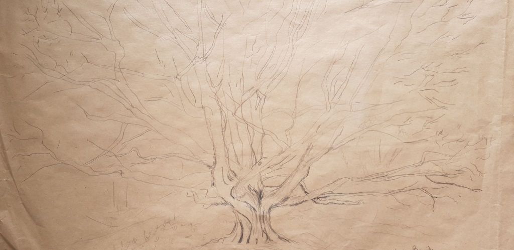
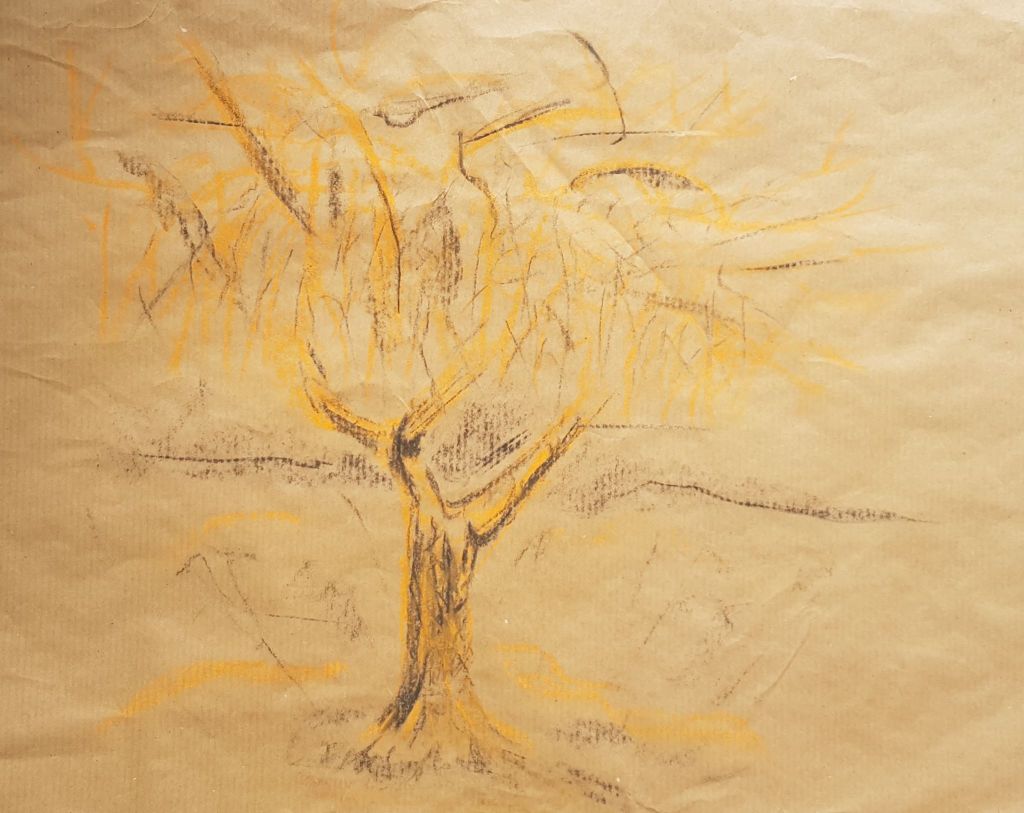
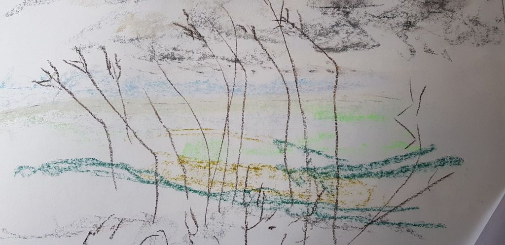
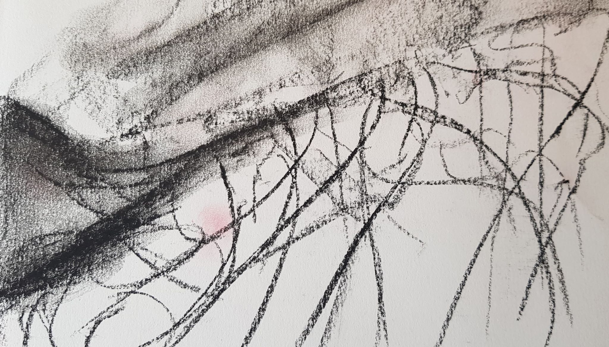
In part three I had drawn trees with expressive marks. See below for examples. It was amazing how making quick gesture marks gave satisfying results. Also experimenting with different papers gave pleasing effects.
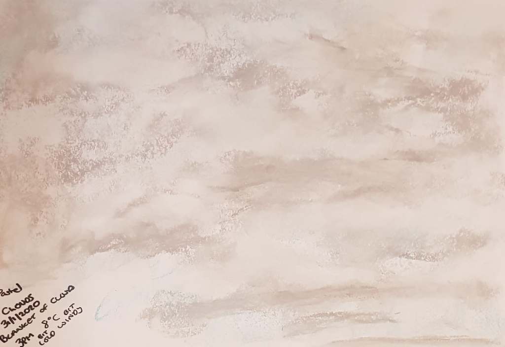
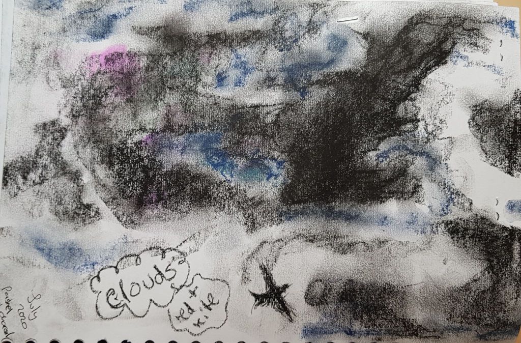
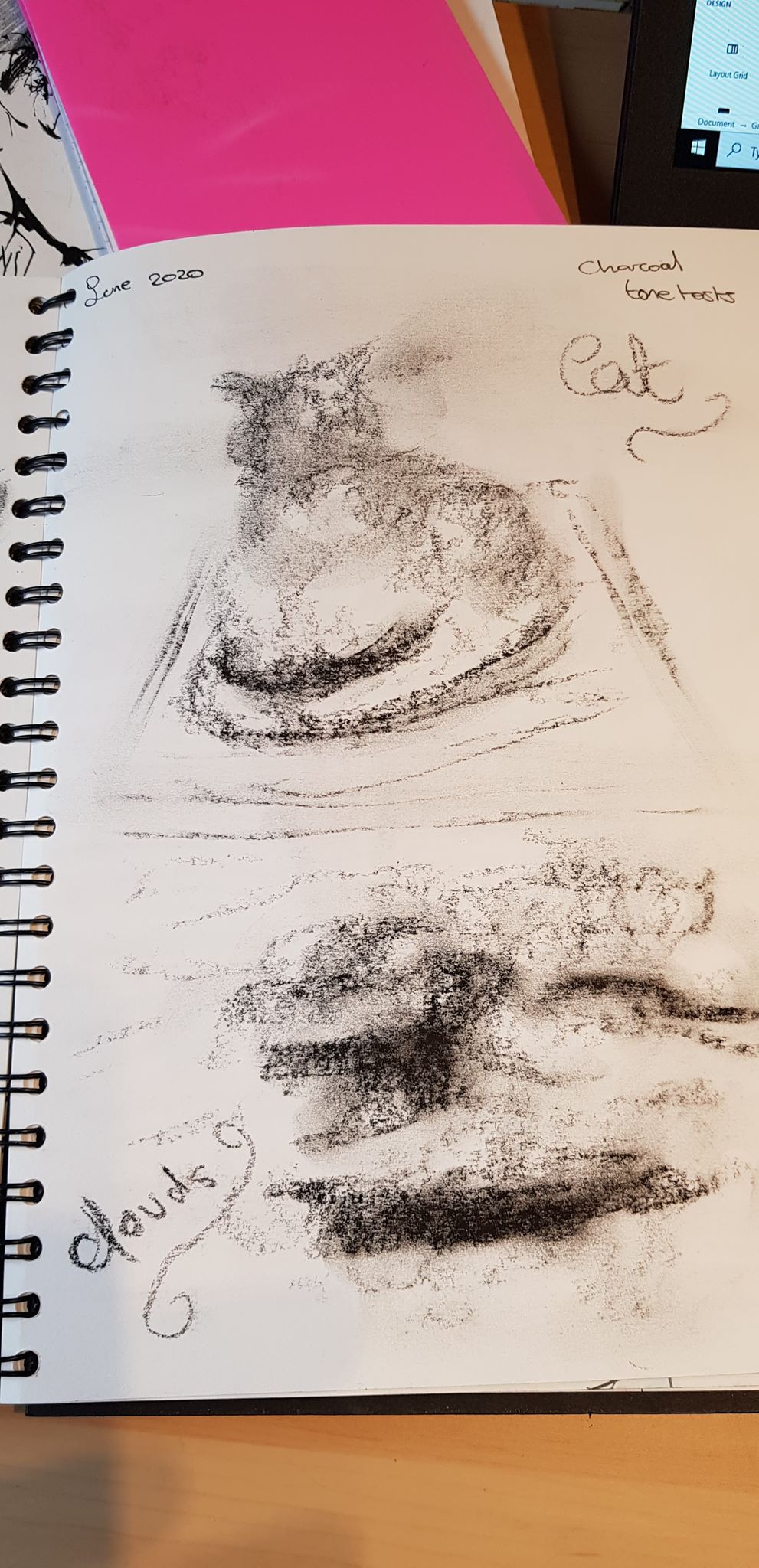
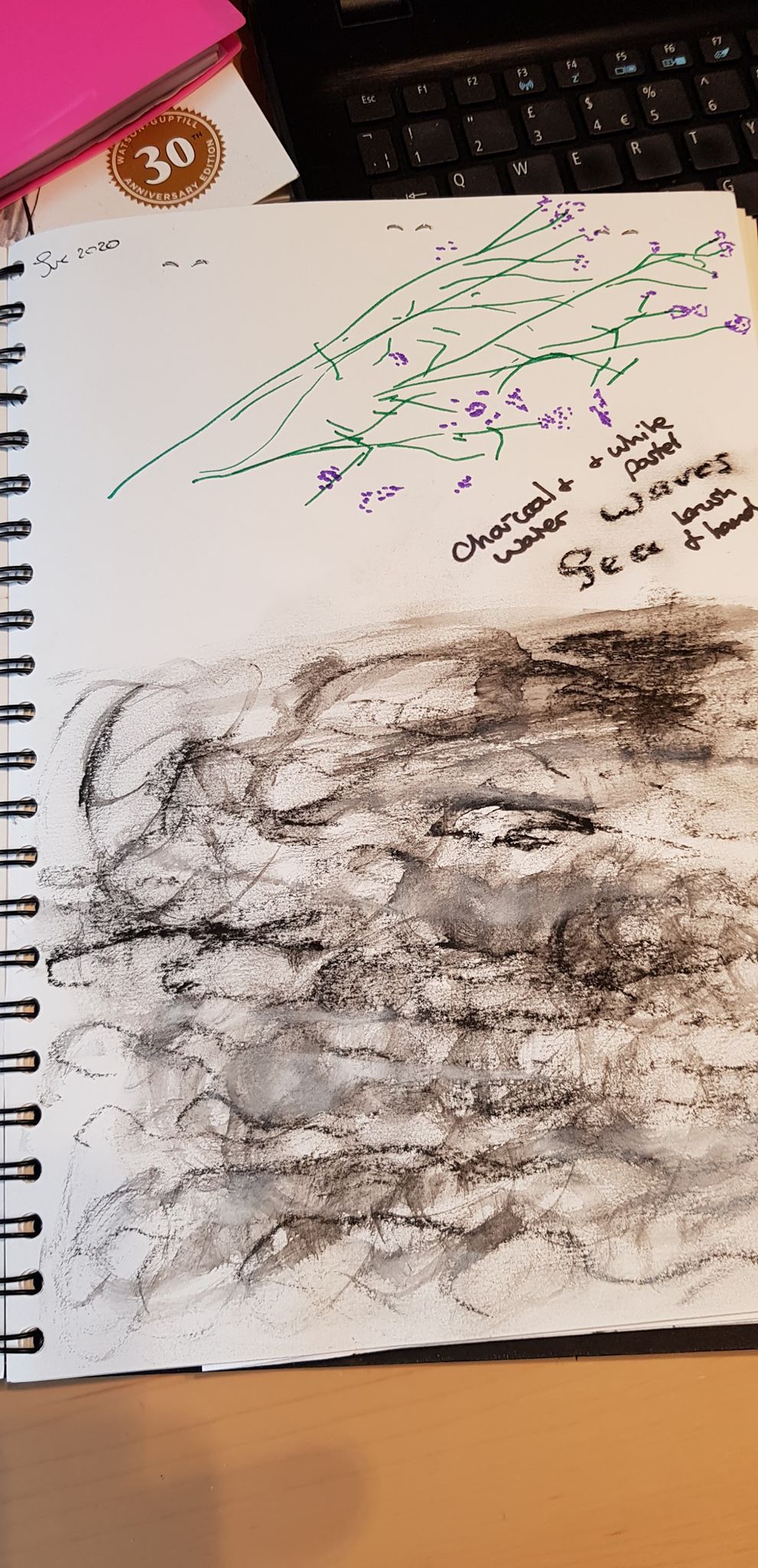
I found cloud drawings satisfying and liked the effects of the pastels and charcoal when experimenting with creating the impression of clouds
Working on layers of foreground, middle ground and background was pleasing (see below)
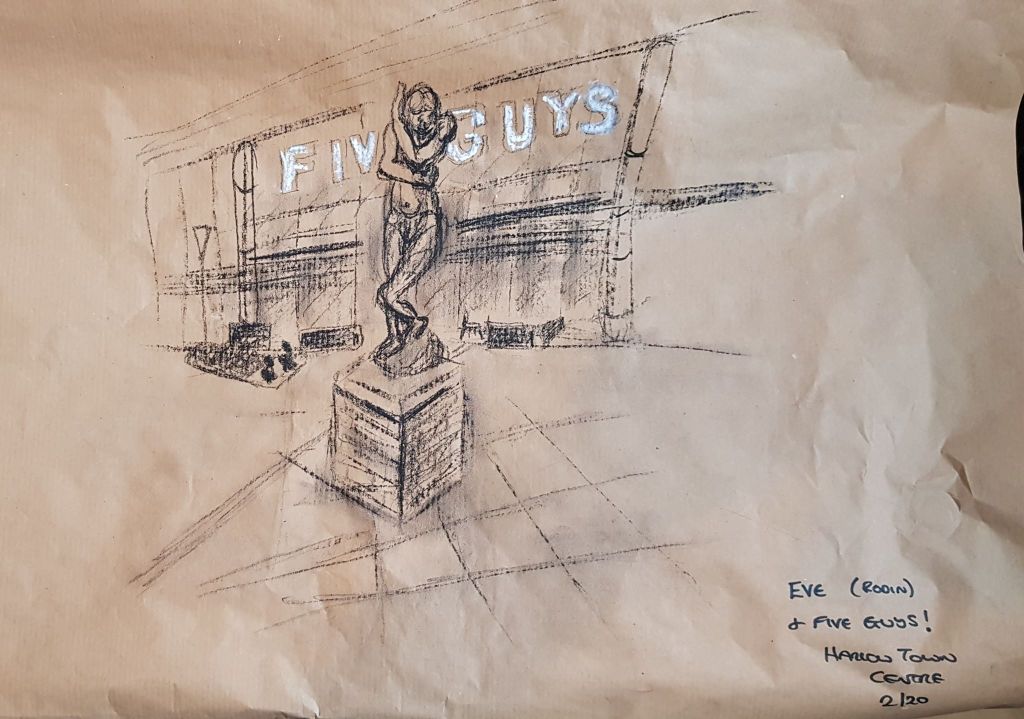
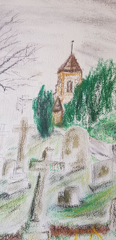
I enjoyed composition with the statues around where I live.
In part four I got inspiration from experimenting with different perspectives to make composition more interesting.
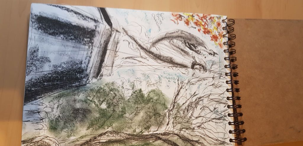
The final piece I had drawn in part three ,below, had many things that needed reflection and growth. I needed to work on my expression of lights darks and tone.
I revisited this earlier in part five and re-worked the drawing. I then decided I wanted to develop aspects of this drawing even further for the part five personal project. I wanted to expand on this type of drawing subject matter and make it more exciting, experimental and ultimately a better way of expressing what I had to say via the medium of drawing.
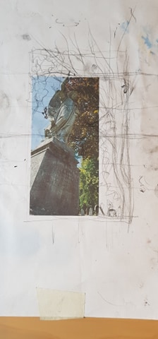
I was interested in the subject matter the Bedford churchyard presented. I revisited it and took many photos. I was drawn to the angel and took photos all around her and at different angles and perspectives.
I considered the composition I wanted for my drawing and took elements from a couple of the photos I had taken, moving them around in my imagination and testing on printouts and in my sketchbook to create the picture I wanted.
Below are some of the artists and images I drew inspiration and direction from for the final piece. From top left, clockwise:
EMMA STIBBON, Steam Vent, 2017, Black ink, volcanic ash and carbon, 210.9 x 92 cm
I am inspired by the scale and power of this drawing. She uses simple materials and monochrome to such great effect. I am inspired to try and use large scale and simple materials.
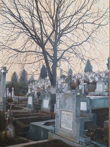
Although not a drawing, the way this cemetery is depicted demonstrated to me that the subject didn’t have to be morbid – just intriguing. Again a simple use of limited pallet to massive effect.
Jenny Purrett – her student’s – wallpaper drawings
Use of an easily purchased product to make a drawing ‘support’ as long as you like!
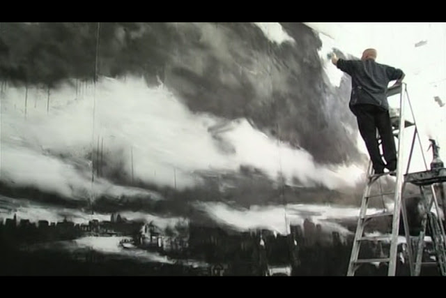
John Virtue, London Paintings, white acrylic paint, black ink and shellac
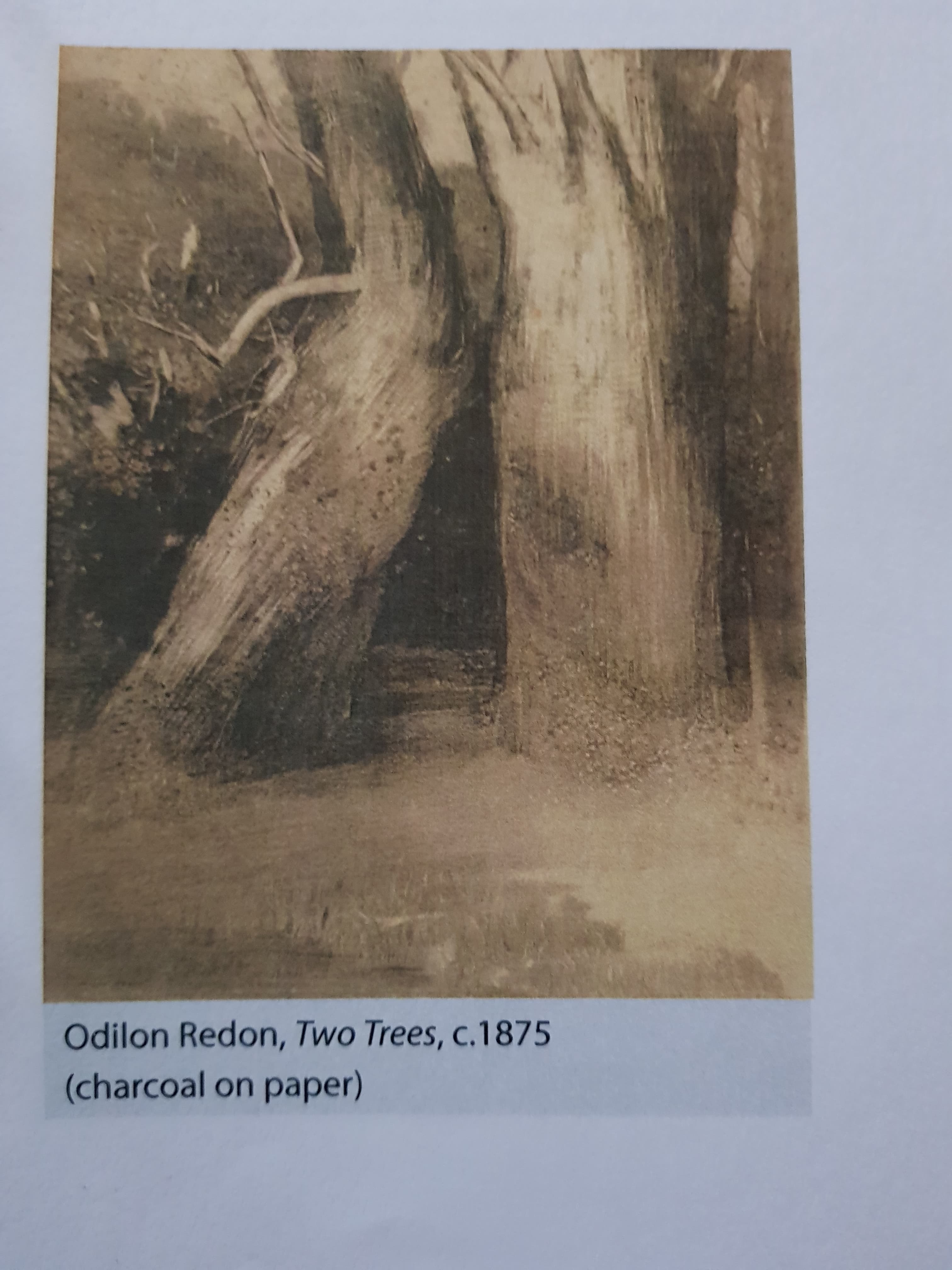
Odilon Redon, Two Trees, c 1875, charcoal on paper
Tacita Dean, ‘The Montafon Letter’, Los Angeles, 2017 TACITA DEAN
The vast image she has created is full of power and awe.
Use of perspective to make a quite day-to-day idea very interesting to the viewer.
ASSIGNMENT FIVE – THE DRAWING ITSELF
GRAVITY, EARTH AND HEAVEN
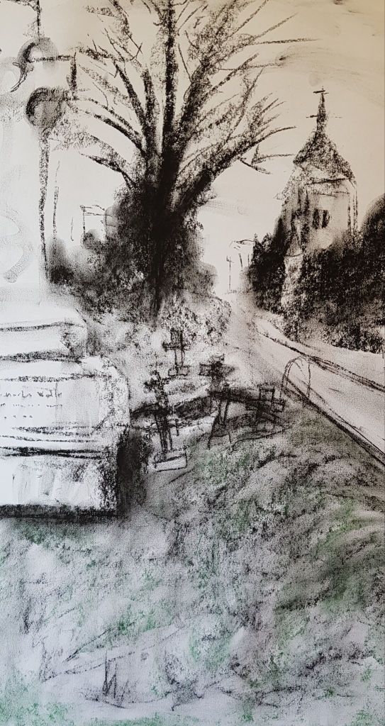
I knew I wanted to use a different kind of ‘support’ than I had tried before, along with a different scale (large) of work. I wanted to demonstrate interest and power. Hence, I had to do some tests with drawing larger scale. I also tested some surfaces and papers.
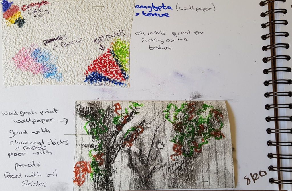
Below was a pastel drawing on anaglypta wallpaper. Experimenting with texture.
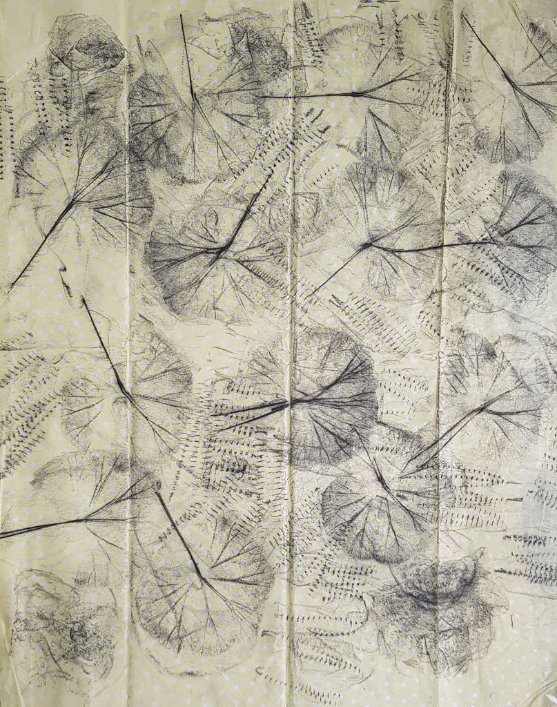
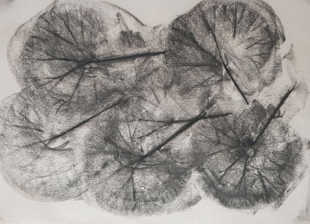
Below, test marks on tree patterned wallpaper
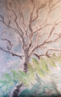
Below – tree drawing on wood grain pattern wallpaper. Testing how the wallpaper would perform. 86cm (h) x 56cm
Below – experiment with scale. Large charcoal drawing on brown paper
100cm (h) x 70cm
Below – testing material shapes, lines, blending and smudging on wood grain pattern wallpaper. Charcoal.
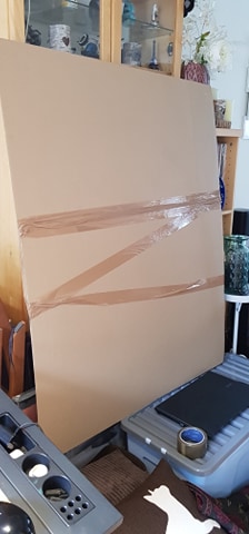
I had to create a base to actually draw such a large piece on to. I used some large cardboard sheets, ordered from the internet and joined them together with heavy-duty parcel tape. This, I found, was reasonably sturdy. The size of the image was to be 126cm (h) x 106cm (w).
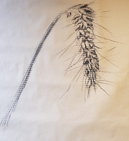
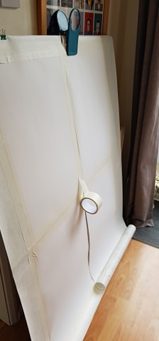
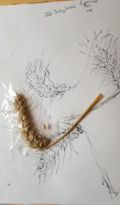
I had noticed, during my previous tests, that the corrugated card pattern had come through into the image I had drawn. It was quite a pleasing effect on the ear of wheat image (mentioned above), but I didn’t want this to come through onto my project piece, as I had already planned to use wood grain patterned paper and further marks would confuse the eye further. Hence, I put lining paper as a first layer on top of the cardboard
I then cut two strips of the wall paper, to fit on to the card. I measured the whole piece so it would actually fit on to four panels just larger than 420 mm x 594 mm per panel.. I did this, as I knew that if the piece ever needed posting it would need to be cut into four and mounted on to 4 x A1 boards.
I spaced two pieces of 420 mm x 594 mm paper on the back of the sheet of wall paper and repeated this on the second sheet of wall paper. I did this as another lining layer and to space out the panel sizes equally (so they would be in equal quadrants if I ever needed to cut the piece up).
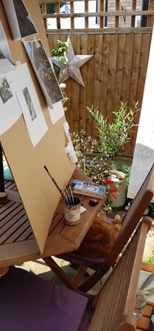
I had to work at eye level, to stop my image becoming distorted at the top or bottom. So I placed my work surface on a big box to raise it. I worked outside in the garden, as the size of the piece meant I created a lot of dust and mess as I went through much more drawing material. The outdoor light of a bright day was also better to draw by.
Below is a ‘mood board’ I put together with all the images I wanted to pull together into the final piece. I had them stuck on with masking tape, so I could pull them off as I needed them and then stick them back for safe-keeping.
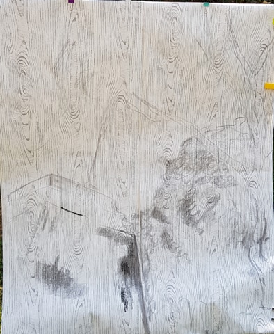
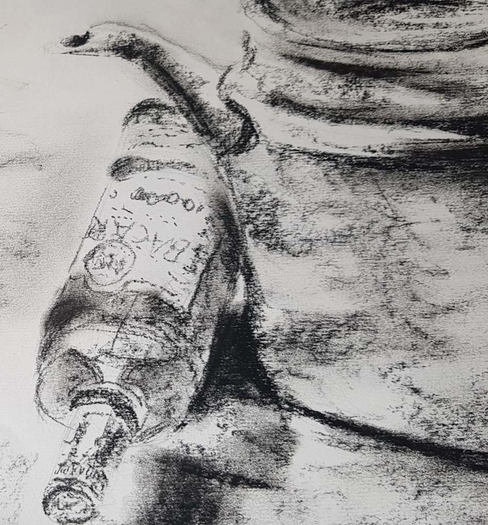
Once the paper was mounted on the card, I mapped out a basic outline of the objects and spacing on the piece with very light charcoal – using the point. It was important to get the perspectives of the whole piece correct before toning it. Perspective was a very important element to the story the image was supposed to convey – adding drama. I started work in the bottom left quadrant, on the stone plinth of the statue. This base was to be the main focus of the drawing. It was weighty, imposing and one of the darkest areas of the drawing. I applied charcoal with the side of the stick, using heavy sweeps for the darkest areas. I drew lines down the plinth with smaller pieces of charcoal and then lines with the end of the charcoal. I pulled a wet brush downwards – to try and reproduce years of rain running down the stone.
I pu
I did run in to problems. I had tested the original charcoal on the wall paper and had found it gave a range of tone quite well – from light to very dark. However, I then bought some new charcoal for the project and didn’t think I needed to test this. However, the new charcoal performed very differently from the old charcoal – which surprised me. The new charcoal had less range of tone and didn’t go to the darkest black – only a mid/dark grey. I learnt from this – that even the same material-type can perform differently. I suppose it depends on the raw material and processes it goes through (brand). I had to revert to the little bits of old charcoal I had left and also use black pastel stick in the darkest areas.
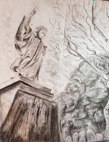
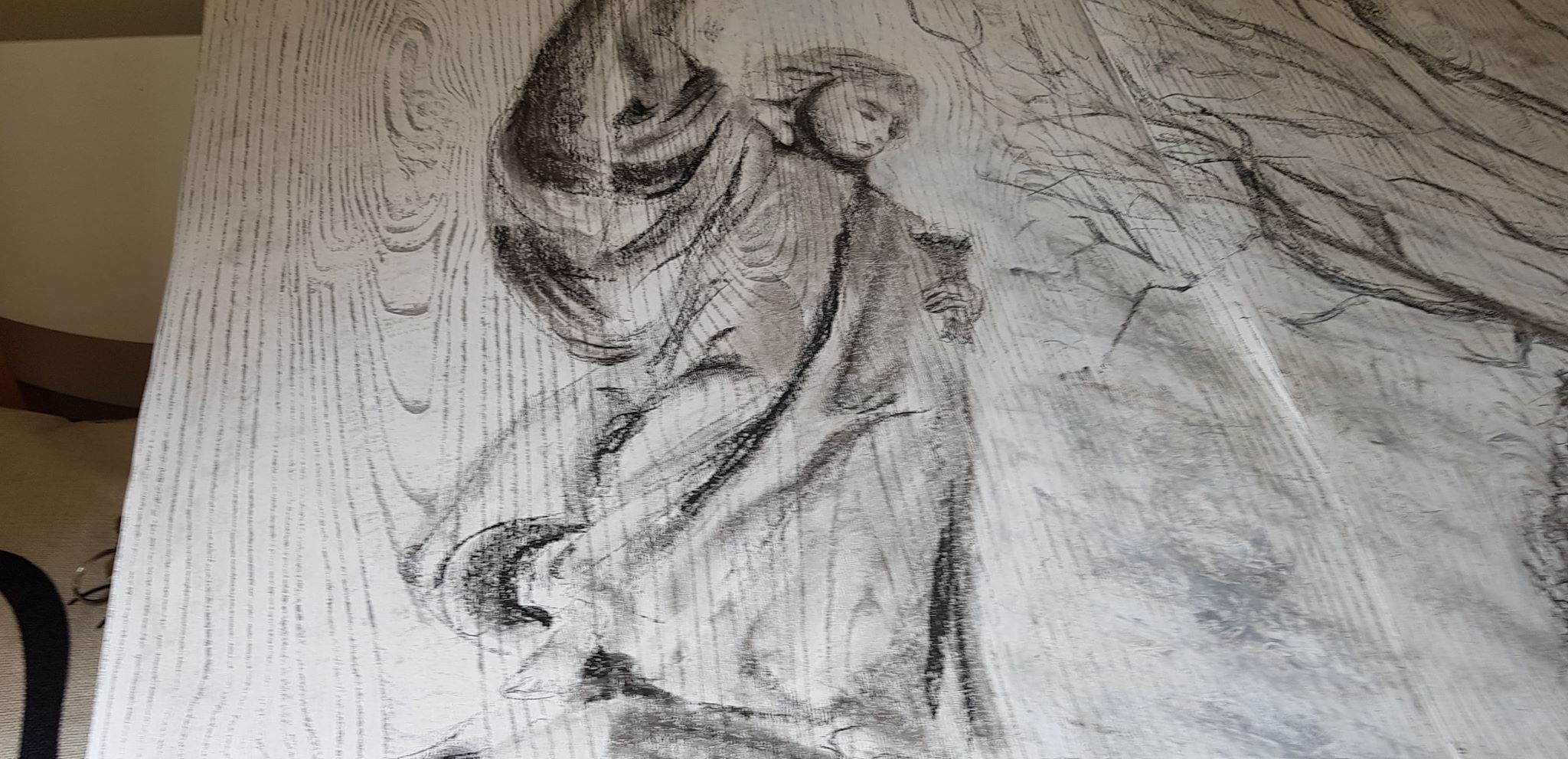
I then worked on the shape and perspective of the angel. I wanted imagined lines to converge onto her hand and index finger pointing sky-ward – to again add drama to the story and give focus to the direction of the piece.
I worked on the face detail as carefully as I could, using graphite pencils to create delicate features of her hair, nose and mouth. I used charcoal as carefully as I could to give shape and depth to her face and hair. As she isn’t a real person, but a statue, I did try and keep her features more blocked and angular.
I had blocked in tones of the bushy trees shapes. I tried to get a range of tone as the trees had very dark areas and also areas were the sun was hitting, plus tones in between. I tried to create texture using the point of the charcoal to draw jagged lines representing branches and clumps of leaves.
I left grave stone spaces at the bottom of the bushy trees.
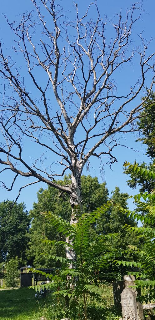
I drew the outline of the white birch tree trunk on the right, using sparse, directional shading to hint at shape and shadow.
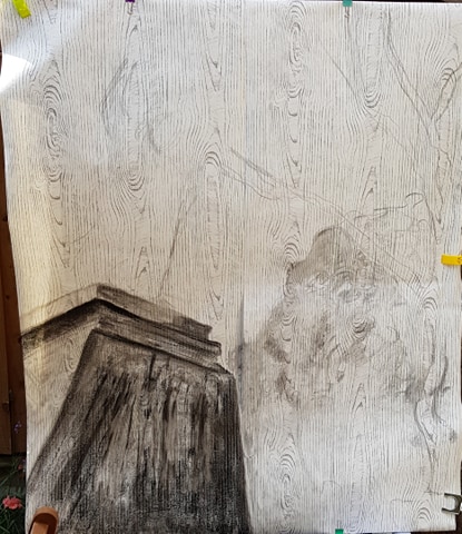
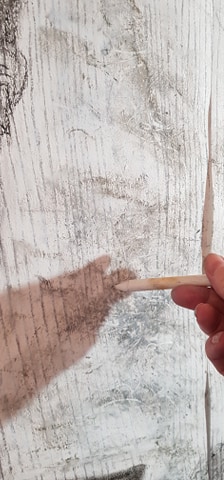
I added a sweep of sky in the middle of the drawing. For this I used charcoal but I also used white oil pastel and white crayon to add some texture and hint at the shape of the clouds. After applying the white oil pastel, I gently cut in to it with a stick to create swirls and break up the cloud forms – I thought this might make them look more realistic.
I did run in to a problem with the oil pastel, as the area where I combined using it and charcoal, cutting lines in to it, became overworked – I was worried the paper may tear. But as it was wallpaper underneath it was, luckily, quite robust.
I then left the drawing for a couple of days. This gave me time to contemplate what was needed to move onwards. I kept coming back to it over and over to imagine, criticise and consider.
My pondering resulted in my need to add some extra clouds behind the angel, to the left of the piece. The clouds had just stopped in the centre and the balance and flow of the image looked wrong. I didn’t use oil pastels in this area, as I wanted the clouds to fall more in to the background, as the angel needed to be the centre of attention in this quadrant.
I also saw that I couldn’t just hint at the gravestones in the bottom right. They needed to have a more defined shape and shading to give them purpose and form. So I used a close up of the photo I had to work on this.
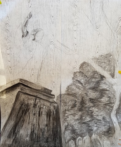
I added hints of the branches of the birch tree reaching skywards. I copied the general flow of the tree, but didn’t go in to detail – to keep the angel as the central focus.
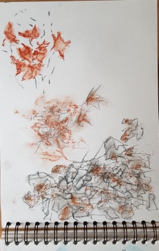
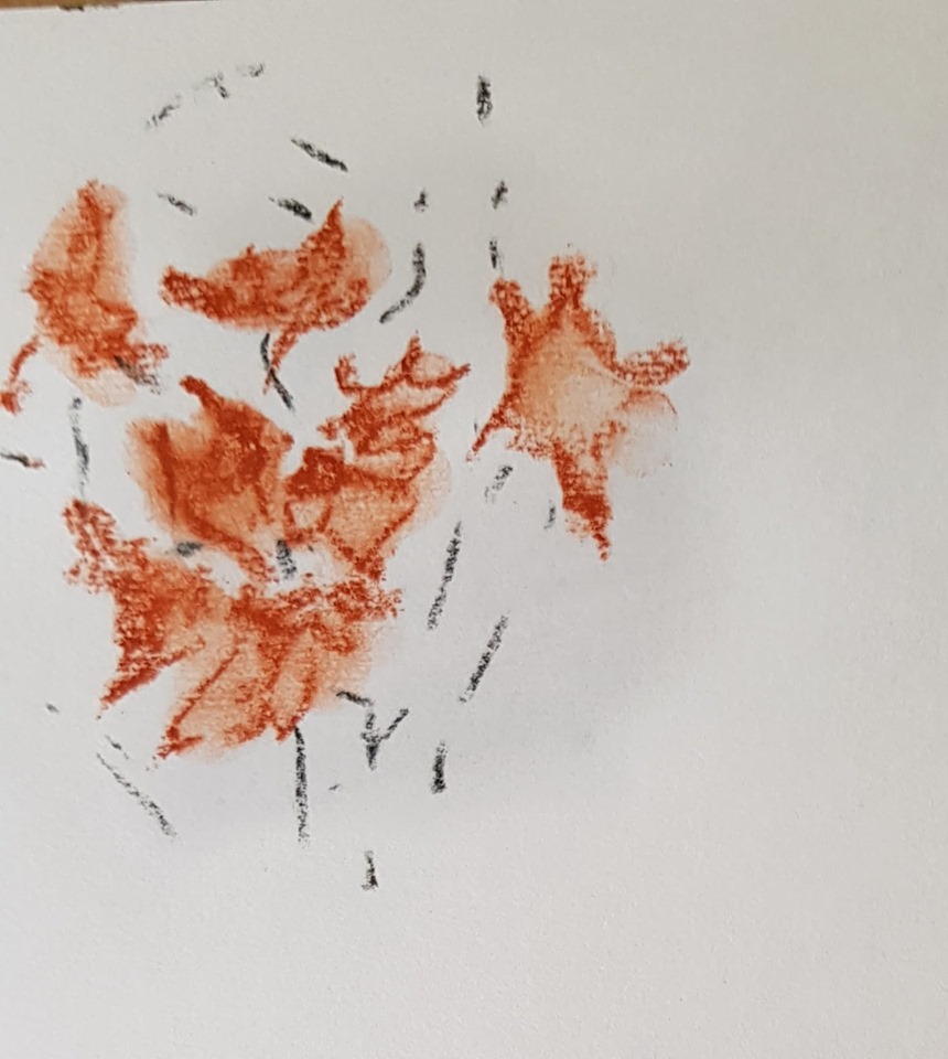
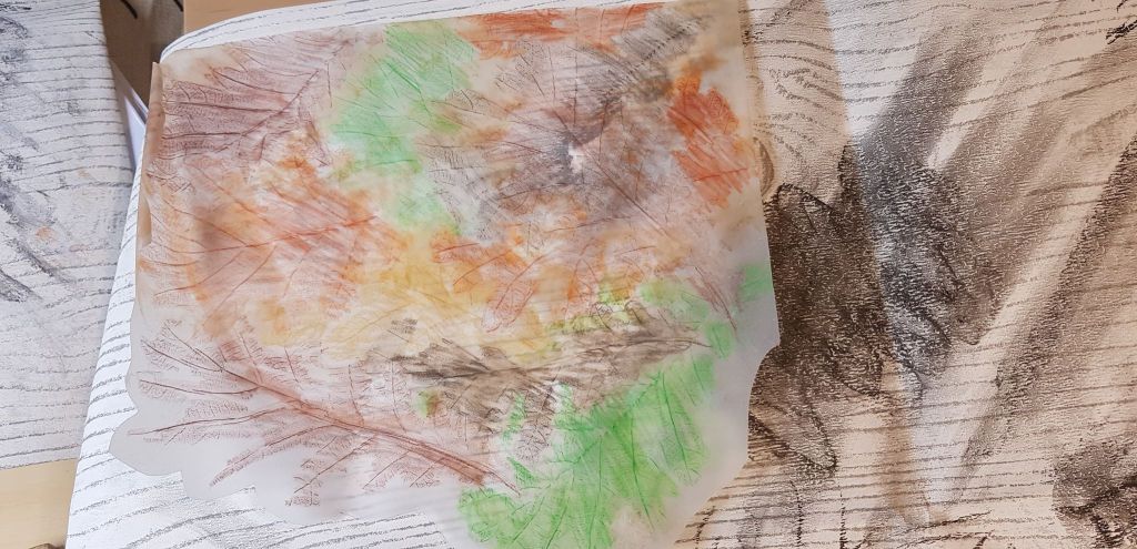
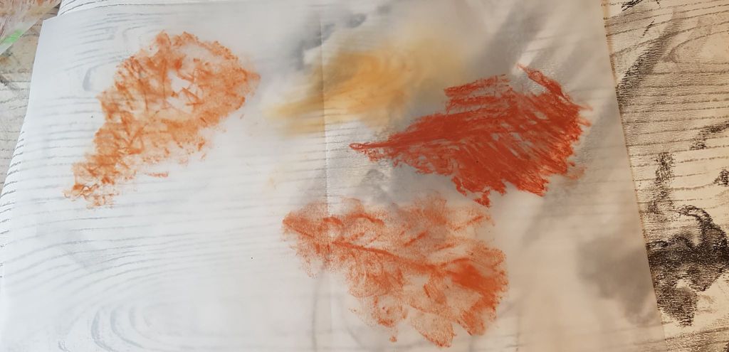
I did consider adding a splash of colour to the top corner of the the picture. The original photos had a canopy of leaves behind the angel’s head. I do like to add a colour accent to images. I tested some leaf images with smudged brown/orange pastel. I then did some experiments with leaf rubbings on tracing paper – to see if I liked how these looked. I was going to stick the tracing paper over the top of the left top corner as a translucent hint of leaves in the wind – but I decided against it. I thought it added a distraction and complication that I didn’t really want.
I tried to photograph the final image and ran in to problems with this. As the image was so big, it was hard to find even light. Also, whatever light I took the photo in, e.g. outdoors, indoors, sunny day, dull day, artificial light, natural light, changed the look of the image quite drastically. In some lights the image had a sepia look, in some lights the central paper join was in shadow, some lights picked out the blue pigments in the white oil sticks. I settled on the photo I liked the best for the final image.
In total, to draw the piece took 7 hours.
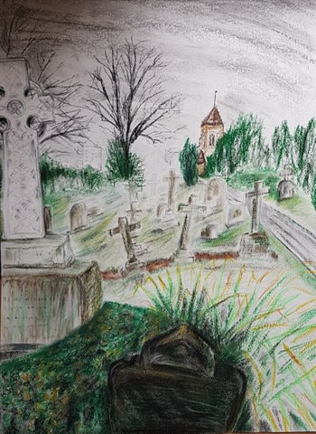
BELOW – THE FINISHED PIECE – GRAVITY, EARTH AND HEAVEN
Charcoal, soft pastel, 4b pencil, oil pastel on woodgrain-patterned wallpaper, 126cm (h) x 106cm
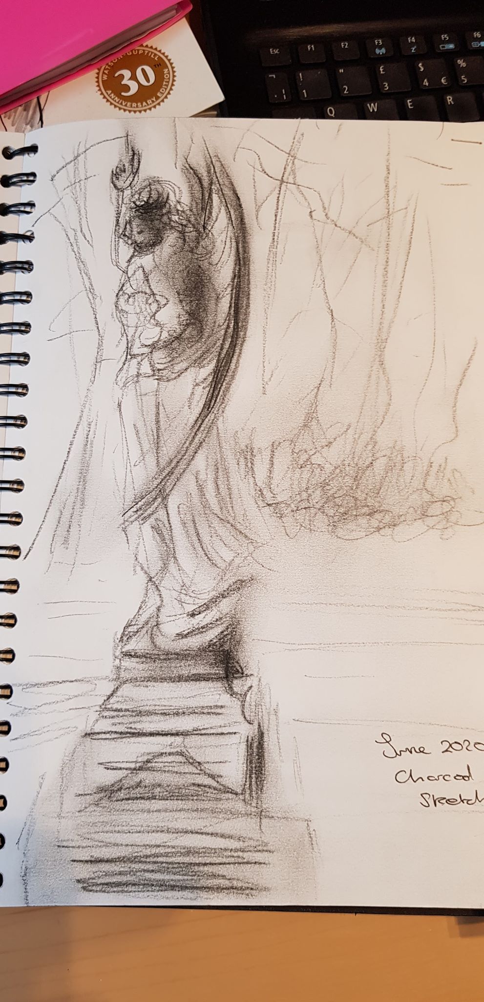
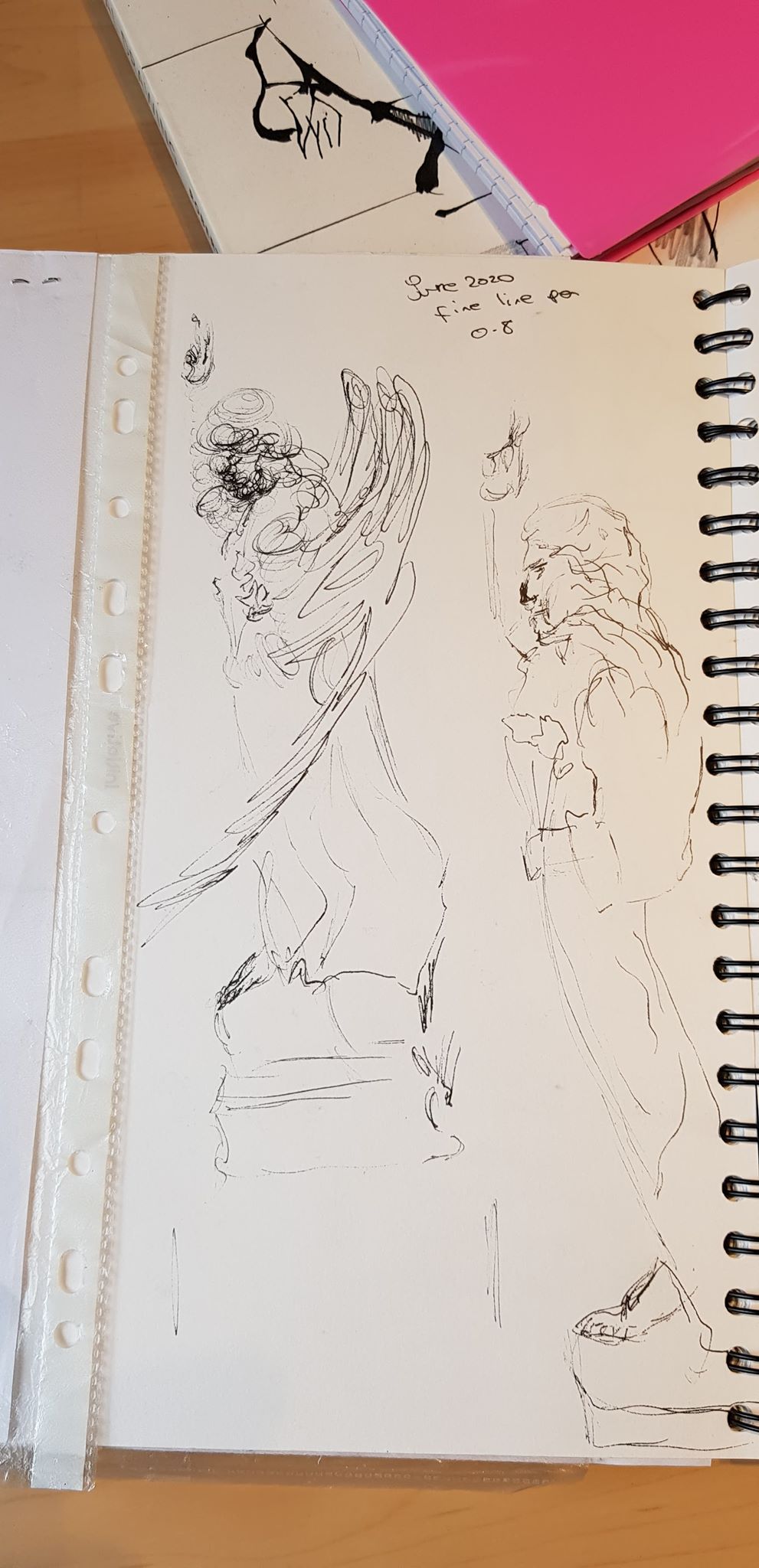
Below are general sketches made in my sketchbook June/July/August 2020. Other sketches made for Part Five can be found in this blog in the section ‘PART FIVE – The Personal Project – Background Work, Development and how the Drawing was Created’
I decided to revisit some parts of the course to see if I could re-work some ideas with developing techniques and apply some of what I have been learning along the way.
I didn’t try a range of materials or paper for this, as I wanted to mostly focus on the marks themselves and improve my charcoal and pastel skills.
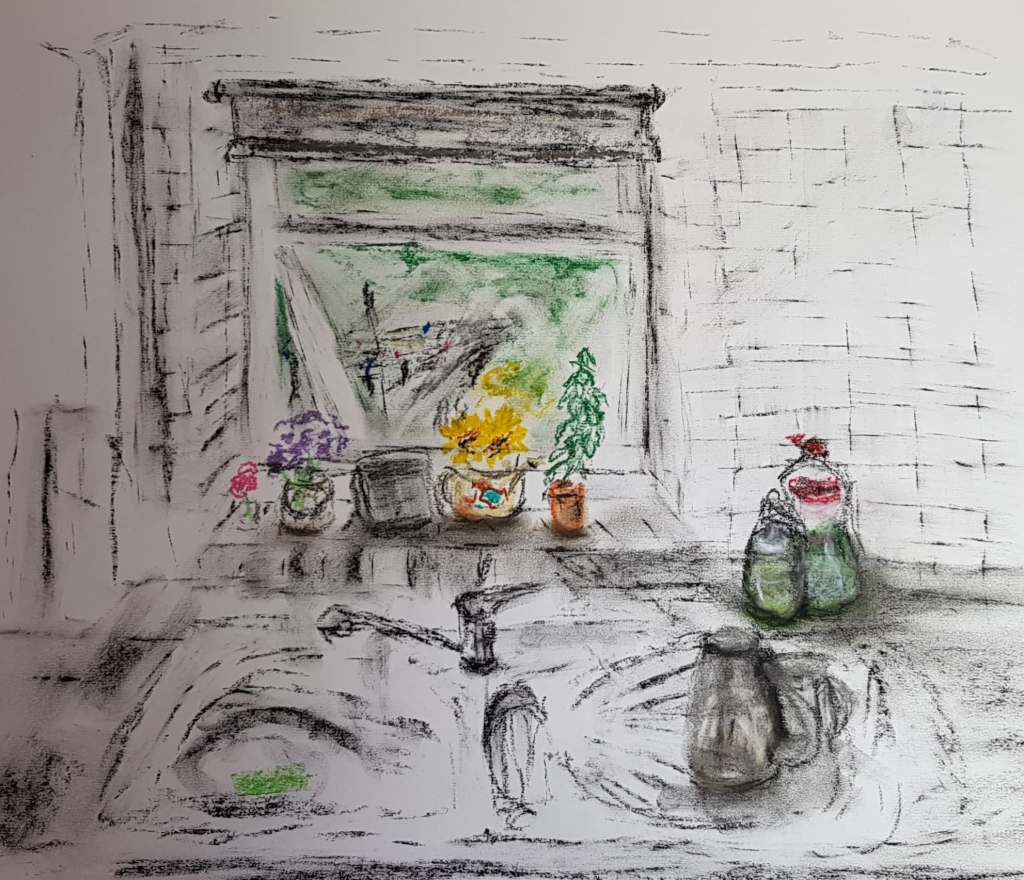
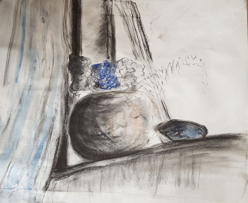
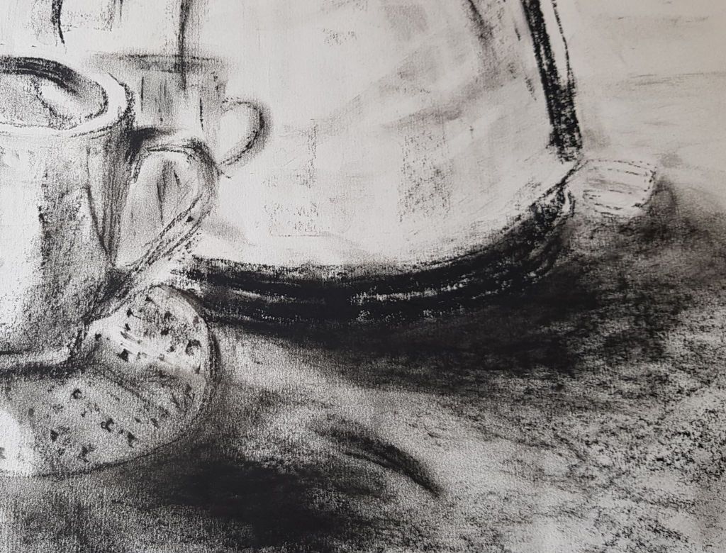
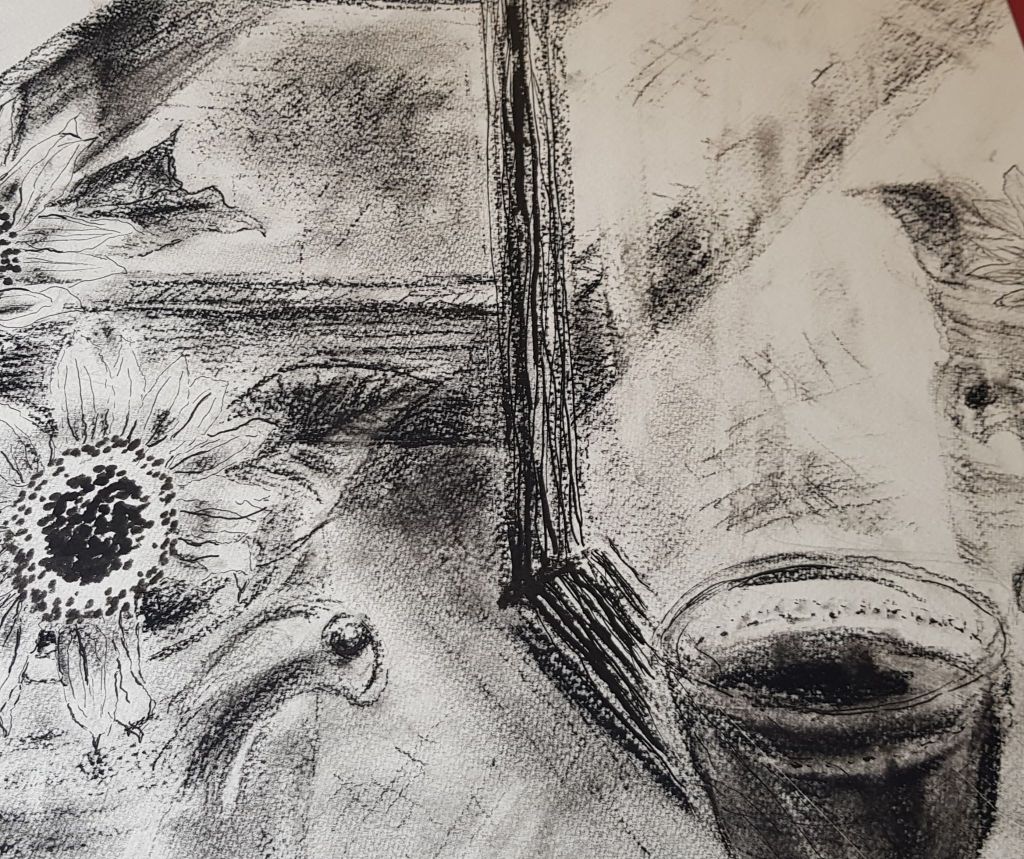
Below, I re-visited the ‘At Home’ section from Part Two of the course, as I was really challenged with making indoor images interesting. I still struggled. I seem to want to bring so (too) much subject matter into the image. Maybe I should focus on smaller areas and bring more detail into a more focused drawing? I quite like little highlights of colour in a fairly monochrome piece though.
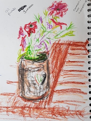
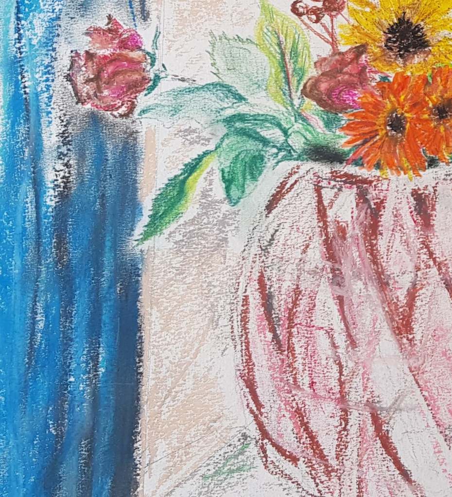
Below, I re-worked the idea of the assignment I produced for part two. I tried to work on improving marks and use of some colour to make the vase more rounded. I tried to lighten and freshen the curtain and not overwork. I added a little colour to help add shape and depth. I didn’t spend much time on this, just over an hour, but I think there are some improvements on the assignment two work. It seems more alive. It maybe could benefit from having more work done on it – to add more shape to the vase. I also only hinted at the flowers in the vase, so the image is rather empty. 594mm x 420mm white paper. Charcoal and soft pastel.
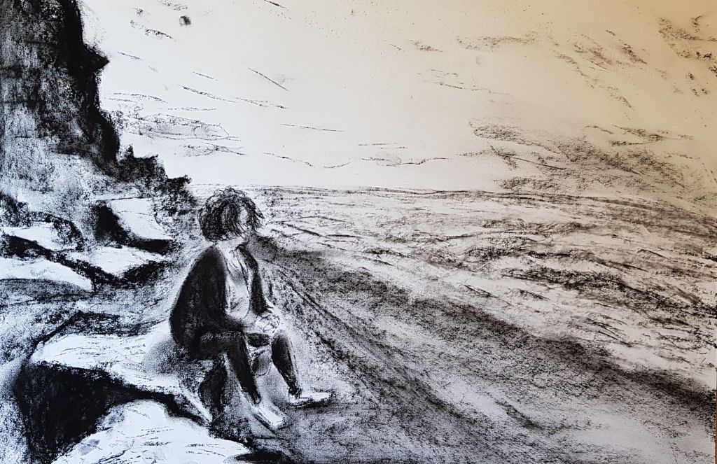
Revisiting part three, below, I tried to work on tone and bring a range of tones and blending into a landscape. I think this did show better blending skills, the figure may be a bit too cartoony and may possibly need more detail, possibly with pencil? 594mm x 420mm white paper. Charcoal.
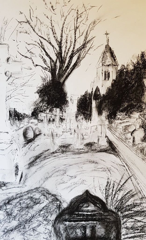
Below – Two versions – I wanted to re-visit and re-work the final assignment of part three. I wanted to try and demonstrate the improvements that my tutor had suggested in the feedback. My tutor had suggested ways of improving the image by using more tonal range ‘ to create more of a sense of depth through dark to light tones’ and developing blending skills. Also, I tried not to labour the marks too much and each one took just an hour. I think the images below may have been more successful as a result of listening to my tutor’s comments. Both are on 594mm x 420mm white paper. Charcoal.
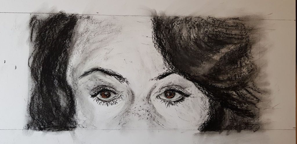
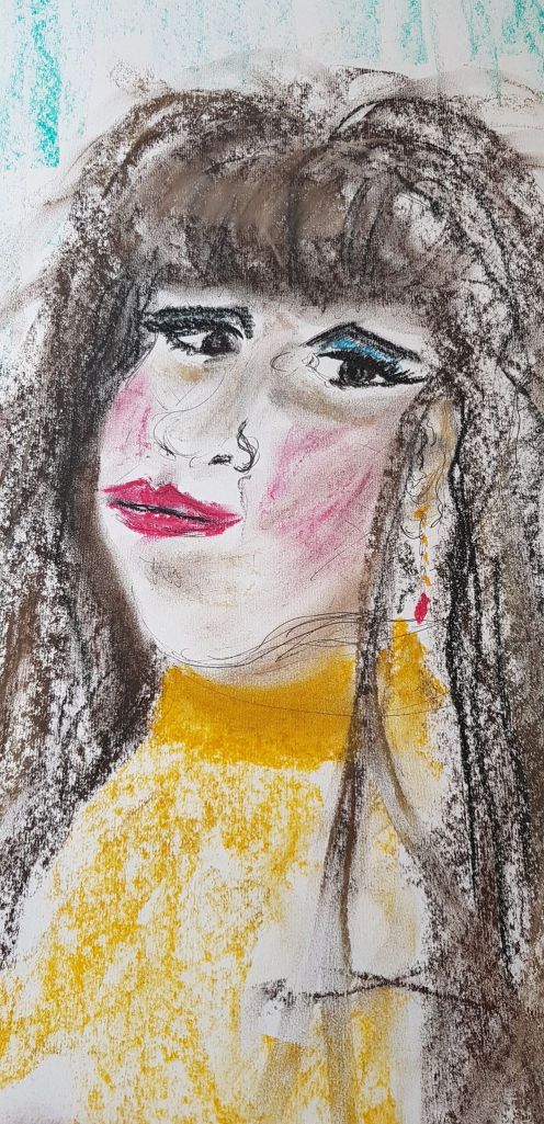
Below, I wanted to re-visit the portrait work of part four, to make a more interesting composition. My tutor had suggested looking at cropping to improve images, bringing some excitement. I cropped right in to the face. I tried to use tone and blending more effectively. I used charcoal, but accented the eyes with brown, soft pastel. I think this did make a more exiting composition. I tried to use more instant expressive marks. This image took about 90 minutes. 594mm x 420mm white paper. Charcoal and soft pastel
I wanted to use this opportunity for self-assessment, to write in a little more depth about artists I have looked at while I have been on the course. I want to explain what I like about them and why. Also, what I can bring into my drawing from my looking at their work. This is important, as other artists can inspire and shine a light on the creative process. They can also give answers to problems in my own work. I don’t think I have highlighted this enough elsewhere in my blog.
JENNY PURRET
I love her loose images, flowing marks and often simple natural subjects. I was interested in her use of rolls of paper to draw continuous line over time. I was inspired by her use of wallpaper in her drawing classes. She uses a huge variety of materials to create her work, including washes, ink, charcoal and pastels. She has also used found materials, e.g. elderberry pigments from berries. She actually works in the field.
I would like to try using wallpaper as a drawing paper – as it allows for a bigger image, experiments with scale and has texture of its own. Its also easily and cheaply available. There are many different textures and patterns – these may create interesting effects.
TACITA DEAN
I am interested in the vast scale of her work. Her use of tone, shade and value are awe-inspiring and overwhelming. Her subjects are very powerful, e.g. clouds and mountains. Her work is based on outdoor observation. She has used blackboard as her paper – a brilliant thing to apply tone to.
I would like to bring some of the power and vastness she demonstrates into my own work.
I would like to experiment with scale. However, I am limited, as I have to work at home (my home is very small)!
I can see how improving my tonal work could be used to produce amazing effects.
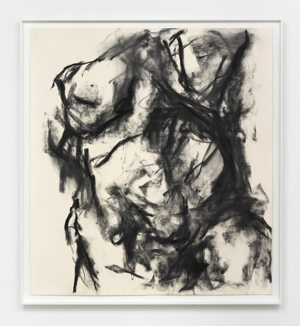
WILLIAM TUCKER
I thought I put William Tucker’s charcoal images in to this section, as a version of charcoal use that didn’t work so well for me.
I like the contrast between the back marks and the white paper – the images do grab your attention.
I found them heavy, rock-like and oppressive though. Lumps of amorphous darkness. They were rather masculine for my taste (is that sexist?). Maybe that is the story the artist was aiming for.
I prefer a more delicate, expressive, joyful creation – achieved by a different use of the material.
EMMA STIBBON
This artist, rather like Tacita Dean, achieves energetic, powerful vast images with only a few materials. Her volcano drawings are full of movement and excitement. Her compositions are so inspiring. Her subject matter is so interesting.
ANITA TAYLOR
Again, the scale and power of her pieces are inspiring. They are like monoliths, but contain much emotion and spirit.
Again the choice of materials is small but the effect is hugely interesting.
JENNY SAVILLE
I am fascinated by her use of unfinished line and repeating, overlapping images to create movement. Her images are alive.
KURT JACKSON
This artist, in his ‘Thorn’ series, approaches the same tree in so many different ways. He uses all sorts of mediums and materials. Each approach giving a different result. So many different ways of telling the same story. He uses print, paint, ink, oil, collage, etching, mixed media, sculpture. This holds his (and our) interest of the same subject over many versions.
I would like to try a variety of materials, to create interest and intrigue in the same subject. It is like an on-going experiment.
TIM KNOWLES
This artists work is very experimental and interesting. He is just the catalyst, the middleman, to natural objects creating their own art. The wind blows pens tied to a trees branches and the pens draw on paper.
Looking at interaction between man, man made objects, natural objects and natural phenomenon. What a creative and thought provoking process! This shows that there are few true boundaries to making images – just the limits of our imagination. I need to find ways to spark my imagination and thinking to break some of my own boundaries.
DARO MONTAG
As with Tim Knowles, this artist as a catalyst and middleman to natural objects creating their own art. Tim presents ant colonies with choices and hurdles and records their choices with their footprints in charcoal.
The image creation raises thoughts and questions. Again, his ideas break down barriers with creating images.
PHILIP PEARLSON
I learnt from looking at this artist’s images of groups of people. He crops his images and fills the paper beyond the margin were our view stops.
This focuses the viewer more intensely. I learnt a great deal about the use of cropping from this artist. His use of foreshortening makes viewing even more interesting and dynamic.
DURER
This artist was working 500 years ago but his images are fresh and interesting today. He used many techniques and many materials.
I have found looking at his gradients of light, shade and tone very helpful and instructive.
GEORGE SHAW
I like George Shaw’s work very much. I like the ordinary and everyday subjects that he produces.
There is beauty in the dismal and reflection of many people’s real lives. He shows me that the subjects you choose don’t have to be pretty, expected or traditional.
JOHN VIRTUE
I like this artist’s use of scale and tone to create mood. His London paintings are vast, weighty and brooding.
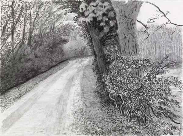
DAVID HOCKNEY
I get a lot from Hockney’s landscapes. I especially like that his views centre on roads through the countryside. The resonates with me as I get inspiration, when I am driving, from my surroundings. The feeling that you are in transition and passing through something, as opposed to static. His use of colour is amazing .
I have been working on Drawing 1 for a year now and have gained so much from it. It has also been frustrating and difficult – but I know this is all part of the process of growth and development. My tutor’s comments and suggestions have been invaluable – I have used them to try and move myself forward. I know the year spent is very much just the start of the process of expanding my creative life.
Part One Form and Gesture
I enjoyed the temporary drawings. I need to use this concept more – to free up my ideas and spark creativity and interest.
I had some success using different papers to work on, besides standard white sheets. I used tracing paper, tissue paper and brown paper in some of the exercises. These papers created different feelings and outcomes. The brown paper feels less precious – promoting looser, braver drawing. The tracing paper was translucent and the light shining through was an interesting effect. The tissue paper emphasised how delicate the natural structures were that were drawn onto it. The frottage method also added to the effect of delicacy and being more in touch with the natural structure. I have gone on to experiment with different papers in later parts of the course, but I need to develop this further. I was not as brave as I would like to be with using different materials.
I found my tutor’s suggestion of looking at the work of Jenny Purrett and Tacita Dean really very helpful. I will cover my feedback about them and their affect on me in a later part of the blog. I will say here that I have referred back to their work time and time again over the year, for inspiration.
Completing part one emphasised areas that needed development. As mentioned above, I need to take more risks. I need to explore different materials and papers. I also need to look at different scales of work.
A problem I found was using multi-media effectively. I attempted to use both drawing pen and charcoal in the final assignment. The pen around the mirror frame didn’t add anything to the image, it just gave it too many focal points and detracted from the main focus (the flowers). I was trying to give the piece more texture and interest, but it just confused the eye.
I wasn’t really understanding the use of a sketchbook as a tool at this point. Now I am at the end of the course the penny has dropped. A sketchbook is a great place to formulate ideas and test materials. It’s also a great place just to play.
Part Two Intimacy
My successes in this part of the course were experimenting with different materials in my sketchbook and on separate larger sheets.
I was starting to understand that this type of work is important to understand how materials perform and for better image outcomes. It is also enjoyable. I tested pens and the affect water would have on them.
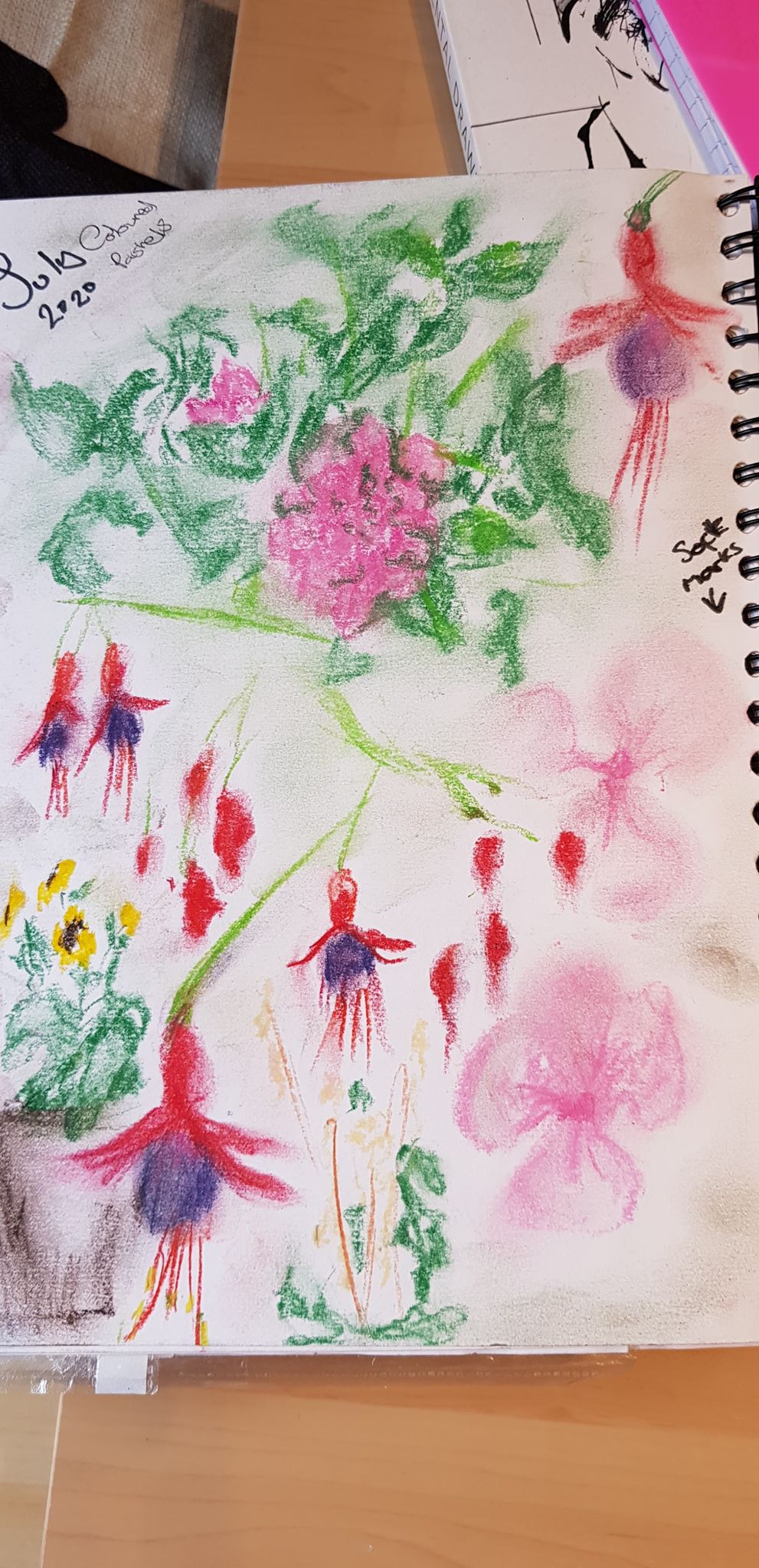
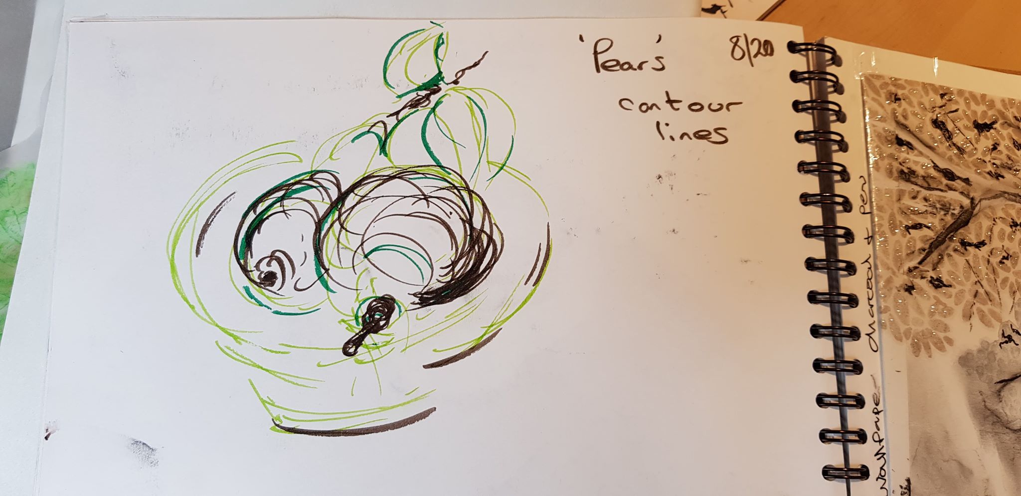
I worked with pastels and the effects created by blending, expressive contour lines and colours were quite pleasing. I saw that spontaneous, expressive lines created better images. I enjoy using the pastels as they create a quick, pleasing effect and can cover a large amount of area with immediacy.
I did use brown paper for some images and again the use of a less precious material gave a better outcome. The marks made were looser and more expressive.
I was realising that my better images were created when I was more spontaneous and energetic with my marks.
The problems I was experiencing were highlighted in the end assignment. The final piece was rather dull and lacked spark. It lacked immediacy.
Section of the Assignment Piece Part 2
To improve this, I have learnt that cropping an image can add excitement. My technical skills with pastels also need much more work. Hence, even more tests and experiments in my sketchbook may have developed this further.
I also used standard paper – not brave enough to experiment. This holds back development of ideas. I needed to put more of the things I was successful with in this part of the course in to practise with the end assignment!
I also struggled with the indoor subject work.
I find inspiration indoors rather tough, as its not an environment that excites me. I find that I prefer outward-looking, liberating outdoor places. Looking at other artists work was helpful though. It helped me to see where their inspiration came from – for very affective images.
Part Three Expanse
I enjoyed sourcing the subjects for this part. I drove to and walked around places looking for interesting things. I do like being out of the home. I was using my phone and the image crop on it as a viewfinder. I was now thinking more carefully about composition.
I enjoyed the tree sketches and these images were fairly pleasing. I tried using different coloured paper for them, e.g. black and brown. This did make the images more free and loose. I experimented with coloured pastels.
I was finding that using charcoal was becoming my favourite material. It is spontaneous and fluid and its marks are expressive.
I was finding creating different tonal ranges and values a challenge and this is apparent in the final assignment piece. There we not enough ranges of tone. My blending and mark skills also need more development.
Section of the Part 3 Assessment piece – demonstrates tone skills need work
Again, the issues I was finding could be worked on in the sketchbooks with more tests.
My tutor’s comments about the final assignment really made me see what I needed to do to create a better image with the charcoal. The penny dropped a little when my tutor described the absolute light and absolute dark and the shades in-between. This, I feel, moved me forward by a fair chunk with this material in future work.
Part Four The Figure and the Head
I had an issue with this part as the UK went in to full lockdown when I started it (Corona Virus). This resulted in difficulties with finding live subjects to draw! Luckily I had completed a few months with a life drawing class and this helped me approach part four more effectively.
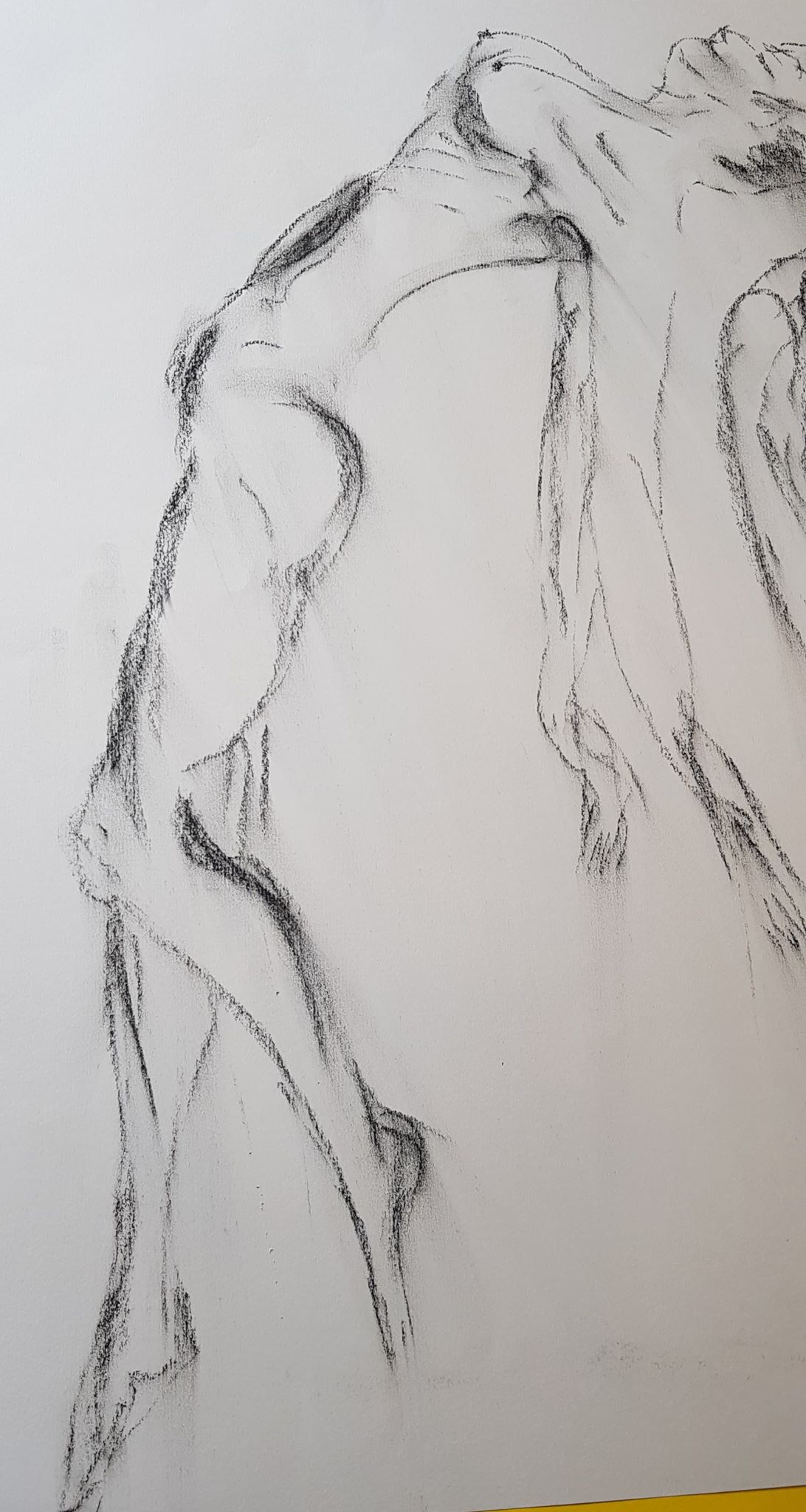
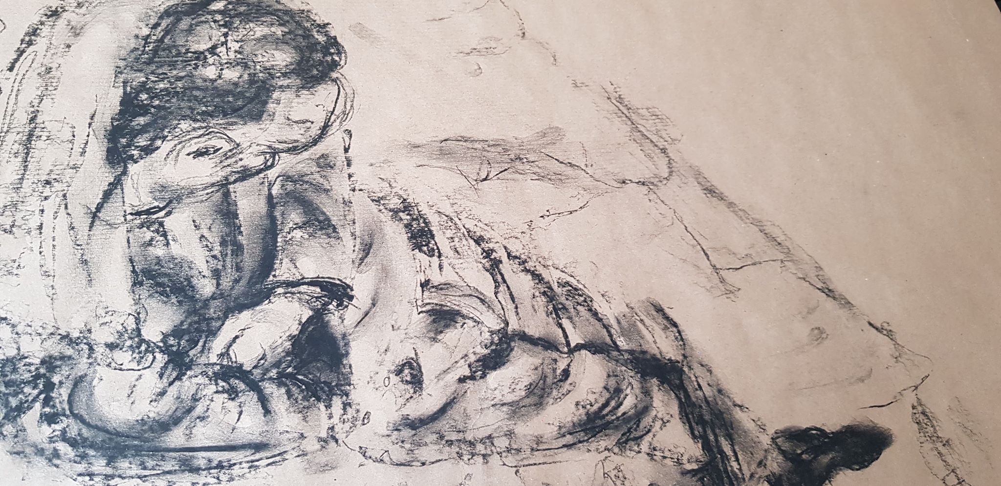
I was using a range of materials at the class – some with a little success, some less so. I used drawing pen, pastel, pencil, charcoal. It was a brilliant educational experience with a live nude model. I got to see others’ brilliant work and ideas. This was then cut short.
My use of charcoal was developing further. At the suggestion of my tutor I started using an eraser to cut into images – this was helping me graduate tone and pick out lighter spots. I was beginning to really feel that using charcoal is about creating volume and shape with light and dark and that outline is barely necessary. I was definitely getting more confident with it.
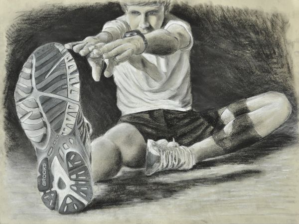
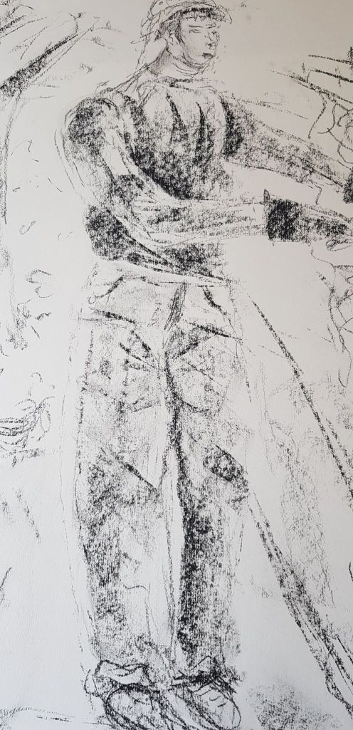
I learnt about foreshortening and enjoyed using it to create interest and focal point. I used this technique in one of my assignment images. Although the image was a bit clunky, the foreshortening did bring something positive to it.
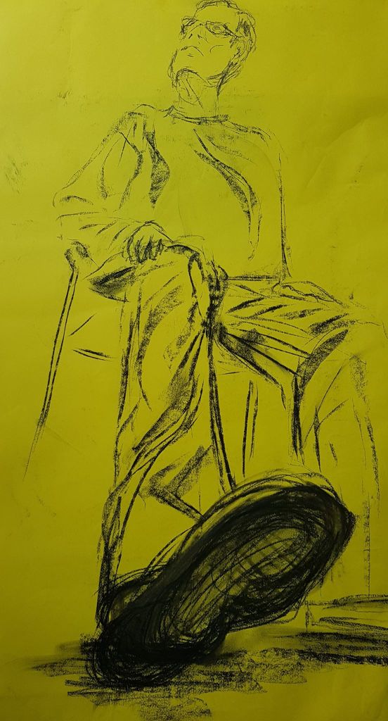
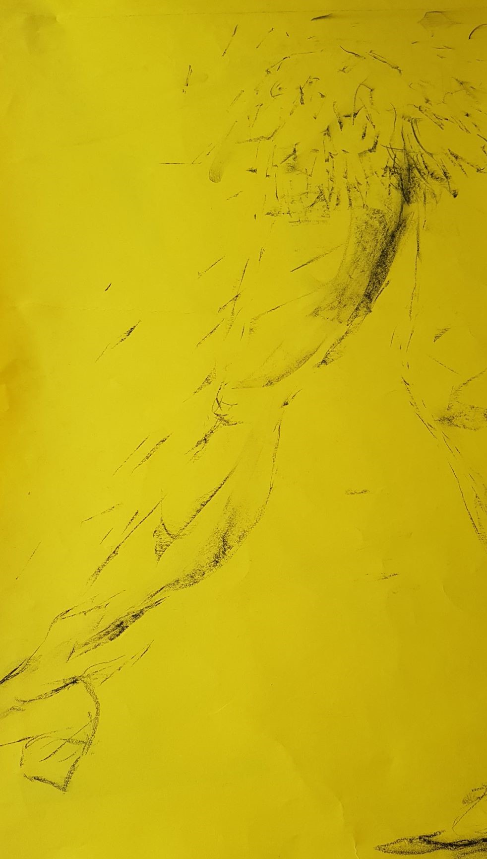
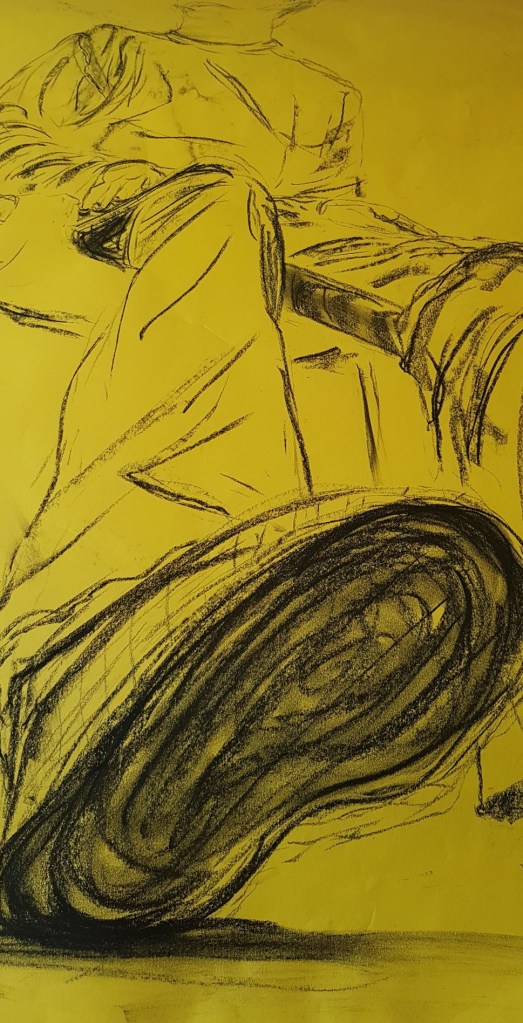
I experimented with using yellow paper. I thought this made the image more dynamic – as a stark contrast to black marks.
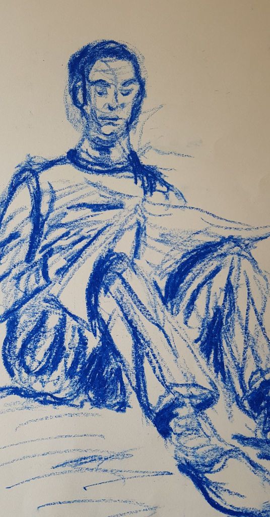
I did have problems with this part. My technical skills need work – my reproduction of human proportions was, in some places, laughable! As demonstrated in the images below. They are not good!
I need to work on my compositional skills – cropping images more affectively. My compositions lack excitement.
I was enjoying the charcoal experience – but now not trying other materials and creating detail in my drawings. I need to redress this, to give me many more means and variety of expression.
I definitely want to try different scale as I move forward as I feel a larger scale would be enjoyable and add interest.