The Corona virus meant I lost the chance to use professional life models for this section of the course. Luckily, I had had 3 months of attending a life class before I started this part.
What needs improvement
Proportion and perspective are so important to creating a believable form. Some of my drawing is off because of this. Some of my images look comical and/or basic. All I can say is that this is a technical skill to be learned and can only get better the more I do.
I did get very despondent about my efforts and did feel rather defeated at points. Looking at others’ work is helpful and motivational when this happens.
I need to work on ideas and experimental work. My compositions need some excitement injected into them. I need to keep using books and the internet for inspiration.
I probably need to reflect more on what different artists and art techniques can give to my own endeavours.
What went quite well
I think my use of tone is beginning to improve. The tonal drawings in the part are probably the more successful. This part of my work has moved the furthest forward. Building tone to create shapes and perspective, rather than drawing lines is beginning to make sense. My tutor suggested using an eraser as a drawing tool and my work really benefited from this.
I enjoyed the research elements of this part and did find the artists I looked at interesting and inspiring. I quite enjoyed writing the research up.
I watched quite a few videos to improve drawing skills. I found these very valuable
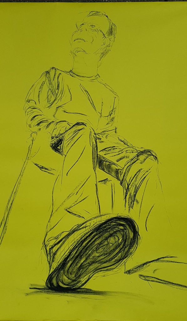
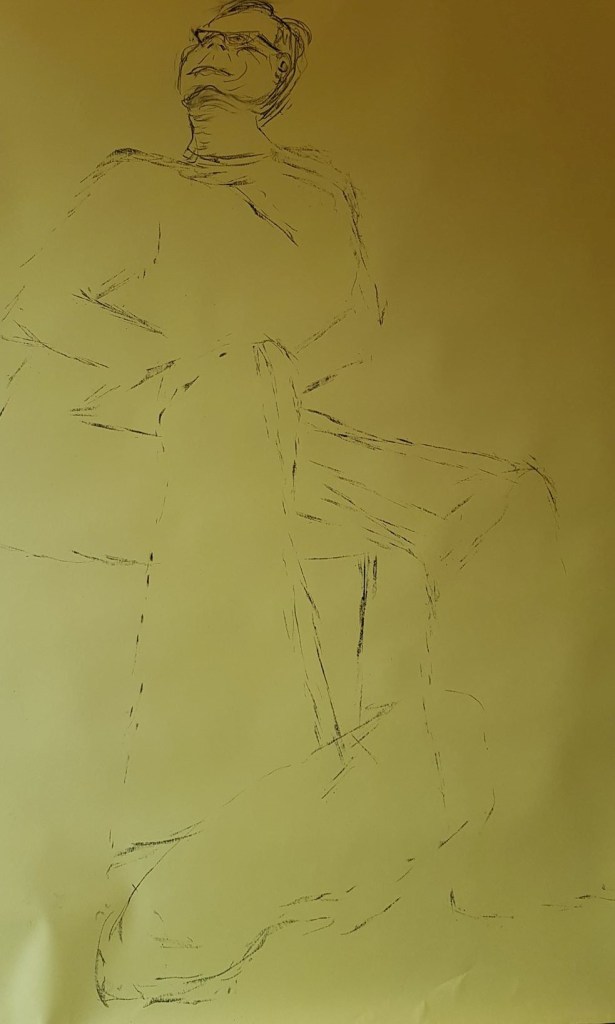
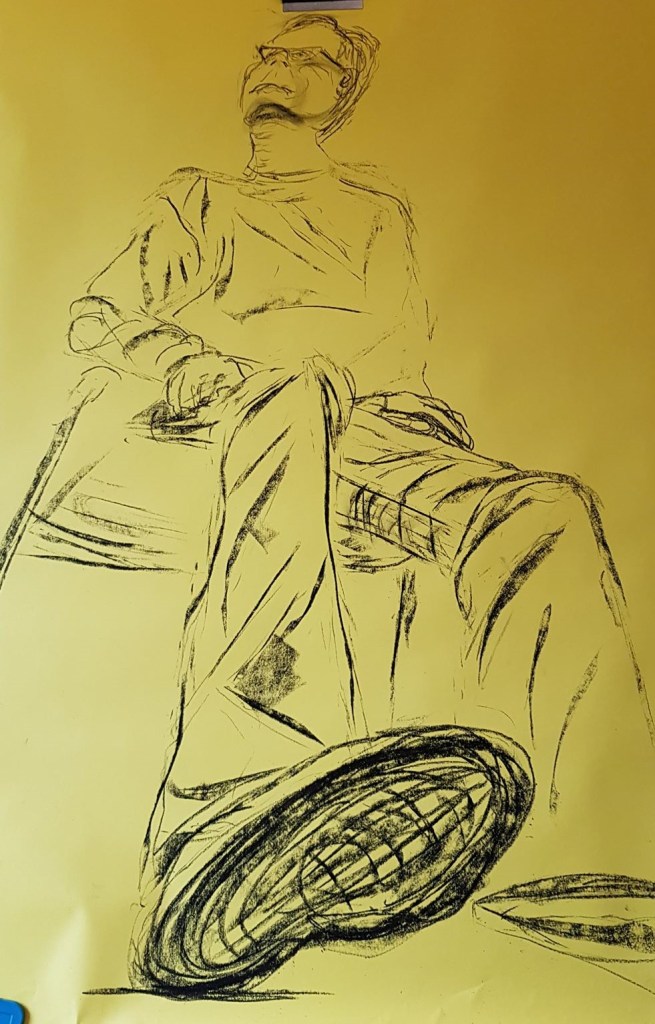
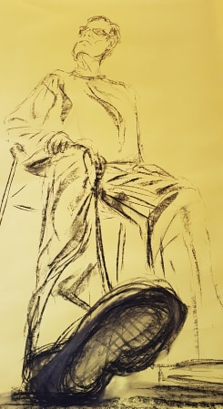
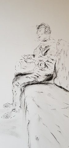
1. Figure Study using Line (A1) – seated model in an upright chair
Final piece number 1 above. Size A1 Charcoal on yellow paper
I struggled to get this piece right and had several attempts at it. All the proportions had to be right to make the image work. Above was probably my best attempt overall, but the head is too big. I enjoyed making the expressive marks but proportion was so important that it encroached on the immediacy of the image. I don’t think the image works well.
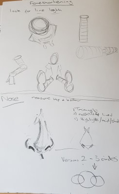
I enjoyed researching the foreshortened images in this part of the course and felt inspired to try this as a technique myself. The foreshortened effect makes images interesting and dynamic. From my attempt here I have learnt that it is not an easy skill to master. One proportion knocks on to another.
I like the black charcoal effect on the yellow background – though it doesn’t photograph particularly well. I had tried the yellow paper with the ‘movement’ part of the course and I had liked it. It gave a punchy image.
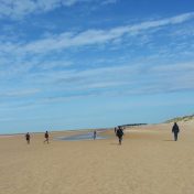
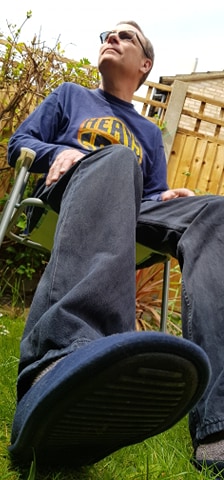
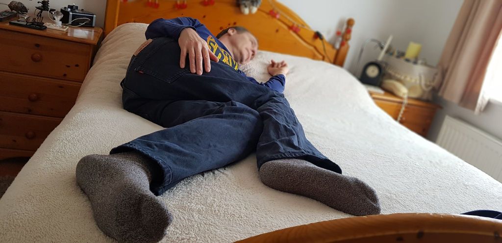
I used photographs as the Corona virus situation means I’m in lockdown with just my husband for company. He has to be my model. I did get him to sit for me for other drawings I’ve done, but he didn’t enjoy it and wasn’t keen to strike a pose. Hence, I had to use photos of him posing. I wanted an interesting image, so thought being on the ground looking up would be a good one. I really liked the foreshortened images of Lucian Freud’s portraits and wanted to experiment.
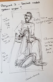
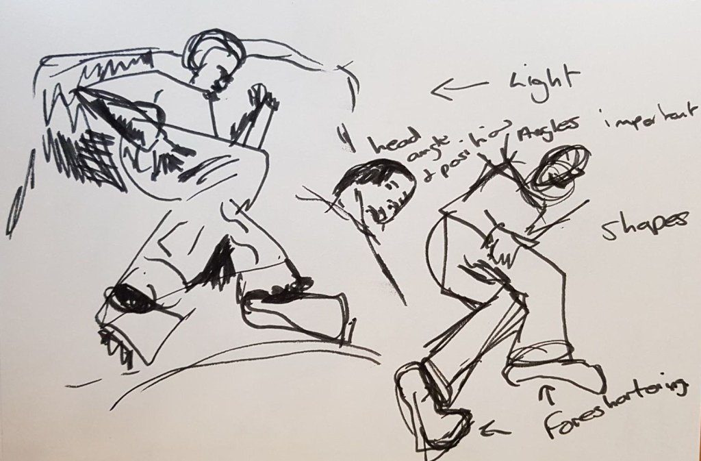
I sketched out the shapes and look of the image in my sketch book (left image above) using fine line. I then sketched out a first attempt and started to use expressive lines to show folds in the clothing
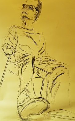
Above are another two attempts. The one on the right is the best images, but was spoiled by the shoe. With the paper I used I couldn’t erase the outline so I abandoned this version.
Id like to repeat this part of Assignment Four again, with a different image and see if I can get a better result. I do find once I’ve had one go at an image I loose the excitement.
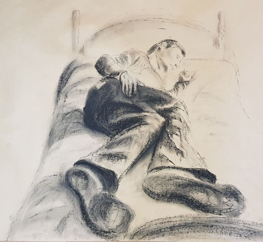
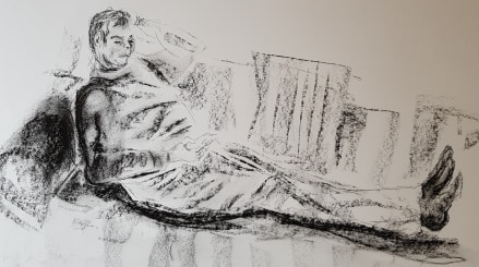
2. Figure Study using Tone (A1) -reclining model
This was probably the most successful image of the three from Assignment Four. Again, I wanted to try a foreshortened image. I had enjoyed watching the video of Anita Taylor, that my tutor had suggested. Her use of charcoal and an eraser to bring the tones up was quite inspiring. My tutor had also suggested trying using an eraser to pick our lighter tones. I found this quite a successful technique and used this in the image above.
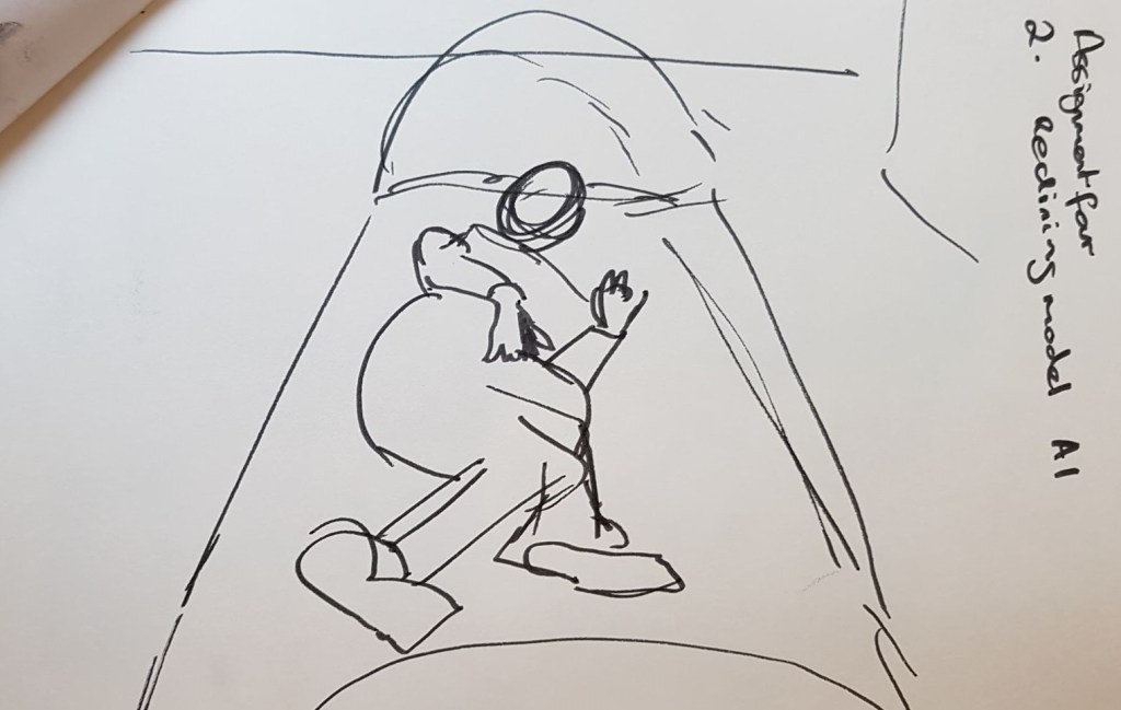
Above is the photo I based the image on. Also, above are tests I did in my sketchbook in felt pen, picking out the shapes of the composition and where the shadow were.
I like the tones and proportions in the image . The foreshortening of the bed doesn’t quite work.
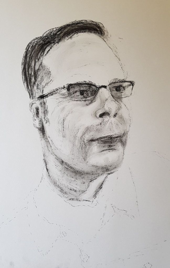
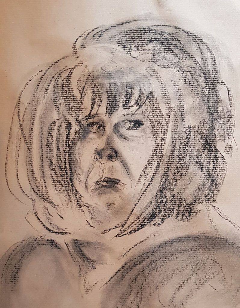
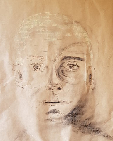
A Portrait or Self Portrait Combining Line and Tone (any size)
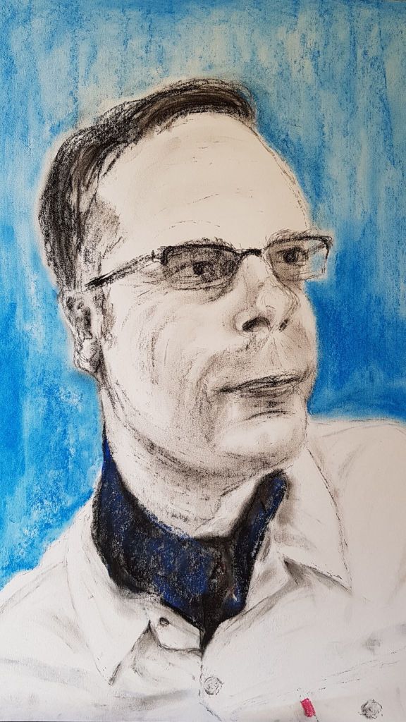
Above, The final piece. 59cm x 42cm charcoal and pastel
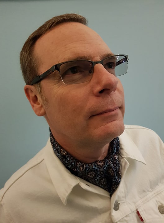
The original photo. Taken in a Victorian seaside hotel in Hastings. I really like the blue walls framing Russell’s face, white jacket and dark blue, patterned scarf.
Av
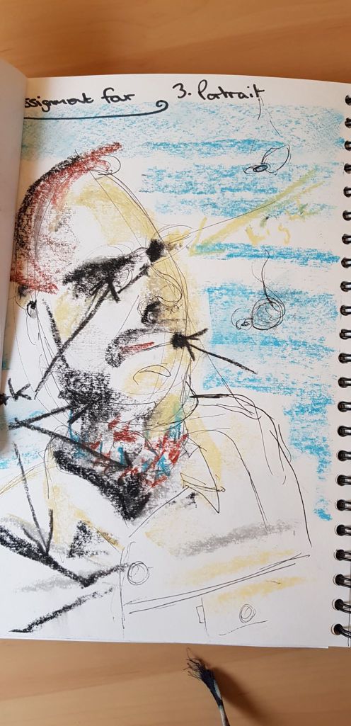
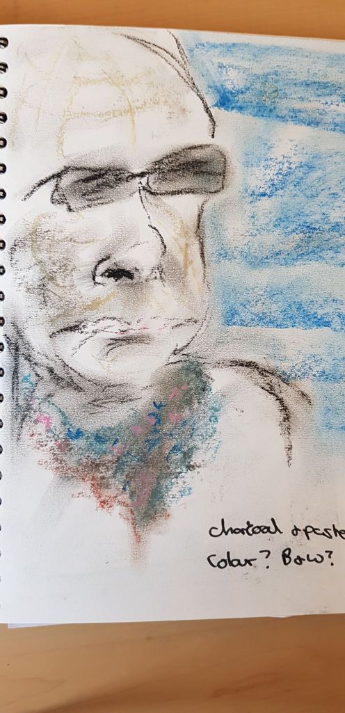
Above are two tests in my sketch book Testing materials and researching the light and shade.
I sketched out the image lightly in charcoal and then started laying down tone and expressive lines. I pulled out white lines shaping the face with an eraser.
The image was reasonably successful, I thought. I liked the tones in the face and the subtle tones in the jacket. I wasn’t sure if I should put in the blue background, but I liked it so much in the photo that I decided to do it. I thought it was ok – maybe it detracted from the face though?
What didn’t work? Well, the angle of the face isn’t right, he should be looking up more. I should have checked the angle more carefully when I lightly sketched the outline. The lips are pursed and don’t look as they should. This is an example of how a small detail in the face can make an image unbelievable. The forehead could have done with a little more tonal work.
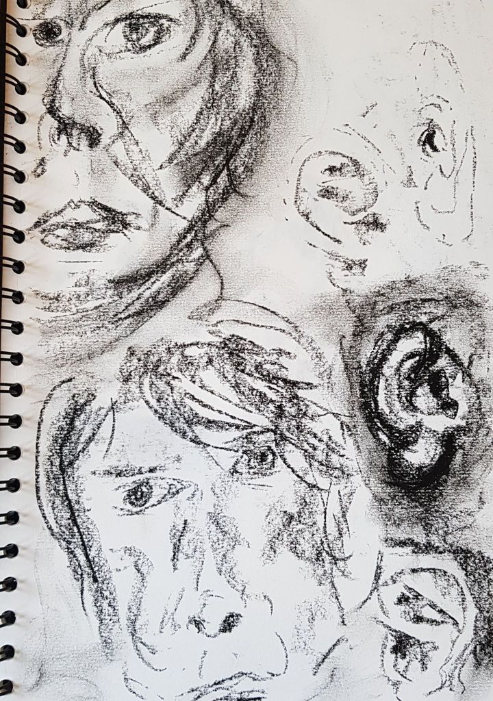
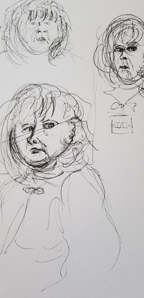
Above: 0.8 Fine liner sketches in an A4 sketchbook
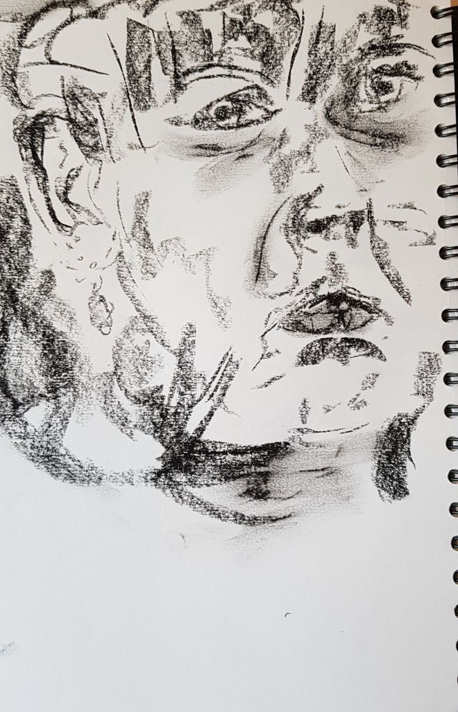
Above: Charcoal sketches in an A4 sketchbook
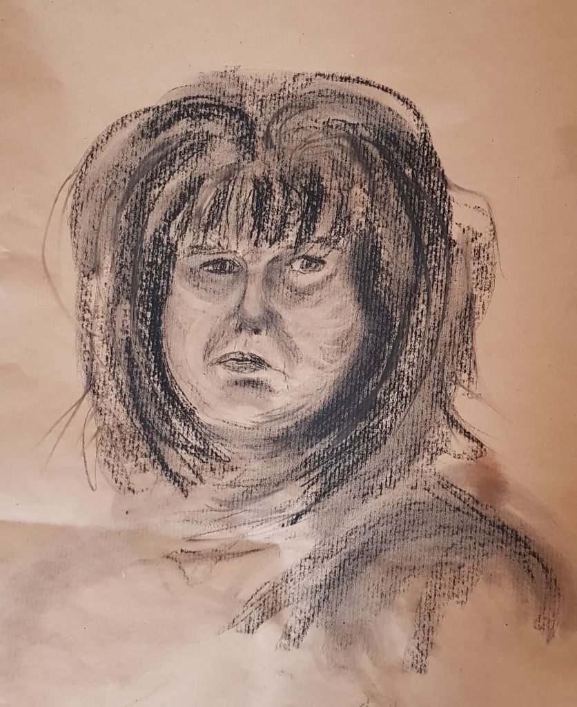
Above: Charcoal on brown paper 60cm x 49cm
I cut into the charcoal with an eraser on the image above and liked the effect. It gives a greater range of tone and gave the image some life. The image was fairly like me, but the mouth is at a strange angle. I look fairly miserable – but I was concentrating!
Above: Charcoal on brown paper 60cm x 49cm
The second attempt above is less successful, but I do like the smudges the eraser adds – it adds interest.
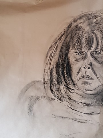
Above: Charcoal on brown paper 50cm x 43cm
I like the attempt above the best of the three. I like that I am half out of the frame as it adds a bit of interest. This looks the most like me. The image lacks the tone range of the first image though.
Exercise 3 – Portrait from the Memory or Imagination
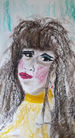
Above: Pastel on white paper 59cm x 42cm
Above was meant to be from my imagination – just looks like me with long hair! It was a bit childlike and basic. I liked the punchy colours though. So I had another go at the imagined face. See below
Above: Charcoal and pastel on brown paper 60cm x 45cm
This was also rather a basic image. A little ghostly, The proportions and almost white hair make the person look like a child. I definitely struggle when I get tired and try to draw too much in one sitting.
Self-portraits could be useful to an artist in a very practical way, to develop skills if they did not have a model available.
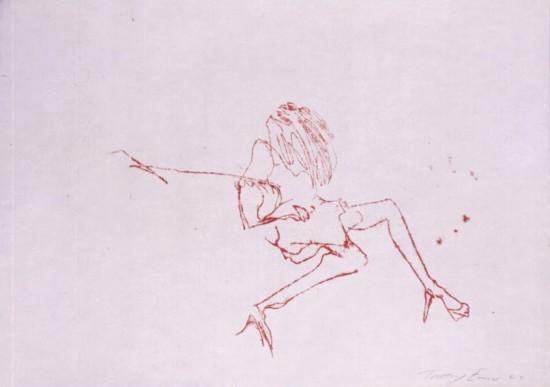
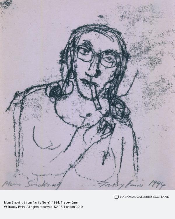
Also, self-portraits are interesting as they convey how the artist may actually see themselves as a person and in a moment. They are a visual way of telling the artist’s story. They are a form of self-expression and self-explanation. Some artists who use self-portraits have done so for many years – so you get an idea of their life story, e.g. Tracey Emin.
Above: Rembrant self portrait with 2 circles 1665 to 1669
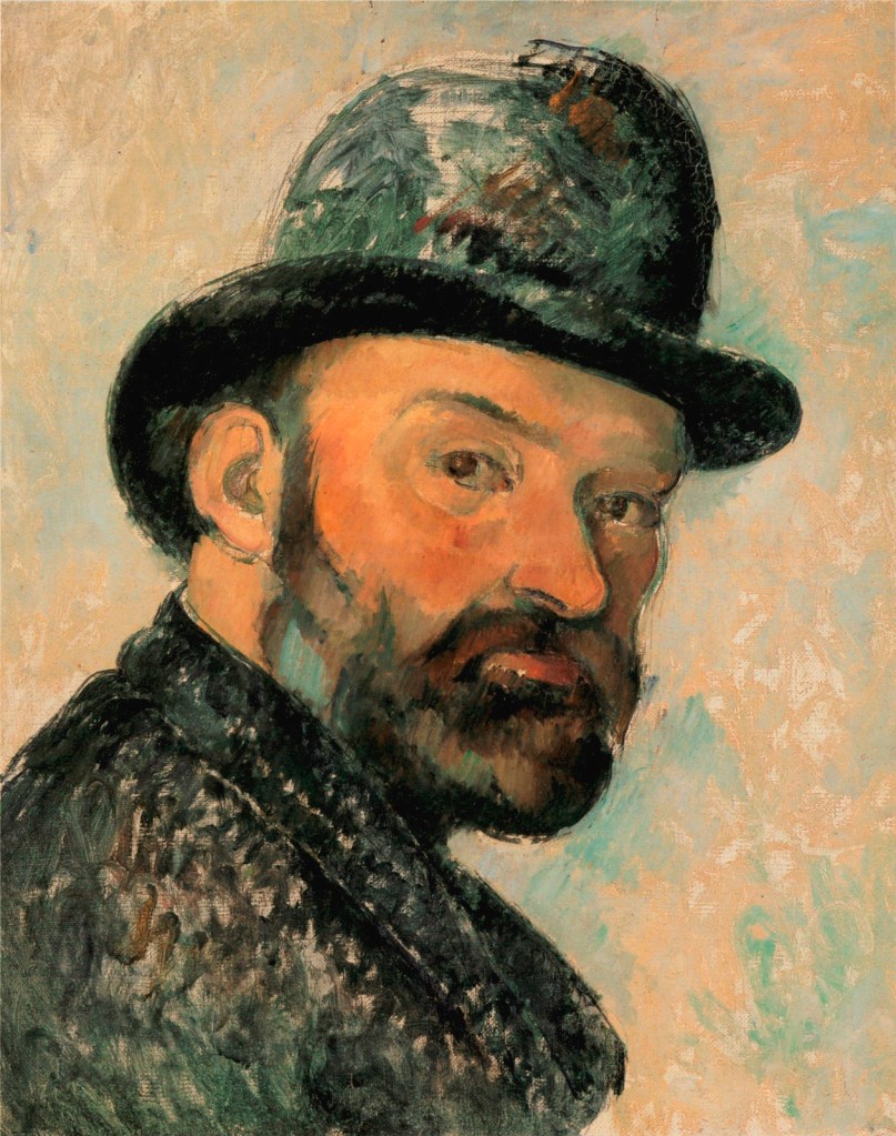
Above: Cezanne 1885 1886
Above: Vincent Van Gogh Self Portrait 1889 1890
PPo
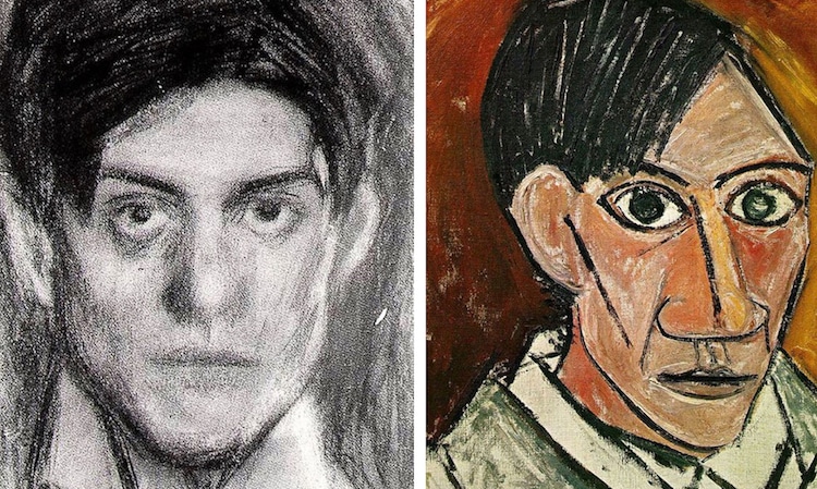
Above: Picasso early 20th Century
Above: Tracey Emin Left to Right: Me at 10, self portrait
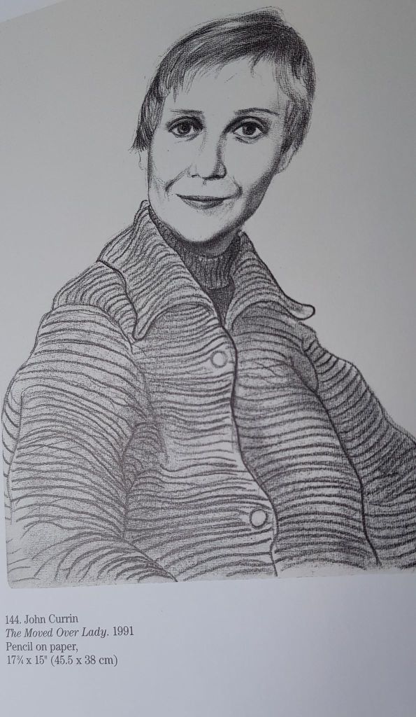
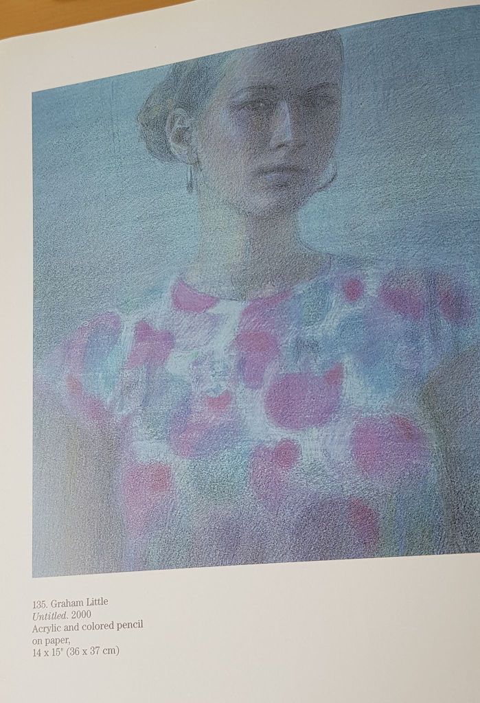
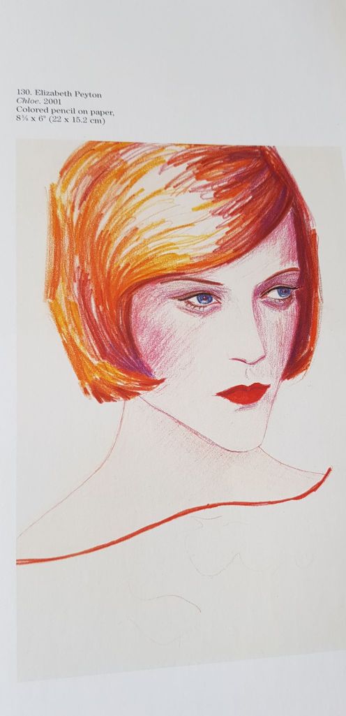
Above, left to right: John Currin, The Moved Over Lady, 1991 (pencil); Graham Little, Untitled, 2000 (Acrylic and coloured pencil); Elizabeth Peyton, Chloe, 2001 (coloured pencil)
I lIke the simplicity and colour of Elizabeth Peyton’s image above.
Portraiture is a very old art form and developed out of a need to represent and save people’s images for history, before photography was invented. Portraits are the only resource we have to get an idea of what historical figures actually looked like.
Before photography, people who could afford to pay an artist, would have their imaged created to promote the sitter’s virtues. For this reason, portrait artists used to lean towards flattering their client, to keep their commissions. So the older works we see may be on the kind side
Photography (in part) changed the direction of drawn and painted portraits. Portraiture was no longer the only means to record people’s likeness. Photography also became available cheaply to all.
This allowed artists to develop portraiture in new directions. Portraits of ordinary people, interesting people, friends and family. Portraits could be more realistic. They could also try and convey more thoughts and feelings about the sitter, the artist and the reason behind the desire to reproduce the person.
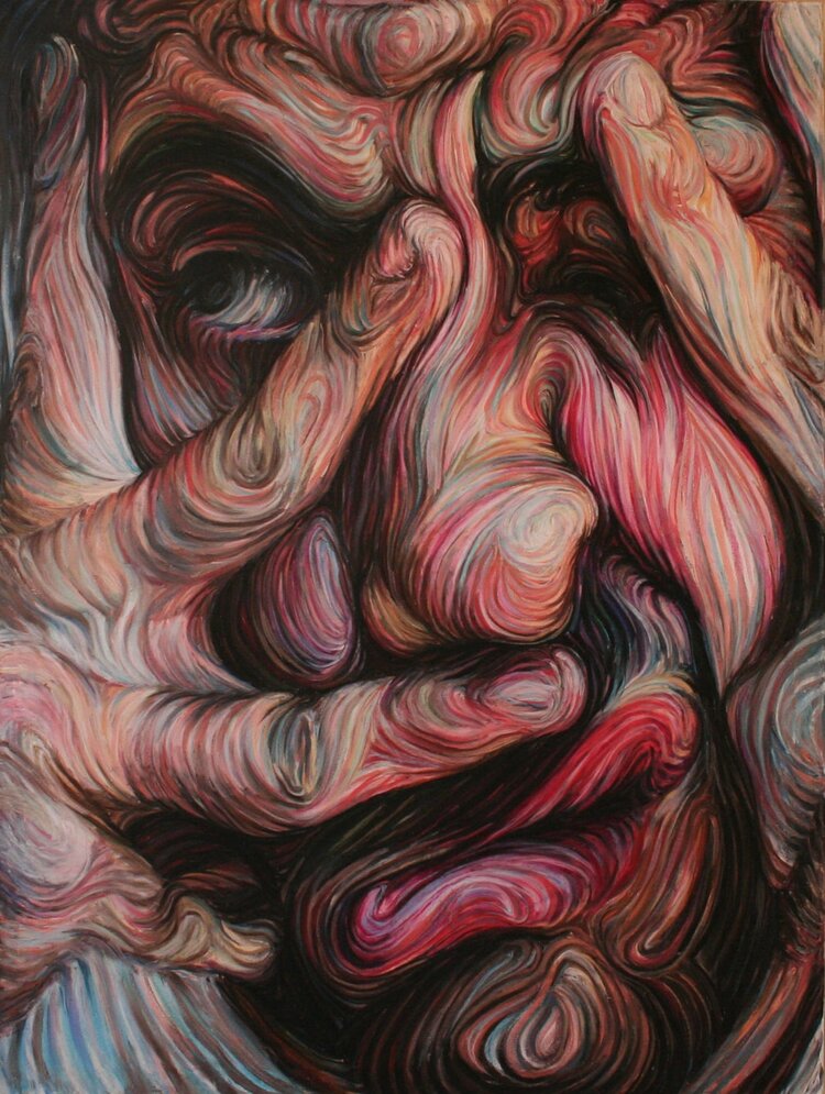
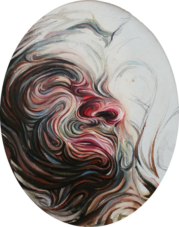
There are as many styles of portraiture as there are artists. I have included some examples of very different styles. These different ways of working can help my own attempts, as I can see that no particular style is right or wrong. All the examples convey the sitter effectively.
I loved the scale of Anita’s drawing and her use of charcoals and eraser. I would enjoy working at this scale. I would need a different workspace to be able to, as I currently only have a corner in my living room.
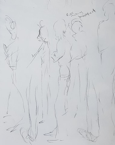
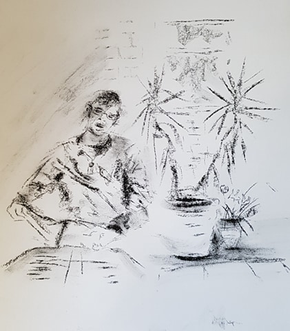
I did very quick line sketches of husband making breakfast in my A4 sketchbook . Very hard to keep up with movement. I could hardly look at the paper at all. All I could do was make quick marks – but I think this does show movement of the figure. This reminded me of the images I’d seen by the artist my tutor had suggested I research, Jenny Saville.
Below. Two figures on yellow paper, Charcoal. both 62cm x 47cm
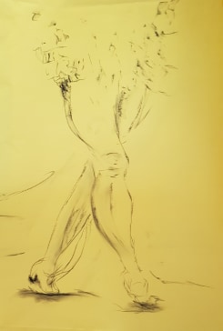
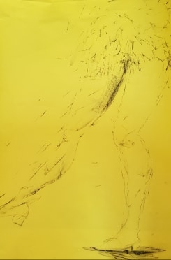
I was quite pleased with the two figures below. Though photographing yellow paper for the blog hasn’t come out well. I found some old black and white footage, online (Shutterstock), of a girl dancing to the Charleston, probably back in the 1920s. I freeze-framed the footage until I came to frames that showed movement, but were clear to see and jotted the lines of movement down with charcoal. I gave a suggestion of form of the legs and clothing, but didn’t go in to detail – this was quite a pleasing, transient effect. I just hinted at the direction of the beaded skirt. The shadow of the shoe, not meeting the gound, showed the foot was still moving. I drew a few directional lines around the figure to hint at direction.
Exercise 2 – Groups of Figures
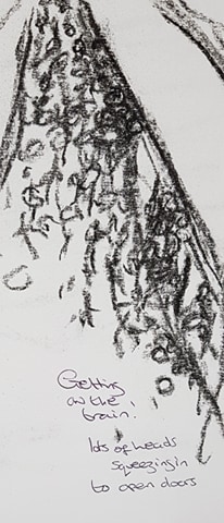
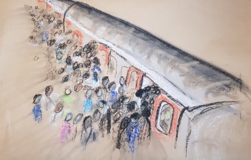
I found some film of people piling onto a train on London Underground. I made very quick charcoal sketch in my sketchbook to get a feel of the direction and movement of people.
I liked the crowd movement this sketch suggested, so I decided to draw a bigger version on brown paper, 48cm x 60cm, using charcoal and pastel
I was quite pleased with this. I kept the figures vague, hinting at clothes and expressions, but showing heads being squashed in the doorways of the trains. I smudged some blurry lines in the pastel on the left of the picture to hint at the direction of the crowd.
I quite enjoyed the moving figure exercises. I like that they are transient and fleeting and I can hint and suggest form and action. I drew a few more examples of movement, below. Images taken from freeze framing film.
Above: 60cm x 50cm Charcoal on brown paper
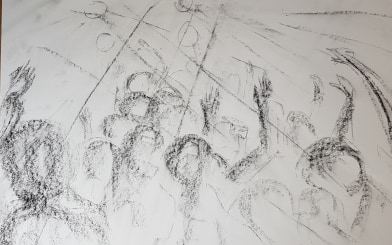
gig crowd 42cm x 59 cm white paper
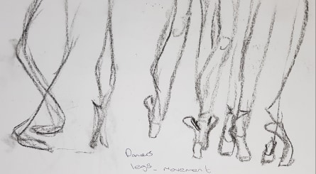
ballet legs Sketchbook – charcoal
Perhaps I should do some more work with transient forms – I enjoyed this.
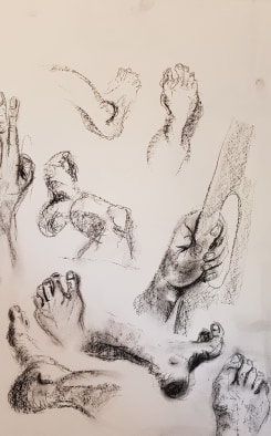
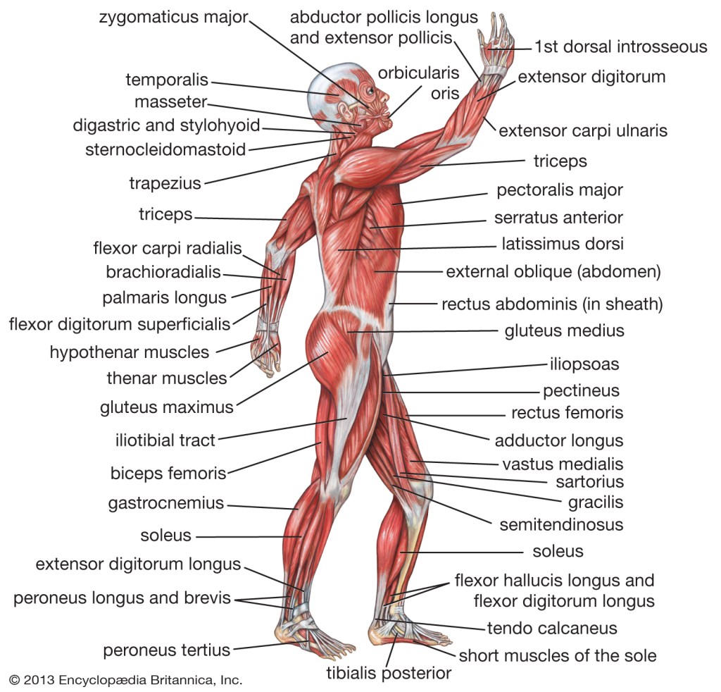
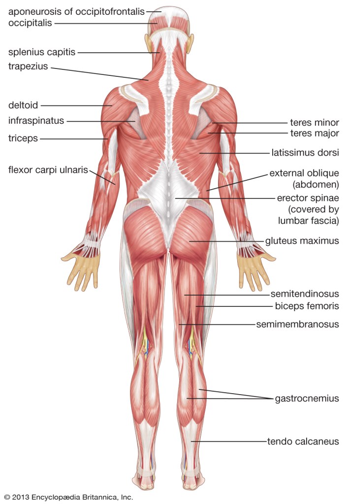
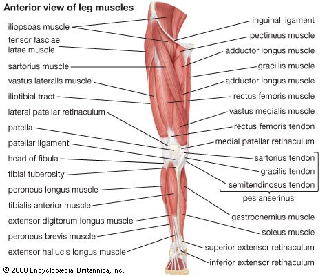
I researched the internet to find various images of the different structures of the body and found loads of material. I also found many on-line tutorials for drawing different parts of the body.
Below are sketches I made in my sketchbook with pencil, charcoal pencil and charcoal sticks.
Below are charcoal sketches of my own body, on larger sheets , 59cm x 42 cm, white paper
Drawing the structures of the body is a real challenge. This is because, as humans, we are expert at looking at the human body, errors in proportion and shape easily make a drawing comical or unbelievable. I can understand why artists have spent so much time in history trying to perfect the art of representing the human form – it is so complex! Anatomy is definitely a whole branch of drawing studies in its own right. Years could be spent on improving skills in this area – as Leonardo di Vinci realised! But with these skills behind an artist, it makes creating images with people in them so more effective – if a realistic image is what is sort after.
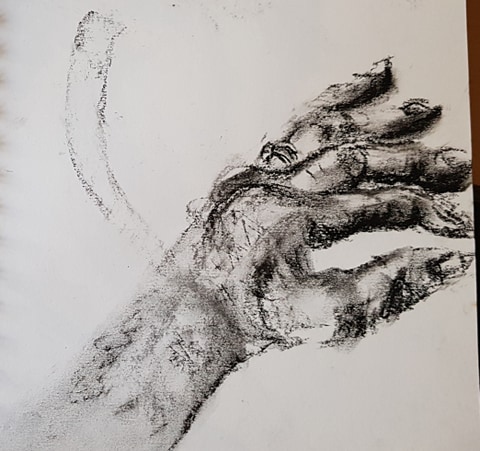
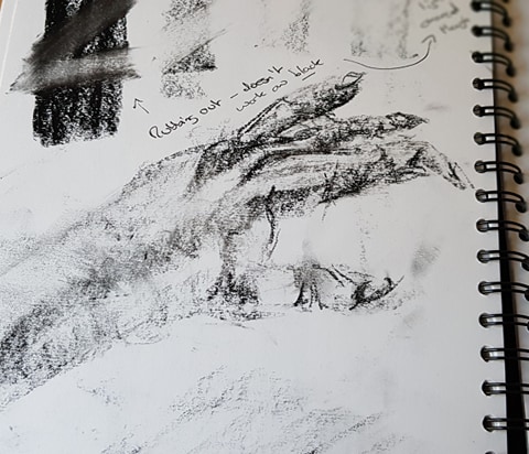
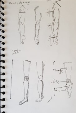
I found on-line tutorials very useful. The tips for drawing very specific parts of the body were helpful indeed.
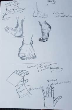
For example – to draw a hand; one tutorial advised to draw a square with a triangle on one side. Fingers are a string of 3 sausages, thumbs a string of 2 sausages.
Another on-line tutorial advised that for feet – draw a 3-D wedge – draw a semi-circle at the front and at the back edge of the wedge.
See below – these tips were fairly effective I thought. In the life drawing classes I had attended; feet, hands and faces were particularly difficult to re-create for many of the group.
The conclusion of this exercise is that drawing form needs constant practice.
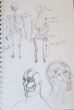
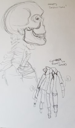
The detailed drawings of skeletons were very difficult indeed. My images were disappointing and childlike, even by copying – but, I could see the proportions were wrong.
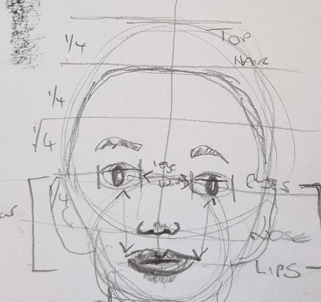
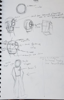
I printed off a very useful chart of body proportions to try and help.
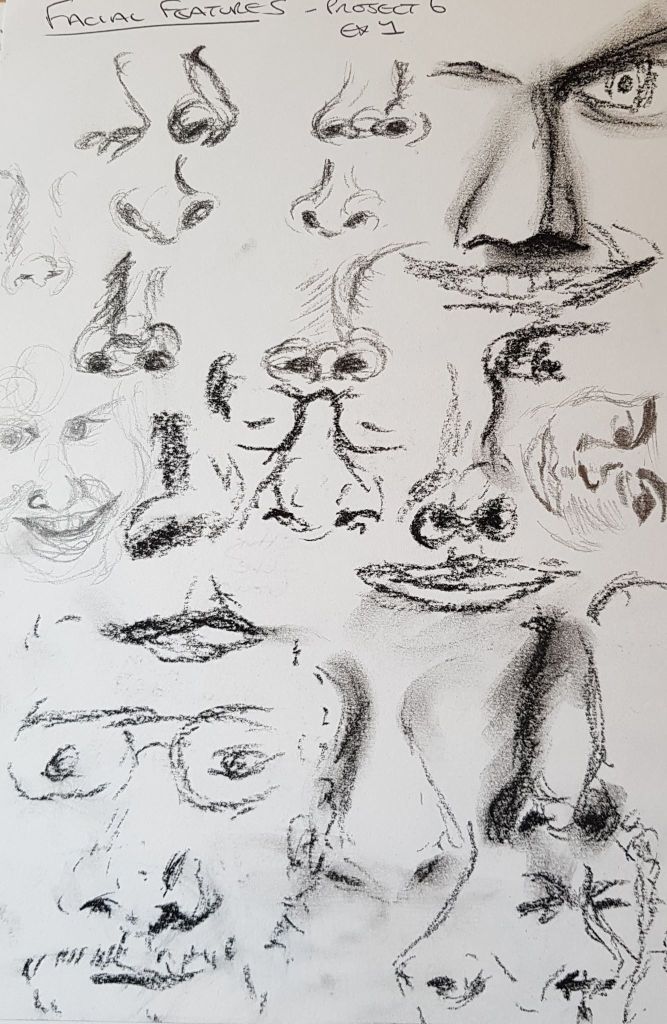
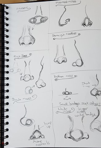
I also followed an on line tutorial for noses. It advised to draw 3 intersecting circles and the proportions and placement of the circles formed the basis of the nose types – see the images in the sketchbook studies near the top of this page.
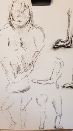
Exercise 2 Three Figure Drawings
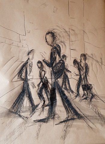
This did not go well for me at all. As the UK was in lockdown (and still is at the time of writing this) when I did this part of the course, I no longer had the professional life models available to me (see my blog entry on High Wych Life Drawing Class). I tried to draw my husband, but I found it hard for all sorts of reasons. The stances aren’t posed, so are rather uninteresting. As they are clothed, the definition of the body isn’t there to see. I didn’t compose the pieces well. As lighting wasn’t definite, like it would be in the classroom, I lost the ability to find tone properly. The proportions are all wrong. My skills weren’t up to the challenge! Also, it was awkward asking poor husband to do something he wasn’t keen to do for a couple of hours. I felt very disappointed and deflated by the results. Given time, I would like to try this section again. I would possibly use on-line, posed, images
The image above (sitting) is possibly the most successful of the three. The proportions are probably the closest to what they should be. In the other two images, the heads are way too small. The tonality and foreshortening of the above image are a bit more on track. I quite like the tilt of the head (permanently looking at the phone!). The slightly more pleasing image of the three – but a long way from inspired.
Another seated figure image is below. I quite like the tonality of this version, Its not too overworked but the figure is rather 2-D.
The above four images are all charcoal on white paper, 42cm x 59cm
Below are some images from the internet that will be useful for future drawing projects:
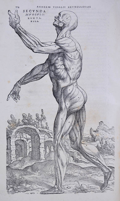
Art and Science have always been closely tied within the study of anatomy. For thousands of years visual representations of the human form have been made for the study of medicine and for the study of aesthetics. Artists have shared the need to explore and understand what makes human form.
The studies on human anatomy by Galen (129 – 216 AD) formed the basis of a good proportion of the western world’s understanding of human form, biology and medicine for over a thousand years.
Also, the studies of mathematician, Vitruvius (died 15 BC), concerning perfect proportion of buildings and of representing the human form, resonated in the Renaissance. This is indicted, for example, in the studies of Leonardo Di Vinci.
Leonardo (1452 – 1519) is quoted as saying “isolate each bone of the animal, on this add its muscles, then clothe all of it with its flesh”. He carefully and prolifically studied human bodies with an aim to create better art.
In the 18th century William Hunter (1718 -1783) was the Royal Academy’s first professor of anatomy. He would make plaster casts of corpses at various stages of dissection. His interests were with medicine, but also in art.
Art, medicine, anatomy and dissection have a dark side. As well as the subject itself being rather macabre, some of the people with interests may have come about their deceased bodies in underhand ways. Di Vinci and Hunter have both been in the spotlight for this practice. Subjects for dissection had also been deceased law-breakers. In recent history some anatomical works have been the result of war crimes. The display of anatomical drawings and other representations of human beings is sometimes controversial for these reasons.
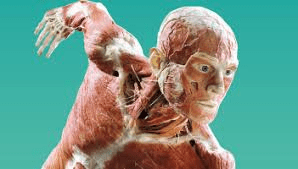
Dead dissected bodies with skin removed and showing dissection are called ‘écorché’ figures.
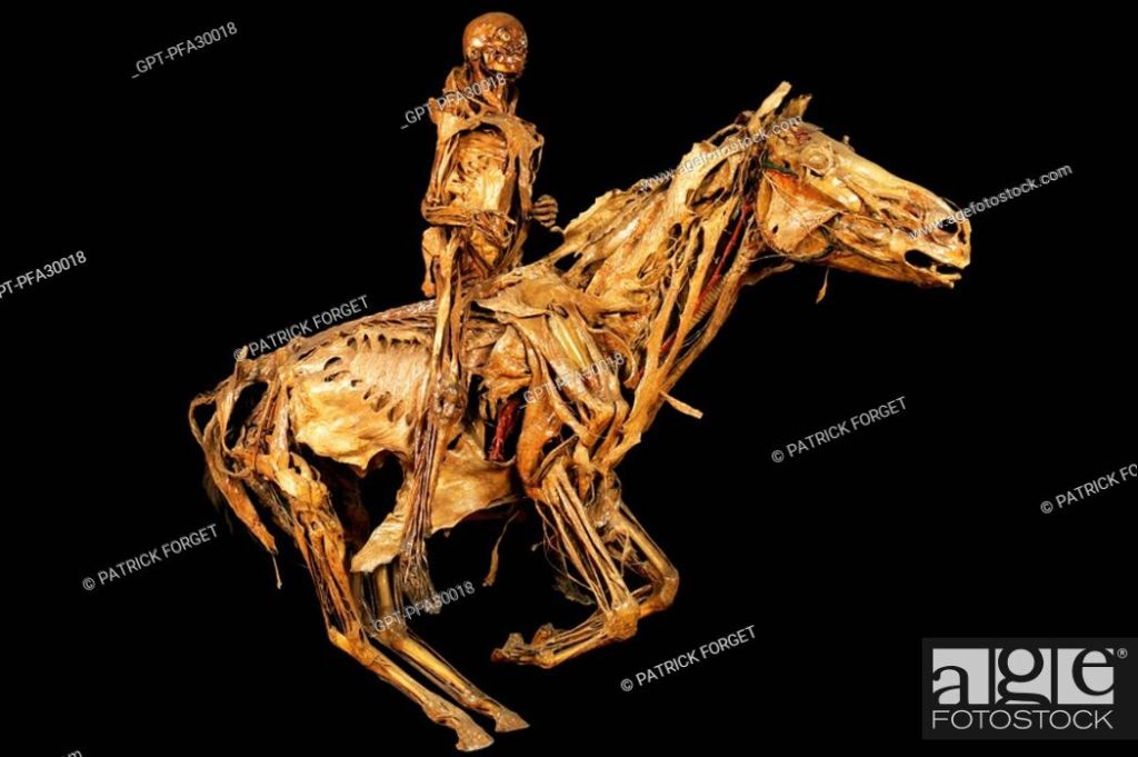
THE HORSEMAN OF THE APOCALYPSE, ECORCHE BY HONORE FRAGONARD, LATE 18TH CENTURY, FRAGONARD MUSEUM, NATIONAL VETERINARY SCHOOL OF ALFORT, MAISONS_ALFORT, VAL_DE_MARNE 94, FRANCE
Honore Frangonard would dry his subjects, inject them with wax and varnish them.
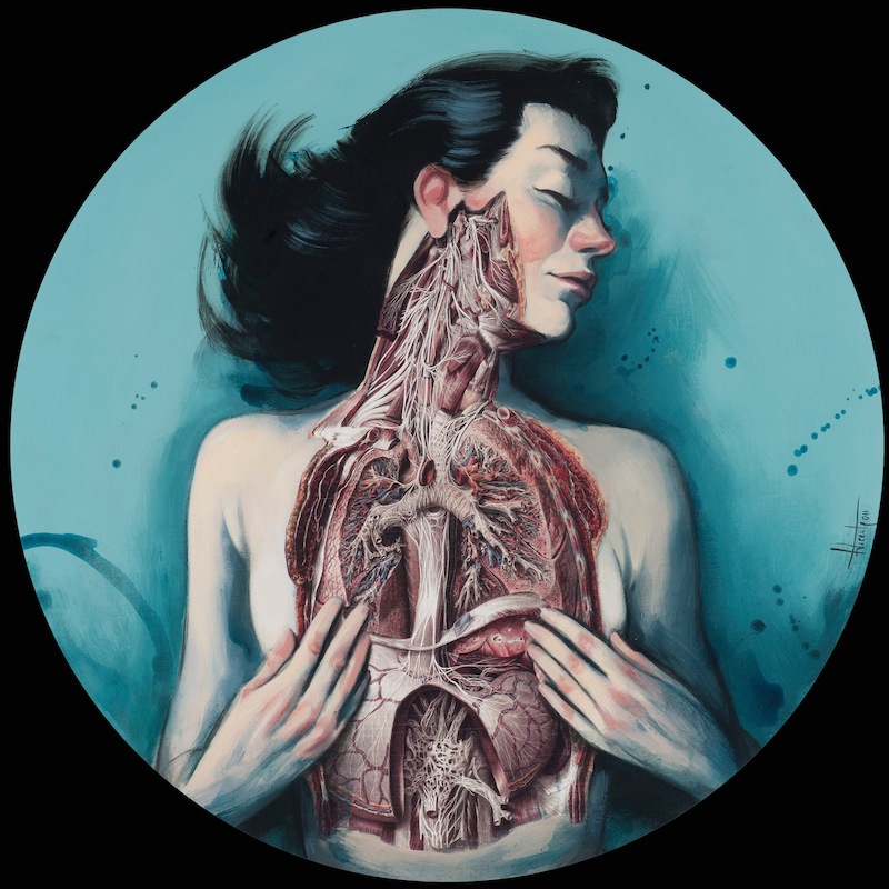
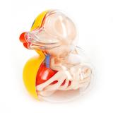
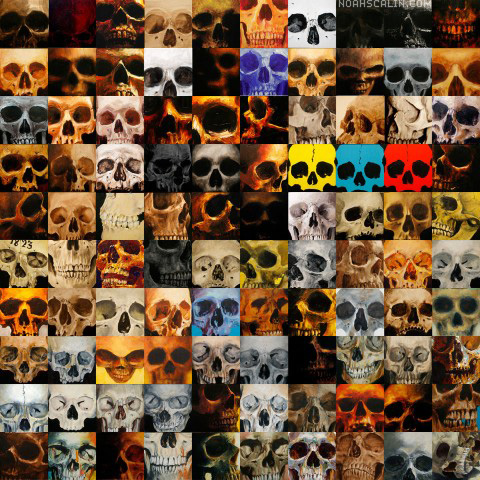
In contemporary society the interest in dissection and the workings of the human body is still of great interest. Many artists return to this theme. The very interesting website below takes you to many artists who make work with the body, anatomy and medicine being the central interest.
Below are some examples of contemporary artists using anatomy at point blank range!
Clockwise from top left: Cordis 60×40 Watercolor and Ink on Paper 2011 Vesna Jovanovic; Danny Quirk Girl Back; Fernando Vicente, Venus; JASON FREENY Rubber Ducky; NOAH SCALIN 100 Painted Skulls;
The general public are still hugely interested in this subject. Hence the great success of ‘ The Body Worlds’ exhibition. This current exhibition is full of ‘ecorche’ figures. This exhibition echos the interest in the 17th century public dissections that used to take place in anatomical theatres for entertainment and learning.