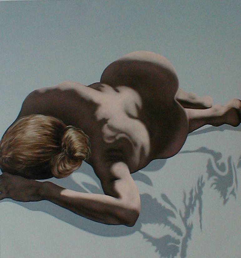
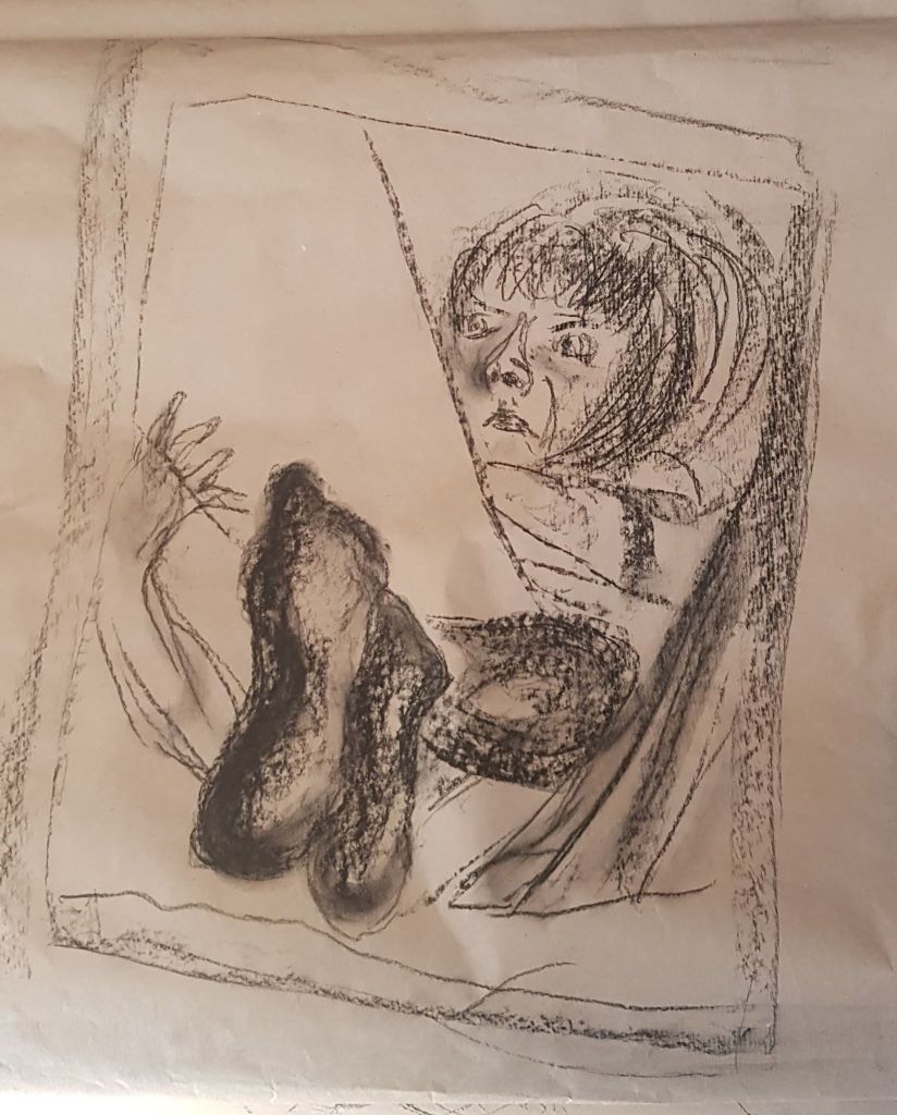
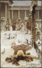
Clockwise from top left: Caravaggio, Supper at Emmaus (in part) 1601; FORESHORTENED NUDE JAMES GWYNNE; Lucian Freud, Reflection With Two Children Self Portrait; Sue’s feet, by me April 2020; Saint Eulalia exhibited 1885 John William Waterhouse 1849-1917
artist unknown
artist unknown
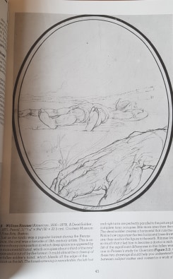
Clockwise from top left: William Rimmer, A Dead Soldier, 1871 (taken from Experimental Drawing textbook, Robert Kaupelis); Next two images – artists unknown; Mourning Dead Christ- Andrea Mantegna, c. 1475
The naked figure in artistic practice has been with the human race for many thousands of years. It is however, a controversial subject.
On the one hand, a naked model is timeless, without culture or creed and without location. The naked model is ourselves, as we are born, without distraction. A neutral reflection. Something to ponder and consider. As it is ourselves, its attractive to us to want to model it, to reproduce it artistically, to tell a story with it. We are interested in ourselves – that is human nature.
On the other hand, some (many) human cultures have developed ideas that nudity is sinful. Nudity is then seen as a sin and opens society up to the possibilities of shame, exploitation, pornography, misplaced sexual desire and ultimately, God’s displeasure. I think this may be something to do with fertility, reproduction and family being guided by religion as a moral compass. This attitude to nudity and sex may be a type of (possibly misplaced) human brain safety net, an attempt to keep order and control within family life and communities. To stop, what would be considered, chaos. Religion has been and still is for many, a strong guiding force in human development.
The above two ideas often oppose each other and do not sit comfortably together, as many societies have moved through history. However, the above two ideas have often co-existed, in the same time frame, in western society.
Much moral confusion exists when artistic practice uses the idea of the neutral human form and is actually seen to depict and promote ‘sin’.
Much of the position with what is an acceptable image does depend on the moral compass of society at that time. As an example, existing nude sculptures were covered with strategically placed fig leaves by later society.
However, some artistic work has been felt to hide exploitation under a veneer of ‘highbrow’ and acceptable, especially in relation to women. In very recent times the ArtActivistBarbie movement has highlighted this. Led by Sarah Williamson, Barbie dolls have been left next to works of art in galleries that are felt to be, as Mary Beard (a Classics Professor) described ‘Soft Porn for the Elite’.
It’s a difficult subject, as should the natural human body to be constrained by moralistic views that don’t allow expression? However, these moralistic views may help prevent exploitation of the subject of the art. Over-bearing morals and exploitation seem to be at opposite ends of the see-saw.
To help me on the course of study, I joined a local life drawing class that I had seen asking for new members via Facebook. I was quite nervous at joining the group, as I realised I would be interacting with people in ways that may feel a little uncomfortable to begin with. Firstly, I was joining a long-established group of people – always a bit tricky. Secondly, I was going to interact with a nude person. So, two levels of discomfort! I had drawn nude life models before, but very rarely and a long time ago. Nudity is not the default state in our society – it’s something kept behind closed doors, in privacy. When another person is present and nude, it is often with a sexual context (or at the Doctor’s!). However, it is also how we are born, how we are naturally and who we physically are under the clothing – we are just a human body.
When the model disrobed, I could feel her vulnerability. 25 pairs of eyes were on her – male and female eyes, young and old. I wondered if she was cold. I wondered if she was embarrassed. I wondered if she enjoyed the experience. Whether she did it just for the payment? Was she bored? I wondered what the others in the room were thinking. So, my feelings revolved around my own mild discomfort and my wonder, at what she and others were feeling. It was quite an intense start.
As the process of drawing began and over the subsequent weeks, the situation became much more relaxed. The wonder left, replaced by studying shapes and form. I began to understand that life drawing is partly about physics, maths and biology and not just about feelings – feelings about the situation and the model. You measure, you consider gravity, light, dark, flesh, bones and sinew. I did find emotion as I drew models, as you have to look at them for so long there is an element of care for them in the act of drawing. You appreciate their time and discomfort for your benefit. You admire the curves and lines of their body as a beautiful, shared thing. I found making the process quite a detached at the beginning of a session (measuring, shapes etc) helped me cope with the initial vulnerability of the model (and myself in that situation) – but after a number of minutes the emotion would be allowed space.
I actually, ultimately, found it harder to draw people I know. As, having proper relationships with the sitters made discomfort come from embarrassment of asking them to do something for you, that is strange to them. Staring at someone who isn’t a paid, experienced model is a little disconcerting for both people. Nude poses were out of the question with someone familiar, as there is a feeling that it changes the rules of a relationship with the known person.
With a person I knew it was far easier to make casual sketches of them doing things they normally do, such as sitting on the sofa reading, watching TV, sleeping or eating. But the emotion of care did kick in during the process more easily, as I knew the faces, bodies and what makes the person tick so well. I don’t know that this made better drawings though – as it was too easy to stop looking as closely and stop making more accurate shapes, as you draw what you think you know rather than what you actually see when the object (person) is so familiar.
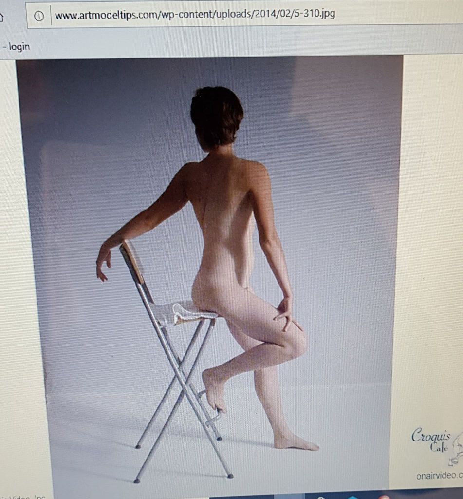
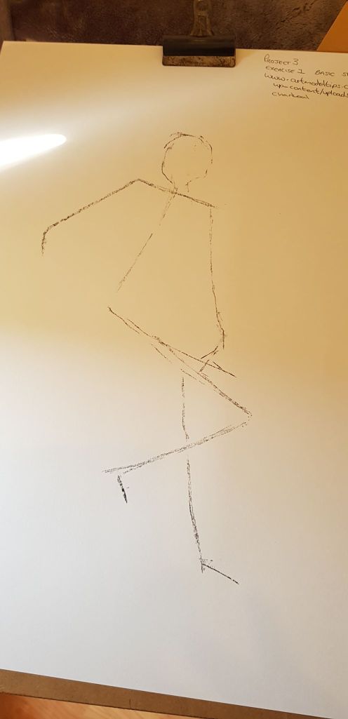
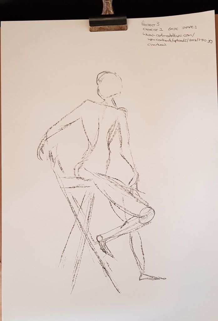
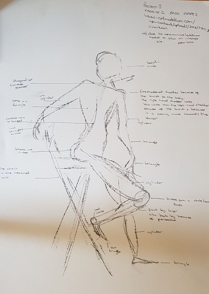
I found drawing the body as axis lines and shapes very helpful and seemed to improve my image. I was hindered in this exercise as the model was photographed (2D) so I couldn’t move around her for alternative views. Below is a screen shot of the website I was using.
Below shows the development of the drawing of shapes. Looking more closely at this drawing, compared with the image, I can see I should have dropped the line of the shoulder to a different angle. The far shoulder is at too steep an angle.
I annotated the image (below) to show the axis shapes and measuring unit (the chair)
59cm x 42cm white paper charcoal
Exercise 2 -ESSENTIAL ELEMENTS
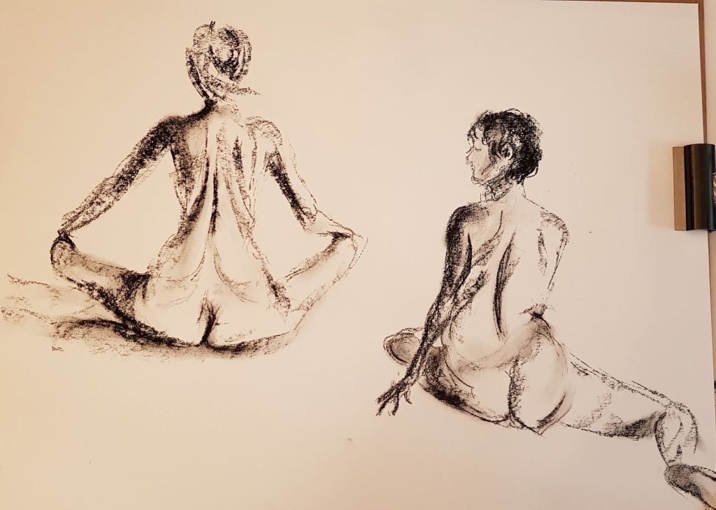
Again, all the images below were taken from the website. Each model has many different photographs in many poses, so this was helpful to this task. I tried to use better defined tone and this is beginning to become a little easier. Though, the areas of tone do still look like stripes. I’m trying to do less outline and used tone as the main marks made – building the form from within – this seems to work better for the charcoal medium. To keep proportion while building tone does require some light margins to the body shapes to be made, using axis and shapes has proved very helpful. Trying to put a spot mark measure of where limbs ended also helps when limbs move away from the form central axis.
42
42cm x 59cm white paper charcoal
42cm x 59cm white paper charcoal
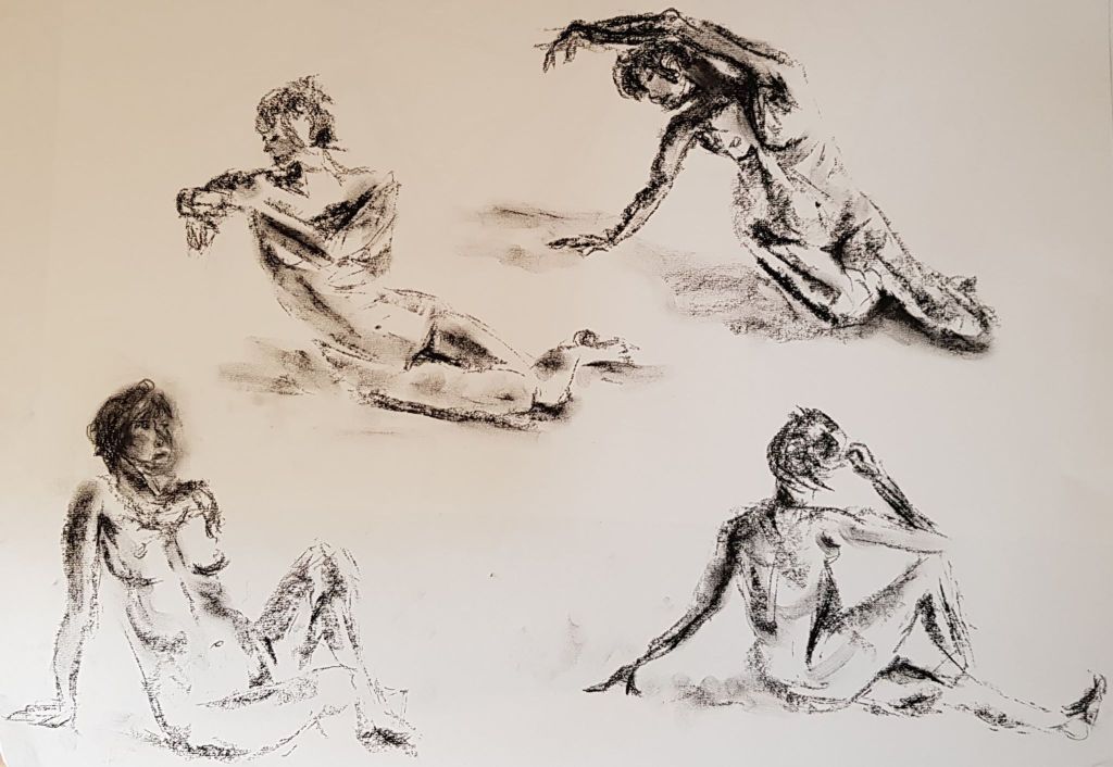
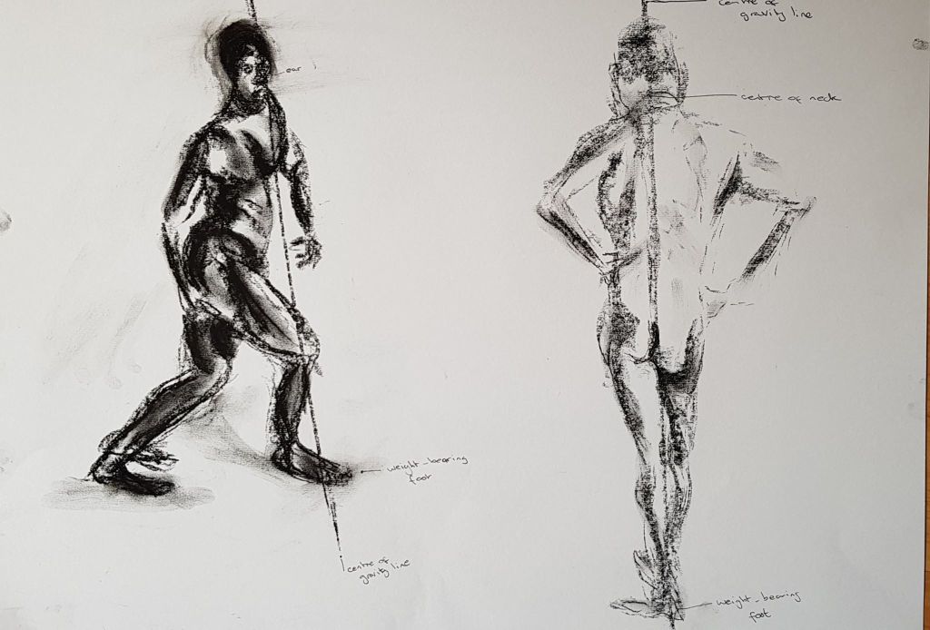
Exercise 3 – STANCE
Lines on the images below indicate where I think the body mass is placed with these models.
42cm x 59cm white paper charcoal
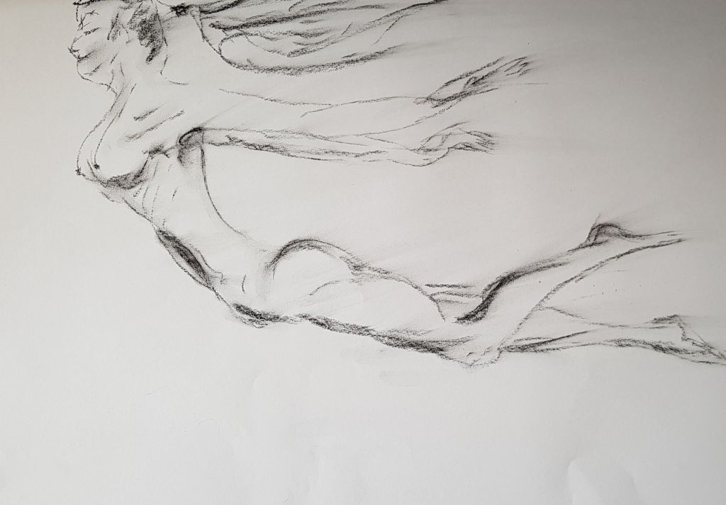
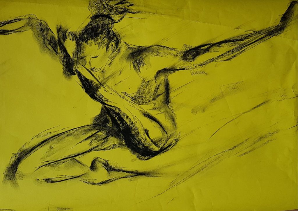
Exercise 4 – ENERGY
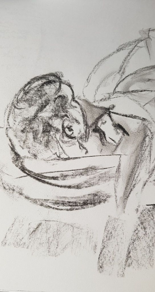
The on-line photographed models had some great energetic poses – taken mid flight. I enjoyed drawing these and purposefully ran the images off of the page to hint that the model wasn’t static, but was moving through the space. I dragged an eraser though the image to hint at the direction of movement. I also didn’t end lines, left gaps and blurred bits of the model to try and show they were not static. I quite liked this effect.
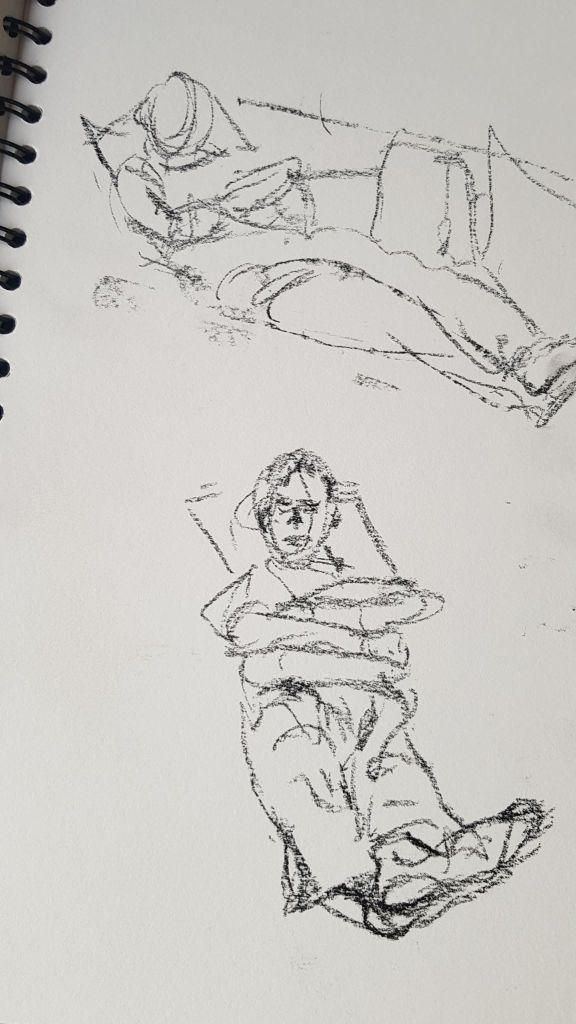
I drew a couple of quick studies of my husband lying on the sofa, using charcoal and felt pen. I worked from different angles. Drawing from behind his head and from the feet up meant I had to consider foreshortening in the perspective.
A4 SKETCHBOOK charcoal
The best most successful sketch was where I planned him out using a sphere for his head and cylinder shapes for arms and legs
A4 SKETCHBOOK charcoal
A4 SKETCHBOOK felt pen
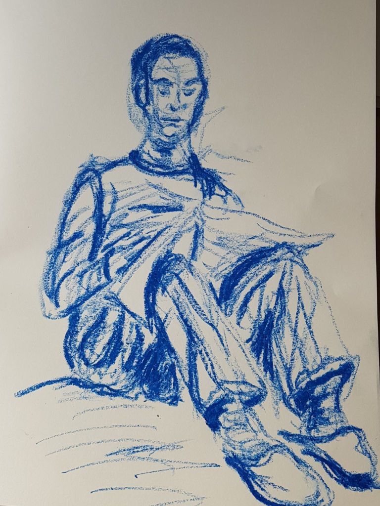
A 10 minute study was done in Crayola blue crayon. I was quite pleased with the effect of lines made with different pressures to hint at tone and folds. I tried to hint at a 3D head with very light sphere marks. White space suggests where light was falling. Proportions need looking at – are his head and arm too small? The crayon marks were made very quickly and I think this gives a bit of life.
40cm x 29cm white paper crayon
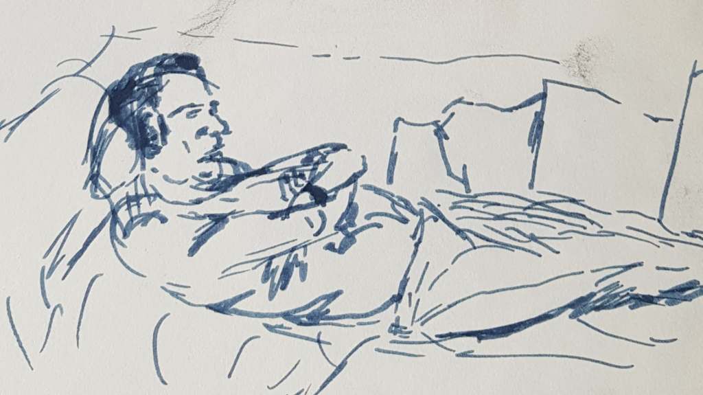
Exercise 2 A Longer Study
Is it important to have believable facial features? Probably yes, as its human nature to find ‘wrong’ faces highly comical – and that may not be the aim of the piece! Maybe there is a place for ‘wrong’ places but maybe they should be intentionally wrong, rather than just an error with the pen?
For the longer piece on the couch (below) – I decided to go from the back of the head – to make the perspective a point of interest. Perspective (large head progressing down to small feet) did help capture the pose. Maybe the head should be even larger?
I kept the couch very light in tone – so the body wouldn’t get lost in it. I tried to be more sensitive with tone to create the creases and folds in the jeans and top. This was a little bit of an improvement to previous tonal work? I think the dark tones down the length of the jeans don’t quite work. He may look a bit like a merman?
The plane of the body may be problematic – does it look like he is hanging from the wall from his feet? How to make him look like he is lying flat? Maybe by suggesting the plane of the floor with light lines?
By late March 2020 the UK had moved into full ‘Corona virus’ home lockdown. This was when I started project four in earnest. My husband was working hard from home and I had no life model to call upon. I did some research and found the website
This had many different life models in all sorts of different poses. They were professionally photographed in neutral settings with good lighting. I decided I would use this website to source some model poses.
The issues this had were:
2D is not the same as 3D – the pictures aren’t alive, so are missing an element of connection;
You can not move around the model;
The models were all pretty much perfect specimens of humans – well toned, attractive, gym friendly (with a couple of exceptions);
Their environment was very neutral and plain.
The positives with this were:
The models didn’t move an inch – ever!
You could spend as long as you wished drawing them;
The light source was very strong (studio quality) so light and shade were very easy to determine;
The lack of connection with the subject made drawing less inhibited;
There were no worries as to if they were uncomfortable;
As poses were photographed, not held, some of the shapes made were very creative and interesting.
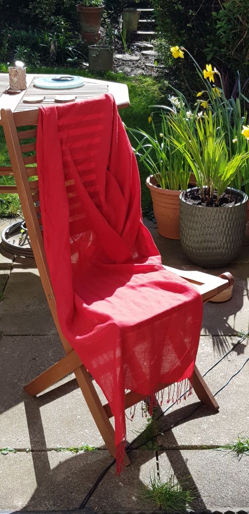
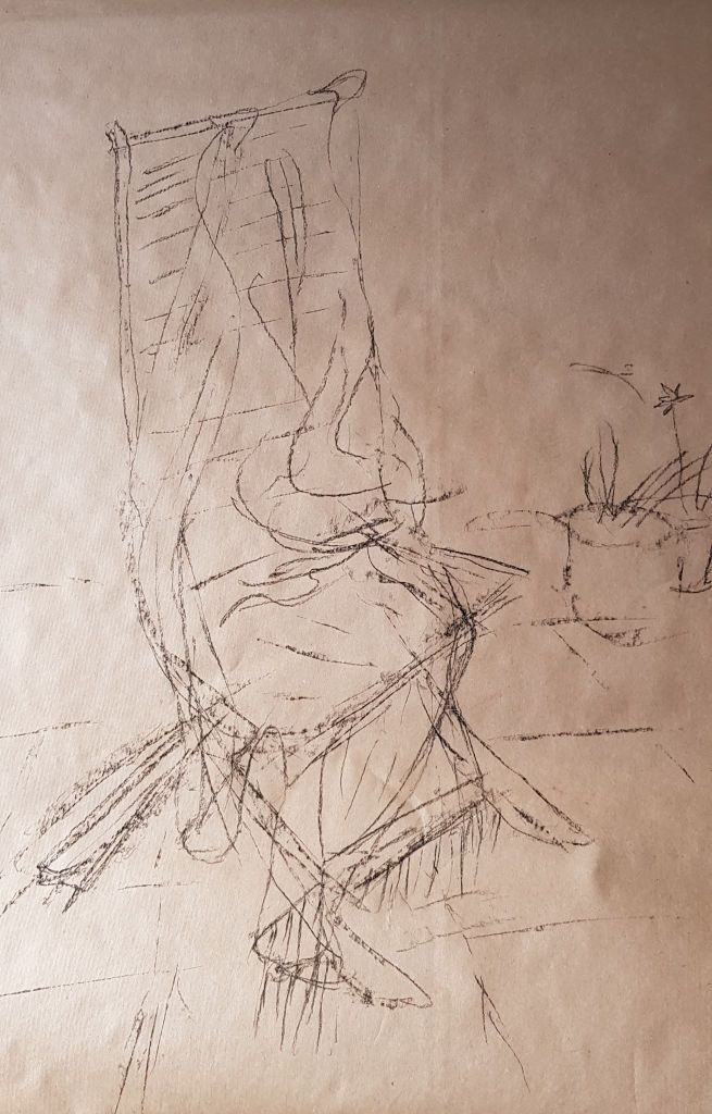
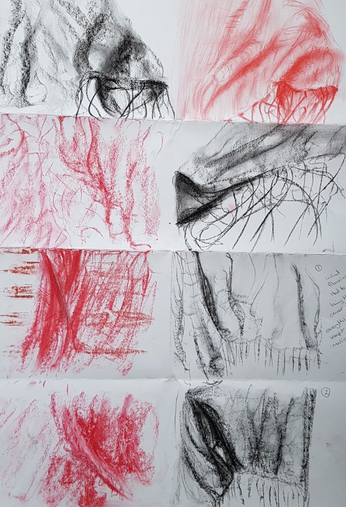
I draped a scarf over a garden chair as it was a sunny day outside. The sun was strong, so it threw strong shadows in some areas and made the cloth transparent in others. There were also areas of almost white brightness on the material. It was a little windy, so the cloth was moving and changing shape.
This task took me back to Assignment One of the course, where I had used draped fabric in my final drawing.
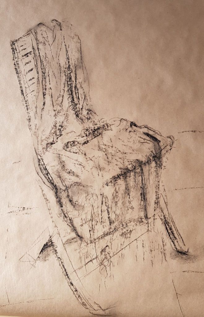
I used charcoal to sketch a line drawing and charcoal for a tonal drawing. I like using charcoal as it is quite sensitive to creating tone without over working. The negative aspect of this material is that it is very easy to go too dark. I tried to keep the lines fluid and light to suggest movement in the wind and the soft drapes. For the tone, I tried to match the dark patches to folds in the cloths and left white the pools of sunlight. I tried to keep the drawing quick and fluid.
60cm x 50cm brown paper charcoal
50cm x 50cm brown paper charcoal
With the close-up five-minute sketches, I tried to suggest shapes, folds and shadows with a light touch – to make the drawings more fluid. Again, the wind was playing with the shapes.
cm x cm white paper charcoal and pastel
59cm x 42cm white paper charcoal and pastel
Were the drawings successful? I need to really keep working on developing grades of tone. My tutor has suggested cutting in with an eraser to help create tone. I need to experiment with this further. I have made some attempts, but have found the eraser smudges the charcoal into grey – I think I need to experiment to improve my technique with this. Maybe the eraser I’m using is not right for this task? Maybe I can’t erase in if the tone is already too dark – so need to do this from a light/mid-tone only.
Exercise 2 Emphasising Form with Cloth
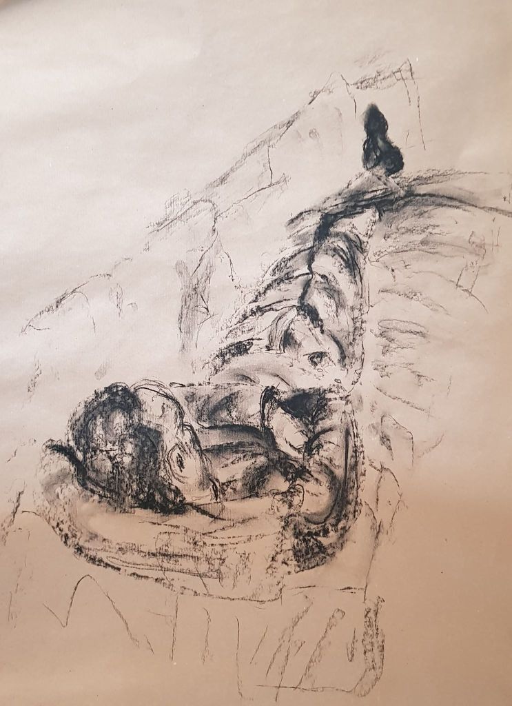
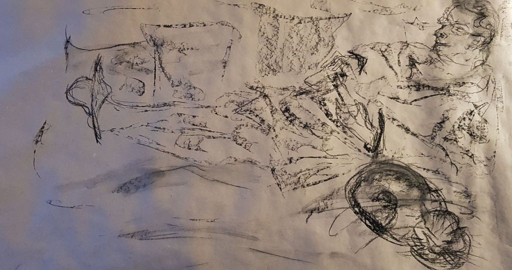
My model (husband) laid out on the couch in his dressing gown and I tried to represent the cloth and his figure. The folds of cloth wrapped around him, suggesting the shape underneath, but also with a life of its own. Clothes are made to fit the human form so they do, by their nature, created a second skin. This second skin has its own characteristics, but they do need the body within to bring them to life.
I sketched in the couch behind and underneath him as the surrounding support.
42cm x 59cm cm brown paper charcoal
This drawing didn’t work well, as there was not enough definition between the dressing gown and the couch. It all just blended in to one. The different areas of the drawing were to similar. Again – more work needed on grades of tone. The face of my model was not remotely a true likeness.. I think it needed less detail, not more, to make it a believable person! Once an unbelievable face is in the picture the image is spoiled. I don’t think the face needs to be a photographic reproduction but does need to hint at character, emotion and proportion. I know this is a future challenge.
I had another attempt below, with very light marks. This shows the folds and form with no depth from tone
60cm x 48cm brown paper charcoal pencil
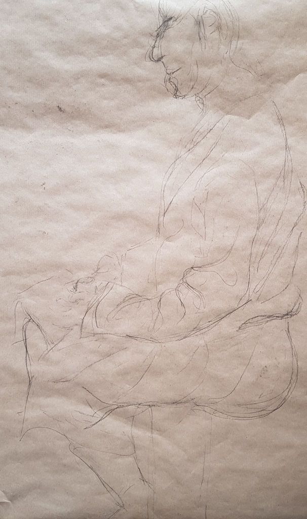
A did a quick pen line drawing for a later exercise and this worked a bit better to show form with cloth. The lines followed the shape of the body and hinted on the weight and shape beneath.
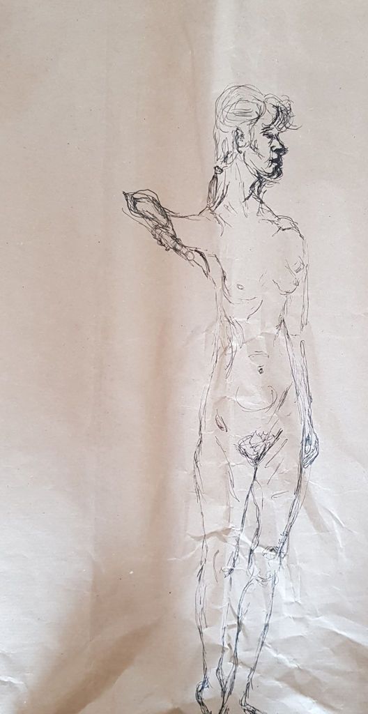
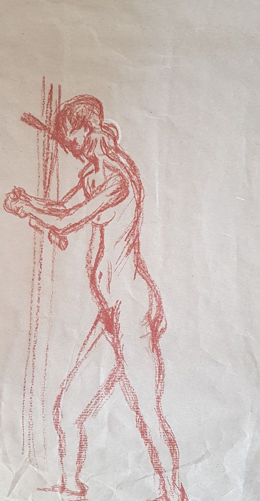
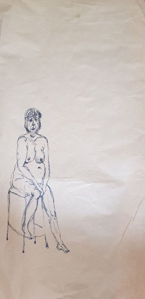
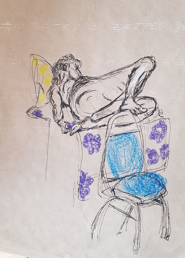
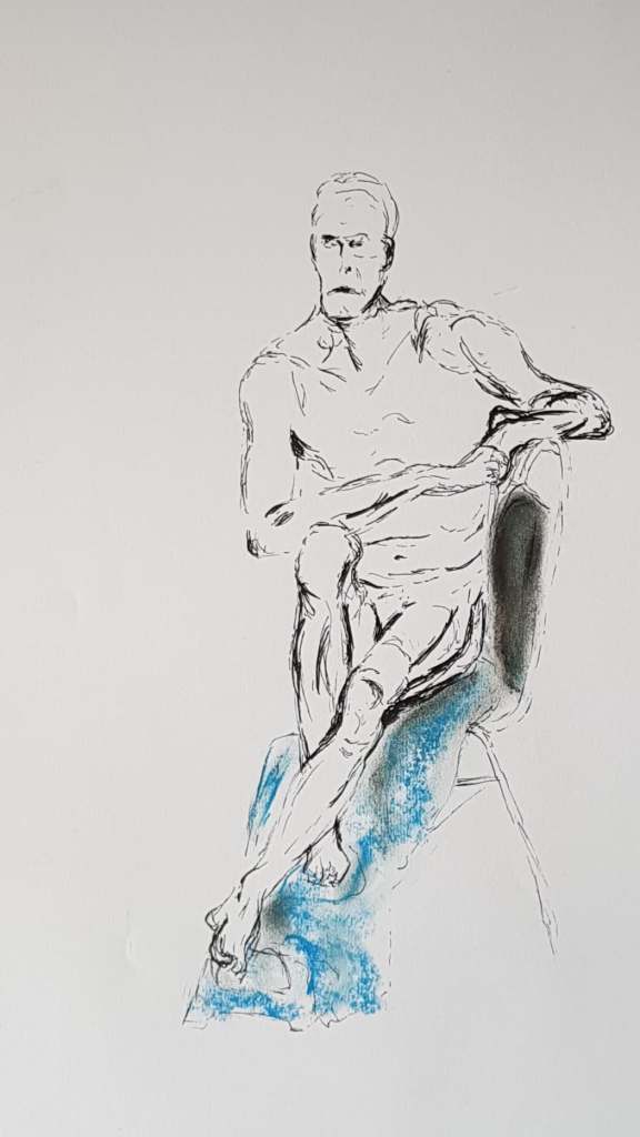
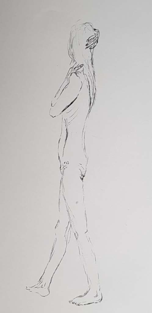
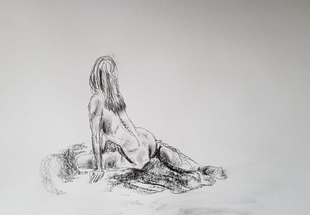
In the New Year, knowing that part four of the drawing course was ‘The Figure and the Head’, I started to explore local groups to join. I was very lucky to find the High Wych group on Facebook. They would meet every Wednesday evening in High Wych community hall, a village only a mile from my home. Their contact details and welcome statement are below.
‘Come and join our friendly Group in a century’s old tradition of capturing the human form on paper. First timers to experienced artist, everyone welcome.’
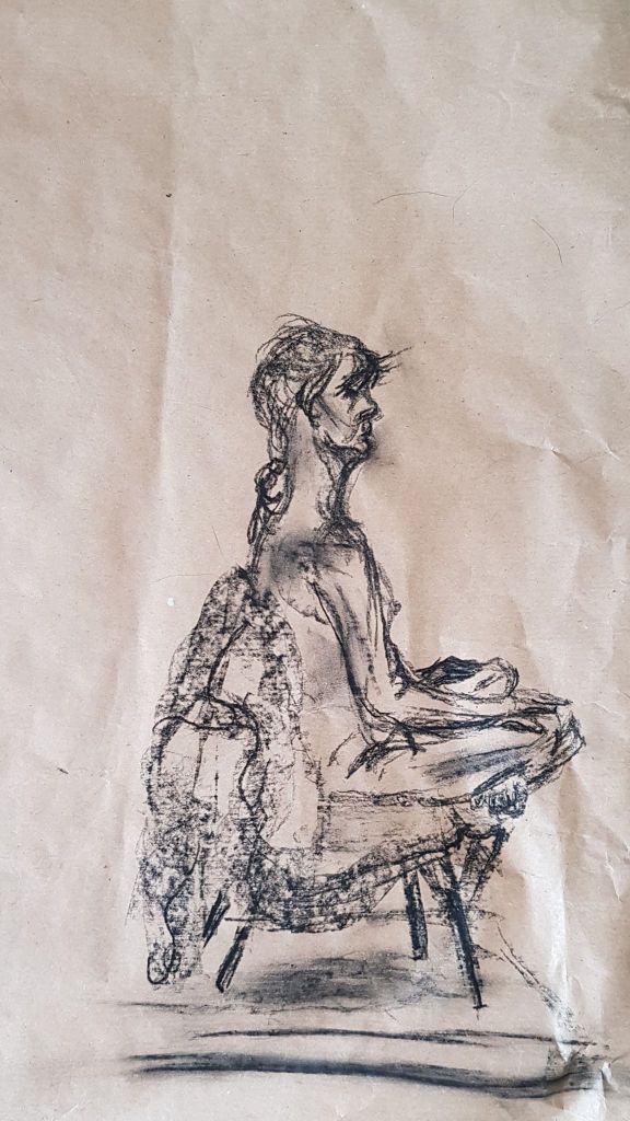
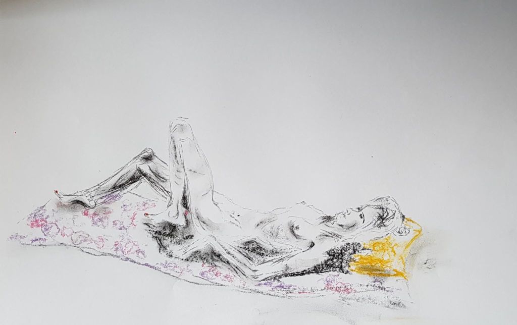
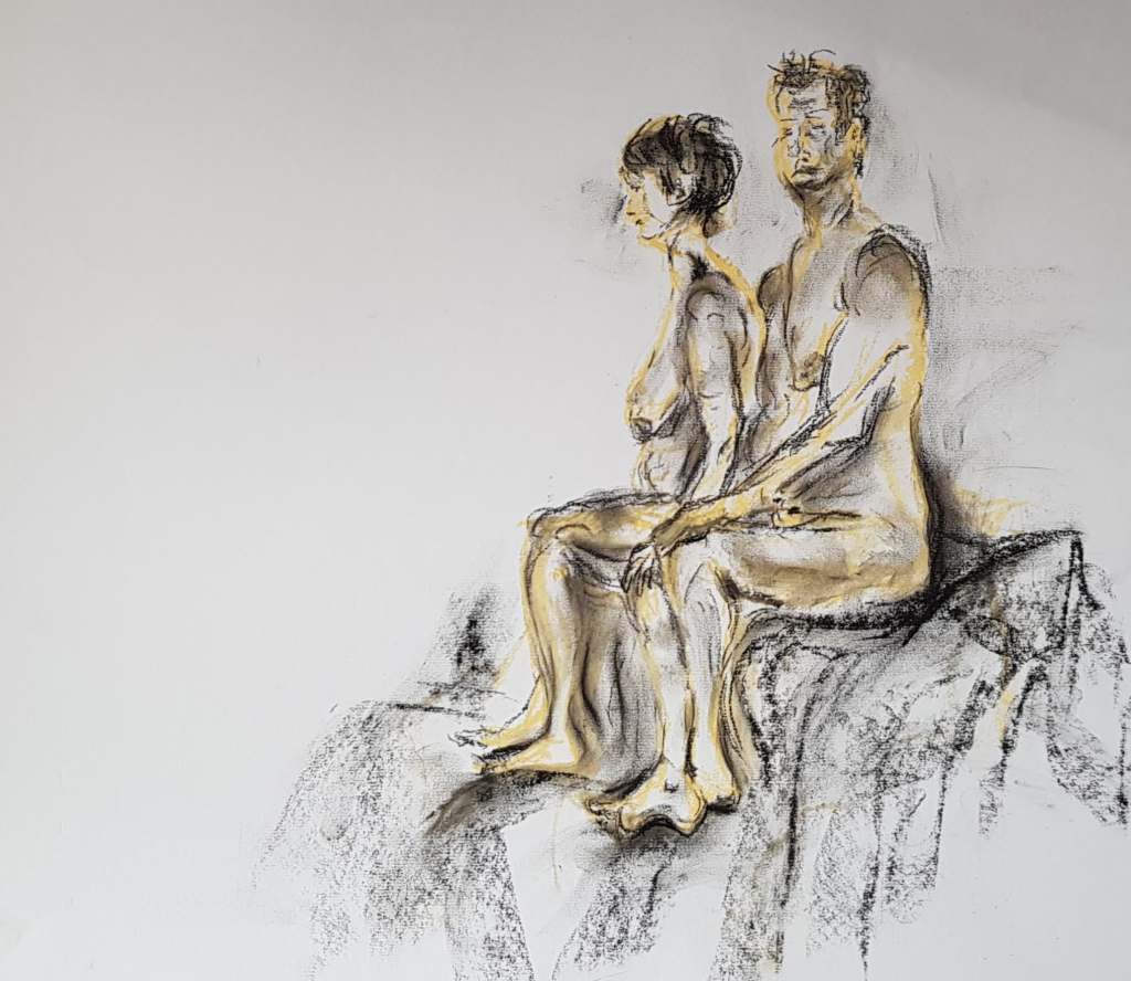
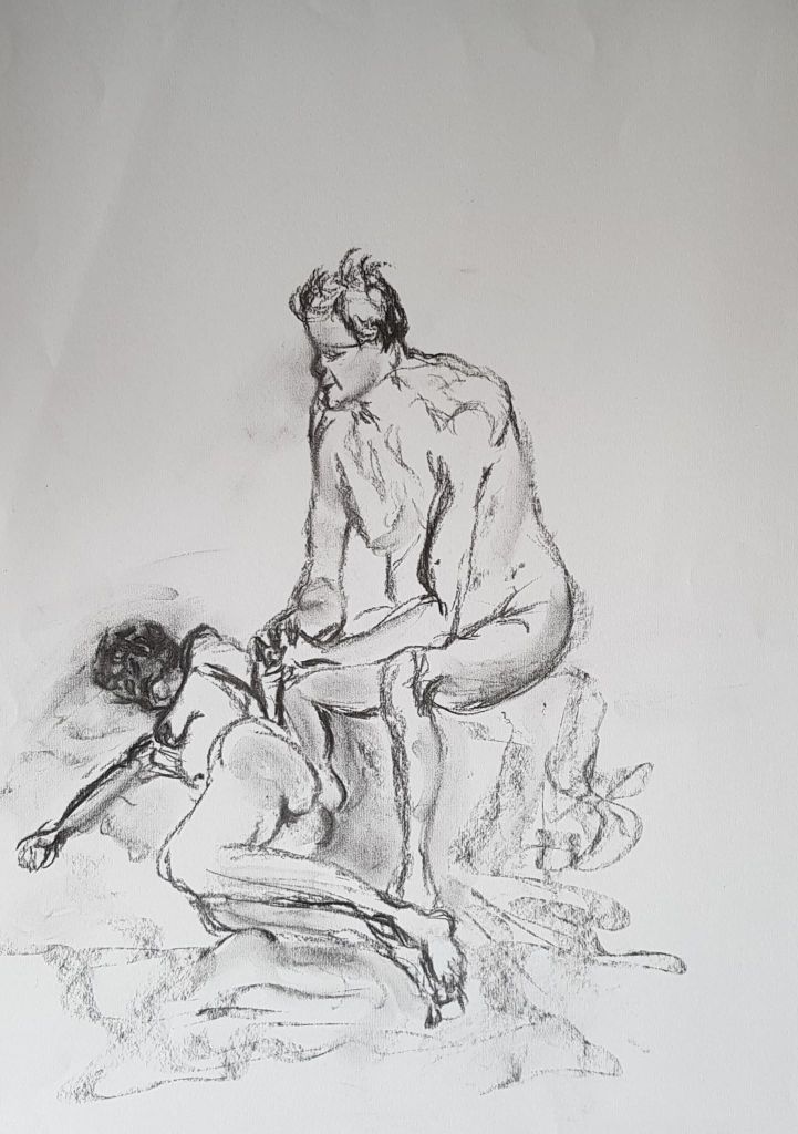
This group seemed perfect for me; two hours with a professional life model, in a casual, friendly set-up. All levels welcome. Fee, ten pounds per session. There was no teaching involved with the session, just the opportunity to sit and draw a nude model. The model would give 3 poses per session: standing, seated and reclined. Occasionally, there be would be ‘light’ instruction available from an experienced member of the group. The teaching was really by taking part.
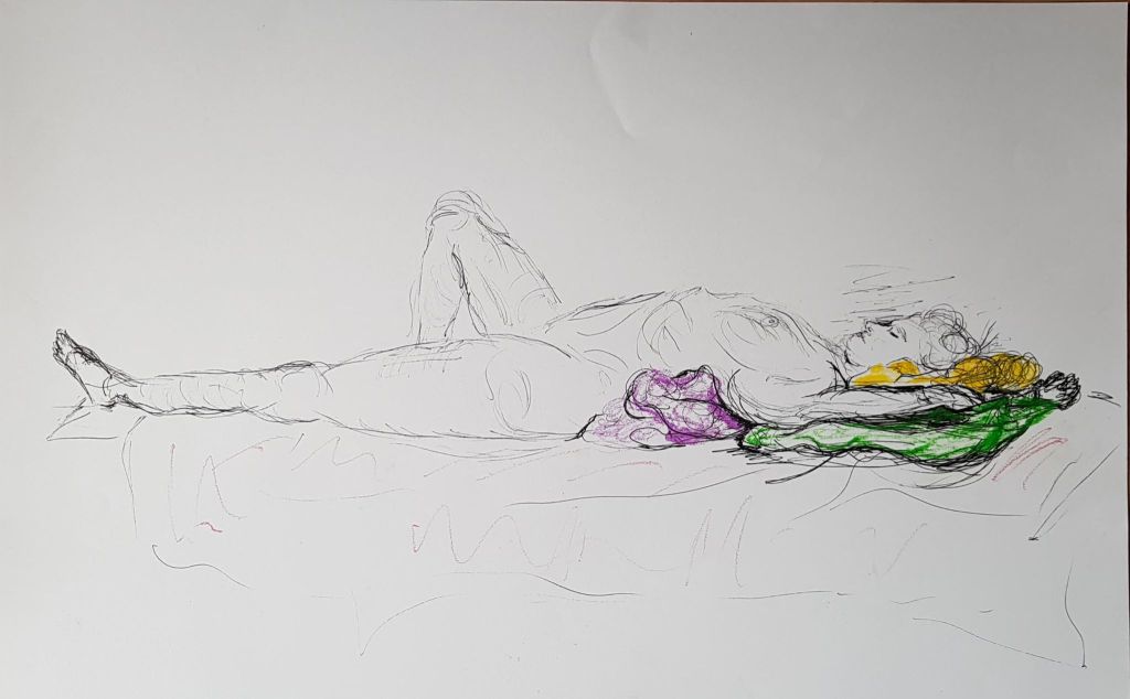
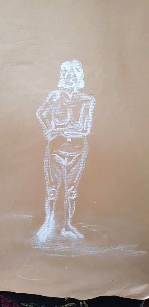
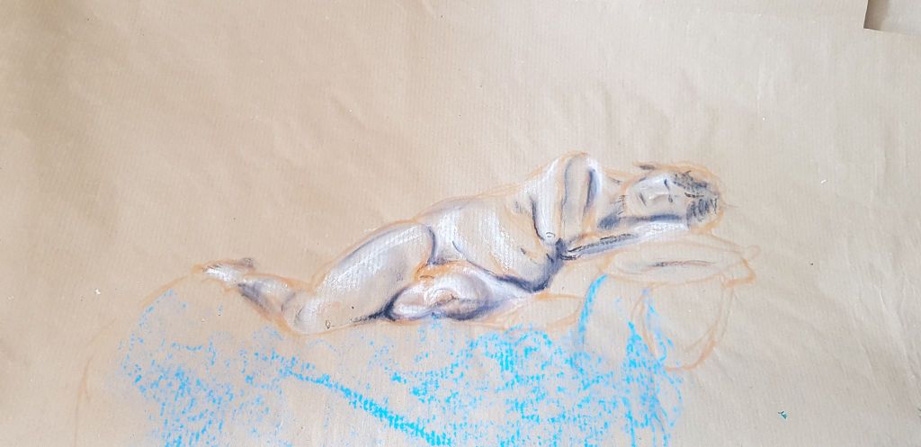
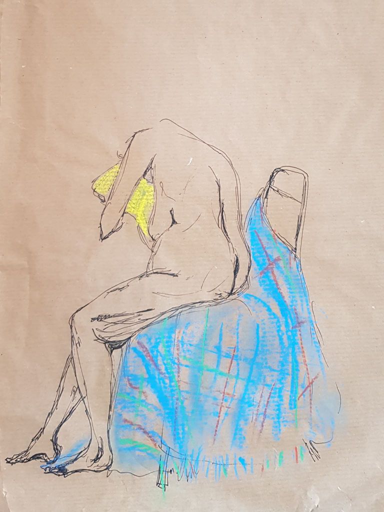
I learnt so much from this class, just before I was due to start part four of the course. Please see the images below – which I tried to keep in chronological order (as much as could remember). I attended between January and March 2020.
I tried to experiment with different drawing materials and paper. As always, I found the best images were the ones I didn’t labour over, or over-think. Some images were less successful than others – but, for me, the class was all about experimenting with your own style.
I learnt so much from looking at other’s work and techniques. Some of the participants were amazing artists. What amazed me was how absolutely everyone’s style was so different. Some used sweeps of pastel, some used brushes, some used graphite pencil etc.. Small images, large images, abstract images and realism images. Some were very interested in my use of brown paper – both positive and confused comments (but kind and constructive). For my next step, I wanted to experiment with the idea of focusing on a part of the figure, rather than just keep plonking the whole figure into the middle of the paper. I had seen another of member of the group do this and I could see how effective it was as a technique. I also liked the idea of coloured pastel on coloured paper, as I had seen this method and liked it.
I learnt that I needed to work on proportion and foreshortening. Also, tonal work – which has been ongoing, as part of the course. Hands and feet were very tricky. My faces were laughable ! But persistence and practice seemed to be slowly finding a path through the darkness!
BUT THEN, the Corona virus struck! The class had to disband. I would now need to complete part four using my husband and the internet as a model source! My husband would not consider nude modelling but would allow some clothed poses, if he could be comfortable (with food, beer and the remote). So this was now to be my way forward into this section of the course.
43 cm x 23cm brown paper 0.8 fine line pen
30cm x 59cm white paper 0.8 fine line pen and crayon
40 cm x 23cm brown paper crayon
33cm x 25cm brown paper charcoal
43 cm x 33cm brown paper 0.8 fine line pen
43 cm x 23 cm brown paper pastel
35cm x 45cm brown paper pastel
28 cm x 35cm brown paper 0.8 fine line pen and pastel
33cm x 30cm brown paper 0.8 fine line pen and pastel
38cm x 25 cm brown paper 0.8 fine line pen and pastel
44cm x 20cm white paper 0.8 fine line pen
34 cm x 43cm white paper charcoal
30cm x 50cm white paper 0.8 fine line pen and pastel
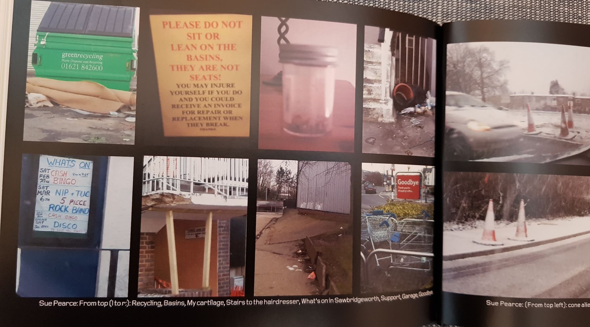
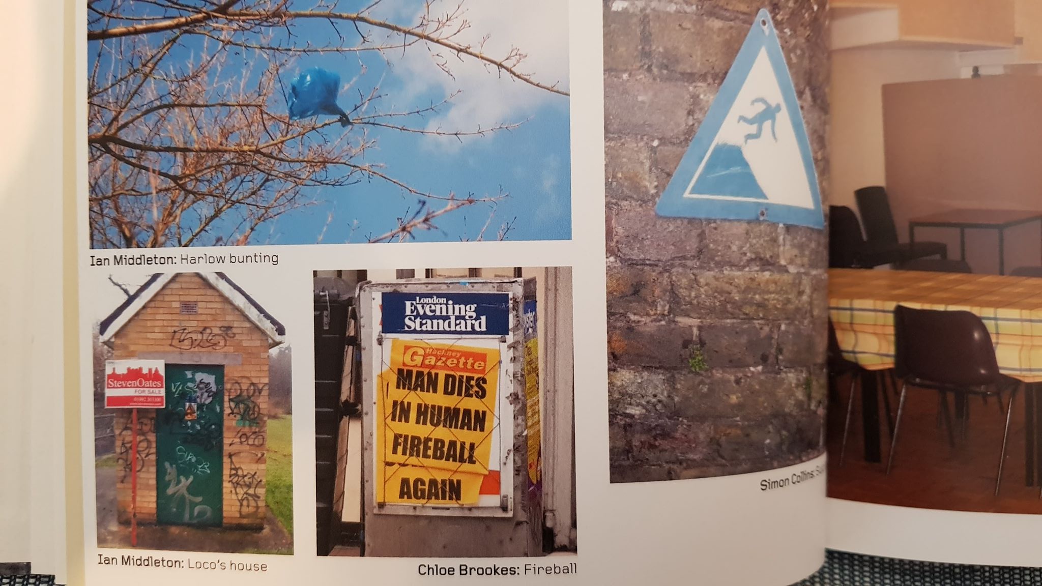
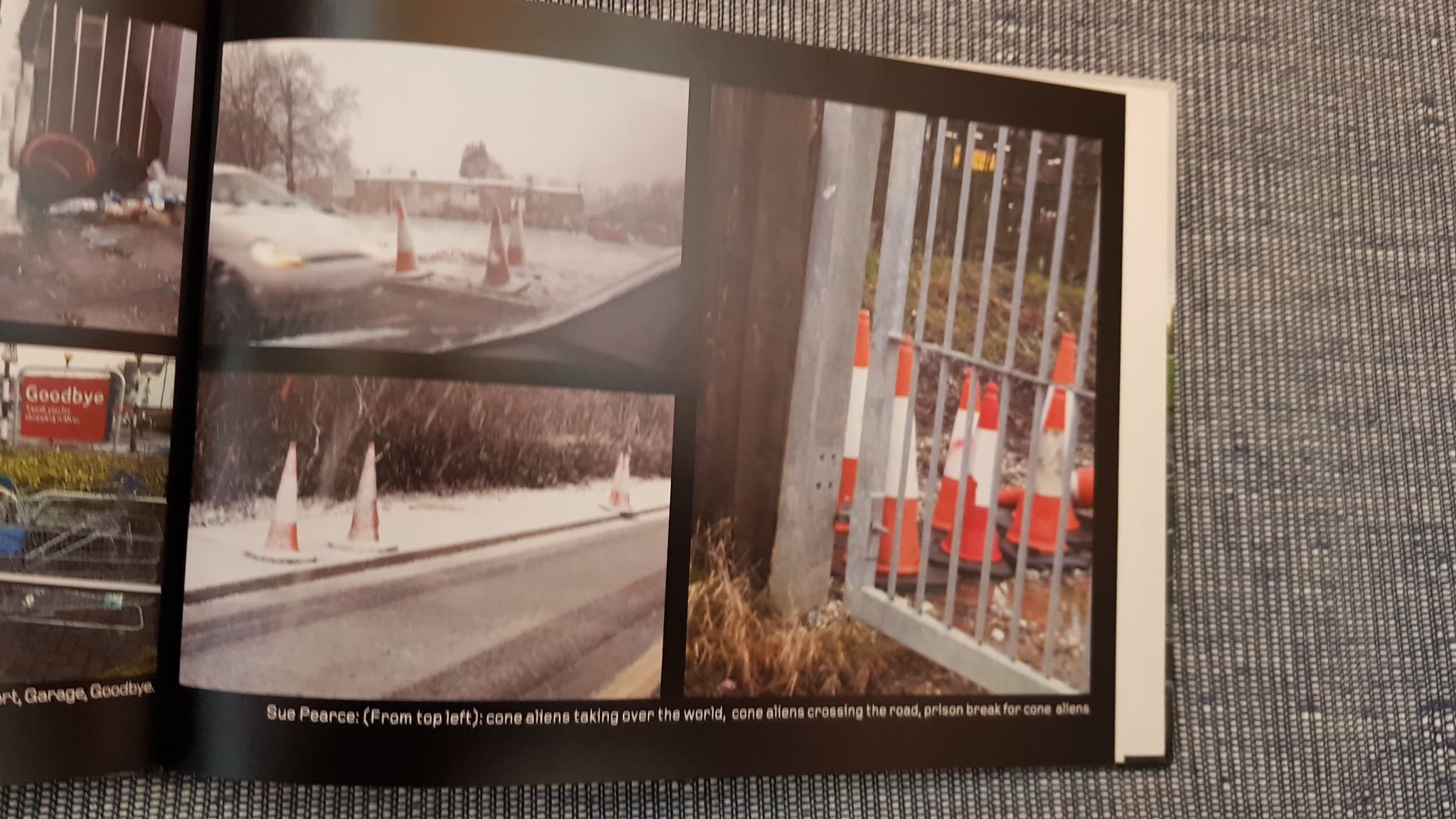
Back in January 2010 some friends (on Facebook) and I were finding our winter surroundings rather testing. For our great amusement, we started to take photos of what we saw around us, in our towns, every day. It started with sightings of plastic bags in trees and grew from there. We posted our snaps in a group. One of the (inspired) friends put a selection of these into a book. Below are the pictures I took (and a few others) that ended up in it. It really made us smile (and grimace) at the reality of our world. It was meant as a joke – but it is also an honest reflection.
I think our little project highlighted what so many people living modern urban lives in the UK see everyday.
This fascination with the day-to-day, the ugly, the mundane and stark reality is also demonstrated by modern artists who also inhabit these environments. I can see it in George Shaw’s work.
George Shaw Scenes from the Passion The Black Prince 1999
Making these images into ‘art’ brings us face-to-face with ourselves as a modern society. The images are amusing, as many people’s traditional idea of good conventional art for a wall is often the subject that is beautiful and inspiring. The beautiful, however, is so not part of many people’s daily experience today – so why not have art that reflects this? It makes us think about the world and culture we have created for ourselves.
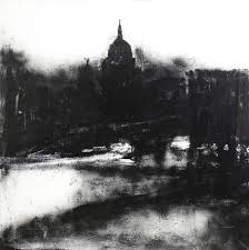
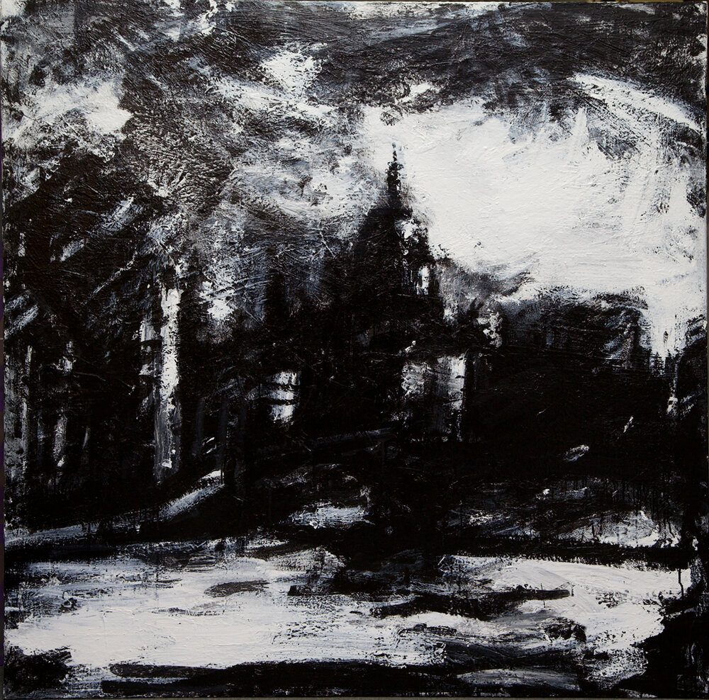
John Virtue’s London images are also gritty reflections of a real city. They look dirty, smokey, rainy, atmospehric and brooding. They are not a picture postcard view – but an image that a city resident would understand.
John Virtue only uses a monochrome pallet for his landscapes. He uses Shellac black ink and white paint. I particularly like the image above as the cloudline is like a heavy, swirling, oppresive blanket over and surrounding the buildings and makes you feel that dark rainy day he is watching.
I like the idea of using the characters of the materials used to create an atmosphere in a piece. I could recreate this with charcoal – maybe wet charcoal? The buildings aren’t drawn in obvious detail, but with the composition and use of light and dark the viewer knows what they are looking at (especially if the viewer is familiar with London and the Thames).
In contrast, below is an urban landscape by artist Antonio Lopez Garcia.
Antonio Lopez Garcia madrid desde torres blanca
This is an amazing image, but very different in atmosphere to that created by John Virtue’s brooding pallet. It is a lighter, hotter, airy city – with its warm horizon stretching far in to the distance and sun suggested by the brightness of sky. What you get from both images is the feeling the artist has towards the subject (and maybe more generally) – created from the choice of materials and the colour pallet.
I feel I am slowly developing a looser approach to drawing. I enjoy using pastels and charcoal and feel I am developing a lighter, more expressive, touch. I feel I had a bit of a breakthrough with the image below. I think it may be, in some ways, more successful than the end assignment. I used different types of marks and material in the image – but didn’t overwork it. I had thought out the process of creating it with a preliminary sketch and test marks and this helped me with the end result.
I am now more aware of how the use of perspective can improve images, why preliminary tests and sketches are important,
I still need to use my sketchbook more to test and be more playful and experimental, but I feel I have moved forward a little with this.
Quality of Outcome
I have worked at all the exercises in Part 3, to try and get the best learning experience I can from progressing though this part of the course. Some of the experiences have been successful, some less so. I have definitely learned skills. My biggest hurdle is the time I spend on the process. I will need to shift up a gear to get a more rounded and progressive quality of outcome.
Demonstration of Creativity
I enjoyed looking for places to draw. I drew inspiration from my driving trips through the countryside and from finding new urban views. The churchyard visits also helped me start framing and manipulating different views and compositional ideas. My personal voice is developing: I realise I am inspired by the curve of the earth and sky, colour, energy, movement, clouds and the changing seasons around me. I like the vastness of the outdoors and being immersed in it. The research into modern artists using urban themes gives me confidence to work on my experience of modern life – not just pretty views. I enjoyed the work on statues and their juxta positioning in a modern, somewhat bleak, landscape and may develop images of these further.
Context Reflection
I do need to keep working on the quality of my learning log. I am trying to write as I go but this is quite a challenge, as my time is quite limited. For speed and neatness, I have been quickly typing text into a word document and then have cut and paste it all into the log at the end. I realise this isn’t representing my learning in the best way. I do need to put more time into the log and now need to work on strategies to do this. I realise that I need to write more fully and in more depth. I think I have started to do this – but I still have a long way to go before I start working at the level required by the course. Despite this, the research points have really made me think in more depth about images created in different eras, cultural backgrounds and reference points. I am finding the log a useful tool to record my progress, my frustrations and successes. I understand the point of the log more. I need to work on time management to make the log more useful and reflective to me (and to the reader!).