There are as many different approaches to (landscape) art as there are artists who paint/draw. Every individual has there own take on subject and method of representation
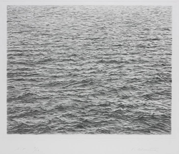
Above are images from two artists whose work has similarities. The similarities are the monochrome pallet and the delicate use of tone.
The differences are more easy to define. Tacita’s image is vast, like its subject – it fills the wall of a gallery. She has used media that are not created for art work, i.e. chalk and chalk board. Her drawing emerges from the black background as she uses chalk to create tones and shapes over the black. Tacita creates art in a time where such experiments of size and unconventional media are encouraged and enjoyed. The speed at which new styles of all art forms are enjoyed and digested is now rapid – probably due, in part, to the internet, social networking and globalisation. People can quickly share new ideas and their thoughts on them. New ideas may be less alarming than in Seurat’s time.
Seurats image is tiny in comparison approximately 25 x 32 cm. He uses conte crayon on a traditional white background, building black tone over the white.
In Seurats time, experimentation with new methods and styles took time to become enjoyed, established and accepted. Indeed, Seurats methods were also considered unconventional – but ‘unconventional’ takes time to grow and metamorphize. Without the experiments and ground-breaking working ways of many artists of the past, which now seem conventional, artists of the present (and future) could possibly not experiment and innovate either. This is because innovation builds on the back of other previous innovation – ‘by standing on the shoulders of giants’.
I think the objective of this research point and the other research points in this project, could be in fact for me, the student, to see clearly that the biggest differences between the images are the point in history and cultural background in which they were created. Both images are groundbreaking in that context and that is the biggest similarity they share.
These images go to show that new innovation exists in art (and other human endeavors) at almost all points in history and will continue to do so.
Drypoint – Ocean Surface 1983 Vija Celmins born 1938 ARTIST ROOMS Acquired jointly with the National Galleries of Scotland through The d’Offay Donation with assistance from the National Heritage Memorial Fund and the Art Fund 2008 http://www.tate.org.uk/art/work/AR00467
In the short clip of film http://www.vimeo.com/22299024 Vija Clemins describes the process she uses to recreate the natural forms she sees into her art. She describes it as re-creating, not copying. The key to this is not mimic but to employ attention span to re-describe what is seen and put it onto another object. She describes a ‘thoroughness’ in approach.
I understand this to mean that hyper-attention needs to be applied to viewing the object in all its detail. Studying the placement and form of practically each molecule of the subject to be re-created. Also, understanding that you are not recreating a moving, animate thing – but, creating a representation of that into the medium you are using.
For cloud studies this would mean looking intensely into and onto the subject, to try and understand its shape, form and volume as fully as you can with a view to recreating it on to a 2D surface.
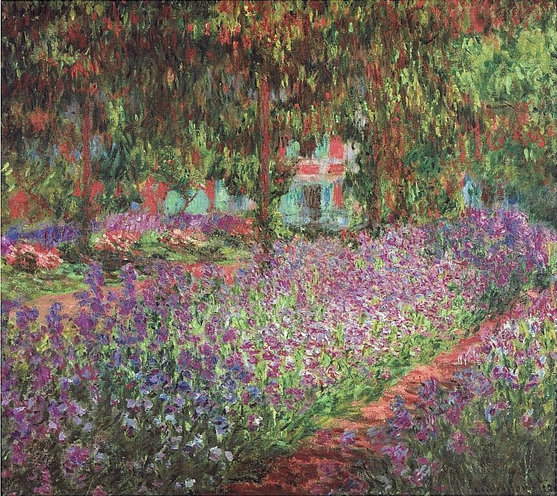
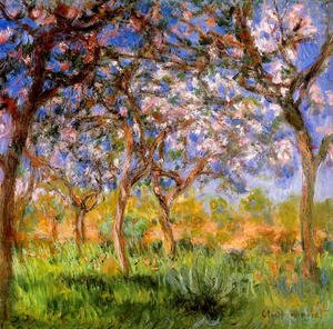
Series drawing/painting gives an artist a chance to investigate the same or a similar subject over and over again. An artist may want to do this because they find an actual place intriguing – it may be intriguing because of its beauty. It could also be an interesting concept, media or method of work that fascinates the artist. Repetition helps the artist dig deep into the subject. Also, from a decorative point of view for the viewer, pieces that are very similar, but also somewhat different but are hung together, can make the space they inhabit more interesting – so ‘series’ can enhance a space from an interior design point of view. .
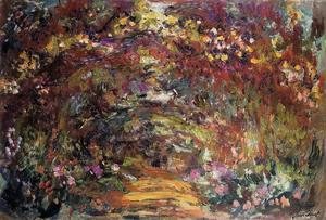
Above, Clock wise, MONET: Garden in Giverny, Giverny In Springtime, The Path Under The Rose Trellises Giverny
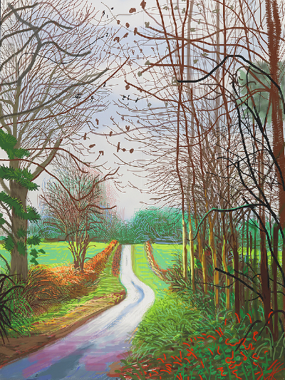
Above, Left to Right, DAVID HOCKNEY: Image 1 and 2 from The Arrival of Spring in Woldgate East Yorkshire 2011, Image 3 The Road Across the Wolds 1997
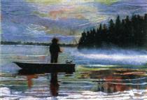
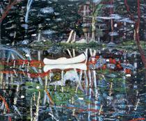
Above, clockwise, PETER DOIG: Lunker 1995, Swamped 1990, White Canoe 1991
Above, Left to Right, JOHN VIRTUE: Landscape 664, Landscape 710 (London Series)
Above, Left to Right: NICHOLAS HERBERT: Landscape L947, Landscape L949 (Sharpenhoe Series, View Across Fields, The Chiltern Hills)
Below are a selection of work from 5 artists from the part 600 years. I can see many similarities in these pieces, as all are representations of what the artists saw of the world around them. Its the interpretation of that world that seems to differ between the eras. In the earlier pieces of Durer and Lorrain, the artist is very much looking on at the scene, outside of it and is just trying to represent what is seen as true. These works see the human element as coexisting with the natural element and are not the most important element. In the later works of Lowry and Shaw this view has shifted to how human interaction works with the landscape. The artist is much less removed from the scene, has an emotional connection and a very human story to tell. Man has affected his environment to make landscapes a story of the human condition. Of course, this is just my interpretation. Perhaps the earlier artists were also telling a human story – but I just don’t understand the language they are using (symbols, composition etc).
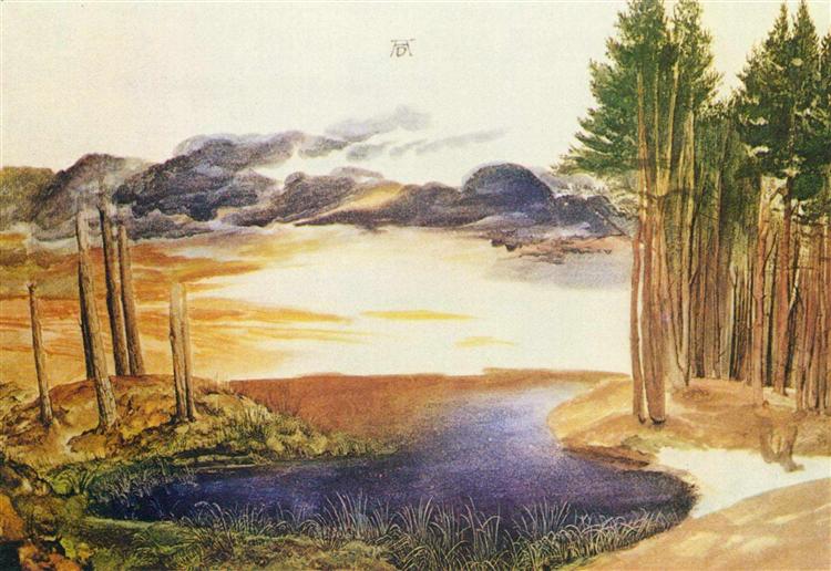
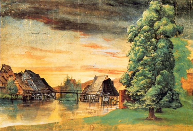
Above , left to right Durer, pond in the wood 1496 Durer, willow mill, 1498
I think Durer’s work may have possibly been ahead of its time in European art and seems to have similarities with much later pieces (19th century?). The landscapes are quite poetical, sensitive, relaxed and romantic in in character. The colours are bold and bright. Not like the darker still life paintings from the same era that I looked at in the previous project.
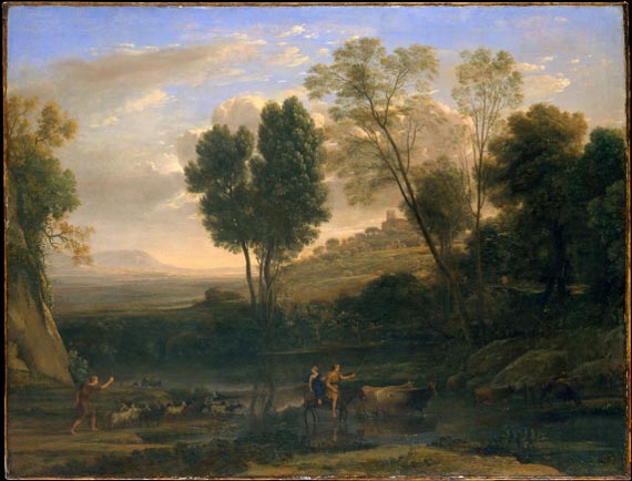
Claude Lorrain SUNRISE 1646/47
Lorrain’s landscapes are very often described as ‘classical’. I understand that this means he was following a certain style, thought of as idealistic in its time. Idealistic in rules of perspective and proportion. Artists of the time looked back to ancient Rome and Greece for inspiration and direction.
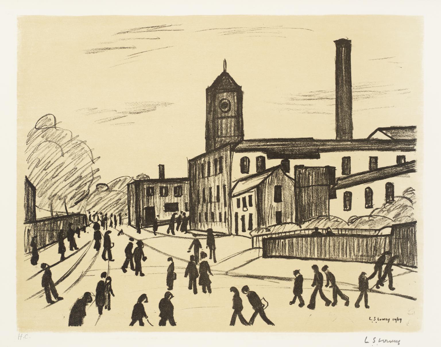
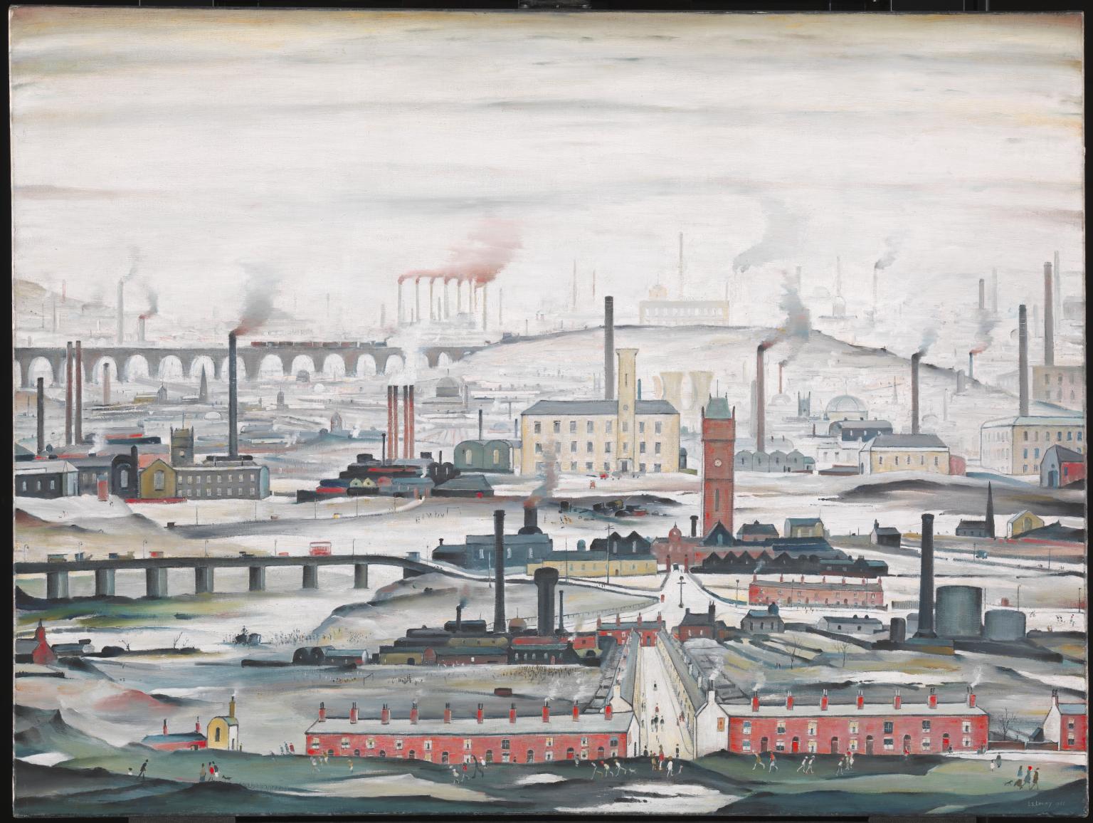
Above, left to right, L S Lowry A NORTHERN TOWN 1969 L S Lowry INDUSTRIAL LANDSCAPE 1955
Lowry’s landscapes are set in an urban world. Not concerned with natural beauty. More concerned with the realities of people’s modern lives and industry. He draws people, factories, buildings. How the people relate to this environment is shown – they trudge around with purpose, heads down, busy going somewhere. The factories show the human interaction with the natural world -by obliterating it in a view of smoky air and dirty ground.
Above, From left to right
George Shaw, Scenes from the Passion Ten Shilling Wood 2002, George Shaw untitled2 2004
George Shaw composes images as artists have done for hundreds of years before him, looking at proportion, perspective and realism. However, his subject matter is very modern and urban. He doesn’t chose to depict people but does depict their urban homes in an honest way. The homes are not particularly beautiful, but are a realistic experience for many people of today. Hence his images are very relevant to modern people of the UK and are important for this reason – they reflect society back to the viewer.
Sarah Woodfine Castle, 2005 drawing in snow globe
Sarah Woodfine looks at new innovative approaches to landscape drawing. Taking it out of a flat plan and putting it within other interesting objects – a story within a story. This gives the drawing multiple functions – as part of a bigger decoration and a depiction of a view.
Such powerful drawings! Using tone to more than suggest movement and direction. I can see from this picture how development of tonal drawing skills can improve my own work. The pictures can remain monochrome – not needing colour to enhance them at all.
Tonal work is a skill all of its own. My own pieces could definitely benefit from developing this. I would hope that, with practise, this skill can be applied in a spontaneous way. This artist’s work is certainly not laboured, just technically skilled.
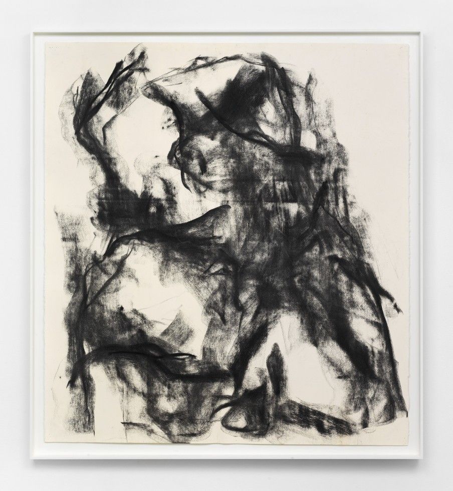
Below have been created using just Ink carbon and ash.
These drawings are big bold and heavy. They are abstract but suggest form and weight. The shapes they make are pleasing and intriguing – like watching smoke rising from a joss stick. The pieces are decorative and monochrome.
I can see that the artist enjoys the effect of the charcoal stick. pressing heavily, lightly, on the edge, creating waves. They seem quite spontaneous.
I too like the effect of spontaneous waves of charcoal. I have pressed heavily and lightly on the edge of charcoal to create perceived folds in fabric, texture of cloth and shifting shadows. Perhaps I should develop this tecqnique to use in whole drawings.
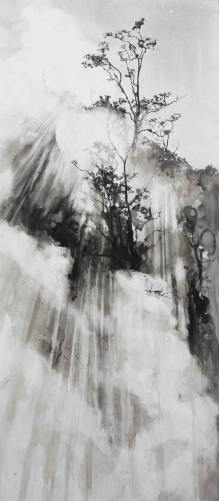
I love the vast scale of this piece. Along with the technical detail, its quite breathtaking! How does the artist map and plan out this type of image? How does the artist know where to start? It demonstrates great subtly of tone. Moving from black to white, with many tones of grey in-between. I need to work on subtlety of tone in my own work. I need to practise grades of tone in my pre-work. I could then apply this to some aspects of my own work.
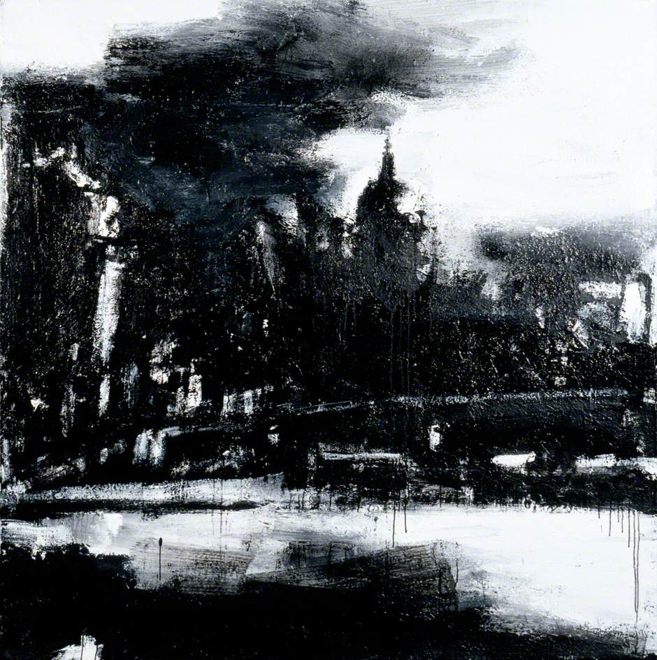
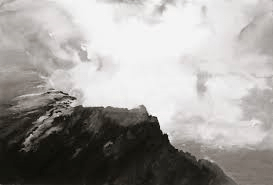
Below – The Roaring Forties chalk on blackboard
Again, its the scale of these works that leaves the most impression of the viewer. Also, the way the chalk is used so subtly that makes you feel the mist and waves. The lines of the drawing strongly suggest direction and movement. I can see that you don’t need tons of detail and shading to produce a full powerful effect of a boat in a storm.
The Roaring Forties: Seven Boards in Seven Days 1997 Tacita Dean born 1965 Presented by the Patrons of New Art through the Tate Gallery Foundation 2000 http://www.tate.org.uk/art/work/T07613he Roaring Forties: Seven Boards in Seven Days 1997 T965 Presented by the Patrons of New Art through the Tate Gallery Foundation 2000 http://www.tate.org.uk/art/work/T07613
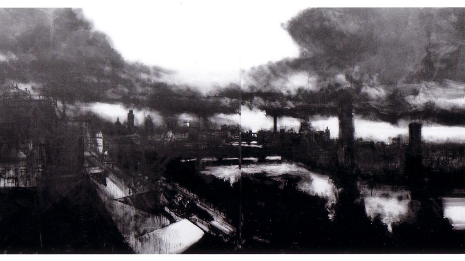
Below ‘FOREIGN POLICY’ 2016 CHALK ON BLACKBOARD
Again, like in the drawing of the mountain, the use of tone creates depth, volume and movement. It is a very impressive, beautiful effect. My use of tone is far from this level of subtlty. It would be great to create vast skies using this level of tone creation.
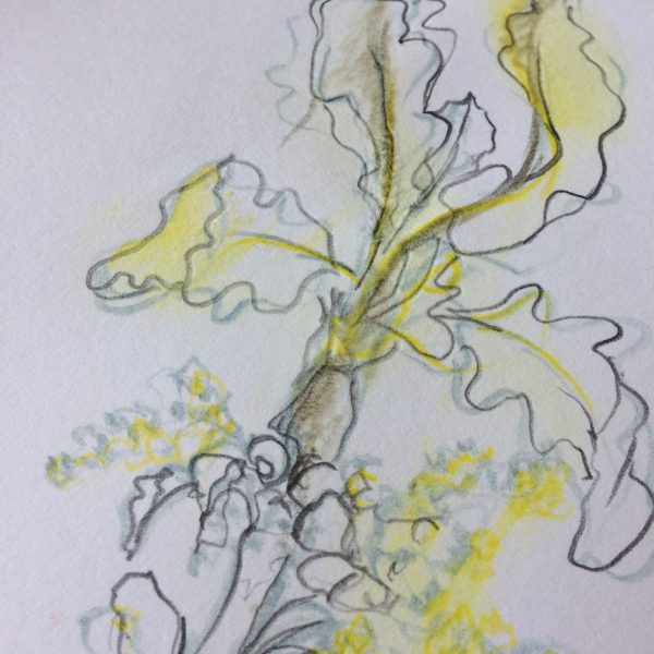
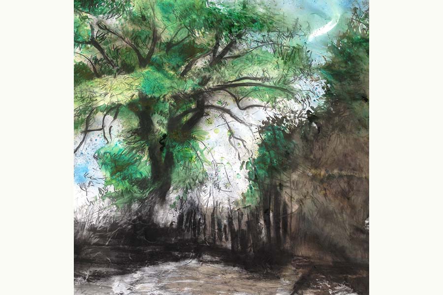
I enjoyed looking at Jenny Purrett’s work and found it quite inspirational. I enjoyed her sense of scale, loose drawing and use of colour. Below are some of her works that may influence my own work in the future.
Above: Silver Birch
I find the scale of the drawing above quite amazing. I have questions about how you would map out and plan a drawing of this size. The drawing is very detailed. Large scale is something I would like to look at as a possibility for my drawings. I need to research how large drawings can be produced. Do artists stick sheets of paper together? Can you buy extra large paper?On Jenny Purrett’s Instagram site she demonstrates some of her student’s work completed on wallpaper. I had never considered wallpaper as a medium before and I would like to give this a go. Wallpaper would allow for a larger scale of drawing and is easy to source.
I like the loose outline of the leaves – combined with just one other colour. The variation in tone of the yellow and the solid black line helps create depth and movement. I like that the objects are too big for the paper and leave the page on a diagonal slant. I can see some similarities with drawings I have done to the one above – seeing Jenny’s drawings gives me confidence that my way of drawing is not necessarily too simplistic. I would like to experiment further with charcoal and coloured pastels.
Above is a collaboration between Jenny Purrett and Lee Turner. It is a lithograph. The above drawing is very delicate and detailed. A whole range of shading from very light to very dark create tone and depth. I like the angle that it is drawn from. I think the artist must have been sitting down on the slope looking up. It makes the drawing more interesting than just being head on to it. I have experience some difficulties getting these types of angle into my drawings as the weather has been so very poor (its Jan/Feb). Perhaps, as the weather improves, I can sit next to my subjects and try other angles of study..
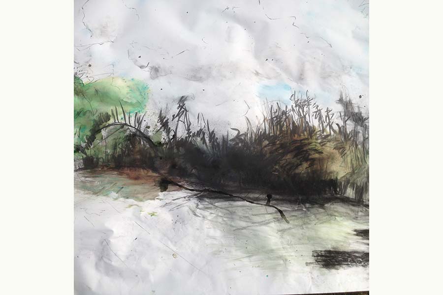
The two
The two drawings above ‘outside drawings’ I like very much. They give me a few ideas about improving my own drawings. I like the way she has incorporated the coloured pastel in with the charcoal drawing. The drawings are very loose and relaxed but do work. They demonstrate energy and flow. This is because the artist hasn’t over laboured the marks made but has considered balance and frame.
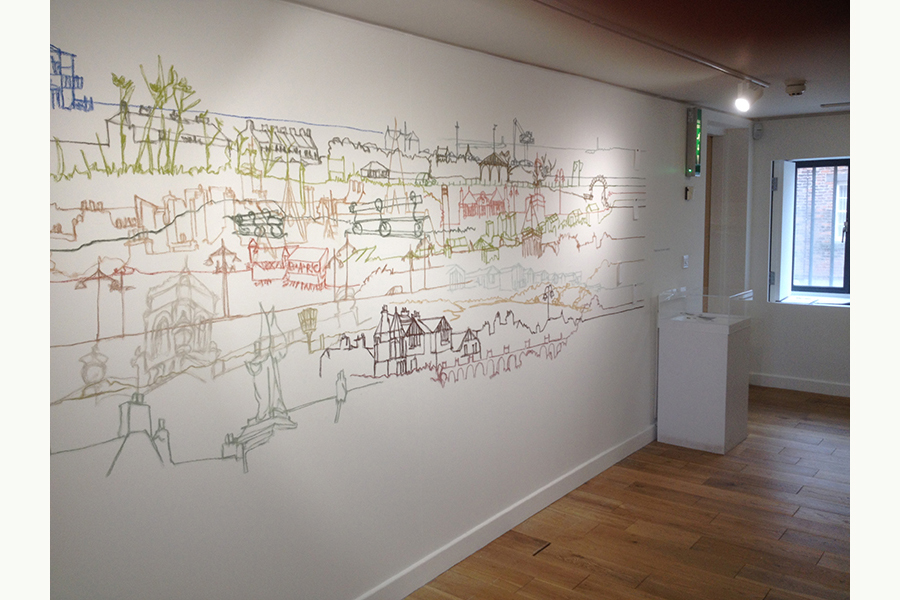
The continuous line drawings made me think of my own townscape line drawing experiments. The above shows you can produce lose, fluid work without over working the process. The continuous line makes you feel like your on a journey with the artist and pulls you along. The image is not at all static.
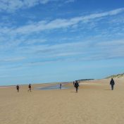
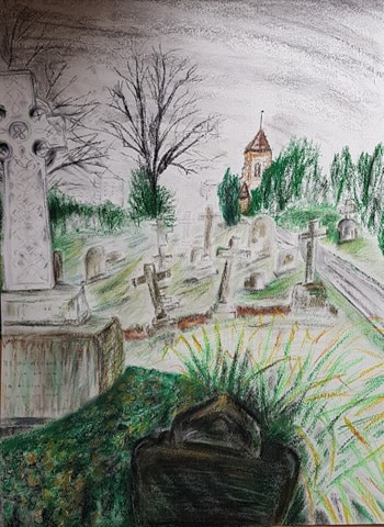
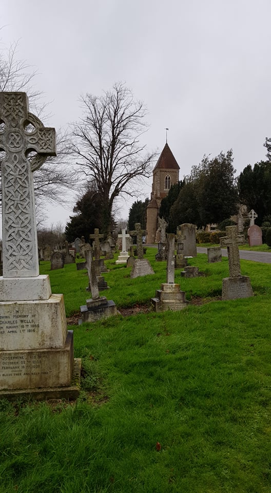
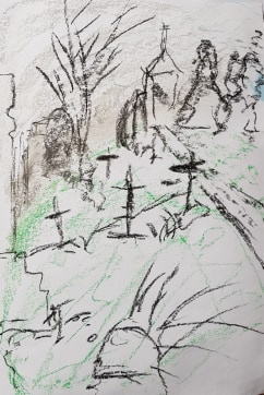
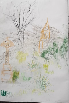
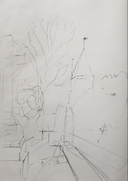
I decided on Bedford Park Cemetery for my final drawing, after some consideration. The view I chose seemed to contain elements that needed to be demonstrated: perspective, distance, manmade structures, natural objects, emotion.
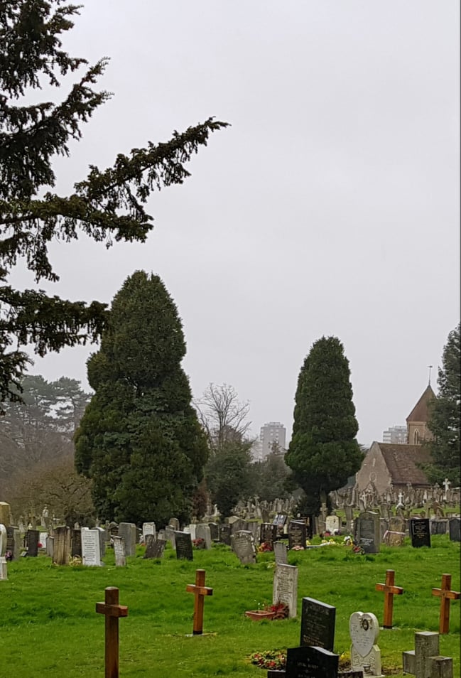
I had a few views in mind for this project, but this one seemed to offer itself. Below are two other images I considered.
I visit Bedford quite a bit to visit my poorly dad in a care home, so the journey (I live near Stansted Airport) and destination is charged with contemplation and sometimes difficult emotions.
I didn’t choose the cemetery to be a morbid subject. It is a beautiful, quiet, interesting place with winding paths, trees, animals, birds, interesting stones, statues and buildings. It is on a hill and has an expansive view over Bedford and beyond. You can see life going on in the distant, surrounding buildings and flats. A vast sky umbrellas the whole scene.
Preliminary Research
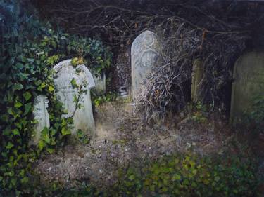
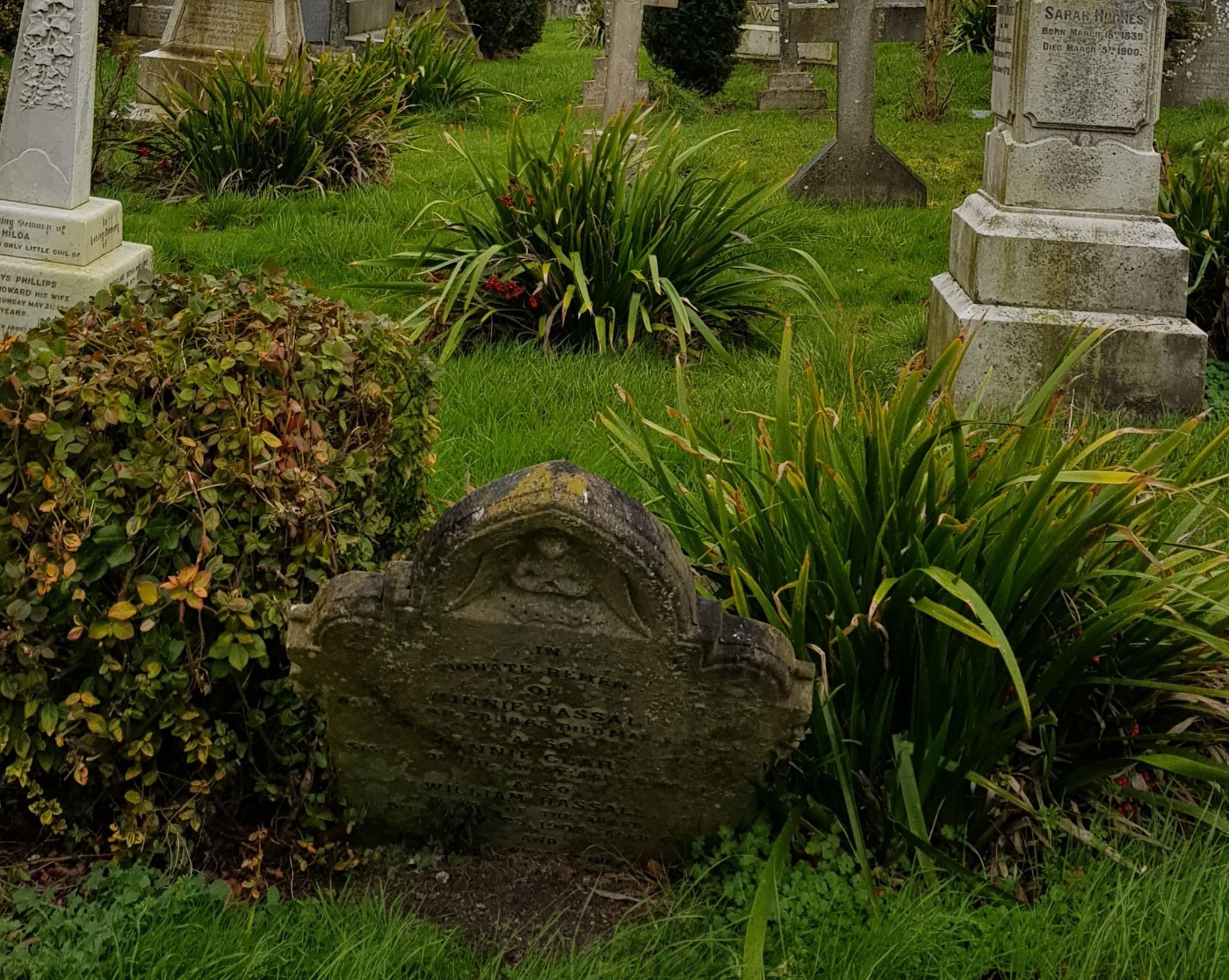
Researching cemetery drawings on the web, I did find many, many pictures relating to horror, ghosts, fear, demons etc. This is not what I wanted to represent. I found other drawings that showed this subject as contemplative, interesting and beautiful.
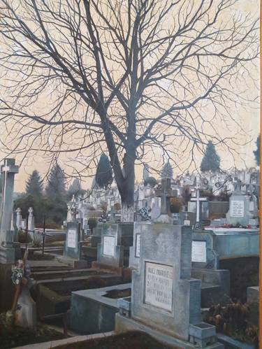
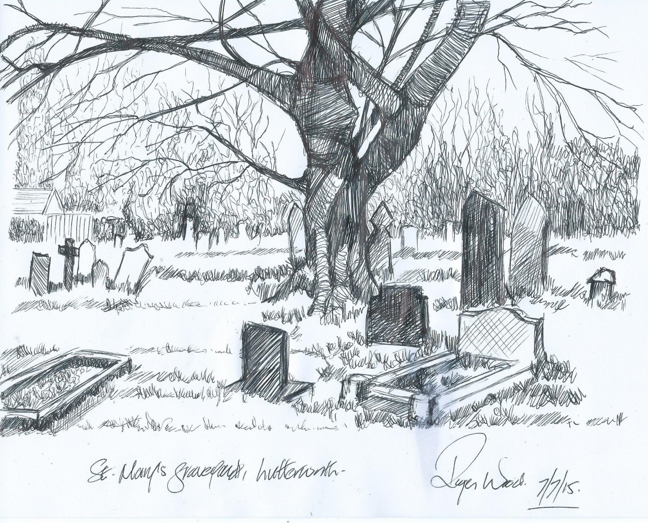
Images above, from left to right: CEMETERY OF LONDON, JORGE ISLA; CEMETERY PAINTING, STANCIU ANDREI; CHURCHYARD IN YORKSHIRE, DAMIAN OSBORNE; ST MARYS GRAVEYARD, ROGER WOOD (?)
For more inspiration I looked at the fabulous works of Hockney – his colourful patchworks of land, expansive views and winding roads. I also found an amazing artist, Oscar Oiwa, who has produced amazing 360-degree drawings in a blow-up dome, using Sharpie pens – so the viewer gets whole surround-view experience!
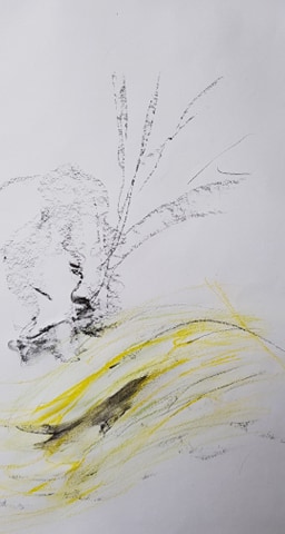
I looked at some work I’d done previously and hoped to pull some of the things I thought were successful. The lose drawings of hedges. The bending, repeated lines to show the form of the ground.
The soft, wet brush marks in pastel and watercolour pencil marks. These demonstrating the flow and shape of the land. The soft edges the water marks add seem more natural, subtle and fluid.
Preliminary Exercises
On more than one occasion, I took some digital photos around the park and the cemetery to get a feel for the place and to consider what would make a good subject to draw. The camera itself is a good viewfinder because it limits you field of vision and gives focus (though it would be lovely to create a 360 scene like Oscar Owia).
However, on the day I came to make preliminary sketches the weather turned very nasty indeed – I got completely soaked to the skin and so did my sketchbook. Hence the sketchbook I will hand in for this piece looks very bedraggled!!
For this reason I had to work on sketches and the main piece at home – using my digital photos and my memory. The sky the day my piece was based on was very grey – a thick blanket of cloud overhead. The landscape was soaked and damp. A cold, wet February at the end of a storm.
I wanted my drawing to show the slope of the earth beneath and the curve of the sky and the weather above. As it was late winter, everything was green and soggy, moldy and damp.
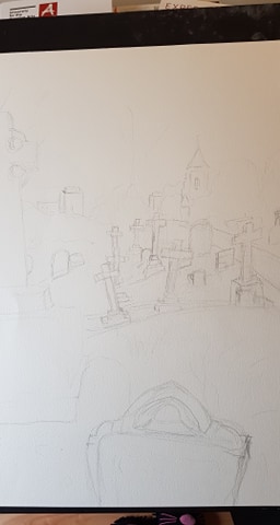
My first sketch was to think through composition of the piece. I decided to move some objects I had seen elsewhere in the cemetery, into the foreground of the scene I was looking at, to create focus and a front layer to the drawing.
My second sketch was to have a look at the forms I was going to add – the church, trees, grass, monuments. Did I like them?
The third sketch was to again look at composition, with perspective, depth and placement of objects in mind.
My fourth sketch was a brief warm-up of creating trees and slopes with marks and lines.
Drawing the Piece
I started by lightly plotting the outline of the shape of the land and the objects in 4B pencil. I had done this in black pen for other, previous drawings but I didn’t want to commit at this stage.
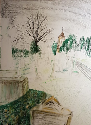
I started at the top of the drawing and used various grey to white pastel sticks on their sides to give the curve of the clouds and weather. Pressing light and soft to give the sky its variation in depth and intensity of colour (greyness). The blocks of shades of grey show the heavy cloud cover. The shape of the blocks also tries to hint at the direction of the wind. I worked quickly to impart energy.
I then drew in the background trees. The dense green pastel jagged points for the evergreens. I added jagged lines of black charcoal within these structures to hint at depth and shadowy recesses in the leaves and branches. With black charcoal I added the bare, tall, leafless trees. I wanted to make them appear stark against the sky so only used black for them. As they were in the middle distance, detail was not important. Plus, the lack of detail helps develop perspective.
I added the colour in to the church with pastel pencils and drawing pen for the shapes in the window and the spire. I used pastel pencils so I could give a delicate outline to the shape of the church. It was important to hint at the lines of the church to make it believable and give perspective to the whole piece.
In the very far distance, I hinted at the shape of the blocks of flats. I did this using a fine drawing pen. I made the lines undefined – just to hint at shape. I added no colour to their form. to help created atmospheric perspective. I had moved these flats into the view for my picture. They were in the background of the actual scene – but not at the angle I drew the piece at. I wanted them in my drawing to show distance and add to perspective. I also wanted them there to show that the cemetery is surrounded by life going about its business as usual – to put life and death in perspective to each other as concepts.
I then moved forward to the front of the mid section. I drew marks in watercolour pencils and pastel to hint at the shaped of the slope and colours in the grass
The path was also important the piece’s perspective. I tried to hint that it was disappearing into a vanishing point, somewhere unseen.
I worked on the mid ground and crosses to show slope and the form of the land with pencil and pastel marks. I pulled a wet brush through some of the green contour marks to soften them and give them movement and energy.
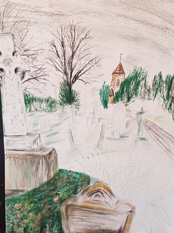
The time-consuming section of the piece was the white cross in the foreground. I wanted to hint at the Celtic artwork without spending many hours laboriously drawing every part of it. I coloured the cross white using pastel then used a 4B pencil to hint at shapes of the carving, weathered marks and shading.. This took a good hour. I wanted the cross’ plinth to look weathered, rain battered and moldy. I made it white with pastel then finally dragged through brown and green pastel. I used a dry brush to pull the green and brown downwards, then wetted the brush and dropped some drips of water down the shape.
The foreground was a box hedge, a very weathered small headstone and a large ornamental grass mound. I imported these elements from another photo of a different area, as the original landscape had nothing at the front of the picture. I did this to create better balance and composition. I made the colours of these elements stronger and more detailed to again give better perspective – differentialting the front middle and back of this drawing.
The drawing is composed of at least 6 layers.
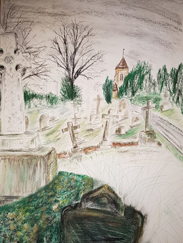
REFLECTION
WHAT WORKS (and why)
I like the idea of the piece. To show life, death, the human worLd, the natural world and the sky beyond, all in proximity to each other.
The sky – with it banks of grey moving in a direction. Its very simple and Its not overworked. It hints at the weather progressing across.
The persective – The eye is drawn to the vanishing point behind the church. The path (decreasing in width) and placement of the objects, e.g. the cross and black tree, all hint at this vanishing point.
The plinth of the white cross – The marks made by using a dry brush through the pastel and by using a wet brush to create real drips, make the plinth look weathered and moldy.
The contour of the earth and slope – the drawn lines give the land shape and movement. The way the crosses point (rather haphazardly) hint at their age and that the land is moving over time. The marks made with a wet brush through pastel soften the contours and show the land isn’t static.
The detail at the front – The Celtic pattern of the cross, the detail of the grass and box hedge develop the perspective of the piece.
The energy – The lines of the drawing show the slope moving up and the sky moving across – hopefully making the scene more dynamic and alive.
The layers – I like the idea of layering images. It makes them more interesting and tells a story.
WHAT DOESN’T WORK (and why)
The box hedge at the front is too lumpy and dense. Looks like a green bath sponge! I think it needs more detail or different strokes of pencil to give a better effect. I should have maybe used the technique demonstrated on my previous drawing of a hedge? The shape isn’t quite right either. This is partly caused by me adding this element into the scene – as it doesn’t truly belong there it is hard to judge what will make it look right.
The contour strokes of the land are not soft and subtle enough. I should have used the wet brush more effectively – maybe with more pastel lines rather than pencil lines. I think the image was affected by the grade of paper I used. The paper is quite rough and absorbent so the watery lines don’t move across the paper as I’d have liked. I didn’t practice on this actual paper grade beforehand.
The grade of paper I used was incorrect for the effects I was trying to achieve. A smoother paper (less tooth) would have let me drag colour across with a brush. The effect of dragging a pastel stick across the paper was rather too dotty. I need to have a look at different papers and what paper works best for what I want to achieve.
The white cross in the foreground is a bit wonky. As this was in the foreground, I should have checked its lines more carefully. All the crosses were wonky – but this was meant to be, as age and land shift had actually caused this. The white cross outline was just misjudged!
The other crosses needed a bit more work to give them depth.
I should have maybe tried this in a less traditional format (rather than white A1 paper). My tutor did suggest this to me, but I wasn’t quite brave enough. Maybe Ill give it another go on larger, less traditional paper. I do have an issue, as I have to work at home in quite limited space, but this may be the way forward.
I tried to make the piece fresher, looser and spontaneous, but I did get quite bogged down at the front of the drawing (hedge, stone) and I think this shows. The piece took a good 8 hours (without the prep). I need to keep working on loosening up my technique.