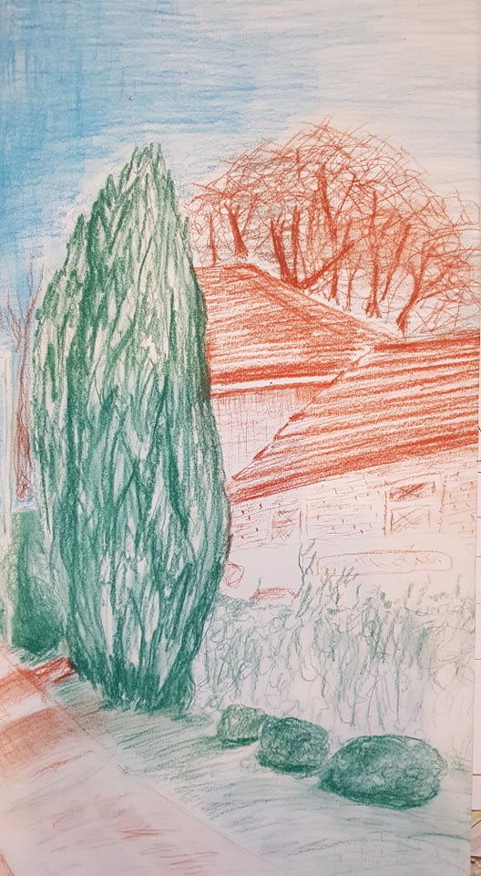
I decided to work on the original sketch as a limited palette piece as the subject naturally seemed to have three colour types: blue for the sky, green for the trees and grass, brown for the man-made structures. I liked the intersections and angles of the objects and the slant of the ground. The tone of the piece doesn’t work as well as it should – I needed to have worked on subtle gradients of tone more – especially on the roofs of the houses. The angles (perspective) of the roofs aren’t quite right. I quite like the pencil marks that suggest the slope in the foreground and the scribbles to create the bushes. The use of just three colours does make the composition more striking.
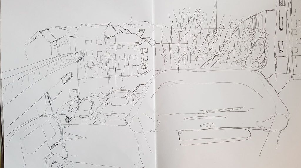
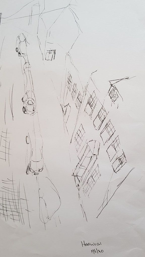
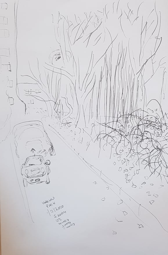
The line drawing below proved quite tricky as getting the perspective correct was quite a challenge. I realised that the car in the foreground filled half the view – my brain wanted it to be smaller, but this would not have been as the scene really was. I was frustrated with the image when I was drawing it, as it was so complex, but looking back on it you do get a sense of the place. I have learnt that manmade objects are harder to draw than natural ones. This is because the lines have to make sense and cannot be vague and organic. Man made objects are usually really just boxes and cylinders.
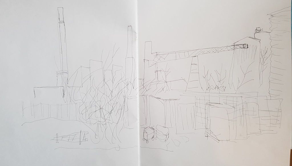
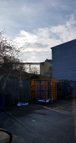
I enjoyed making the line drawing below. The building was fascinating, with all its different shapes, sizes, materials and structures. It is a factory near where I live which I rarely (if ever) look at – I just know its there. My area doesn’t have much heavy industry, so this glass factory is, to me, an unusual, interesting structure. Trees and plants grow around it and in front of it – alongside pallets and man made debris. Because I was interested, the lines flowed from my pen! I would love to create a more complete drawing of this.
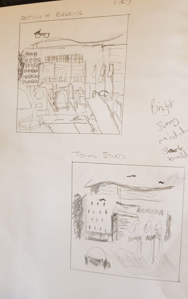
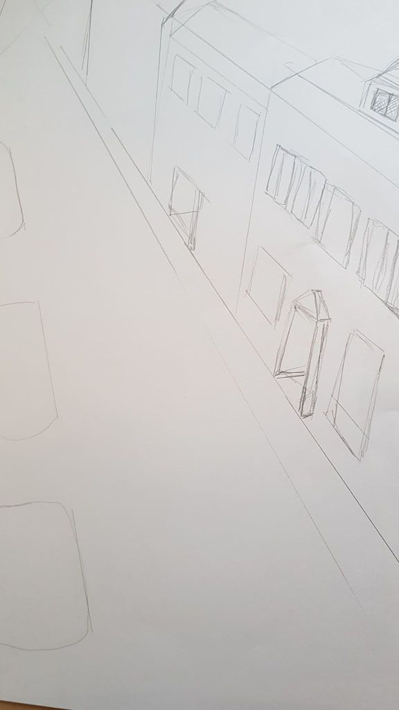
I drove to Harlow town centre ‘Watergardens’ car park. This is a vast car park, facing the civil centre, flanked by Asda and TK Max. I thought it would make an interesting subject as the civil centre is a vast concrete building with blocks of building and trees visible next to and behind it. However, I found my heart wasn’t in this view. I spend a lot of time in this part of town (I work near by) and I think familiarity bred contempt! It was a bright, sunny cold day with a blue sky. The sun bounced off of the buildings. I used my viewfinder to frame different sections of the buildings for the sketches below, as the subject in front of me was vast. This did make the subject more manageable. I did then do a line drawing of the areas for exercise 2.
I drove to the residential area around where I live and drew the sketches below.
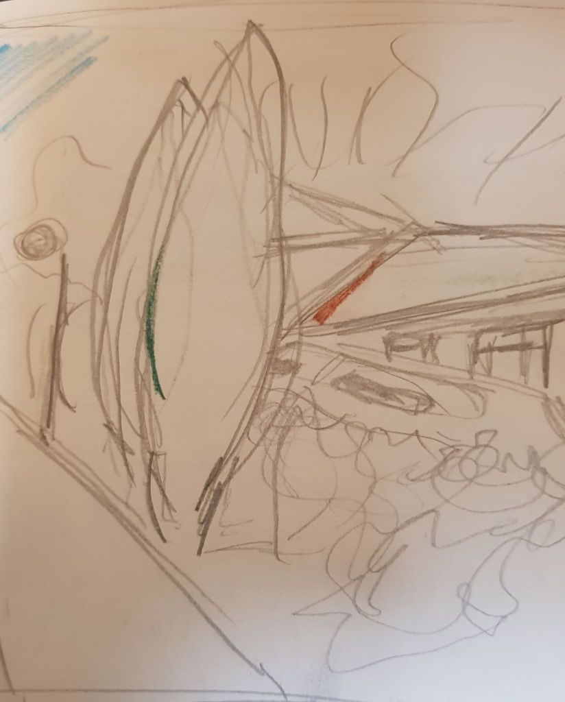
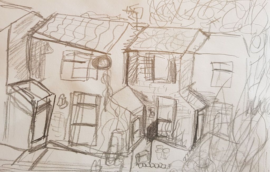
The view below interested me more as I liked the angles of the houses against the trees where the land was sloping. I like the composition, as the intersection of the lines and angles of the objects make it interesting to the eye and it is dynamic.
The street view below was tricky to sketch. To make this a finished piece I would need to work on perspective lines more. The front door section of the houses jut forward while the main body of the houses step backwards – it was very hard to put this across in the sketch.
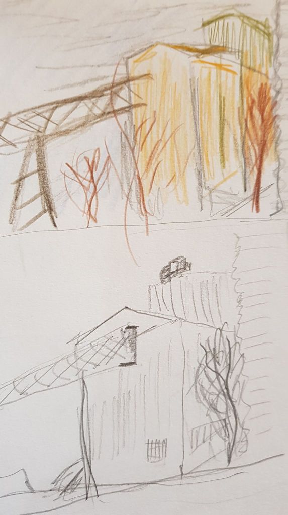
I drove on again and found my favourite subject of the day. Harlow does not have much heavy industry at all but there is a very large glass factory in one of the industrial areas. I found a good place to park and was quite excited by the view as it is not something I’ve looked at that closely before. The buildings and structures formed interesting angles and silhouettes against the blue sky. The building materials had different textures (corrugated iron, iron bars, sheet metal) I decided to develop this structure and view further with a line drawing (exercise 2). I would like to develop the sketches and the line drawing into a finished piece at some point.
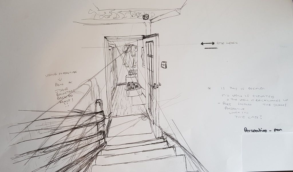
I made this exercise (unintentionally) more difficult by sitting in an elevated position on the stairs. I learned quite a bit from this exercise, as I did make a few errors. I didn’t know where the vanishing point should be for the staircase – should it be on the ground in front, or at eye level? I got very confused with the left hand staircase – hence two sets of stair rails drawn. The lighter drawing followed the perspective rules more closely, I thought – but it didn’t look like the reality I was actually seeing with my eyes.. Conclusion: Needs more practise!
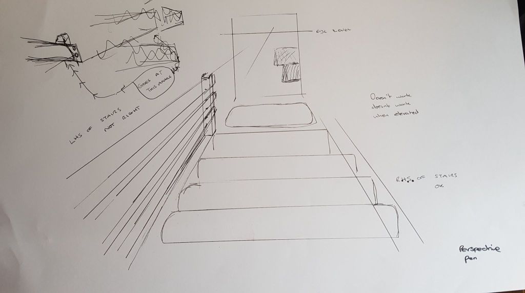
I tried to redress the problems I had found – see the image below. I used eye level for the vanishing point for the stairs and for the ground level. This seemed to work better – though I still doubted the left hand side of the stairs, as it didn’t match my reality. I think I should have elevated the vanishing points behind me to create a steeper angle.
ANGULAR PERSPECTIVE
Below was a quick sketch Id done of an old high street (from a bedroom window) before I had considered the exercise on vanishing points.
I made a quick re-draw of the scene, below, to try and bring more perspective to the piece.
I think applying perspective does improve the realism of the sketch. However, as the high street buildings were a few hundred years old the sketch loses out in other ways. The buildings, in reality, were a bit crooked and uneven. So I would only use the lines as bones to a final drawing, as the haphazard build of the houses also needs representing. They look a bit ‘new build’ in the drawing below.
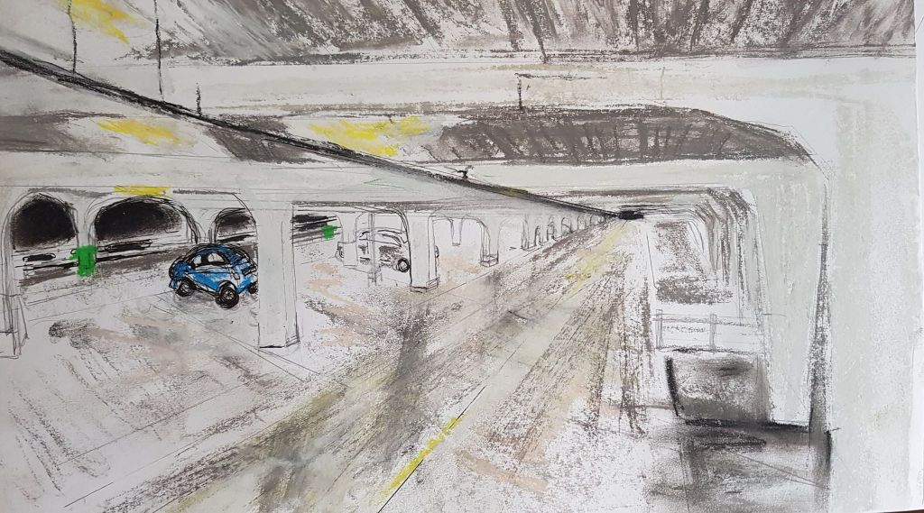
I park in a multi storey car park for work and this lent itself as inspiration for a drawing to highlight perspective. The man made lines and angles of the car park, along with its large size, are a great place to demonstrate perspective. This drawing was quite challenge, as I realised there were multiple vanishing points to apply. These points had to be applied to the parked cars too. I didn’t get it right on the left hand side of the drawing, where the 2 cars are parked as their parking spaces don’t recede at a tight enough angle.
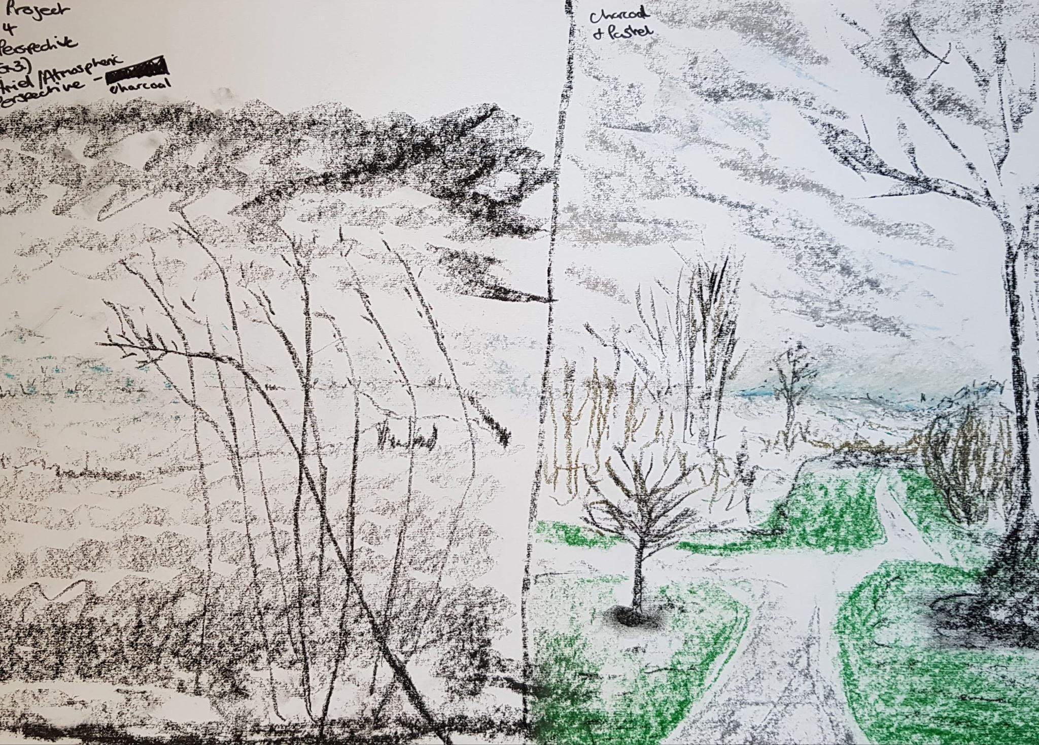
AERIAL OR ATMOSPHERIC PERSEPCTIVES
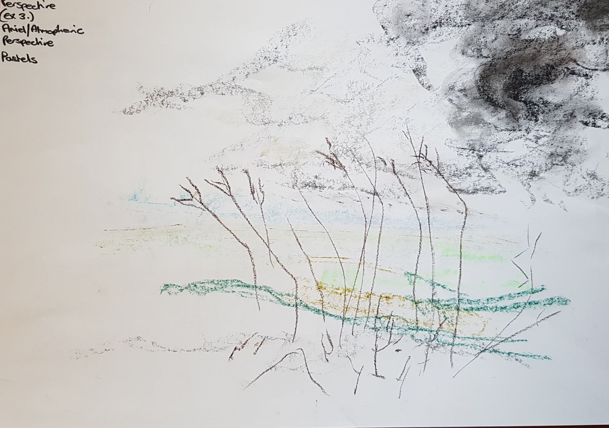
I drew some quick sketches and tried to suggest atmospheric perspective with tone – making my horizon’s nearly white – but smudging and using blue to try and achieve a misty effect. I quite like the charlcoal sketch with tone as it seems quite brooding.
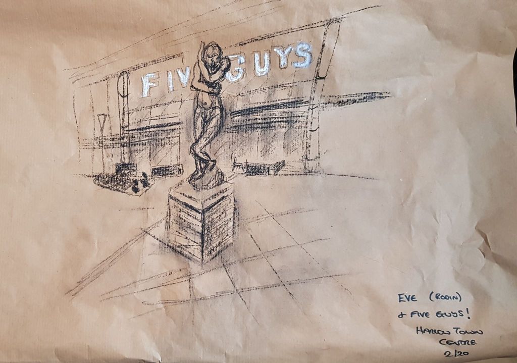
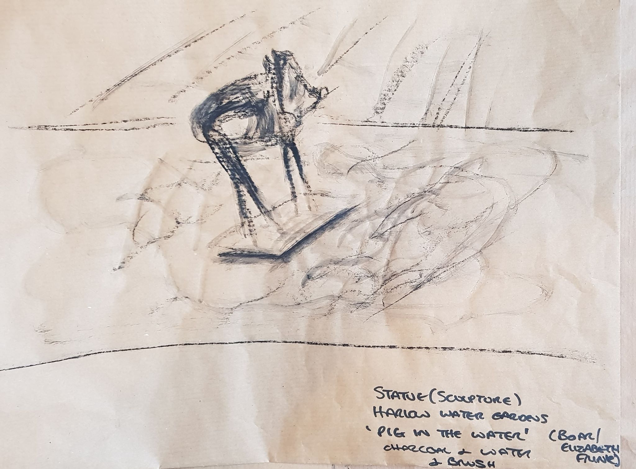
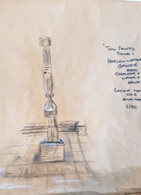
I quite enjoyed drawing statues. Harlow Town is very near where I live (its where I grew up – and I’m rather fond of the place) and actually calls itself ‘sculpture town’. There is a sculpture trail in the town – I’ve put a copy of the trail pamphlet in my sketchbook. The sculptures amuse me as they appear randomly in a ‘warts and all’ new town built of grey concrete and paving stones. You will be greeted by a Henry Moore when you come out of Pizza Express, a Rodin when you come out of Next etc. Everyone treats them like part of the furniture. I used to climb and sit on the Henry Moore family group when I was a child (they moved it in to the Civic Centre a few years ago – to keep it safe).
I drew my sculptures quickly with charcoal (charcoal and wet brush in parts) and used white pastel for a couple of highlights. I used the brown paper. I was quite pleased with the results. Id like to do some more! Maybe bigger!
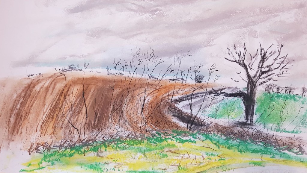
I have started using my car as a tool for drawing. I travel down the A507, to Bedford, every week to visit my poorly dad. This winding road has a multitude of amazing views. The only issue is that there are few places to stop and draw them. I have found a couple of good places and use my journeys down this road to stop and make very quick sketches. I used one of these sketches to develop into the Foreground, Middle Ground, Background exercise. I used Hockney’s landscape paintings as inspiration, as in many cases the incorporate a road and suggest to me Hockney was also interested in views as he drove? The sketch I have used to develop was initially made at a side road called Buttermilk Farm, near Cottered. The side road allows parking a gives a great view of surrounding farmland – with rolling hills, fields and a big sky. I used grey pastel shades for the background of a rolling grey cold cloudy sky. Thick clouds moving oppressively across the top half of the view. The side of a pastels allow the colour to be put on like a thick blanket. The background of the land is distant clumps of trees – using a black drawing pen to keep the detail small but somewhat structures in shape. The middle ground is sweeps of brown pastel , overlaid with pastel pencil to show the furrows of the ploughed field. The foreground is detailed black line pen drawing of tall weeds.
WHAT WORKS
The Clouds – Drawn spontaneously with energy.
The little trees in the far background – Hint at distance and expanse
The weeds in the foreground – bring the viewer right to the front of the picture. The black pen allows them to be more detailed in structure.
WHAT DOESN’T WORK
The Midground – The technique with the pastel is too heavy and lumpy. Probably should have used drawing pencils rather than a block of colour as the midground shouldn’t shout as loudly as the fore ground.
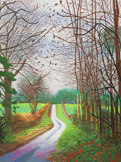
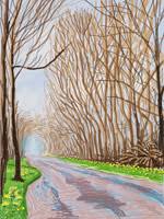
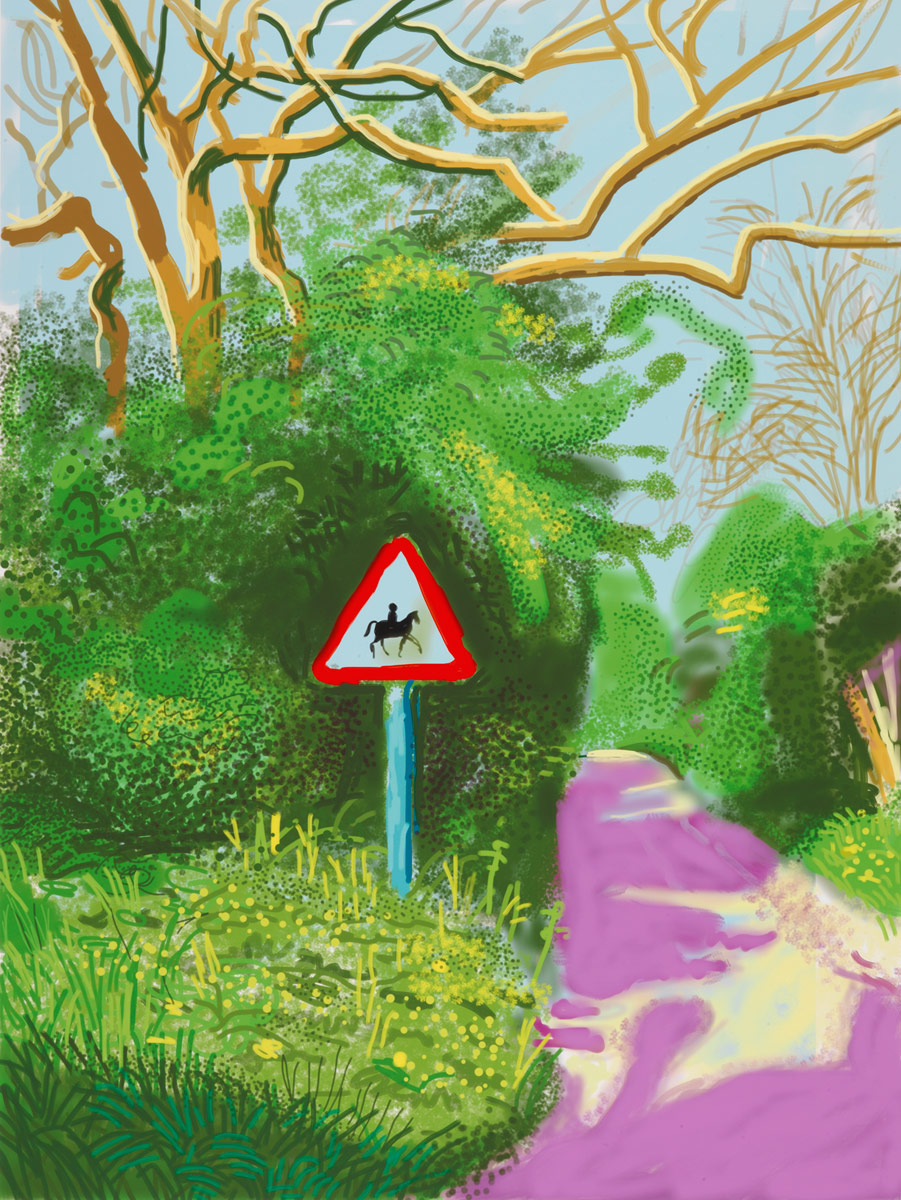
Inspiration – see various Hockney below
I love Hockney’s use of colour and the way he composes the pieces. They are rather hyperactive in colour, but excite the senses. I can relate to Hockney wanting to create a series of drawings. The different aspects help create a reel feel for the area they are based in (Yorkshire). I would like to maybe develop a similar series on the A507!
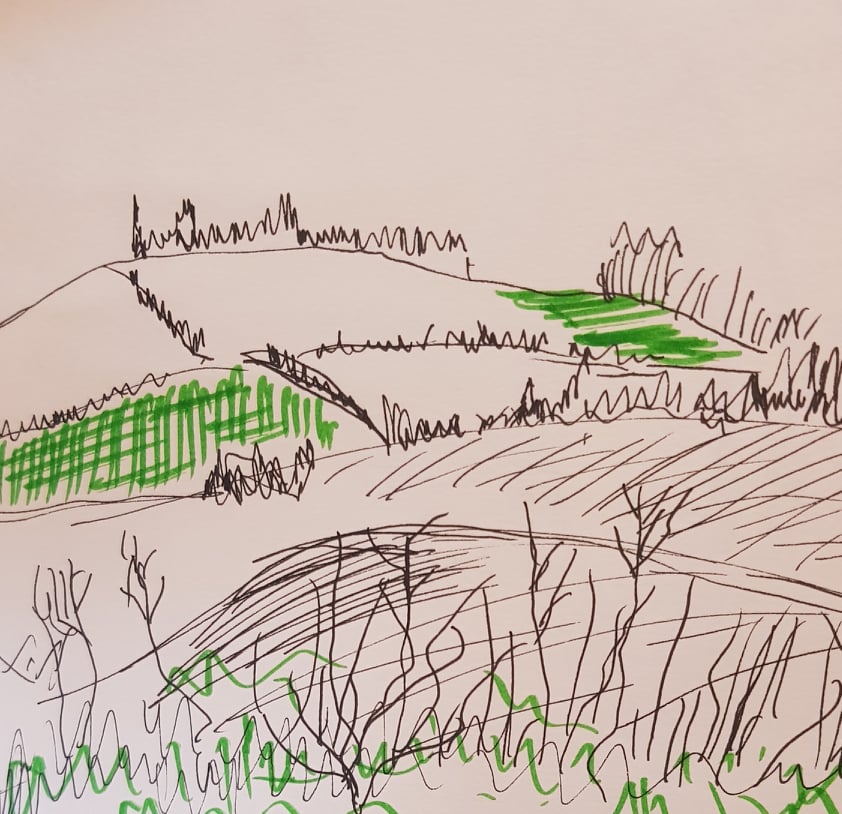
Above is another sketch I did at the same location (facing a different direction) to demonstrate fore, mid and background. I didn’t develop this sketch further, but I think it also demonstrates three layers of composition. I actually prefer this rough sketch, to the piece at the top of this page.
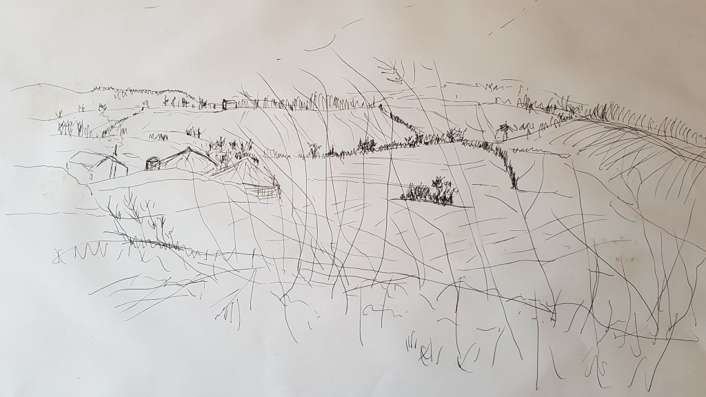
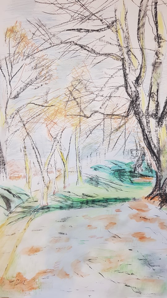
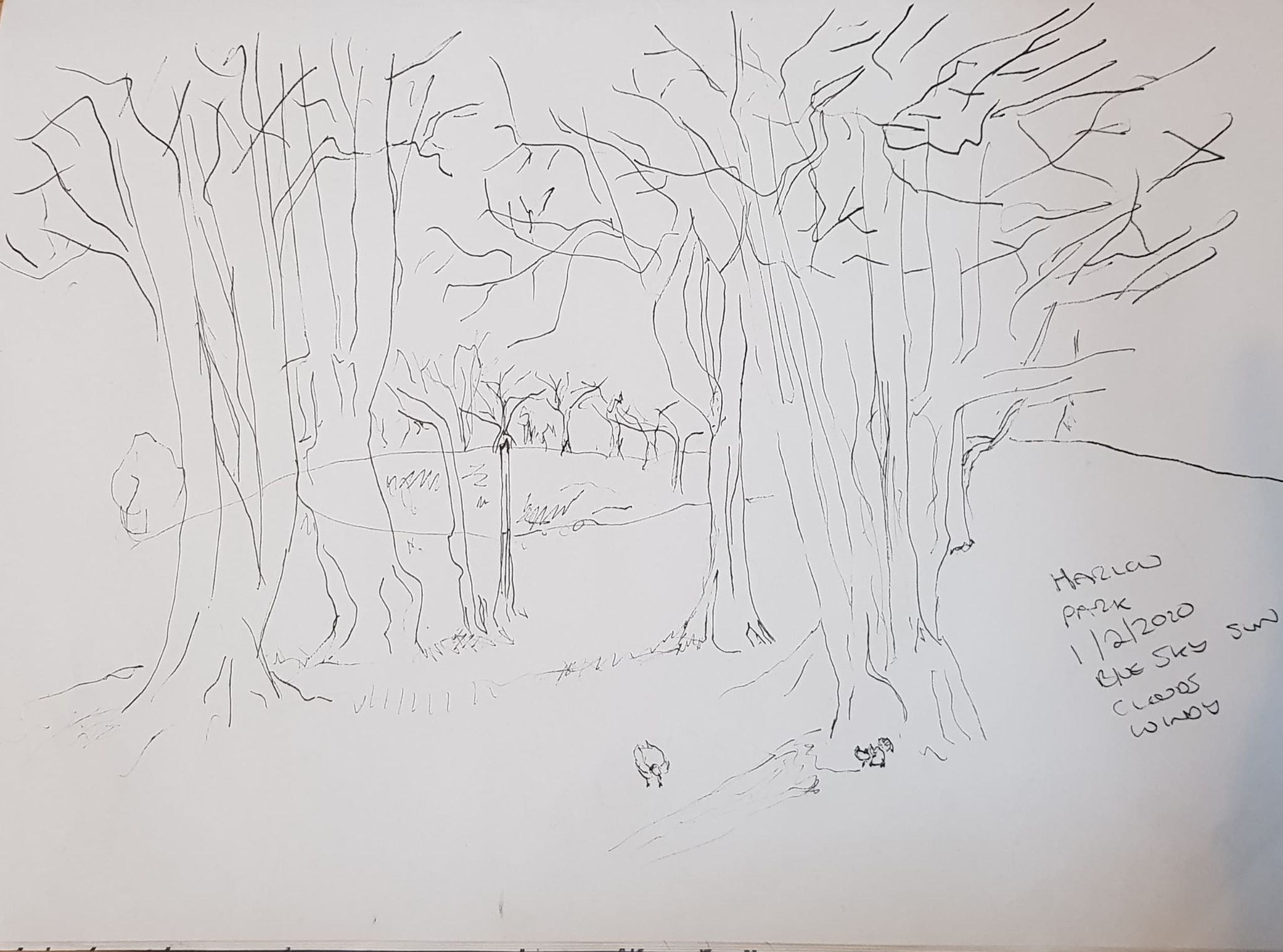
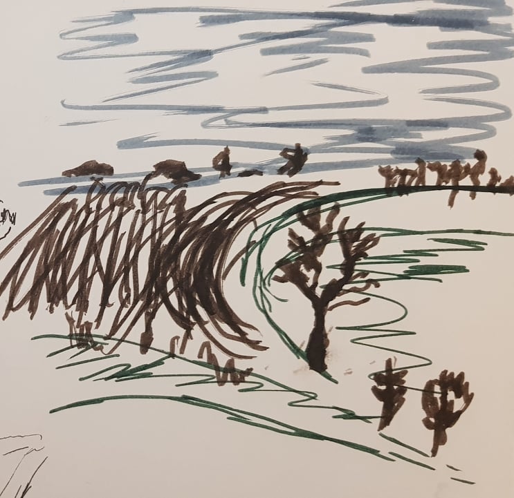
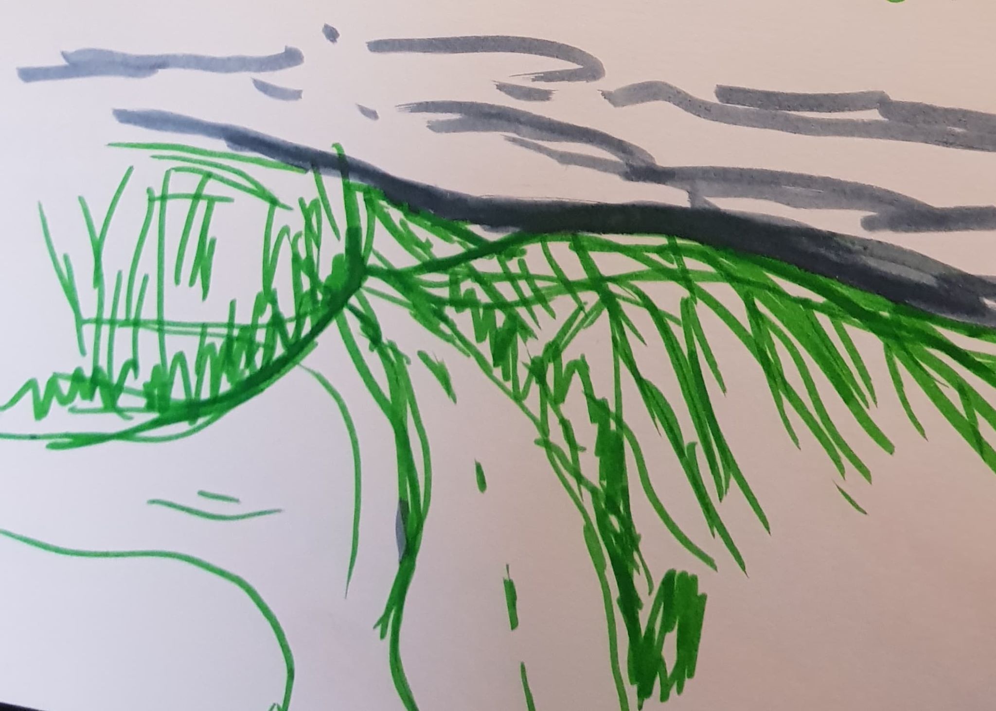
I chose a sketch from my Harlow Town Park studies to develop. I chose this sketch as the shape of the land was interesting with: a gently curving path with banks either side that moved though the scene from front to back; interestingly placed trees in the far ground and a large impressive tree in the midground. The foreground was patterned with patchy grass and bare ground. The colours were interesting – I had a digital photo to work from too.
I used very light lines of a 0.8 black drawing pen to give a sketchy outline of the trees. I filled the midground, large tree with charcoal marks and lines to create a stonger shape for the trunk and some of the thicker branches. I tried not to over work these marks and most of them were done with just one shot. I used yellow marks on the trunks to suggest the direction of sunlight and created shape. I then used coloured pencils to give shape and texture to the rest of the scene. To soften and blend the coloured pencil marks I dipped a brush into a little water and blended the water with the pencil marks using direction of the brush to suggest contour and direction.
I quite like the image – but it may lack a focal point. The image, from life, had a bridge heading left where the footpath ended in the distance, but I decided to leave it out as I thought it might over complicate. I now think this may have balanced up the largest tree on the right of the picture? I like the softness and contouring the watery brush has given.
For the 360 degree study I chose to use the multi-storey carpark that I use for work as my base. Each corner of the car park has a very different, interesting view of the town. As the views are urban I decided to use a ruler and felt pen in three of the views to give them a feeling of being artificial. What expressed itself to me doing these drawings was that, despite the artificial nature of the car park and town, the natural sky and weather conditions were still very much part of the scene – nature was still part of the bigger picture. I would like to explore the contrast of nature and the urban and how they coexist for people.
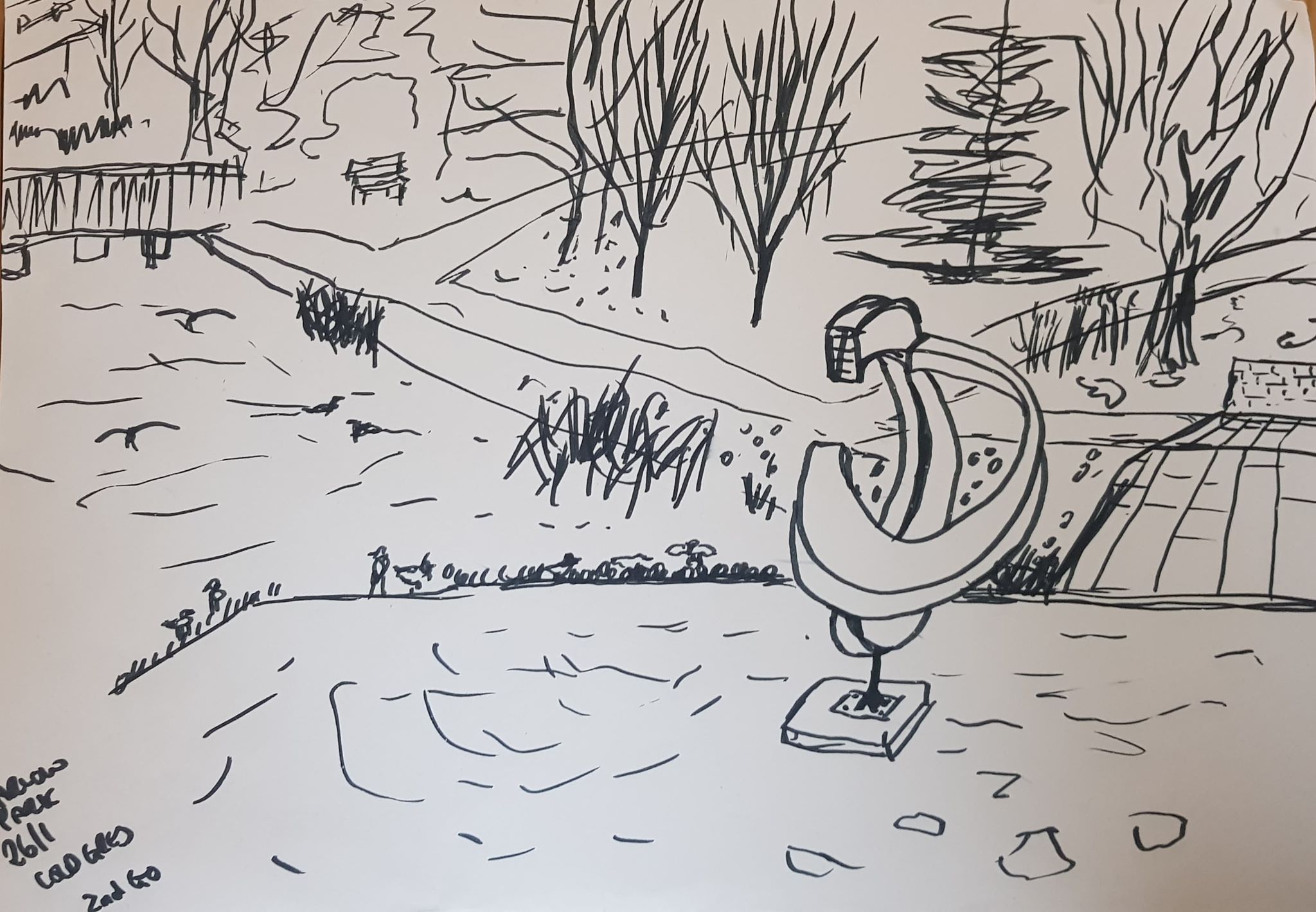
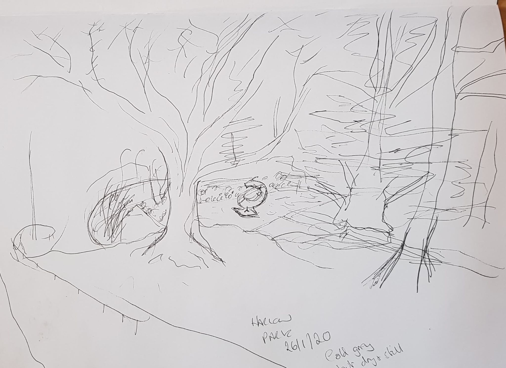
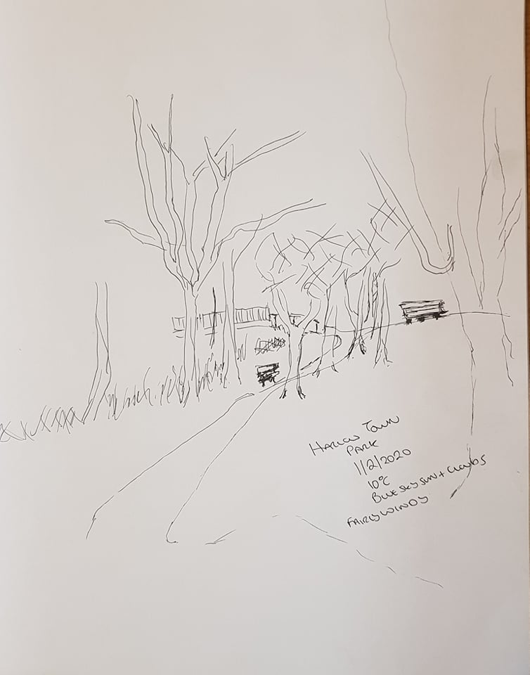
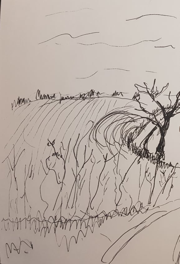
I had a couple of attempts at the walk in Harlow Town Park, as the weather was so poor on both occasions (grey cold windy drizzly).
I tried line drawings in black 0.8 drawing pen and also coloured pencil drawings. The drawing pen I found most effective as this can quickly give a sense of structure and shape for a preliminary drawing. However, this pen doesn’t quickly give a sense of tone, light and shade.
I then did a sketchbook ‘walk’ in my car of the road, A507. This road has some really amazing views. Again I used black drawing pen to make the quick sketches. I also tried hatching and energy lines in coloured felt pen to give and idea of the shape and use of the land. Some (winter) fields are ploughed earth, some grassed, the road travels through the landscape, the sky umbrellas it. The sketches did put me in mind of Hockney’s Yorkshire landscapes. I can only aspire to making my landscapes as vibrant and full of life through colour!
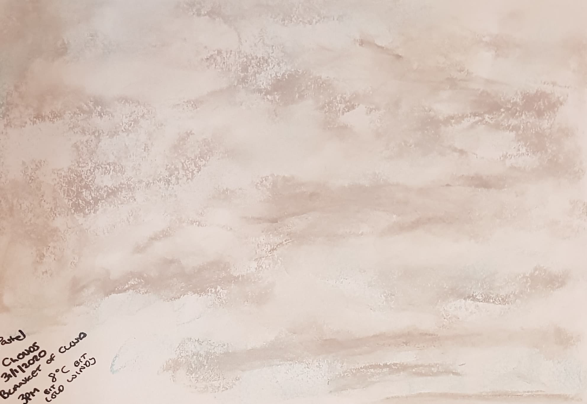
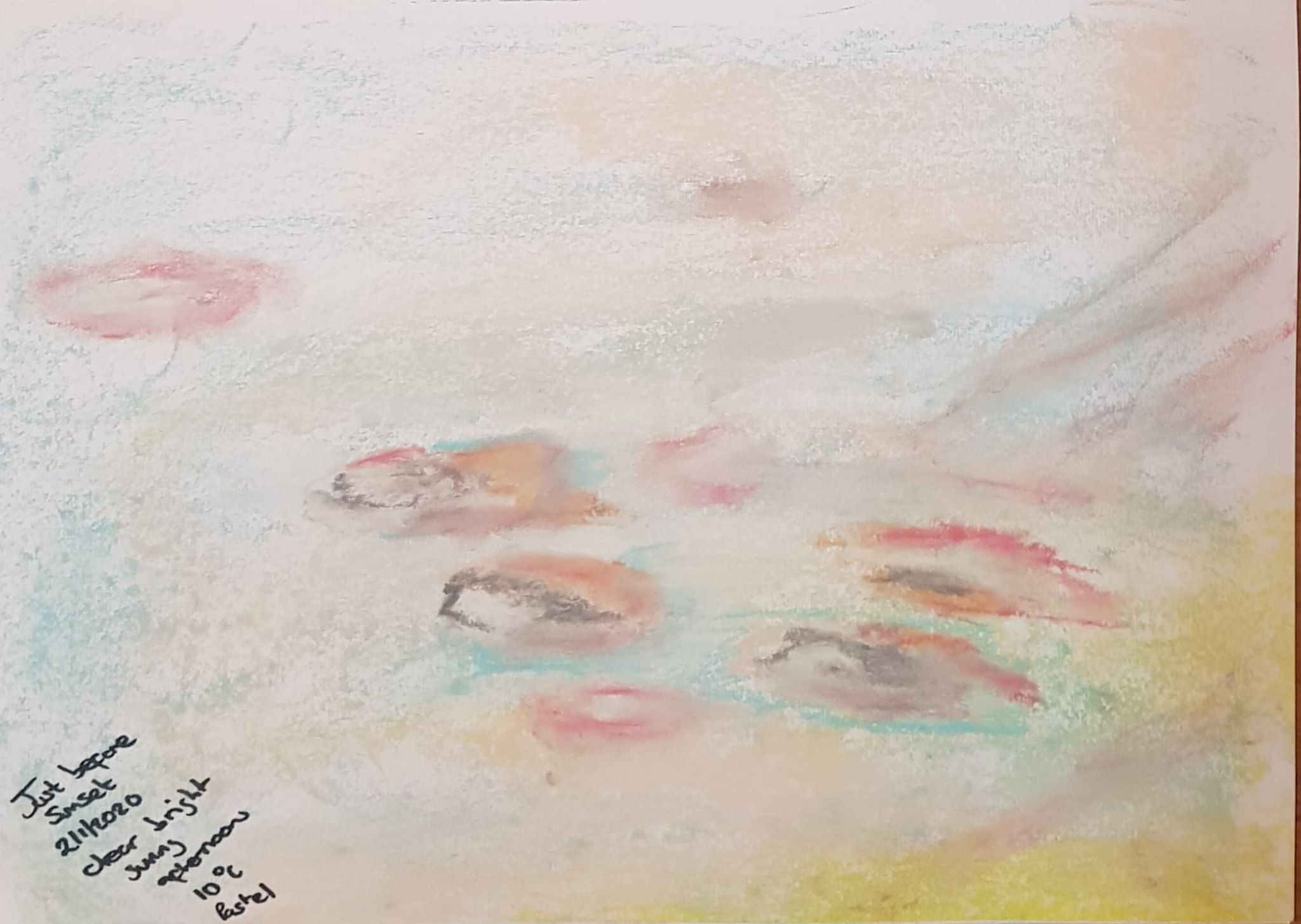
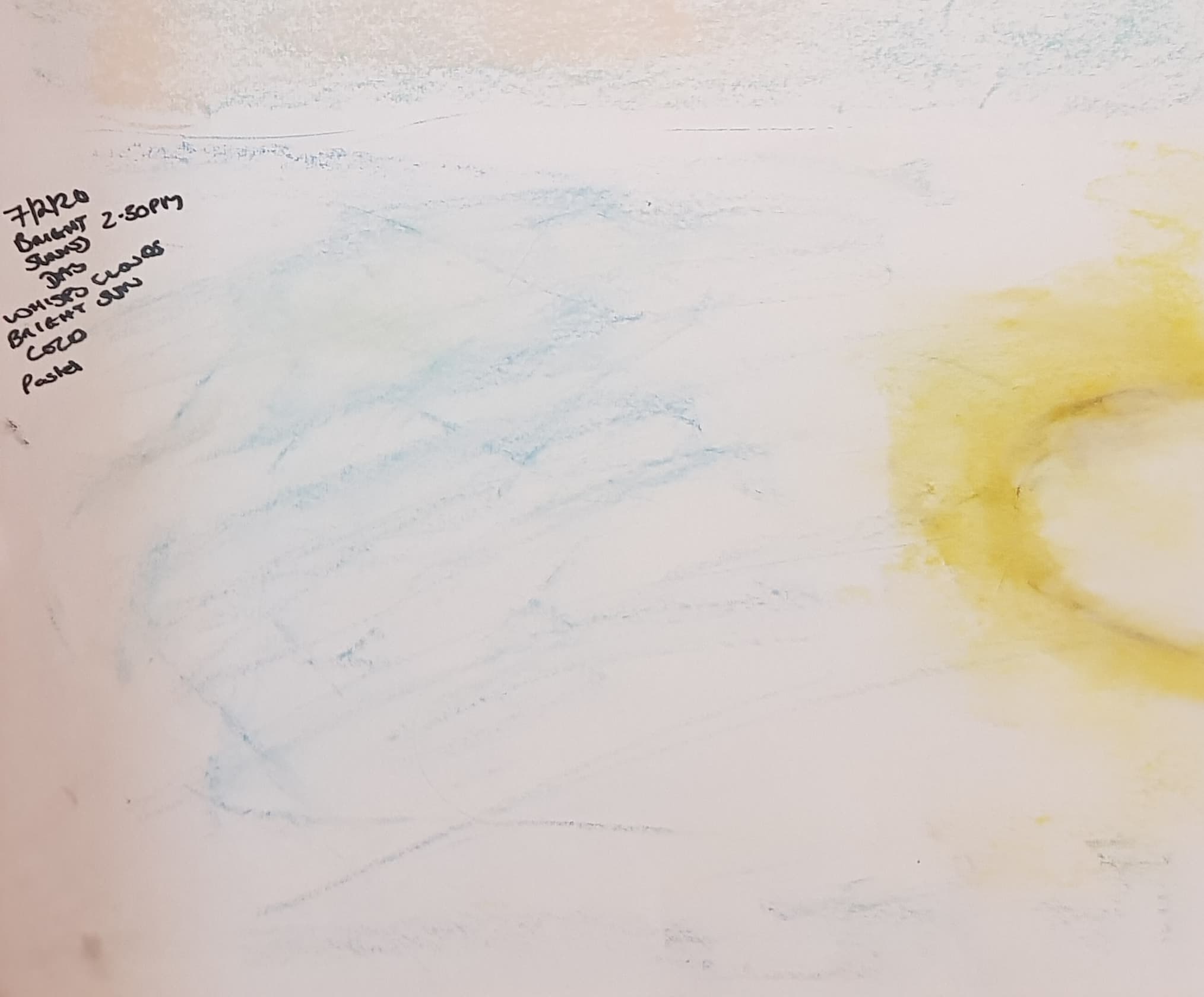
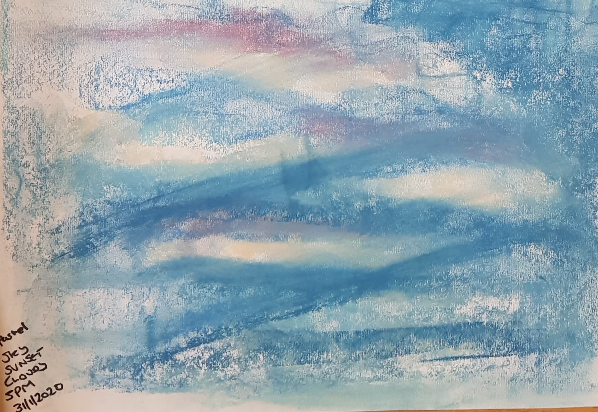
I drew clouds and sky on a few different days at different times of day. I love looking at the sky, so I wanted to put energy and excitement into my sky drawings. I used sweeps of pastel and put different colours into the mix trying to reproduce what I saw and felt. This method suited the grey sky best – it was a blanket of light grey with shots of dark running though it that hinted at the direction of the wind.
Maybe I should now try more realistic detailed drawings of actual cloud formations? I downloaded a sheet of cloud types and put it into my sketchbook to help me develop this.